Modern lake house
-
Thanks Walt.
-
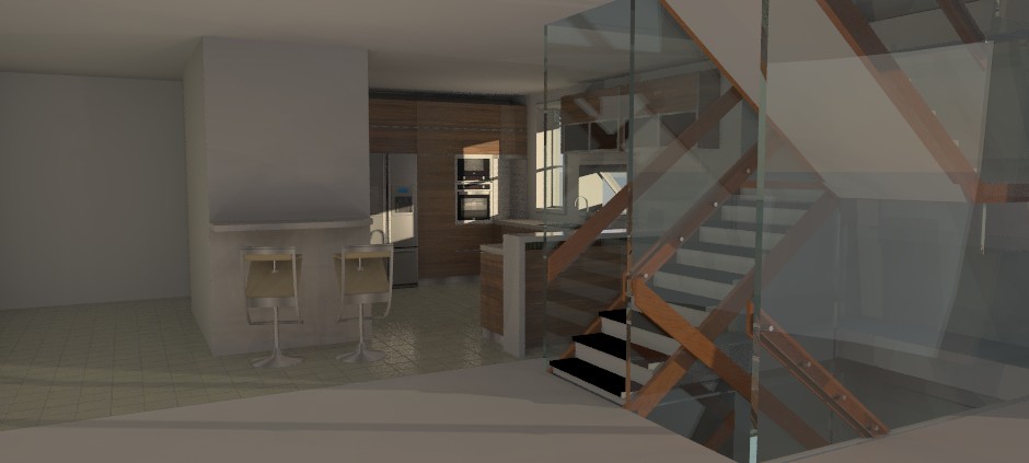
Still just testing and rearranging things.
-
It may be me but I like the definition given by the bars.
-
I like the glass better. It's in keeping with the exterior glass and the bars seem heavy. Maybe provide definition some other way. I don't know that the glass would be so thick but it could have reinforcing (glass) fins to add detail. It gives more the appearance of passing vertically through the floors like a single, continuous vertical element,which I like.
-
I liked the bars as well but it did block the view and light. I also realized is was a 1950s-60s decor style and while I love mid-century design, it was not right for this house.
The glass is actually acrylic which is lighter, safer and more durable than glass.
-
definitely different
 . can't image what the "window" would cost ... and look out for the kid with a "BB" gun..
 -
Thanks Charles.
It's all acrylic. The real problem would be cleaning it!
-
It's interesting. Very futuristic looking. However, to be in such a beautiful setting and yet be detached from it (your literally in a bubble) seems contrary to the point of even being there. You can't even step outside on a balcony to enjoy the air.
-
Thanks Daniel.
No balcony. Good point. I'll see if I can put one in. It really should have one now that you mention it.
-
GAH! Still sick. I'm getting better, but my head hurts every day. (sinus pressure) Focusing on complex problems isn't happening.
-
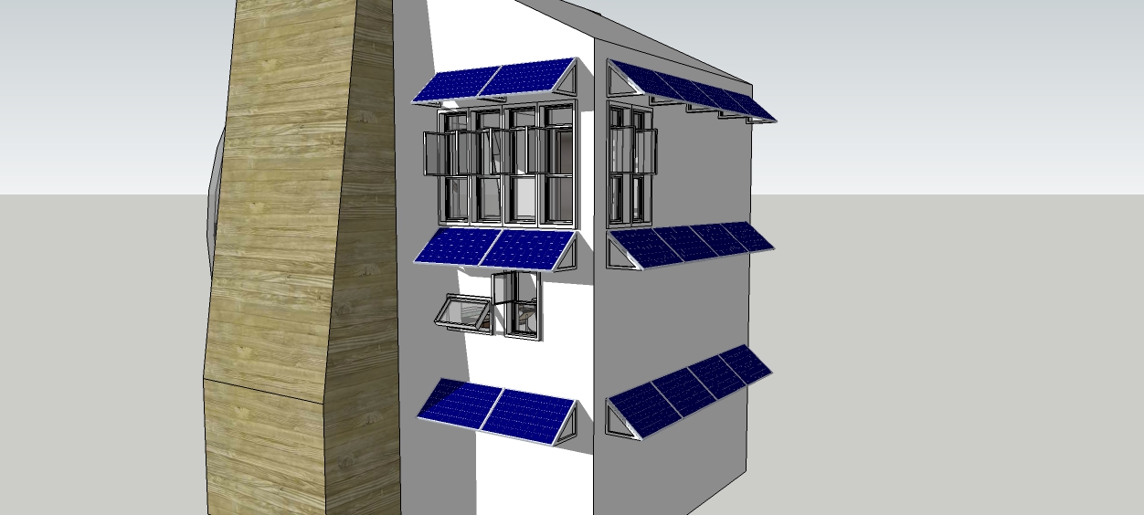
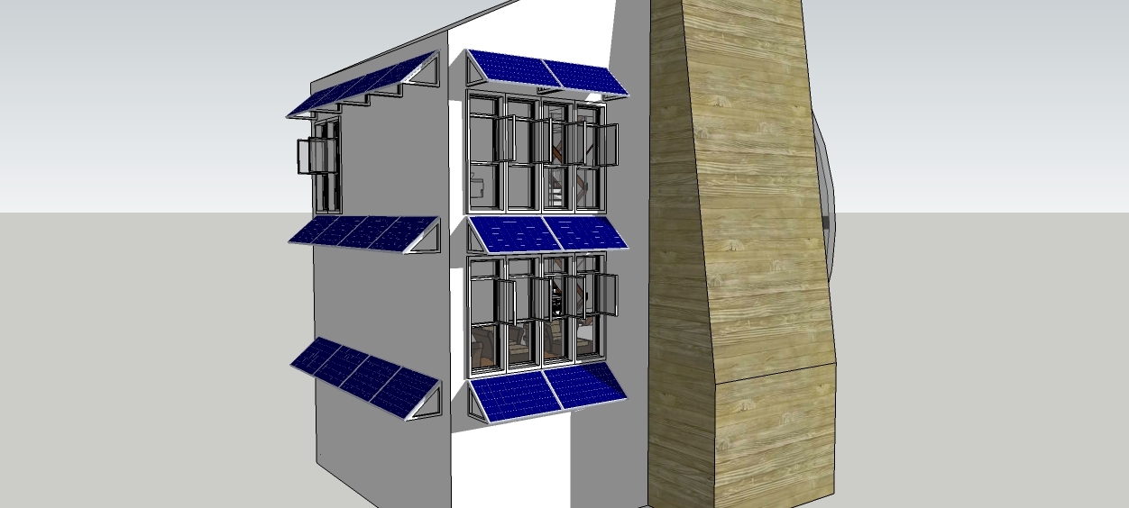
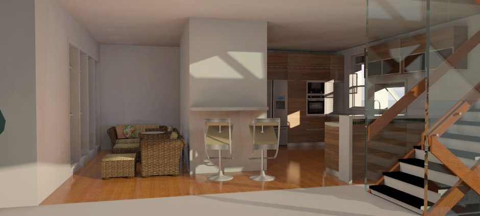
I'm finally feeling better. Here are some updates.
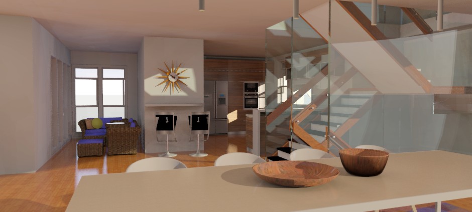
The wicker furniture is in the sun room. It will also double as a breakfast nook.
-
Nice render, I like the stairs better too.
-
Thanks Walt!
It's evolving.
-
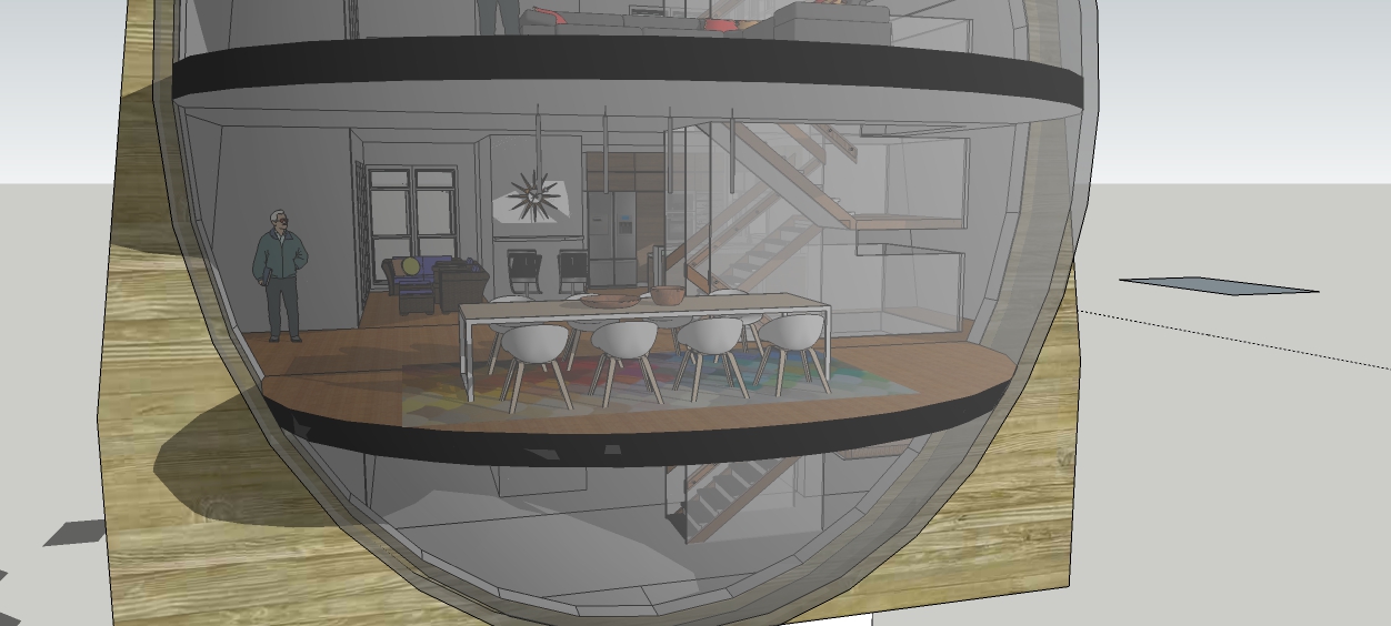
Update. I know you all must be tired of seeing the almost same scene. Bear with me. The rest is coming.
-
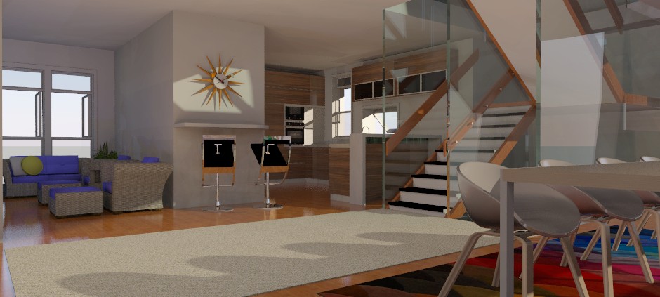
A better view. This will be the last of this view. I need to complete the rest of the project.

-
Nice rendering. I like the stairs!
-
Thanks pbacot. I think the render turned out nice as well. But I'm still not happy with the overall decor. It "checks all the boxes" but has no personality.
I'll come back to it after I finish the rest of the project.
-
I think you're trying for a futuristic clean look but some of the features and furnishings are mid-century with some 70's -80's added.
-
@pbacot said:
I think you're trying for a futuristic clean look but some of the features and furnishings are mid-century with some 70's -80's added.
Ah! I think you've nailed it! I couldn't quite put my finger on it.
Thanks!

-
Bryan, Looks like your moving along nicely. Your renders are looking real good.

Hello! It looks like you're interested in this conversation, but you don't have an account yet.
Getting fed up of having to scroll through the same posts each visit? When you register for an account, you'll always come back to exactly where you were before, and choose to be notified of new replies (either via email, or push notification). You'll also be able to save bookmarks and upvote posts to show your appreciation to other community members.
With your input, this post could be even better 💗
Register LoginAdvertisement


