Final Documentation for BakeHouse Distillery
-
Phew now final I can post the finished after a few months in design, documentation and the writing of a 70 page planning report to support the application.
BIG JOB! The proposal contains:
DEMONSTRATION GIN DISTILLERY,
RESTAURANT,
RECEPTION CENTRE,
MANAGER'S RESIDENCE,
COMMERCIAL LAUNDRY, and
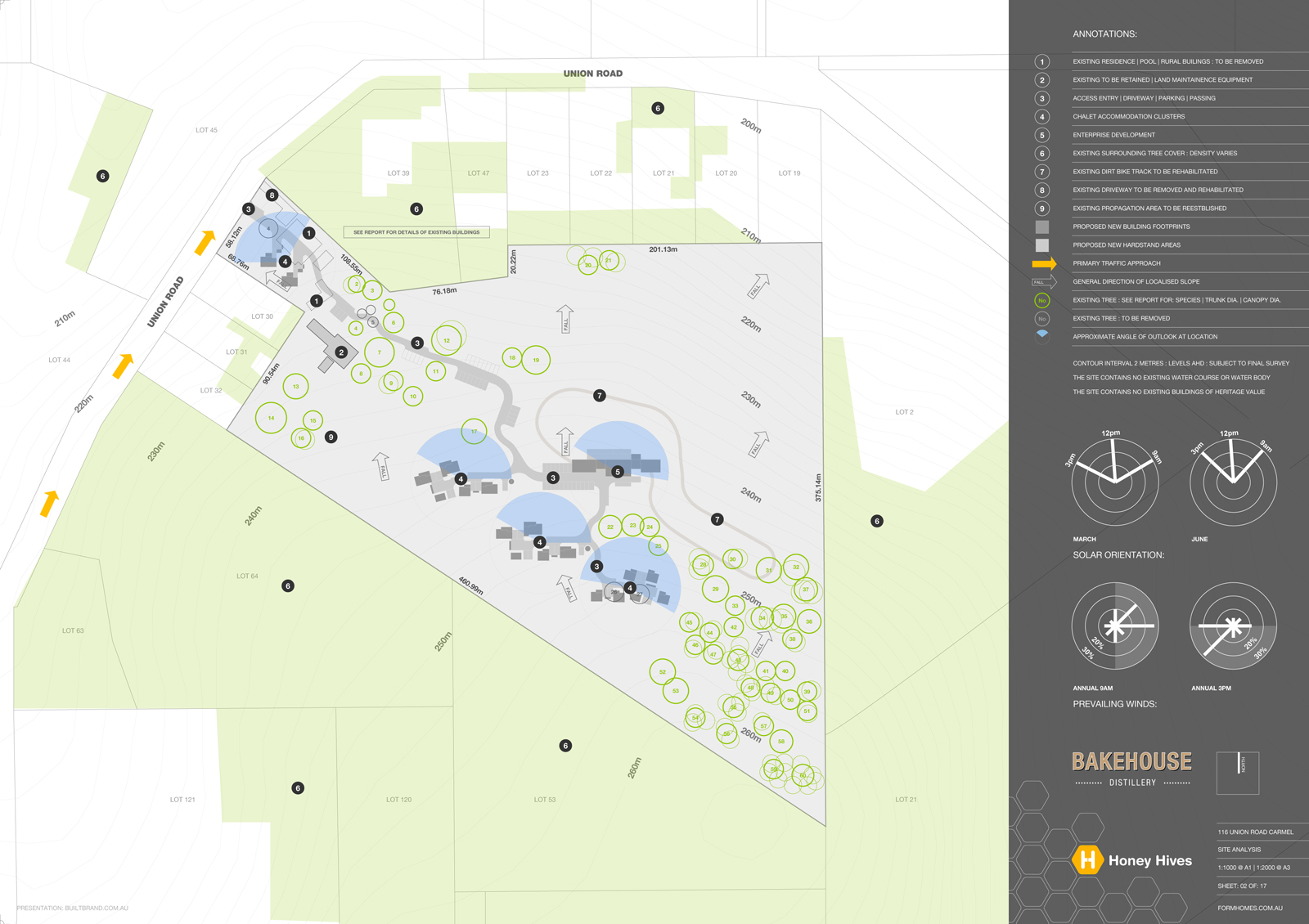
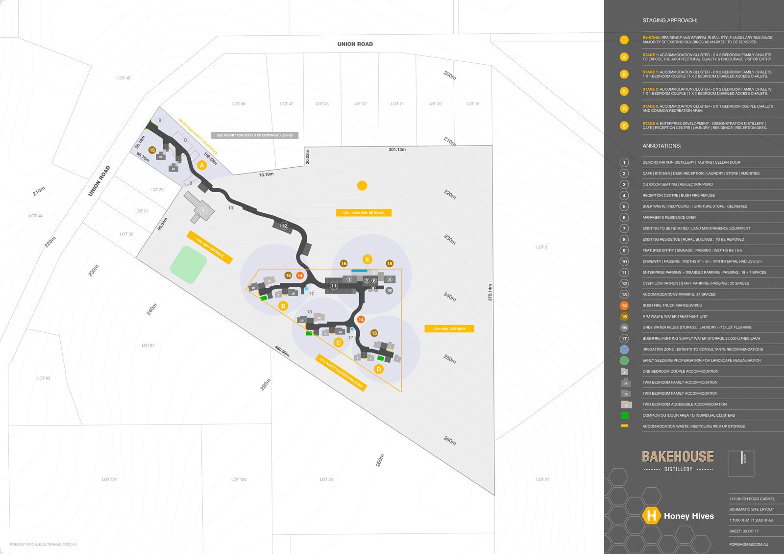
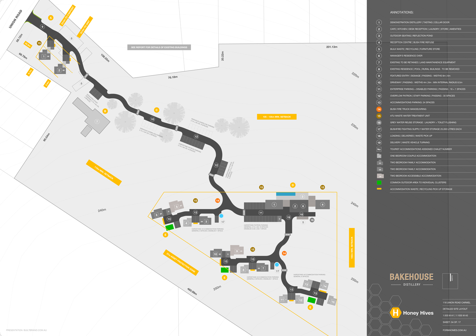
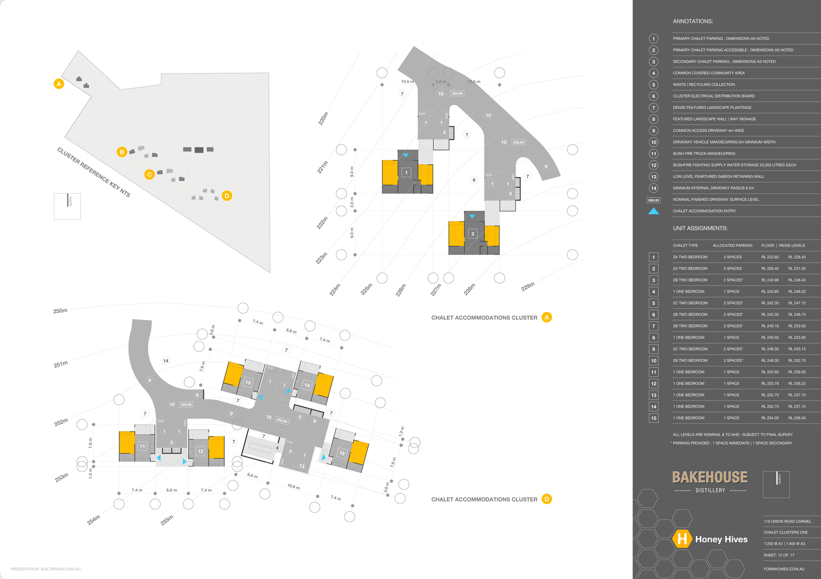
15 TOURIST CHALETSThe development is within a sensitive Drinking Water Catchment, so we have had to employ the use several modern Aerobic Treatment Units to pretreat wastewater before on-site disposal. This on-site disposal of wastewater actually helps as we are also in a High Risk Bushfire, we essentially keep wet all vegetation surrounding the development, lowering its flammability.
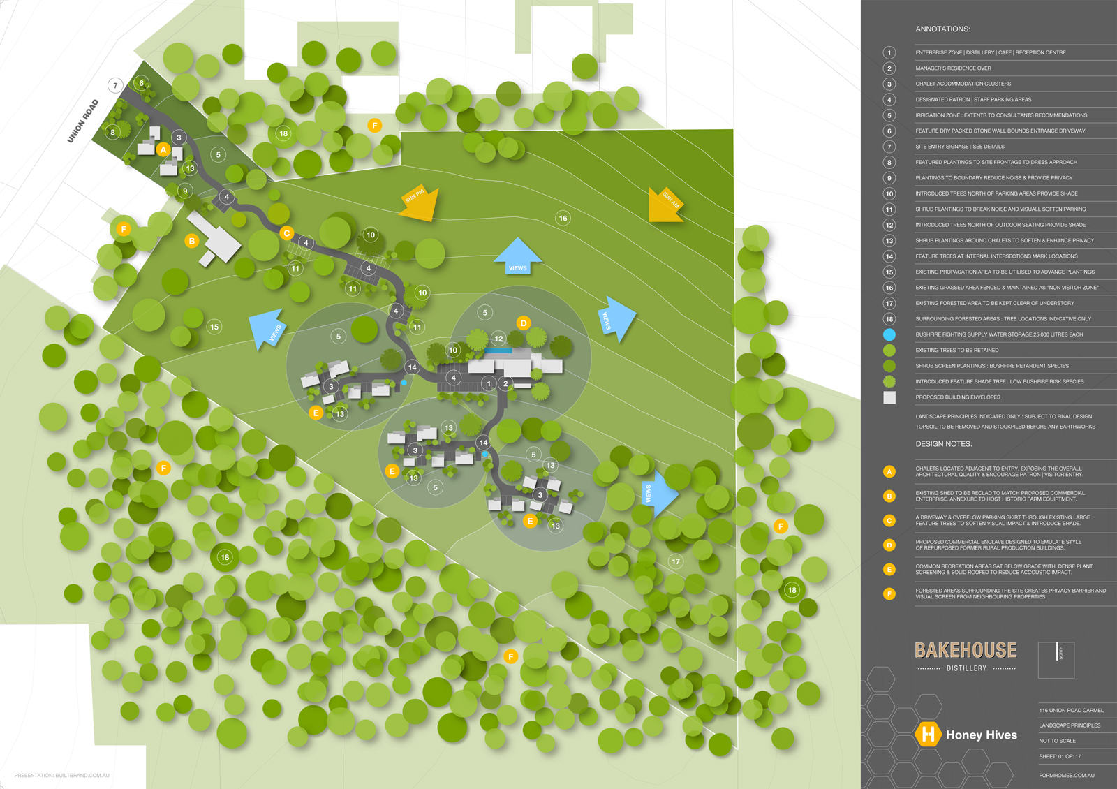
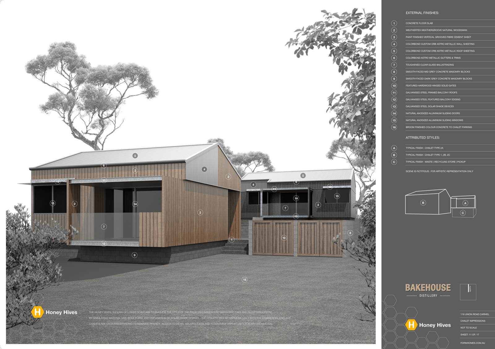
The site is located within an established "rural agriculture | rural production area" so the intent of overall styling is to project built forms as "repurposed" from those expected in a predominantly rural area.
AND now the fingers are crossed that we have demonstrated a well considered, well addressed proposal that can be supported through assessment!
This thread is a pretty much an update of a previous, posted to display the "early concept".
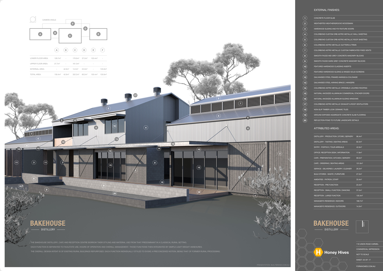
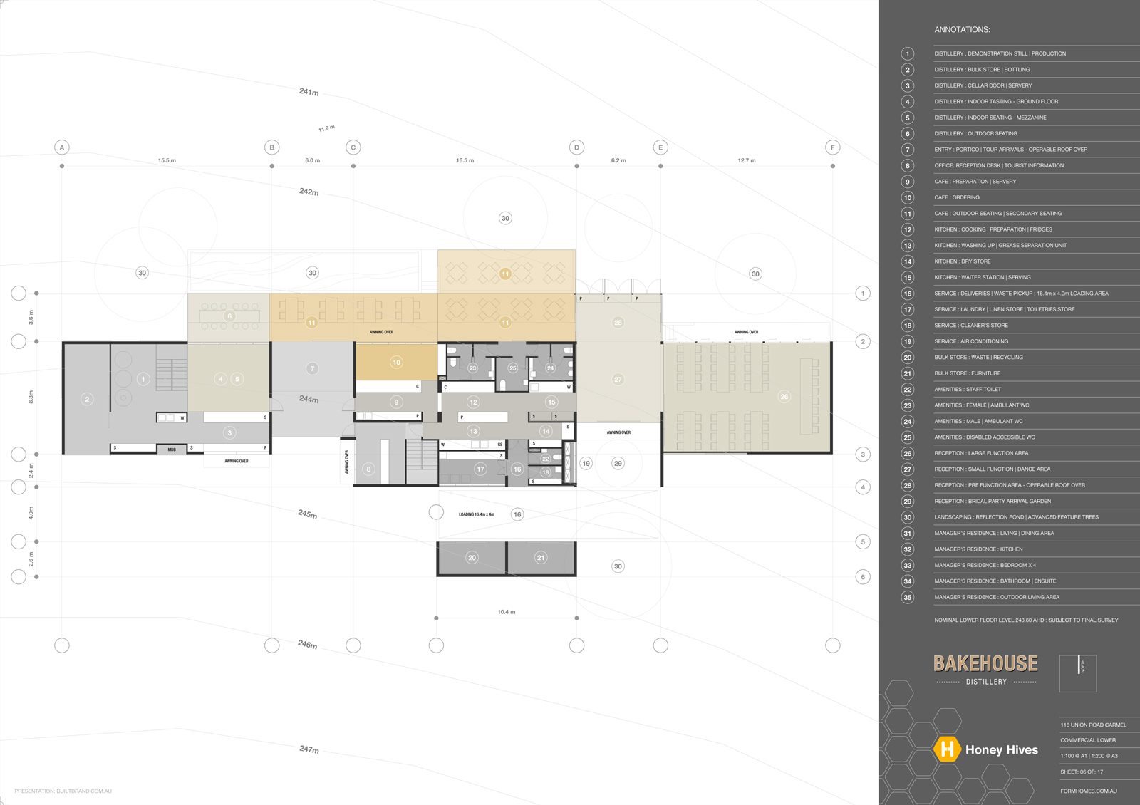
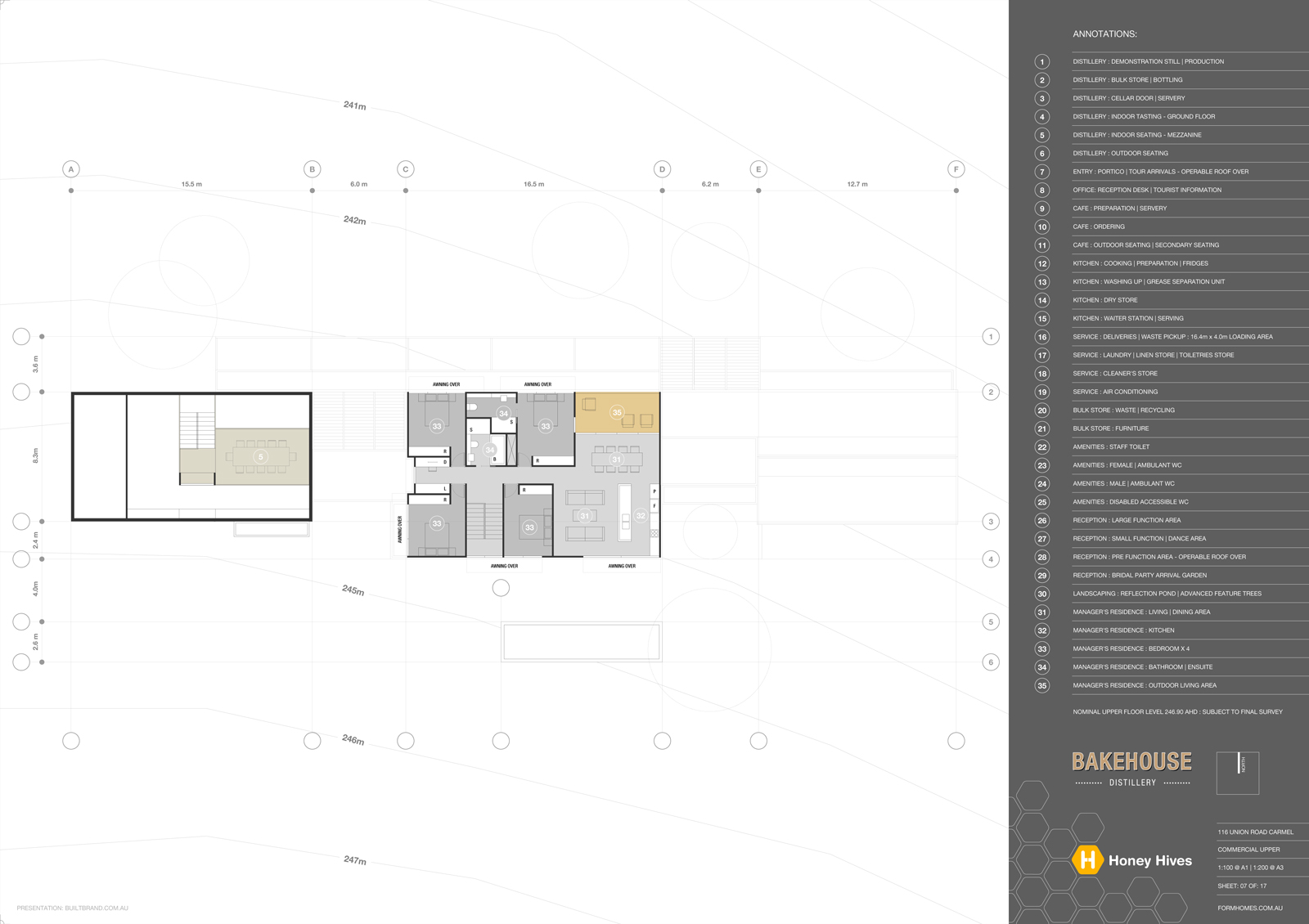
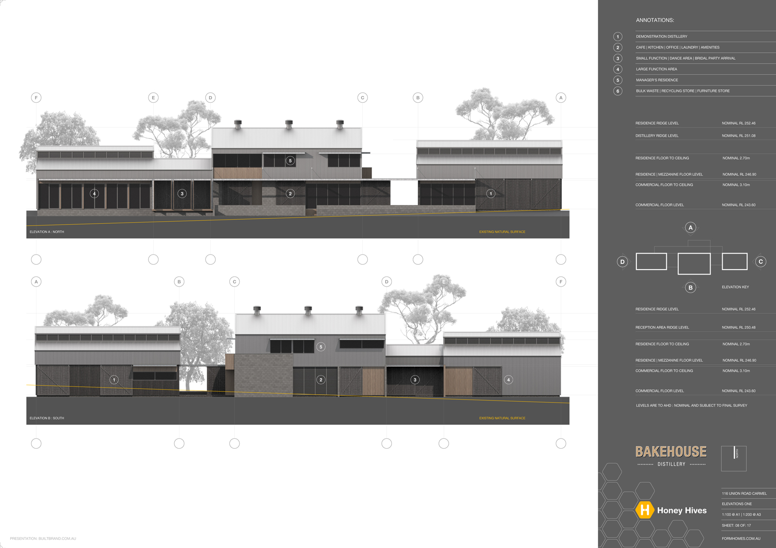
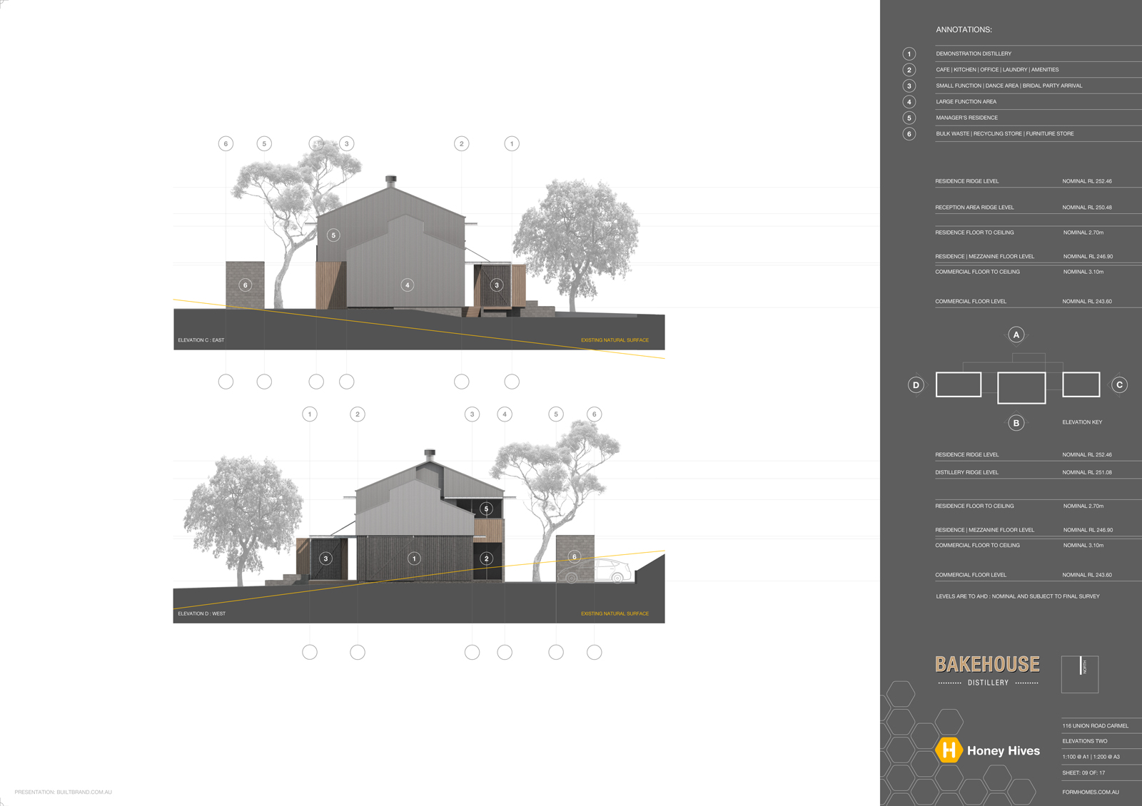
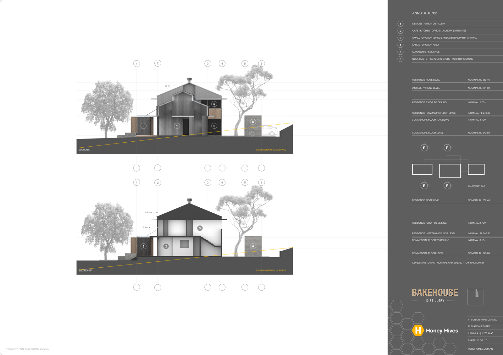
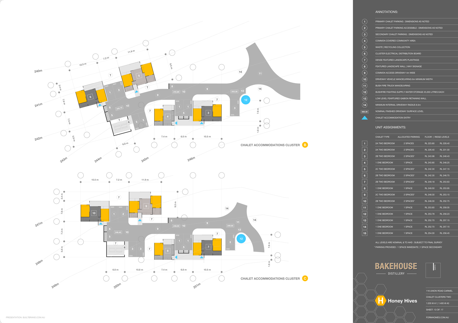
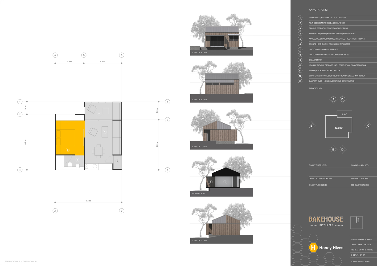
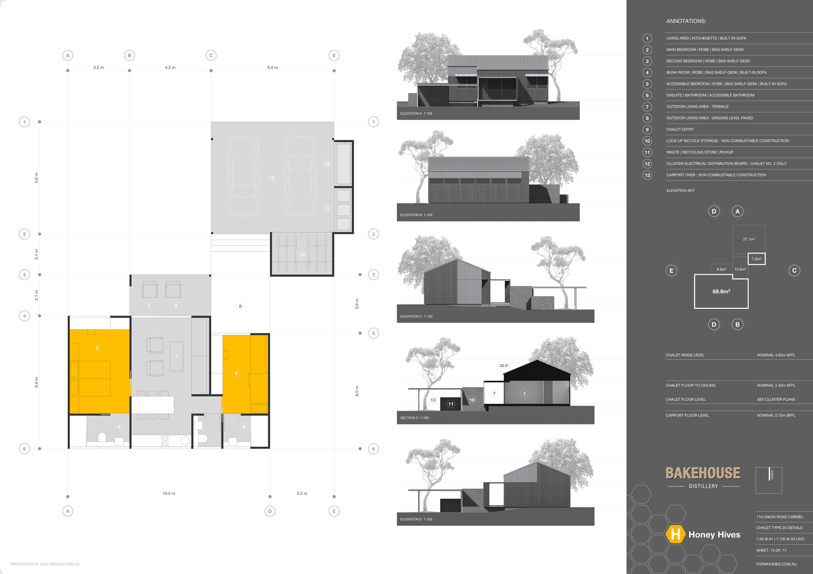
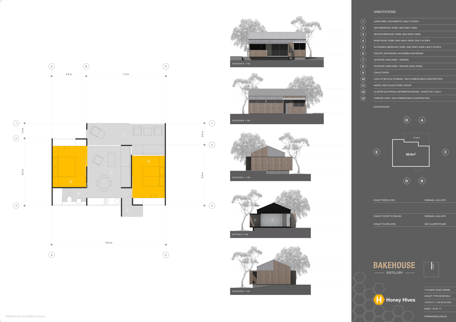
http://sketchucation.com/forums/viewtopic.php?f=81%26amp;t=66083Other than utilising Indesign to create shadows to the PDF exported from Layout, ALL docs were produced directly in Layout, IE: All floor plans, site plans and annotations. SketchUp was used for modeling and export of rendered elevations which were imported to Layout as images.
Layout | SketchUp | Maxwell | Photoshop | Indesign
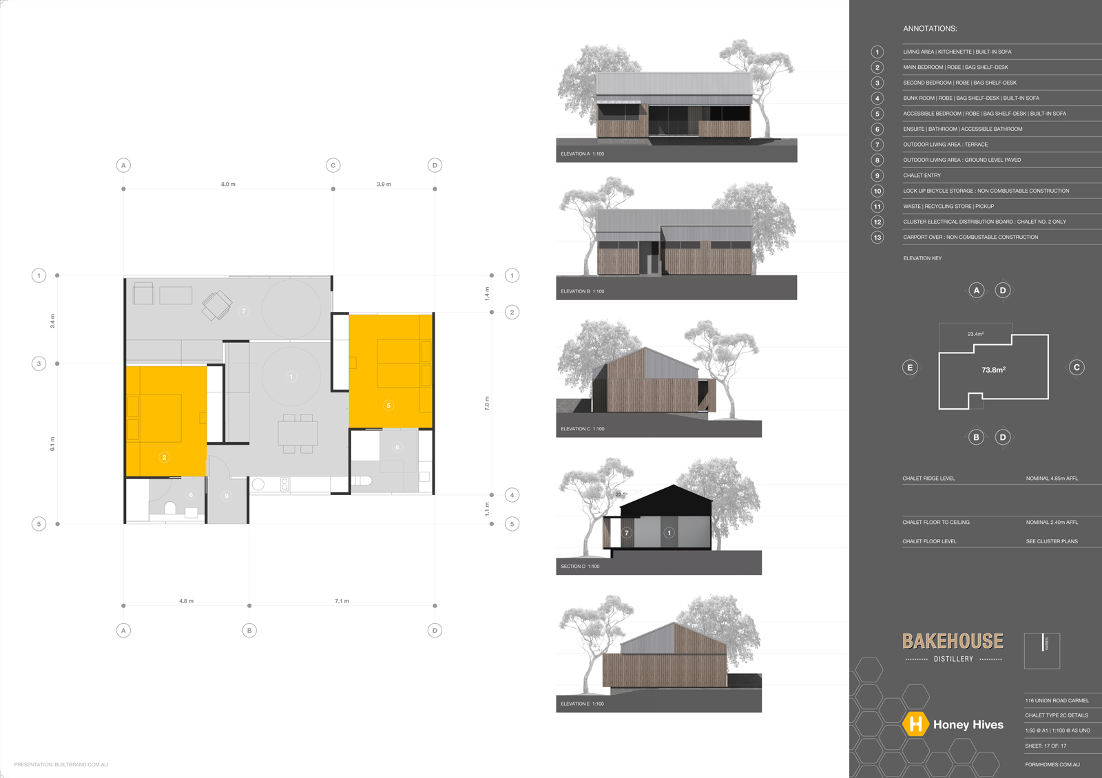
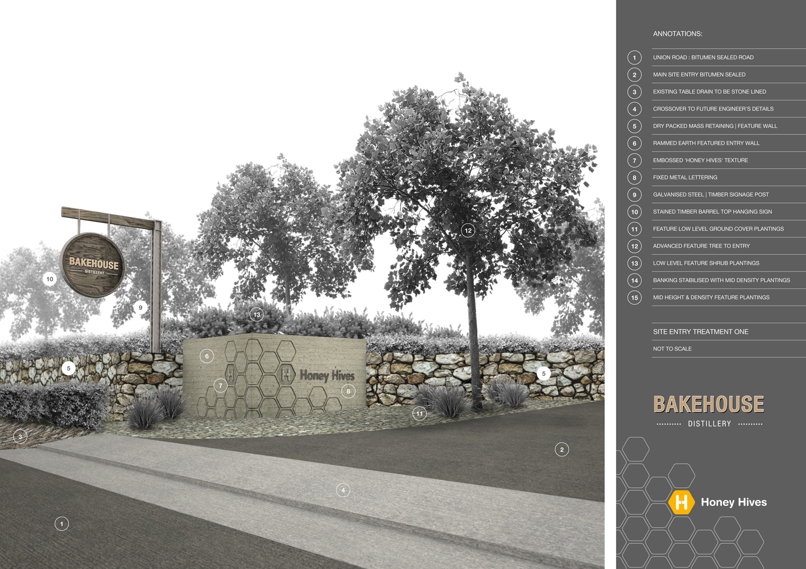
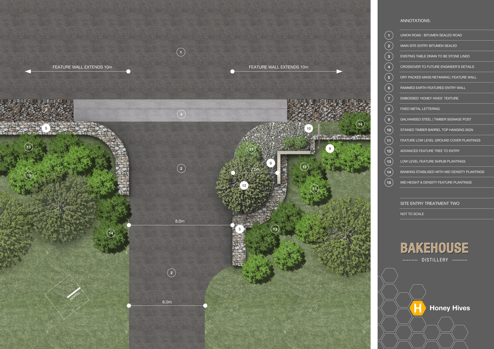
-
Actually I'm speechless but, as you see, obviously not


Long before I think about presented contents, As allways, I'll stick to your outstanding good graphic language. Reduced to white-gray-black, combined with a clear color coding using mainly orange as a matching contrast color for your there pointed(?) references. This "language" you hold through all the plans and everything, from start to end, is from one single font

Since this entire facility is probably too far away from the road to be seen from there, it is a good idea carefully to appreciate the driveway(?) with it´s own special design.
Especially I love the "simplicity" to produce plasticity by the use of shadows (are the shadows made by layer syles PS?). In the plan "Landscape Principles" this effect is nice to look at, since this works very playfully, without any strictness. -
HornOxx ist totally right.
Outstanding as always. Beautyfull presentation
-
Great assignment, great design, great presentation... Great job!
-
A real Richard!
Great (again)! -
Beautiful work, great job!
-
Masterpiece of presentation and documentation! Congratulations!
-
Hello Richard, nothing I can say that has not already been said above. Clients often fail to realise the amount of work goes into these type of presentations. Beautiful


John
-
@hornoxx said:
Actually I'm speechless but, as you see, obviously not


Long before I think about presented contents, As allways, I'll stick to your outstanding good graphic language. Reduced to white-gray-black, combined with a clear color coding using mainly orange as a matching contrast color for your there pointed(?) references. This "language" you hold through all the plans and everything, from start to end, is from one single font

Since this entire facility is probably too far away from the road to be seen from there, it is a good idea carefully to appreciate the driveway(?) with it´s own special design.
Especially I love the "simplicity" to produce plasticity by the use of shadows (are the shadows made by layer syles PS?). In the plan "Landscape Principles" this effect is nice to look at, since this works very playfully, without any strictness.Thank you SO MUCH for the praise mate!!!!!!

To answer your question:
@hornoxx said:
Especially I love the "simplicity" to produce plasticity by the use of shadows (are the shadows made by layer styles PS?).
To keep the whole page sharp and text legible I've used Indesign to get the shadow effects for the trees. Everything on the page was compiled in Layout and exported as a layer enabled PDF.
The trees are on 3 separate layers within that PDF. Within Indesign the PDF is dragged onto a page, all tree layers turned off so all background elements only are displayed, this is then copied > pasted in place and just level one trees enabled and shadow cast added > pasted in place again and just level two trees enabled and shadow cast added > and again for level three trees. The whole document then exported out as a PDF.
The result is much cleaner and lighter (file size) wise as kept as vectors.
Again, big thanks mate!
-
@jo-ke said:
HornOxx ist totally right.
Outstanding as always. Beautyfull presentation
Thanks mate, I'm hoping the Council assessing the application for it clear and legible!
-
@kaas said:
Great assignment, great design, great presentation... Great job!
Thank you my man! Seriously fun design job, certainly a lot of time spent fully considering all aspects to get what I hope will be a successful venture. And keep me stocked with Gin!!!
-
@cotty said:
A real Richard!
Great (again)!Cheers mate! I'm now hoping for an approval so I can jump onto some marketing work to promote the final product!
-
@andybot said:
Beautiful work, great job!
Thanks mate! Its been a big job, just writing the report took weeks of research and writing itself!
-
@pbacot said:
Masterpiece of presentation and documentation! Congratulations!
Thank you as always kind sir!!!!!

-
@tadema said:
Hello Richard, nothing I can say that has not already been said above. Clients often fail to realise the amount of work goes into these type of presentations. Beautiful


John
Luckily in this case mate the client has been so involved with the whole design and documentation he is rather struck by the work that has gone into it!
And luckily for all of US here, the tools at our disposal are well up to the task of producing great stuff!!!
-
A comprehensive submission, very easy to read and understand.
-
-
These are awesome, richard. I am in love with that first landscape plan.
-
@marked001 said:
These are awesome, richard. I am in love with that first landscape plan.
Cheers mate! I particularly like the method to convey the site's slope. Its just the contours chopped up and joined to create an object. Then given all the same fill and then transparency dropped by 5% for each object.
-
Very fine as always!

Have you try the Affinity serial programs who seems have a very agressive price against Adobe ones?
Hello! It looks like you're interested in this conversation, but you don't have an account yet.
Getting fed up of having to scroll through the same posts each visit? When you register for an account, you'll always come back to exactly where you were before, and choose to be notified of new replies (either via email, or push notification). You'll also be able to save bookmarks and upvote posts to show your appreciation to other community members.
With your input, this post could be even better 💗
Register LoginAdvertisement


