Re-branding Feedback
-
This isn't really something for the gallery of WIP, as it's got no SU or LO work in it.
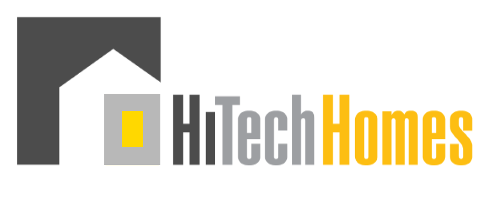
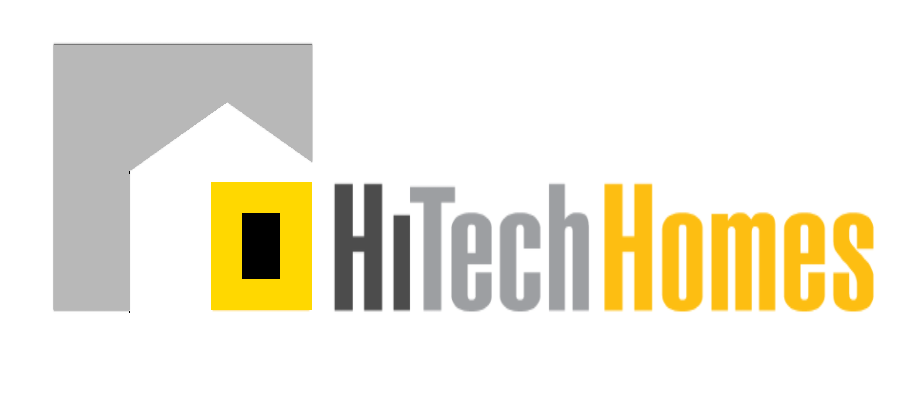
I've got a new client and the first job is to update their branding. Would love your thoughts on which new logo is working best. There are three in this link. The first aims to set a theme for an over arching campaign, the second simply aims to morph their existing logo. The third is really the second shown as an imprint to a card or signage.
Looking forward to any feedback offered. http://hitechhomes.webflow.io/
-
I kind of like #2 the best. Simple yet adaptable to many environments. JMO
-
I like the second of the two logos.
-
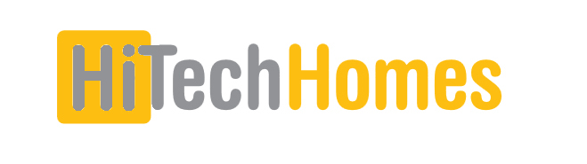
For me there is a problem with the first one, it comes over as Hi from Tech Homes rather than Hitech homes.
-
Thanks Chaps!!! Personally I like the first as it gives good campaigning options, though even like you guys and other friends the second option seems to fly the best!
-
I like 2 and 3 most
-
I favor the 3rd.
-
with solo, really like layout and overall appearance of number 3
-
Richard, I have to agree with Box when he says the first comes aver as "Hi from Tech Homes" rather than Hitech homes.
I'd be for morphing the existing a little more.
The black over block shape that encompasses the house / home at the same time gives the impression of seriousness and solidness which is good.
The house / home shape is suggested not outlined, which is also good as it could be any house / home, possibly the clients house / home.
I take it that the orange upright rectangle graphically represents the hitech element to be incorporated in the house / home, fair enough.
The company name 'HiTechHomes' is what it is but I think the gray colour of the 'Tech' word should in some way be brought into the graphic logo, possibly as an inner / smaller grey rectangle.
Mike
-
Maybe!
-
@ely862me said:
I also like the 1st, it's simple and effective. The second one seems a bit edgy and lost, imo.
Can you make the T come a bit over the HI orange background ? See how that works.I do see some scope with what you are suggesting!!!!

One other option I guess to lessen the effect of the "HI" TechHomes might be to reverse the grey / orange so that the tech is same colour as the Hi!
Thanks mate I'll play some more!
-
@mike lucey said:
Richard, I have to agree with Box when he says the first comes aver as "Hi from Tech Homes" rather than Hitech homes.
I do wonder though Mike if the "HI" intro is what then holds with us, when we look at the logo thereafter, would we have this same impression in the case of the logo standalone?
The "HI" was conceived as it give lots of greater opportunities: HI Life | HI Quality | HI Returns, plus it's use as a favicon, app icon, facebook profile image etc.
@unknownuser said:
The black over block shape that encompasses the house / home at the same time gives the impression of seriousness and solidness which is good.
Totally!!
@unknownuser said:
I take it that the orange upright rectangle graphically represents the hitech element to be incorporated in the house / home, fair enough.
Part of the reason is a possible move toward SIPS as part of their bigger business model. In that case the logo icon could cover both aspects of these businesses. 1. Homes and 2. Panels as part of a home's construction.
@unknownuser said:
The company name 'HiTechHomes' is what it is but I think the gray colour of the 'Tech' word should in some way be brought into the graphic logo, possibly as an inner / smaller grey rectangle.
Totally get what you are saying, I like what you have presented, though it then IMHO becomes rather obvious, maybe trying too much.
Thanks for the feedback Mike!! Excellent ideas!
-
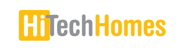
Is it HiTech Homes or Hi TechHomes?
I'm going to assume it's the first, so, IMO, HiTech should be the same color
-
Richard,
You might check out this,
The Psychology of Color in Business
http://www.visualcapitalist.com/psychology-of-color-business/Mike
-
@bob james said:
Is it HiTech Homes or Hi TechHomes?
I'm going to assume it's the first, so, IMO, HiTech should be the same color
Yeah I reckon your right mate! Update the link to reflect. http://hitechhomes.webflow.io/
-
While the second seems to be of a mold that is almost passe already--it may work, as you say on the business cards. The first to me is a little too cute "HI!...(TechHomes)" Now if you were in Hawaii (HI) it might make sense.
The house symbol is so used but very effective and nicely done here.
-
I also like the 1st, it's simple and effective. The second one seems a bit edgy and lost, imo.
Can you make the T come a bit over the HI orange background ? See how that works.
-
@pbacot said:
While the second seems to be of a mold that is almost passe already--it may work, as you say on the business cards. The first to me is a little too cute "HI!...(TechHomes)" Now if you were in Hawaii (HI) it might make sense.
The house symbol is so used but very effective and nicely done here.
I still read Hi TechHomes:
- The box around the Hi separates it from the other two;
- The spacing between Hi and Tech is much greater than between Tech and Homes.
- So now it looks Hi TechHomes but not as organized as before.
I think you're sacrificing the logo look and legibility for the nice idea of mixed meanings for Hi.
However, even if the idea is nice, it works only once, while the logo will be everywhere.
Have you thought of getting rid of the box, and create an animated word where Hi stands there for a while but after shifting to the left the remaining of Hitech letters start being typed on screen?
Hello! It looks like you're interested in this conversation, but you don't have an account yet.
Getting fed up of having to scroll through the same posts each visit? When you register for an account, you'll always come back to exactly where you were before, and choose to be notified of new replies (either via email, or push notification). You'll also be able to save bookmarks and upvote posts to show your appreciation to other community members.
With your input, this post could be even better 💗
Register Login


Advertisement