Single/twin occupancy dwelling 24' square.
-
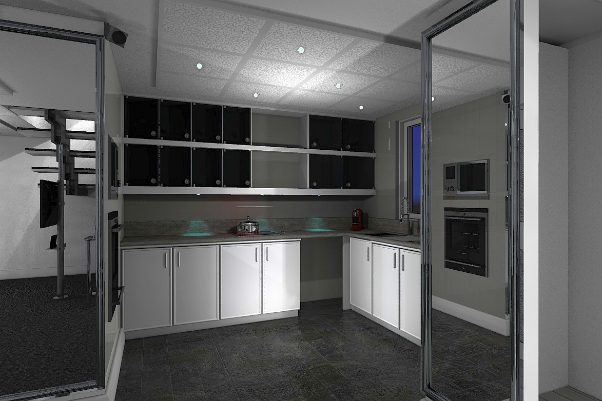
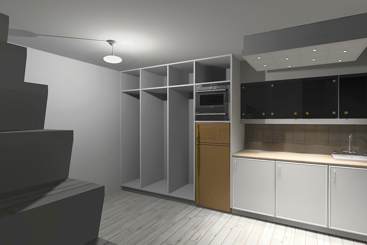
Kitchen closeup.
-
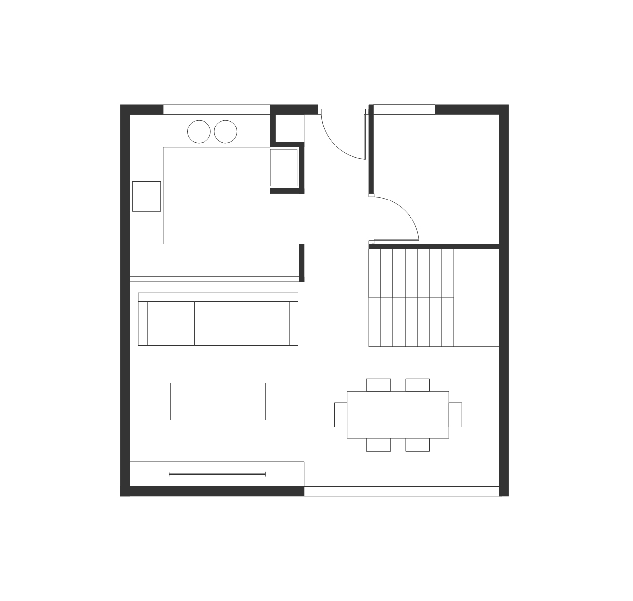
I hope you're up for crit on the layout mate? I've played with just your lower floor.
You seem to have a LOT of circulation space that is going to waste, whilst the "use" of areas aren't defined. In this case I've pulled the fridge to a cabinet formed by extending the entry division and introduced a cupboard to face the entry.
I've assumed a dwarf wall dividing the kitchen and lounging area so the sofa can back to this. And utilised the space that you had for the lounge as the dining. I didn't really like your idea of mounting the TV as you then expose the rear of it.
I haven't played with upstairs, though my thoughts are that it can work as a "for two people" rather than "maybe for two people". Let us see how you might approach that again.
BTW the acoustic style ceiling tiles for me have a very corporate feel, maybe you could soften this with plywood.
-
BTW, in regards the idea of a dropped ceiling feature - I'd probably not use this for each space.
On the plan I've provided, consider one in the kitchen, then that same size replicated to the living area, then utilise a pendant light over the dining area. Downlights throughout can be rather unforgiving!
-
Thanks Richard, criticism with a point is why I posted here. Not having formal training I accept the learning curve. The reason I had the living area where it was, allowed the television to be under the stairs with a docking station for tunes which allows for the potential of a patio door behind the dining area and access to a garden. This would not be possible without glare when using the television and docking station. potentially.
-
@mike amos said:
Not having formal training I accept the learning curve.
That makes two of us mate! No formal training this end, just a jump in at the deep end can be good grounds for learning!
BTW I wouldn't let the function of the TV determine the layout of space. Well yes but not if it overly effects the function.
-
I have to think about this a bit, it requires a new outlook on space utilisation and I need to get my brain around it. One of my flaws that I will acknowledge is an attempt to multi use spaces. Probably confuses things somewhat.
-
Mate one of the first things I do when designing a tight space is to place standard sized furniture around and ensure it fits comfortably and can be navigated.
Every now and then I present plans designed by others for marketing, to demonstrate the layout well I again drop in furniture so the plan is easily read. Its amazing how many times in those cases it seems to have not even been considered by the designer.
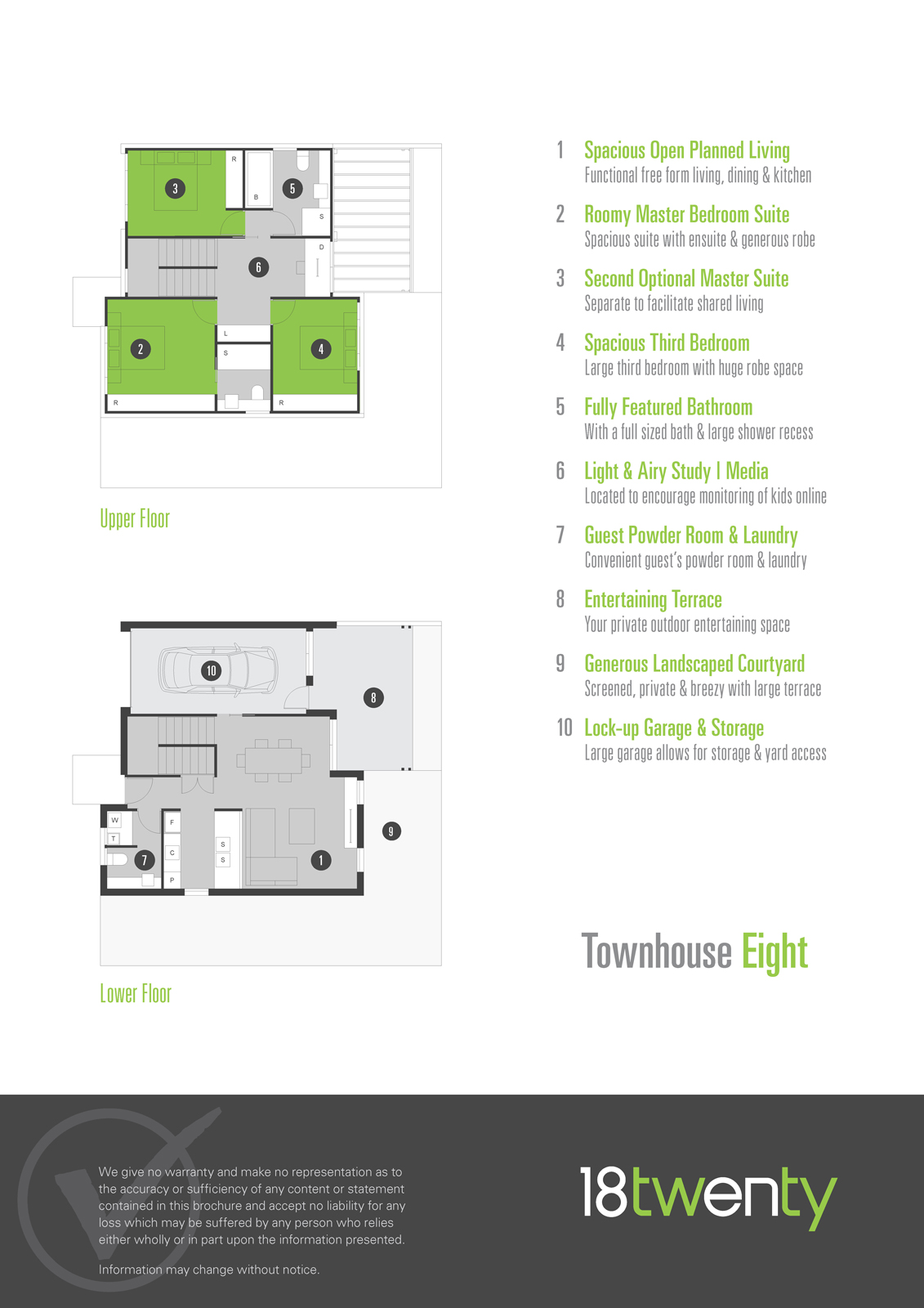
I think your approach to multi use spaces is the perfect way to go in the case of the space being small!!! However a space of 24' x 24' (8m x 8m) isn't actually that small. Here is Sydney we can legally place a granny flat in 60m2 from that (as just a single floor), we'll normally design for accommodating 2 bedrooms, bathroom with combined laundry, living / dining area and kitchen.
Here is a recent design that I utilised a similar kitchen / dining / living similar to that projected in your space.
-
I agree, 8m x 8m is fairly generous. I have a suite of designs for a low cost housing project which are based on a footprint of 6m x 6m.
The key is to carefully overlap spaces whilst trying to avoid unnecessary circulation conflicts. Generally, think in terms of "Zones" rather than "Rooms"
-
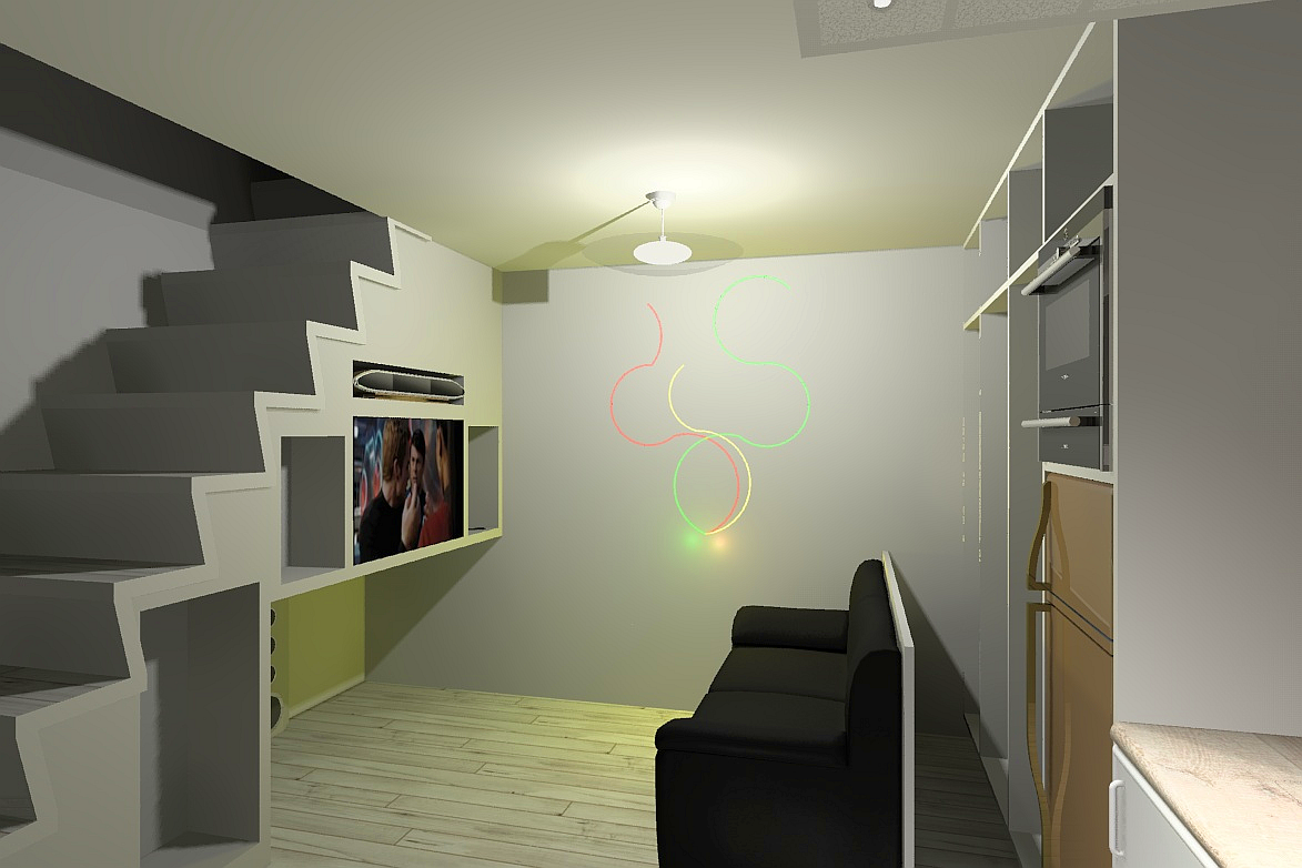
Not getting myself across vey well there. sorry. The majority of drawings are based around a 15 square foot footprint. Not sure what to do with all the space so I tend to over emphasize the individual units also, I tend to have the dining table and chairs hide in a cupboard for the most part.
-
Do you have examples of built units, and how people are using them? But I'd agree with Richard, given your first plan. There's more room on the left for living space and the right would fit the dining OK.
-
@pbacot said:
Do you have examples of built units, and how people are using them? But I'd agree with Richard, given your first plan. There's more room on the left for living space and the right would fit the dining OK.
No I do not, simply because I am not an architect, not working in the business and use this as a hobby. Most of these spaces have dual use in -particular the dining area and traditional tables etc are not intended to be used in these spaces. The dining tables are meant to be tucked away out of sight allowing the area to be used as a coffee/lounge area.
-
Just to explain, I do not mean to be rude or give offence, I am just explaining my status. I'm sorry for any offence.
-
I have moved the goalpost's a bit to a 20 foot square footprint, I got a little lost with so much space. The render below is just playing with the use of a light sculpture/picture as a method of illumination. I don't like the room lights so will have to alter by trial and error.
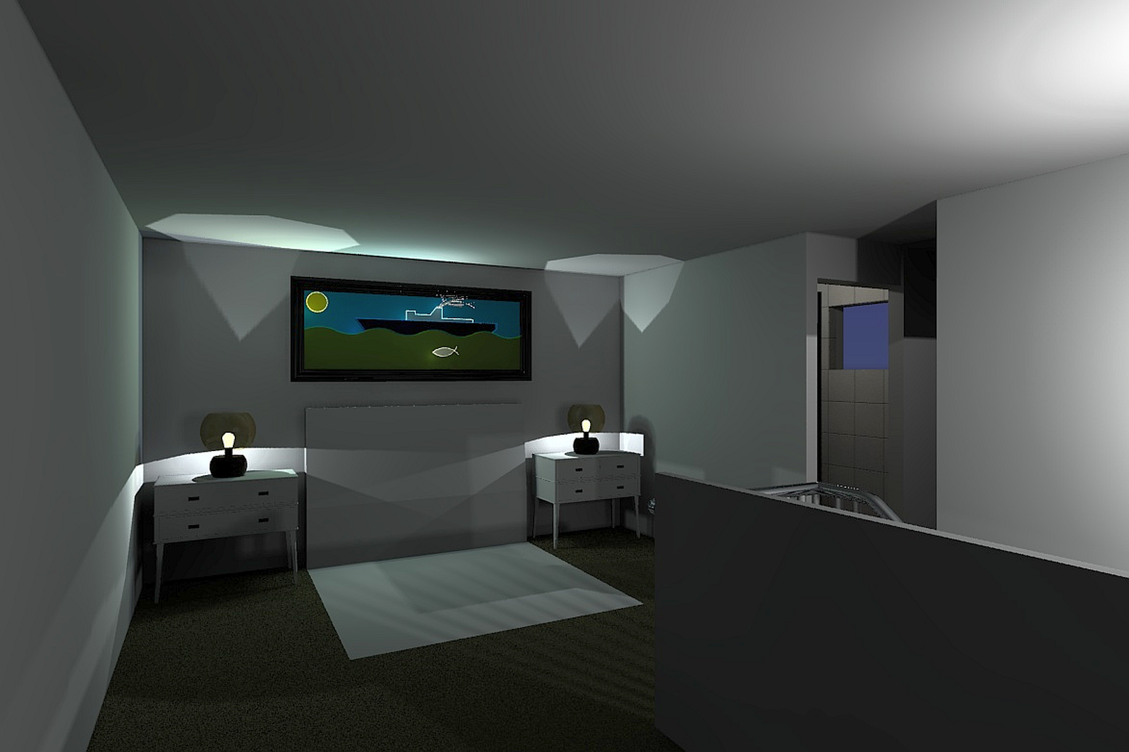
-
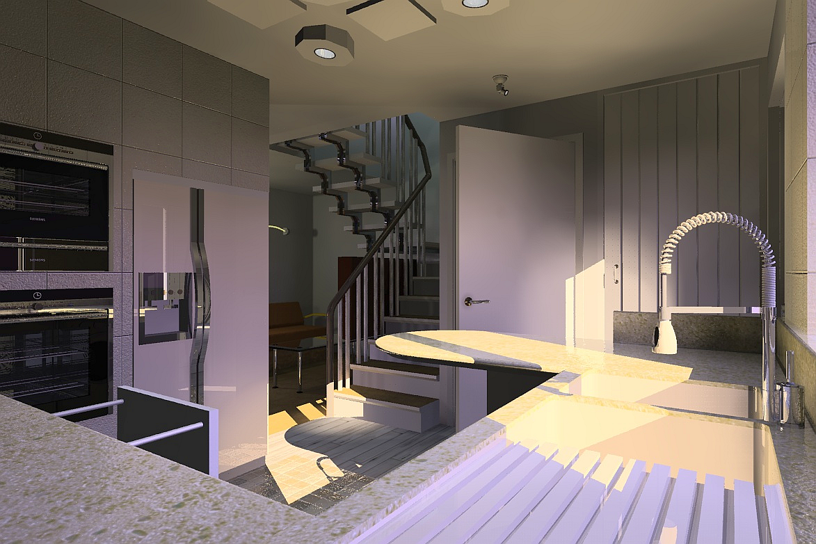
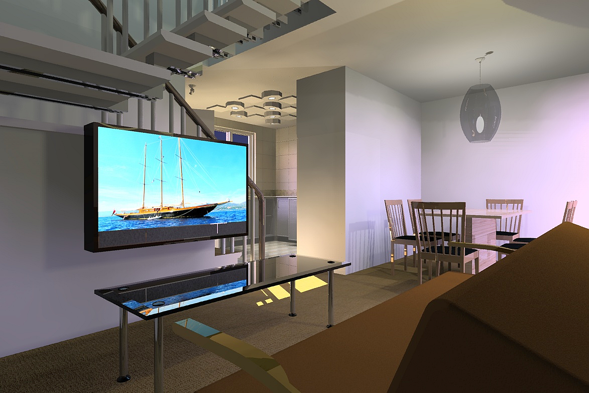
The 20' version from the kitchen towards the living area.
-
Better lights and more interesting too. This is rendered with Renditioner V3
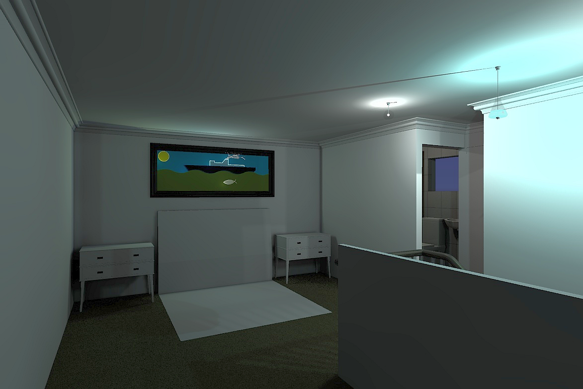
-
Evening shot from living to kitchen.
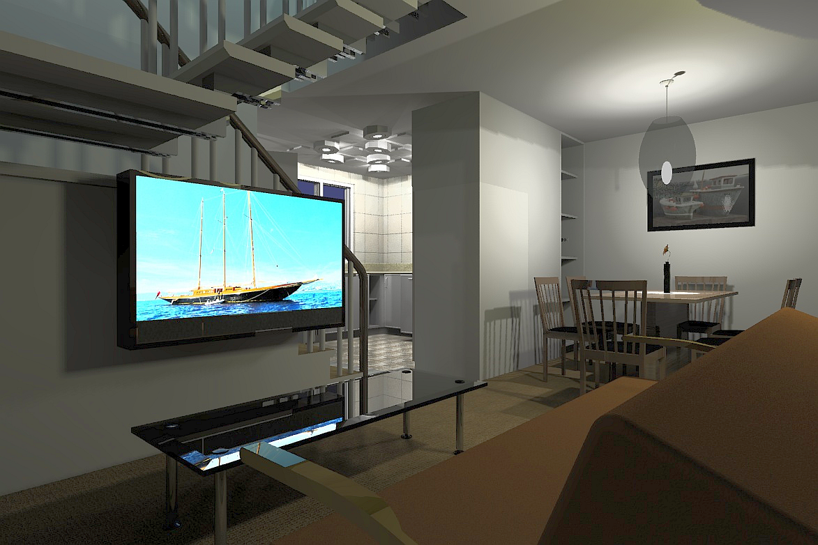
-
Don't you have windows except for the kitchen Mike?
-
There is a set of patio doors to the right of the dining table and there is a glass element to the front door, there is also a small window in the wet room which is behind the stairs but that, like the door, cannot be seen from this angle.
-
Another view, I have changed some of the lights.
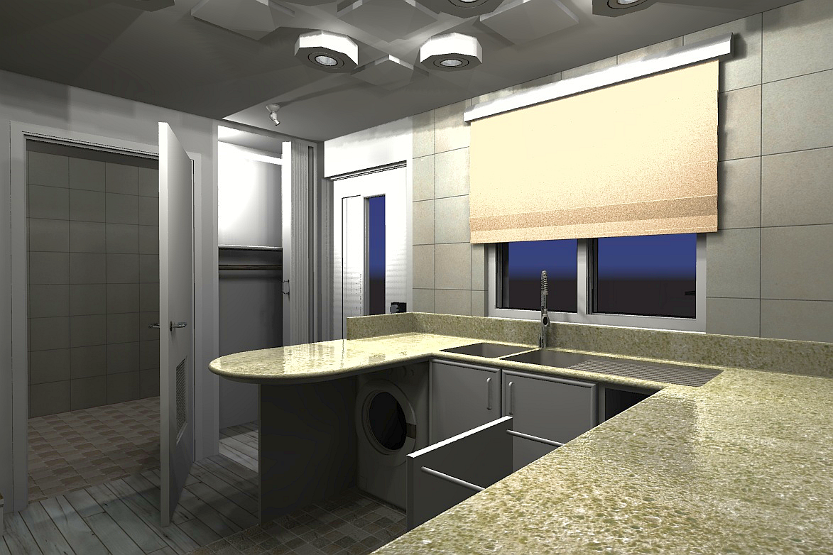
-
Another reduction in size means that everything is reduced to what is NEEDED with no extraneous frills or frippery. No hob for example with cooking via a convection microwave oven. There does need to be a full size fridge freezer of course for all those instant meals and beverages for football/F1/films etc
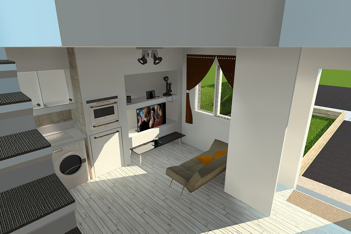
Hello! It looks like you're interested in this conversation, but you don't have an account yet.
Getting fed up of having to scroll through the same posts each visit? When you register for an account, you'll always come back to exactly where you were before, and choose to be notified of new replies (either via email, or push notification). You'll also be able to save bookmarks and upvote posts to show your appreciation to other community members.
With your input, this post could be even better 💗
Register LoginAdvertisement


