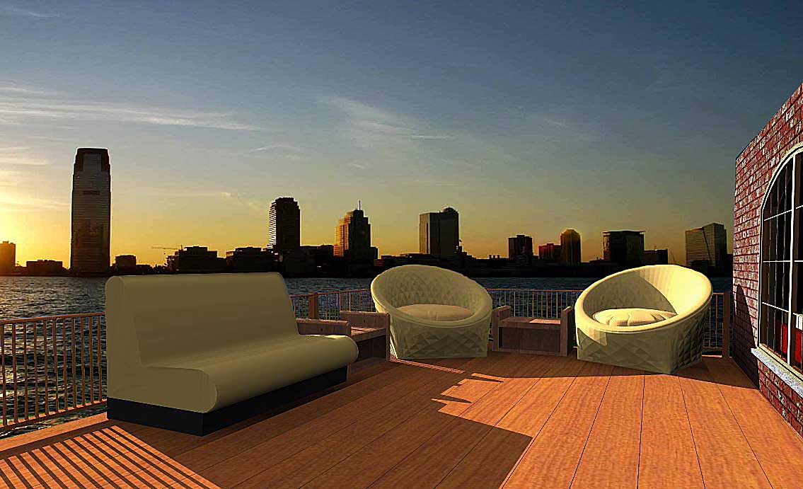
Lazy Afternoon
-
Here's another way to relax..........with friends.
garystan
-
Very nice... I would rather not see the brick facade on the right as it doesn't look realistic and takes away from what is photograph worthy in the rest of the image.
-
Kris, I agree that the brick doesn't work and I like your cropping better.
The light casting the shadows is too high relative to the height of the sun in the background image and it is too close, as well. The illumination looks like artificial light, not sunlight.
-
**Krisidious :
Thanks for your review. And thenks for the "nice" review. I wasn't sure what material to use. I did want to include the outside of the building, but wasn't sure what texture to use. Being it is a reflective surface, I did have to tone down the brightness. garystan** -
Well the brick and window itself looks fine... If it had a little bit of a parapet roof look or a little over hang it would make if feel right. Brick will always have a cover at it's top run. it will either be brick or cap or metal sheathing. Like so.

I might actually like to see some patio door type walkout over there.
-
**Krisidious :
Thanks for the tip on the roof. I initially wanted a "flat" roof. But, even though, a flat roof would've have that edge to it. I'll remember that next time. Question : Other than the "off" areas, does this pic have that slow and easy afternoon feel to it ? garystan** -
With a great city view over the bay why would one have a chair that faces away from the view?
-
Dave R. :
In other words, I should've used softer, more-angled light. Correct ? garystan -
The scene doesn't seem to be influenced by the environment lighting. It looks as if the scene is 'green screened' onto the background.
Some reflections are needed as everything looks to be 100% diffuse?
The armchairs are too faceted .
The main focus is the couch which is in shadow and lacks detail to make it interesting.
Not sure what render engine your using but early am shadows would be longer and have some element of softness.
Another thing is the jpeg artifacts at full resolution. It is very apparent and leads to blotchiness in your output. Is it image artificially upscaled or is the .jpeg compression set too high?
-
@garystan said:
Dave R. :
               In other words, I should've used softer, more-angled light. Correct ?

                                                                         garystan
In other words, you should have used light more consistent with low sunlight. The shadows should be a little softer, that brick wall and windows should be reflecting some light back into the scene. The light should be lower as I said before. It should probably be a bit warmer considering how low the sun is in the background image. It's pretty simple to figure out where the light source in your render. You should be able to draw lines from corners on the shadows through the corners on the furniture casting the shadows and to the sun. The rays from the sun are, for practical purposes, parallel so the edges of the shadows of the furniture should be parallel not splaying out as the distance from the furniture increases. All very basic lighting stuff.
Hello! It looks like you're interested in this conversation, but you don't have an account yet.
Getting fed up of having to scroll through the same posts each visit? When you register for an account, you'll always come back to exactly where you were before, and choose to be notified of new replies (either via email, or push notification). You'll also be able to save bookmarks and upvote posts to show your appreciation to other community members.
With your input, this post could be even better 💗
Register Login


Advertisement