Loft Bedroom WIP
-
3 minute render at 3840x2160 resolution.
SketchUp 2014 + LightUp v4.1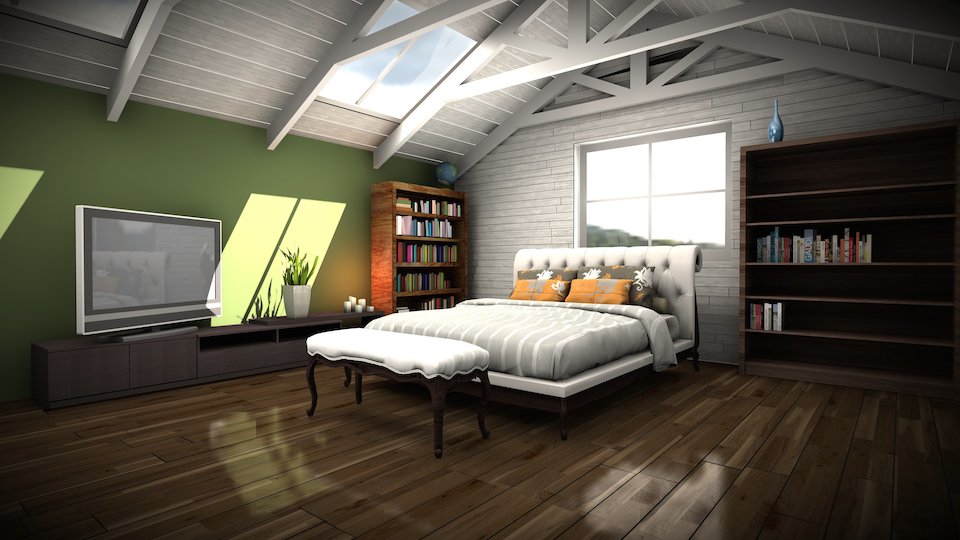
-
Looks great, Adam, but your wood grain is running in the wrong direction on some parts of the two bookcases. It really stands out on the side of the bookcase on the left.
-
I'm curious about the reflections in LightUp - is there any way to reduce the glossiness of the reflections, or is it only possible to reduce the intensity of the reflections?
-
Floor looks way too glossy but this could be a killer scene! Have I seen this rendered somewhere else before? I'm sure I've seen this model before, but maybe i'm wrong.
-
There's a roughness setting that controls glossiness
-
Here's a quick video covering some setup for polished floors.
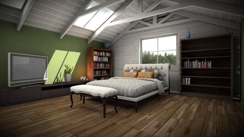
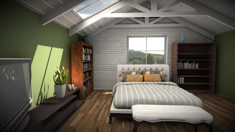
And a couple new stills with fixed wood grain and reduced floor polish. Thanks for the feedback.
-
wow Adam, that looks really great! Those controls are quite comprehensive.

-
Nice work. Like the video too. I have one question on this render. the ceiling appears to be floating above the trusses, and this appears more pronounced on a couple "boards". What's causing that?
-

Are you referring to the back left corner where the ambient occlusion is more pronounced in two areas.
-
The (AO?) shading of the ceiling at most of the trusses makes it look like it is floating an inch above the trusses instead of sitting on them. See the second truss in. Maybe it is the lack of the same AO on the trusses themselves.
-
@rich o brien said:
Are you referring to the back left corner where the ambient occlusion is more pronounced in two areas.
I used the floor plugin to build the timber siding but SketchUp appears to have eaten a triangle there.

@pbacot said:
The (AO?) shading of the ceiling at most of the trusses makes it look like it is floating an inch above the trusses instead of sitting on them. See the second truss in. Maybe it is the lack of the same AO on the trusses themselves.
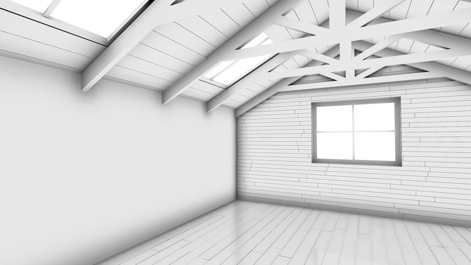
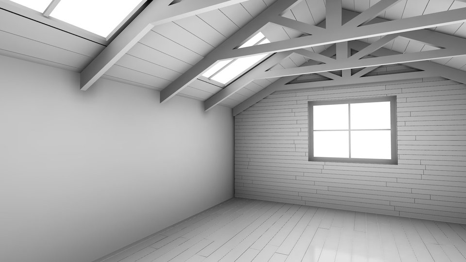
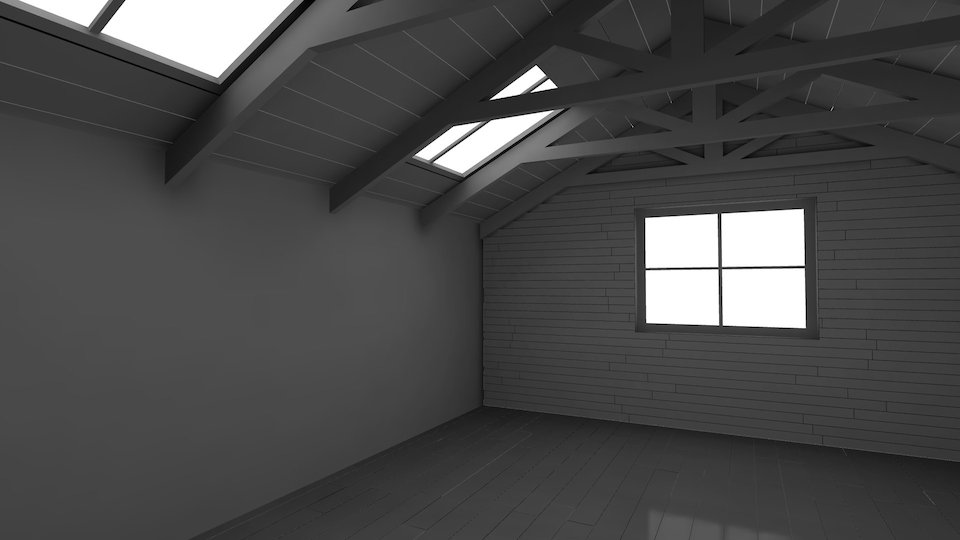
One thing is that raytracers tend to have quite aggressive AO cutoff by default - a few inches away from the surface and its full white - whereas LightUp defaults to a few feet.
Using the Custom cutoff distance, you get quite different results. These AO with no color bleed ('clay render') using increasingly large cutoff distances: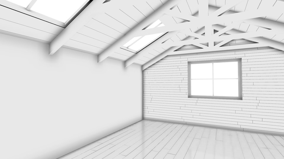
-
Adam,
Thanks for the demos. I am not sure what the answer would be as to whether I'd like the results in Lightup. I have to try it again. It looks to me like the AO is too pronounced.
Peter
-
@pbacot said:
Adam,
Thanks for the demos. I am not sure what the answer would be as to whether I'd like the results in Lightup. I have to try it again. It looks to me like the AO is too pronounced.
PeterPeter, the amount of AO is controllable by a Multiplier, so you can tone it down, change the blend colors, change the blending with direct lights. Lots of control to get the look you want.
I turned it up to full whack just so you could see the difference of AO cutoff.
Hello! It looks like you're interested in this conversation, but you don't have an account yet.
Getting fed up of having to scroll through the same posts each visit? When you register for an account, you'll always come back to exactly where you were before, and choose to be notified of new replies (either via email, or push notification). You'll also be able to save bookmarks and upvote posts to show your appreciation to other community members.
With your input, this post could be even better 💗
Register LoginAdvertisement


