A 20' square two level home.
-
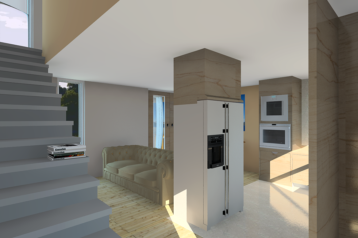
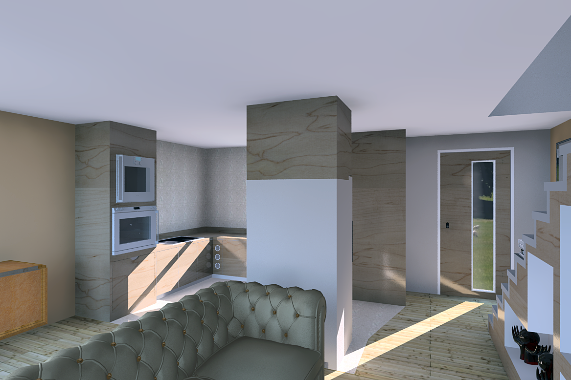
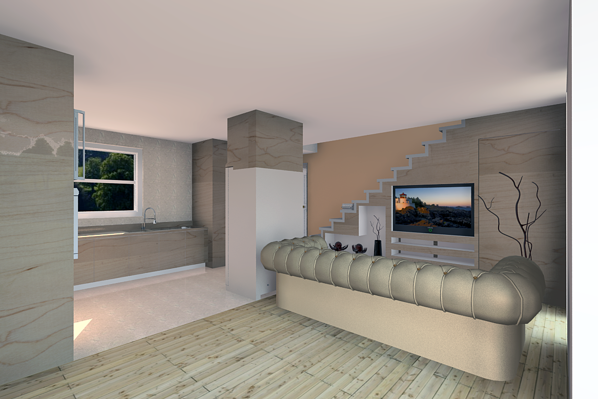
A small home with seperate kitchen/living/dining areas on the ground floor and bedrrom/bathroom/walk in closet on the first floor. Water capture roof tops the lot off and water storage on two levels for all purposes. Renders by Renditioner V3 pro.
-
Looks pretty cool.
Any exteriors yet?
-
Dear Mike,
A glass screen to the side of the stairs would add a degree of safety while retaining the opening feeling.
Regards,
Bob -
Thanks guys, Bryan, no exteriors yet due to the roof line and water reclamation needing work on and I suck at exteriors. Bob, the screen in my mind is lexan with fittings on the side of the stair and ground floor ceiling. A few other bits for detail will not go amiss either, flotsam etc. That and do not drink and climb stairs,,,,,,,,,
-
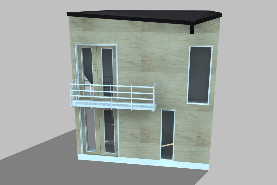
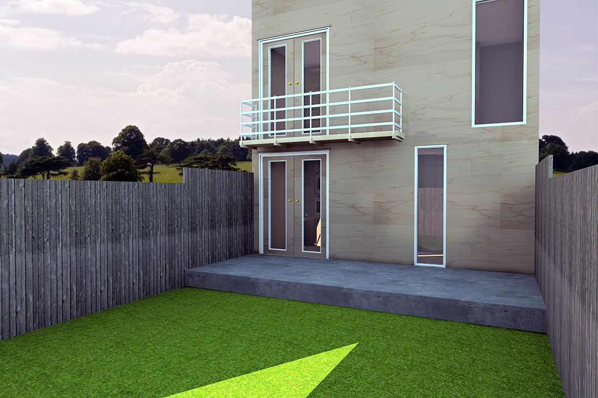
A quick exterior view, nowhere near good enough to use as there are some duplicated mats with different finsh required.
-
Better but nowhere near right yet.
-
Nice! Throw in some tress or bushes and you're done!
(you do NOT suck at exteriors)

-
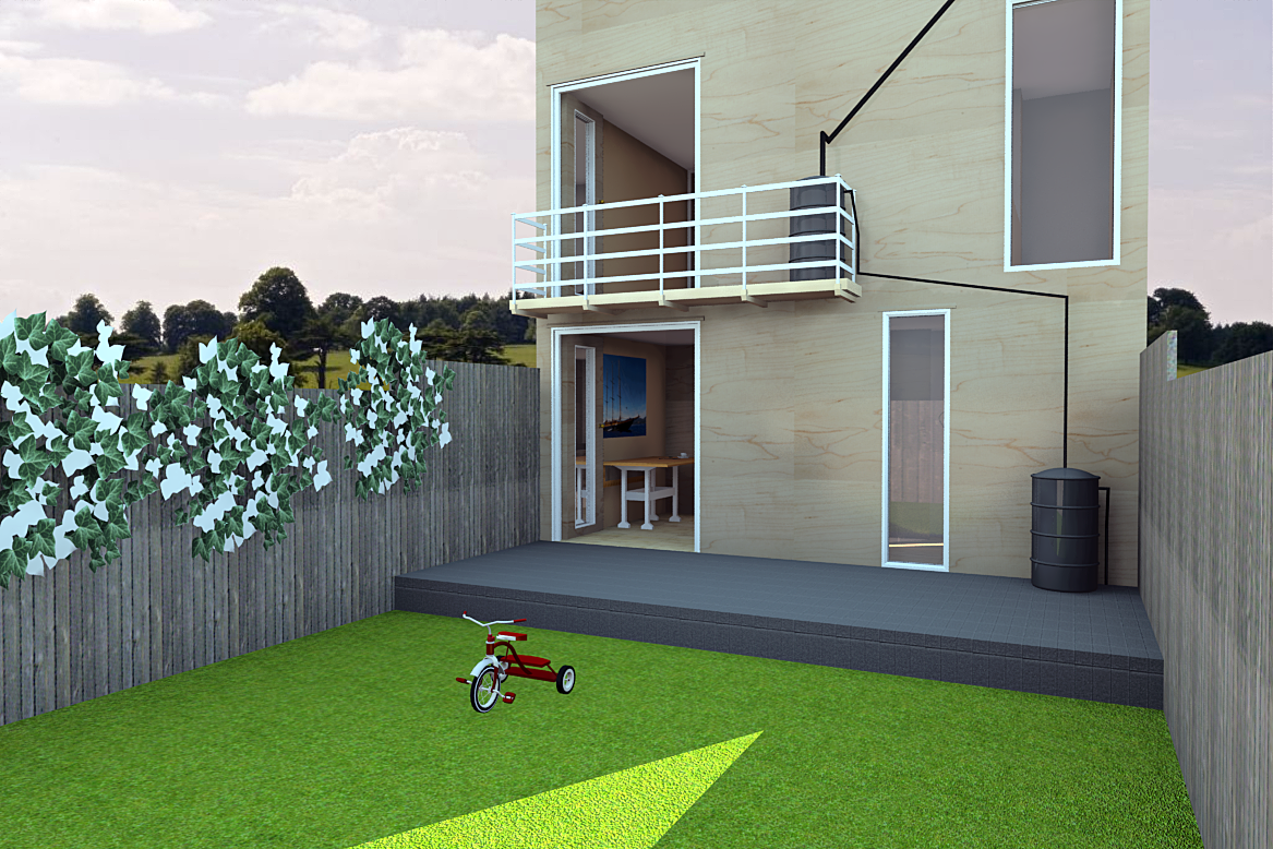
Thanks for the kind words, lets just say I need to catch up then. Ihave added a little ivy and a trike for clutter but the model is now too big to do anything else with. Looking into reducing internal items for external renders which will give a few more mb to play with.
-
That looks fine and really makes a difference!
-
Thanks mate.
-
Would love to see a plan of the layout Mike.
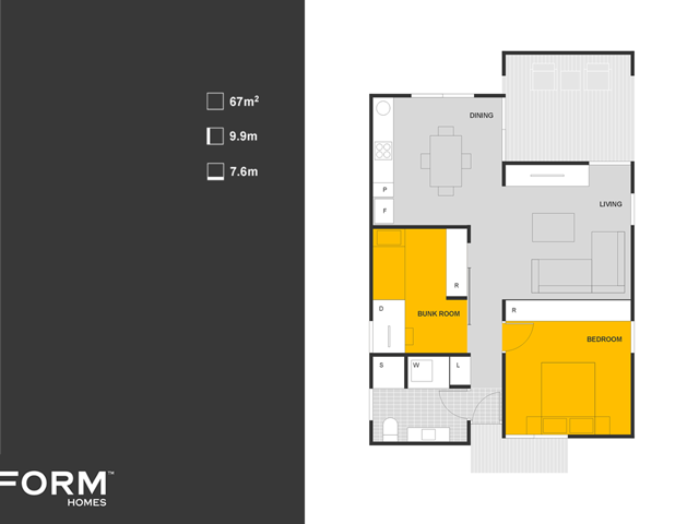
I've found when planning small spaces it's always worth starting around most common furnishing. A standard sized 3 seat L shaped sofa and a standard rectangular 4 place dining table.
A few places I've done with similar layouts to yours, I've flipped the bench at the rear of the kitchen to create a bar separating the kitchen from the lounge area. This way you can fit the dining area comfortably within the kitchen and the lounge can take up the full front space. Your current arrangement of the sofa backing to the (assuming) dining area isn't ideal.
Here is an example of what I'm meaning around planning space around furniture.
-
Thanks Richard, Sorry I was so slow replying, we have an old and slightly senile cat gone missing and I have been out a lot looking for her.
I agree on the seating and dining area but the whole ethos behind this was a home for one university graduate with a short term dual residency. No allowance for kids at all so something temporary prior to embarking on a family home. The sofa is way oversize for the property and if the was a standard two seater there would be room to get around it to the dining area. The table would probably do for four so a meal with friends would not be out of the question and there is the possibility of a sofa bed for alcohol based emergencies. If I had not given myself such strict size rules There would also be the potential to offset the tv/dining area too so perhaps I was being a little too rigid.
Thanks for taking the time to consider and comment, being an amateur I have to learn with every oppertunity I can get.
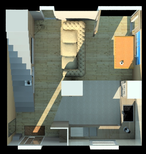
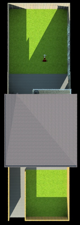
I hope the views I added come across OK, I tend to have the wall exteriors as a seperate group so any textures are more likely to be consistent.
-
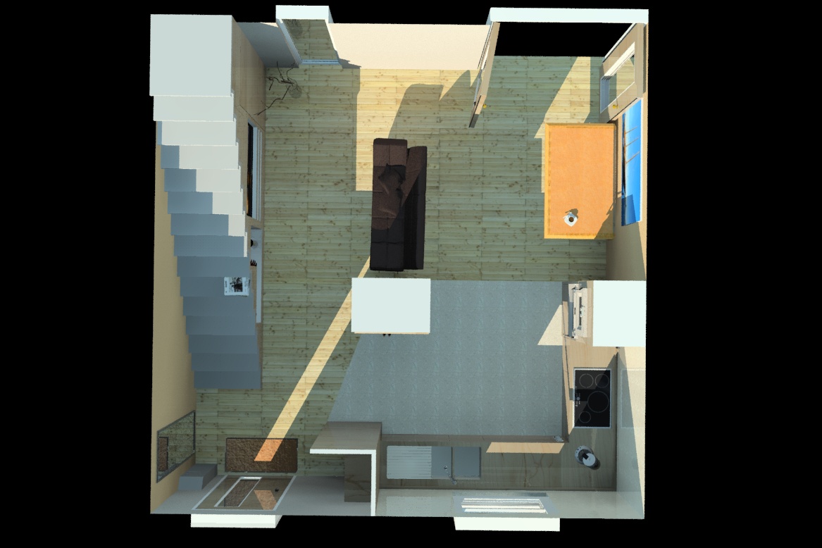
Better sofa.
-
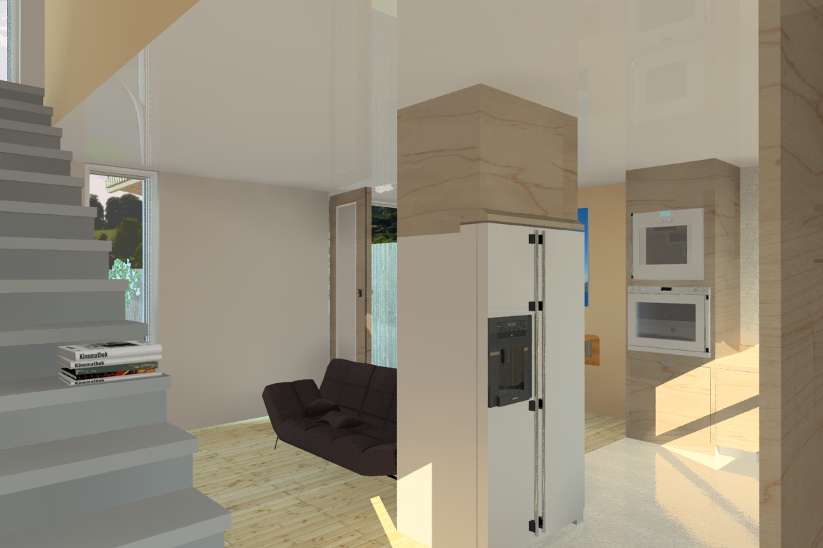
Interior shot with smaller sofa.
-
All good mike, I'd say from the plan and the fact it is only a one bed home, that the kitchen is over equipped.
Locating the kitchen as a long installation along the right wall would have given a better layout, or even put it to the wall against the stairs.
Unfortunately mate, for the current layout furnishing is problematic.
BTW sliding doors or outward swinging doors opening to the yard space are a massive space saver.
I hope you found your cat mate!
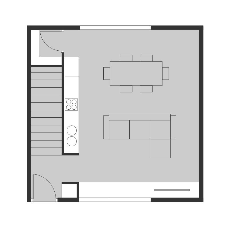
-
Thanks for the advice and education, I am thinking like an amateur too much and will realign the direction a bit. No sign of the cat, she is old and a little demented, as in senile I think. Not looking good.
-
Mike we house sat last year and the home owners cat buggered off while we were there for the week and didn't return for months. It's not time yet to start thinking negative thoughts.
Very cute BTW, is she a russian blue?
-
She is just a very pale grey with the white blaze and feet. I reckon she is just an average moggie otherwise, no particular breed.
-
Cat returned this morning after a confrontation with a neighbour, not going into details but their cat spends most of its time in our garden. Vengence etc.
After days of running around the area until 10pm I am going to be looking at layouts with reference to Richards helpful comments. I am not sure I can get in to the 20'2 though. We shall have to see.
Sorry I went on a bit about Ellie the cat.
-
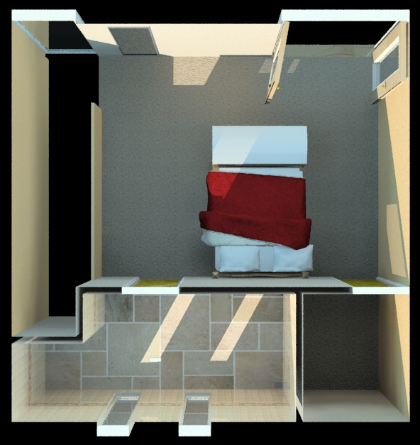
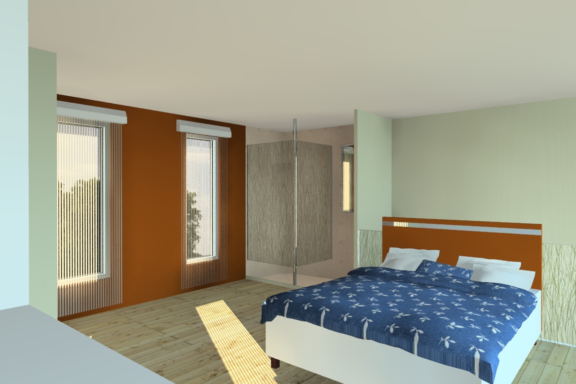
Rethinking the layout and it has gone from 20'2 to 20'3. A different take on en-suite which I would appreciate feedback on if possible. The use of an open plan shower and sink arrangement reduces the footprint reduction of the room with less internal wall.
the white objects on the left are placebo cod and wardrobe and vertical blinds also reduce infringement on usable space. Funnily enough another little gain is the increase in windows to improve light ingress into the bedroom space which imho improves the feel of the shared space. The green hued wall next to the wardrobe is a toilet (enclosed with a door too). Render as ever with renditioner pro v3.
Hello! It looks like you're interested in this conversation, but you don't have an account yet.
Getting fed up of having to scroll through the same posts each visit? When you register for an account, you'll always come back to exactly where you were before, and choose to be notified of new replies (either via email, or push notification). You'll also be able to save bookmarks and upvote posts to show your appreciation to other community members.
With your input, this post could be even better 💗
Register LoginAdvertisement


