New Render
-
Thanks. Lets just say its a work in progress at the moment. I ll soften the materials down and add more detail to the model.
I need to do another series of angles as well so you know what your looking at.
Do you agree?
-
It's a great start. Keep them coming
Is it a real world project?
-
if it's for architecture, why a such dramatic view of a table ?

-
Thanks I know it needs some work, just difficult getting all areas to a good standard.
The design is a concept at the moment but im trying to get it considered for a healthcare building in Hull. I work as architectural designer for Hull Royal Infirmary. Looking at a lot of improvements in the area.
Some of my recent work can be seen in the mail if your interested in seeing some more current work.
Thanks for your advice.
-
Hello Adam, as Rich stated you need better textures, but the main problem IMHO is the scale of the table and chairs, they are far too big. You will achieve better results with the people if you place them into your scene rather than in PP (shadows).
Nice light and colours .
.John
-
Not sure if the tables and chairs are too big...
To me it looks more like the entourage people are far too small, leaving the viewer with the impression that it's the table and chairs that are off scale...
-
Thanks for your responses. I m going to delete the tables and replace them with something more appropriate, but it will be to scale. I ll try get something underway soon and will repost the new graphics. I really appreciate your guidance on this. Thanks a lot.
-
Regarding the wood texture on the table and chairs, I don't know if it is just a poor texture or if it is just scaled too large. And, if you're going to have a wooden element close enough to see the grain, you need to pay attention to the direction of the grain. In that image it is running all over the place, where it should be horizontal it is vertical.
-
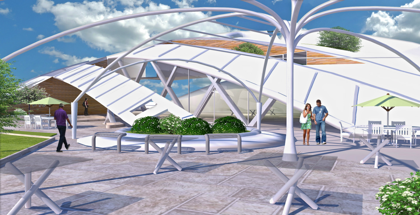
Here's a new render. Tried to make changes as per your suggestions, what do you think?
Thanks in advance for any feedback.

-
Hello Adam, the render is much better IMHO but "Czech hedgehogs"
 they also seem to be semi transparent.
John -
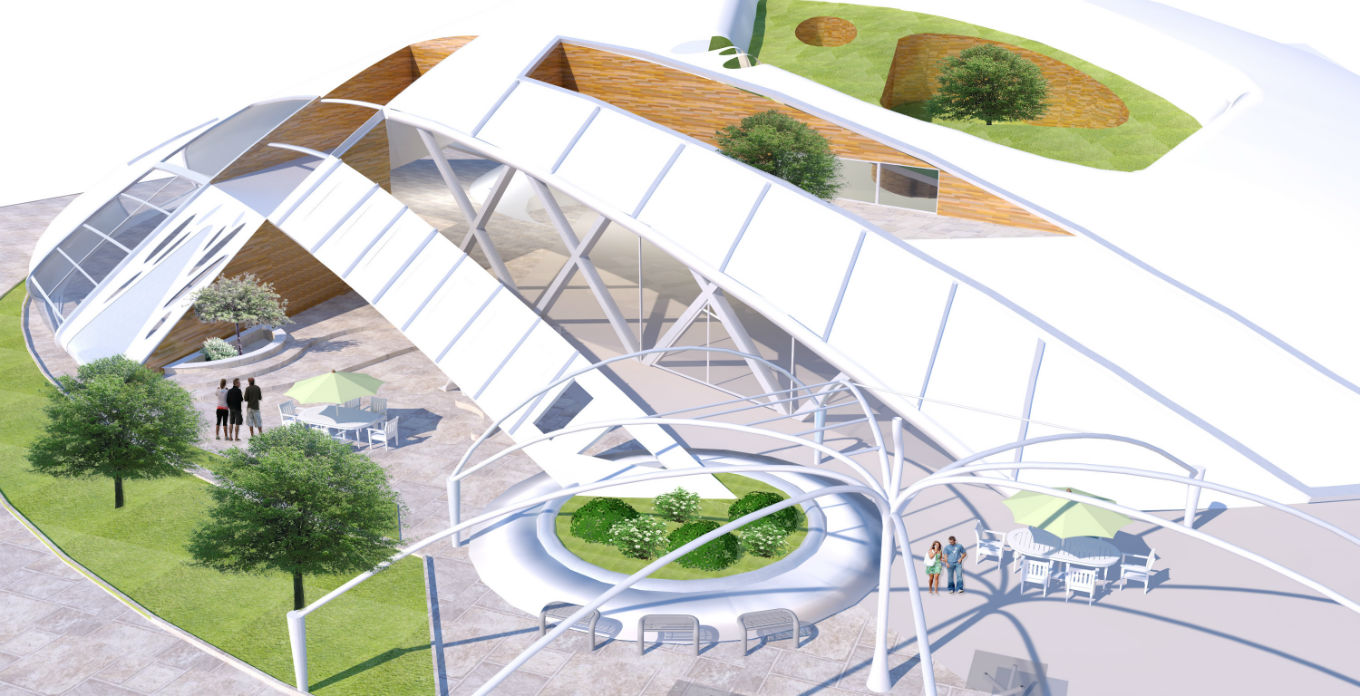
Another one to show some perspective.

Hello! It looks like you're interested in this conversation, but you don't have an account yet.
Getting fed up of having to scroll through the same posts each visit? When you register for an account, you'll always come back to exactly where you were before, and choose to be notified of new replies (either via email, or push notification). You'll also be able to save bookmarks and upvote posts to show your appreciation to other community members.
With your input, this post could be even better 💗
Register LoginAdvertisement


