Pocket Park
-
@mitcorb said:
Now that you are back at it-- and it is looking great, it would be neat to see those concession structures complementing the gate and fence styling. On the other hand, it might come off as too uniform, or repetitive.
I like the plant material's appearance. It looks a lot like Japanese rice paper plants in the leaf.
Also, I like your transparent figures.Good suggestion for the concession stands.
Thanks, but I have no idea why those people are transparent. I got them from the warehouse and didn't see they were transparent until I went full texture.
 (no credit shown in the warehouse for them)
Don't know how to change them either.

But I kind of like it.
-
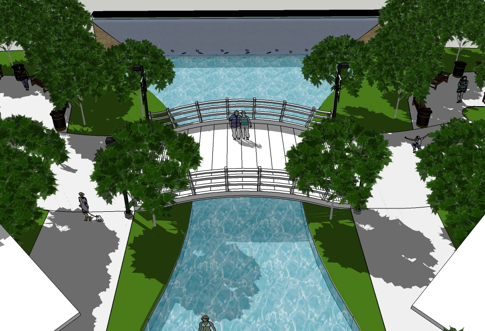
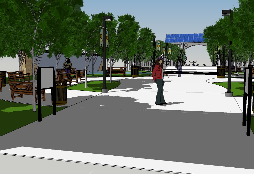
Street lights and signage added. Water wall updated.
Concession stands still need work.
Bigger pictures.
-
These are looking great. You have come a long way.
I don't know for sure, but there may be a way to opaque your figures if you actually wanted to do it. Might be a little bit of work, because you may have to reassign colors/transparency while retaining outlines, or something like that.
I like that you are using the color pallettes from the Sketchup application itself- or it appears that way. -
Thanks mitcorb. It was hard regaining the momentum and motivation.
Yes, it's pure SketchUp. Ver 8 at that.
I think I will leave the people as they are. It's kind of fun.
I'll try and finish the concession stands tomorrow and after that will be the final environment placement, but it will only a monochrome, low detail surrounding environment with the park in full color.
I'll try and tweak the water wall as well. It's not working for me right now.
I really want to finish this one. I'm getting impatient to take a crack at Artisan. I think it's going to be either a robot or a car.
-
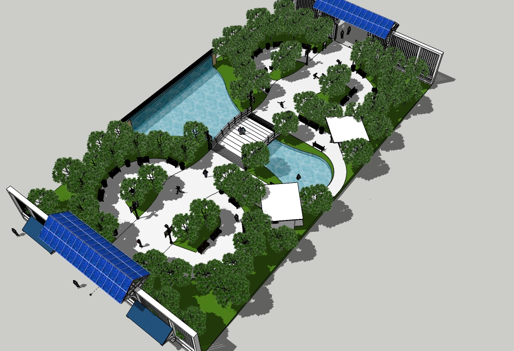
Minor tweaks.
Water wall. Bridge support thickness. "Floating" trees. Added more benches near concession stands.
-
Nice progress. How are those trees treating you. That's looks a little like a project I did a good while ago and turning the trees on, especially with shadows was a killer on performance. I had a layer setup that hid most of the tree parts so I could move them around.
-
@pbacot said:
Nice progress. How are those trees treating you. That's looks a little like a project I did a good while ago and turning the trees on, especially with shadows was a killer on performance. I had a layer setup that hid most of the tree parts so I could move them around.
The trees are working incredibly well!
It is from the warehouse and credit goes to Mr. Planet.
I have 70 of them in this model and while I do have to wait for moves and shadows off/on, the wait time is less than 10 secs for the initial recalculations, but once SU is ready it stays stable in low poly mode until the move is complete. I can live with that.
-
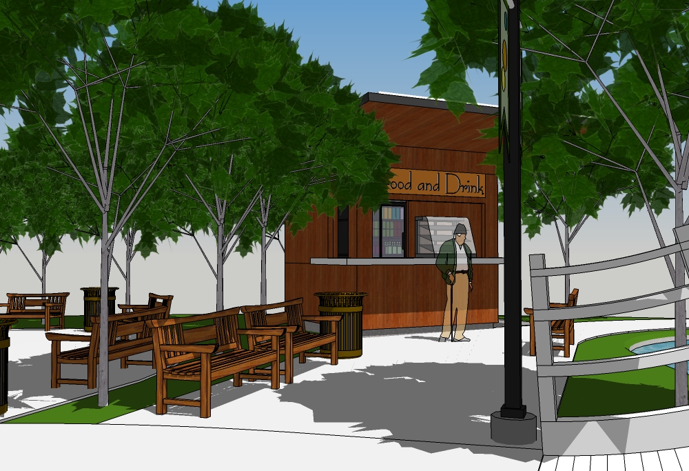
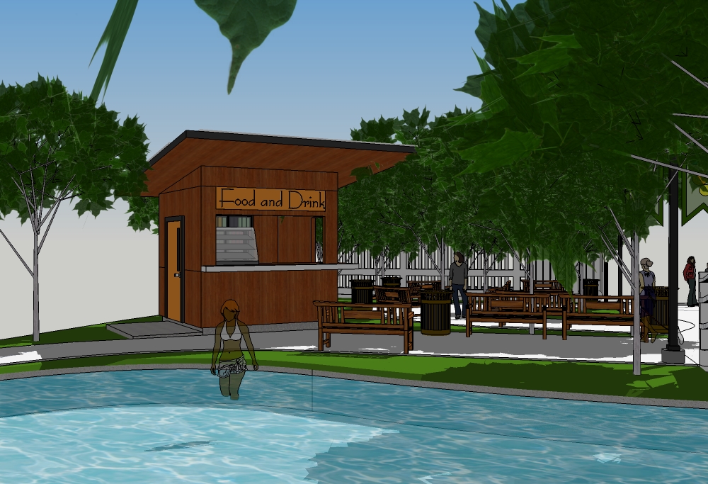
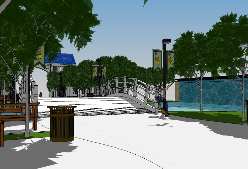
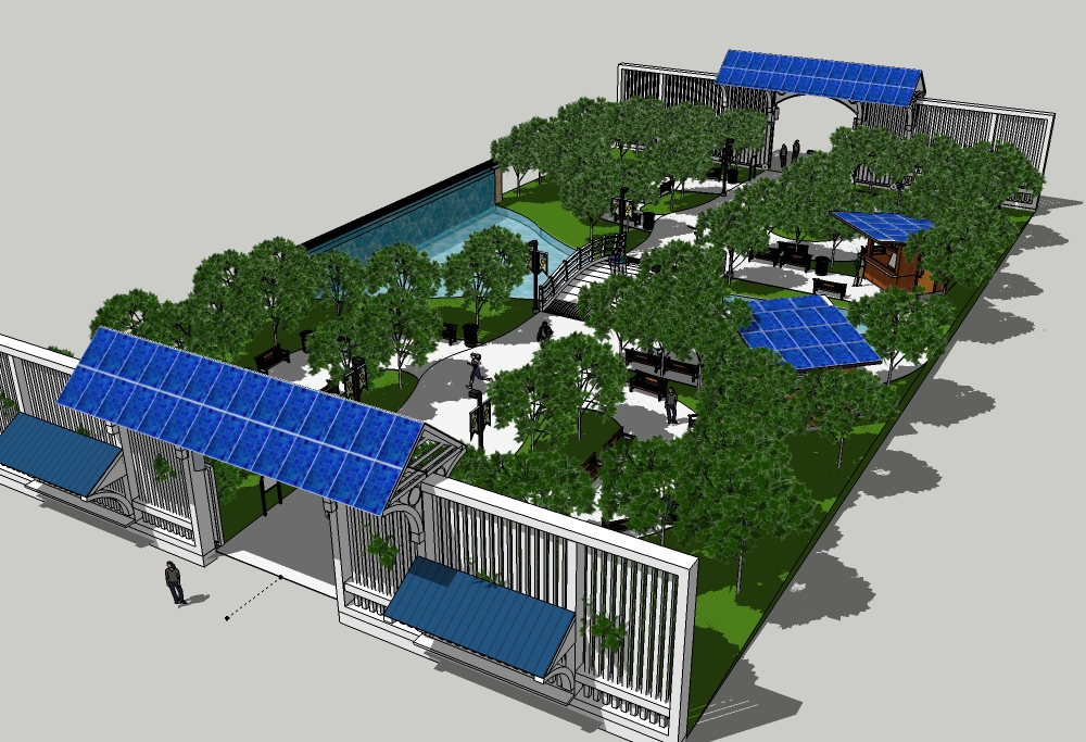
Park complete.
Next post will be site setting.
-
I see you allow skateboarding in your park. Why not, it's not a crime!
-
@pbacot said:
I see you allow skateboarding in your park. Why not, it's not a crime!
Of course I do! This isn't an old folks park!
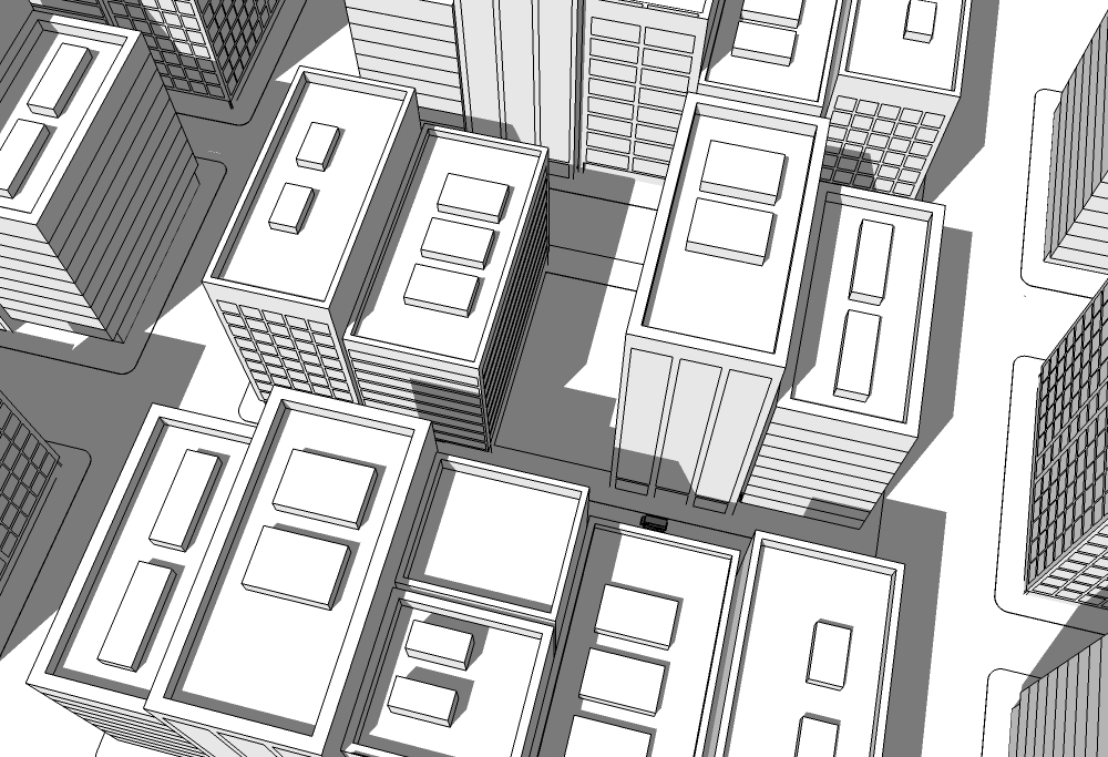
My quick and dirty city.
-
And finally...
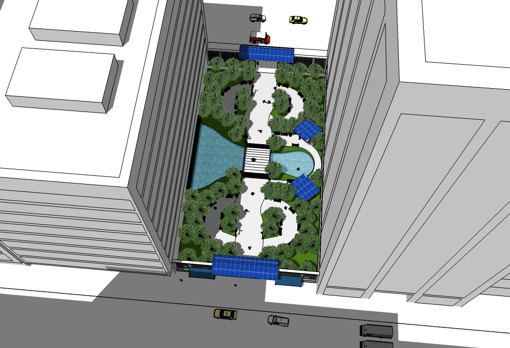
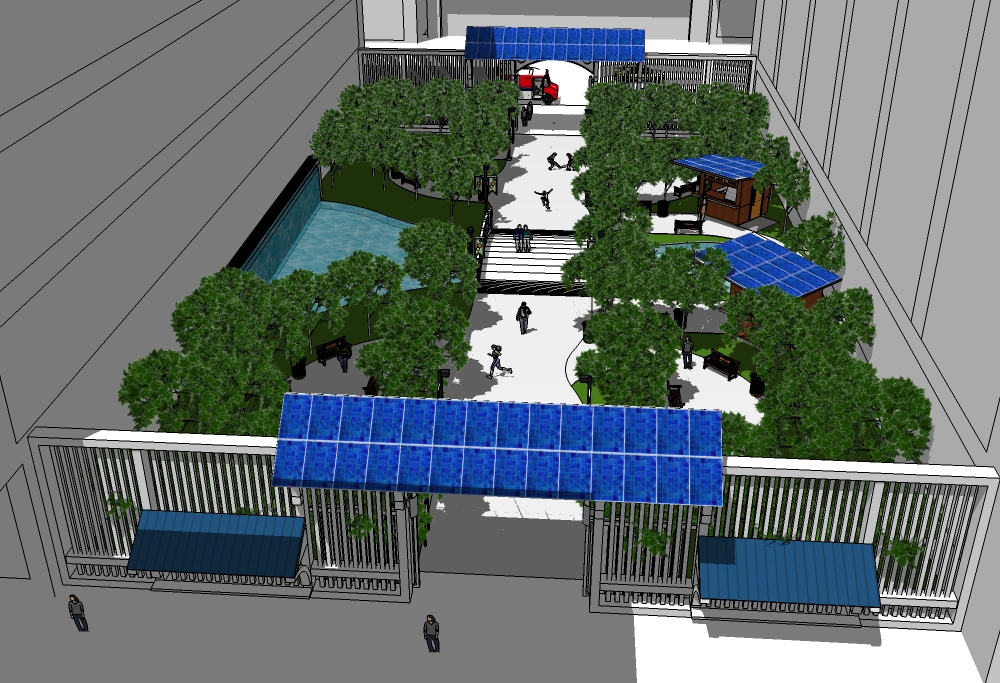
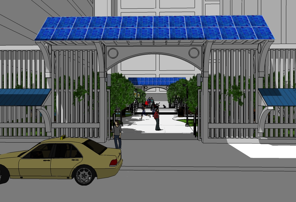
-
@pbacot said:
I see you allow skateboarding in your park. Why not, it's not a crime!

looks good Bryan.

hopefully those trees don't have to compete too much with those buildings for .
. -
Street view and change of shadow.
LARGE picture.
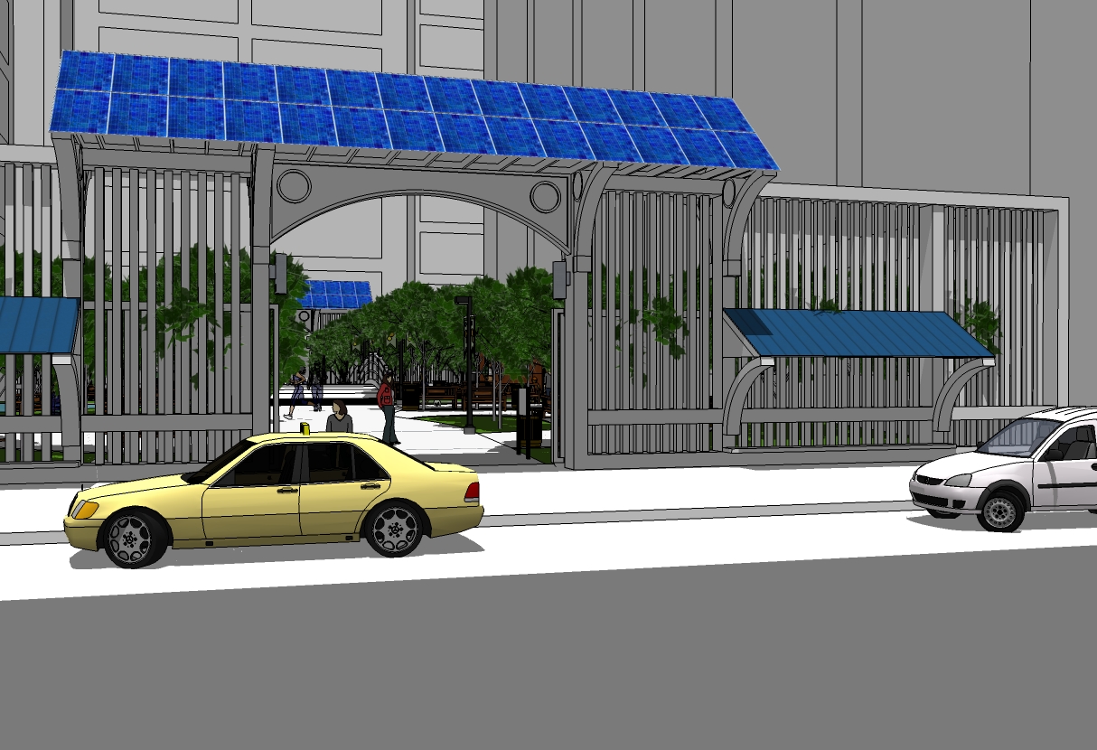
-
-
Heh. Heh. I'd say those bridge rails are quite a challenge for the skateboarders.
As for the sunshine- hell, throw technology at it: solar tracking light collimators and light tubes or reflectors. After all, it is a model, right?
 -
@mitcorb said:
Heh. Heh. I'd say those bridge rails are quite a challenge for the skateboarders.
As for the sunshine- hell, throw technology at it: solar tracking light collimators and light tubes or reflectors. After all, it is a model, right?
Actually, there is a fair amount of light that is constantly reflected off the buildings. Modern building are more exterior glass than anything else.
I didn't think about that for the bridge design, but it makes sense.

-
And now time for a render?
-
@solo said:
And now time for a render?
 Not now. This is done for the time being. I'm moving it to the finished page.
I will eventually render it. Probably within the next few days and post it in the new thread.
-
Awesome Brian - when it's all planted out it is making a really cool place. I really like the little kiosk, though the roof there seems out of character with the entries!
-
@richard said:
Awesome Brian - when it's all planted out it is making a really cool place. I really like the little kiosk, though the roof there seems out of character with the entries!
Thanks Richard.

Yeah, I did some research on the design of the kiosks and they do fit the theme and are quite common in Japan. I thought roofs exactly like the gates might be to cliched. shrug What the heck.

Hello! It looks like you're interested in this conversation, but you don't have an account yet.
Getting fed up of having to scroll through the same posts each visit? When you register for an account, you'll always come back to exactly where you were before, and choose to be notified of new replies (either via email, or push notification). You'll also be able to save bookmarks and upvote posts to show your appreciation to other community members.
With your input, this post could be even better 💗
Register LoginAdvertisement


