Pocket Park
-
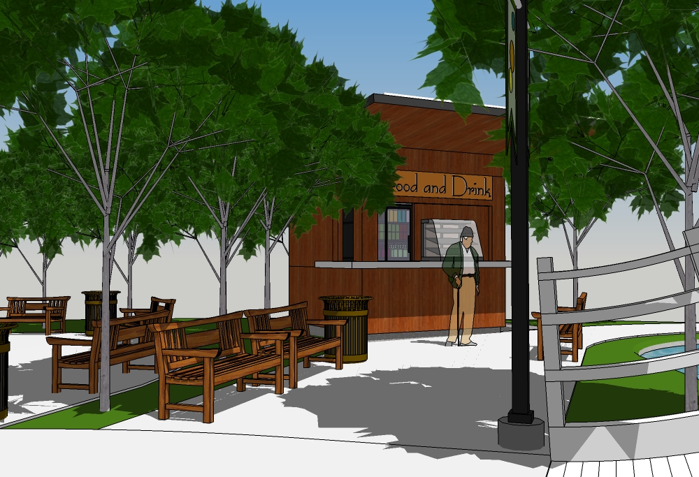
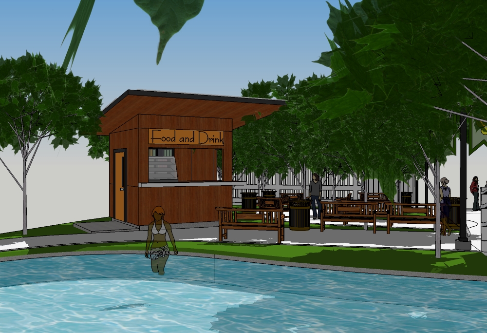
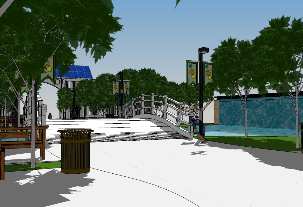
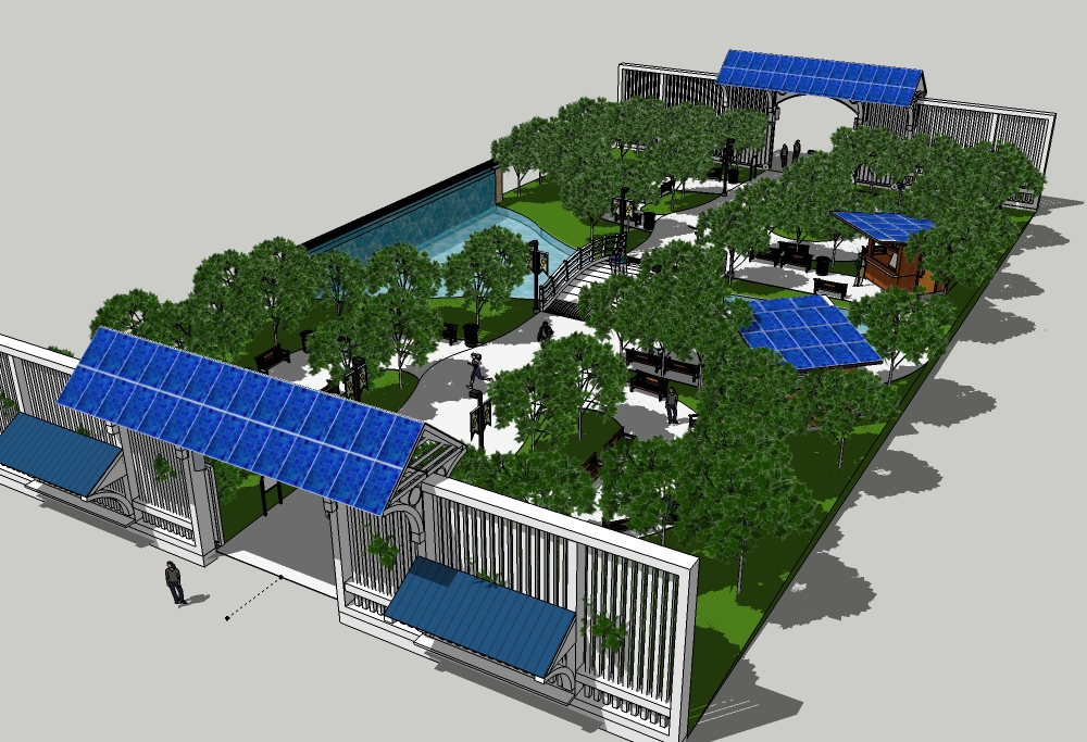
Park complete.
Next post will be site setting.
-
I see you allow skateboarding in your park. Why not, it's not a crime!
-
@pbacot said:
I see you allow skateboarding in your park. Why not, it's not a crime!
Of course I do! This isn't an old folks park!
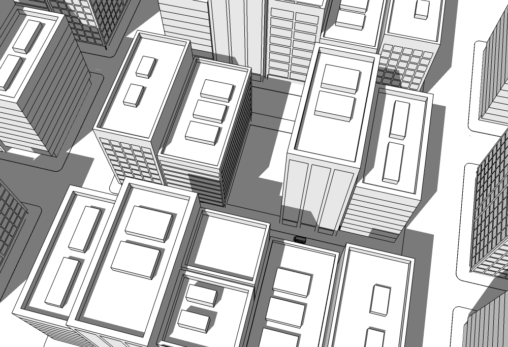
My quick and dirty city.
-
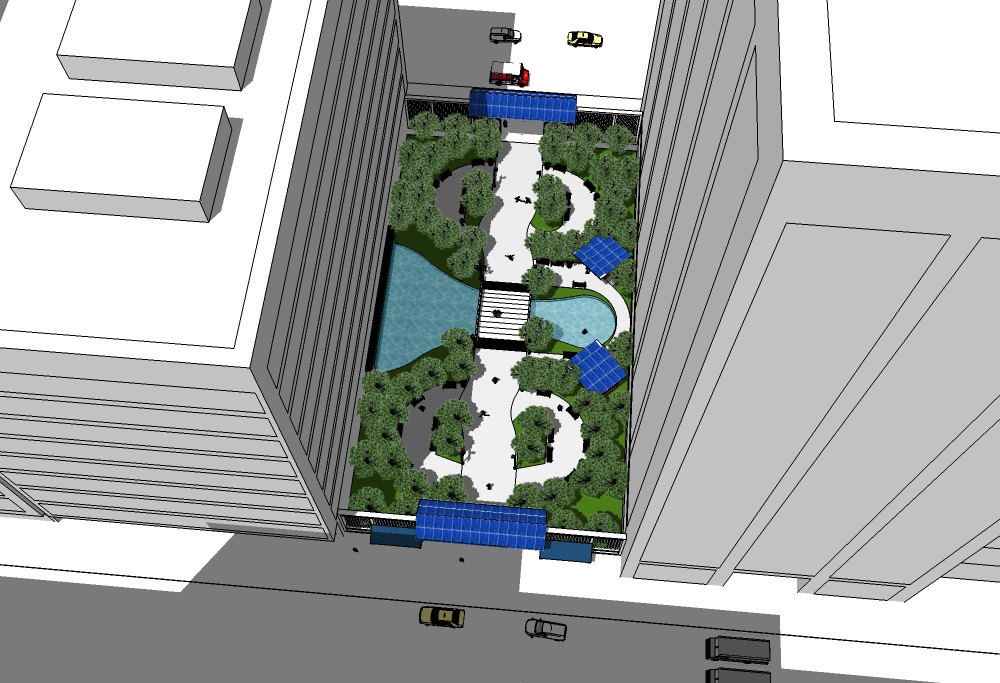
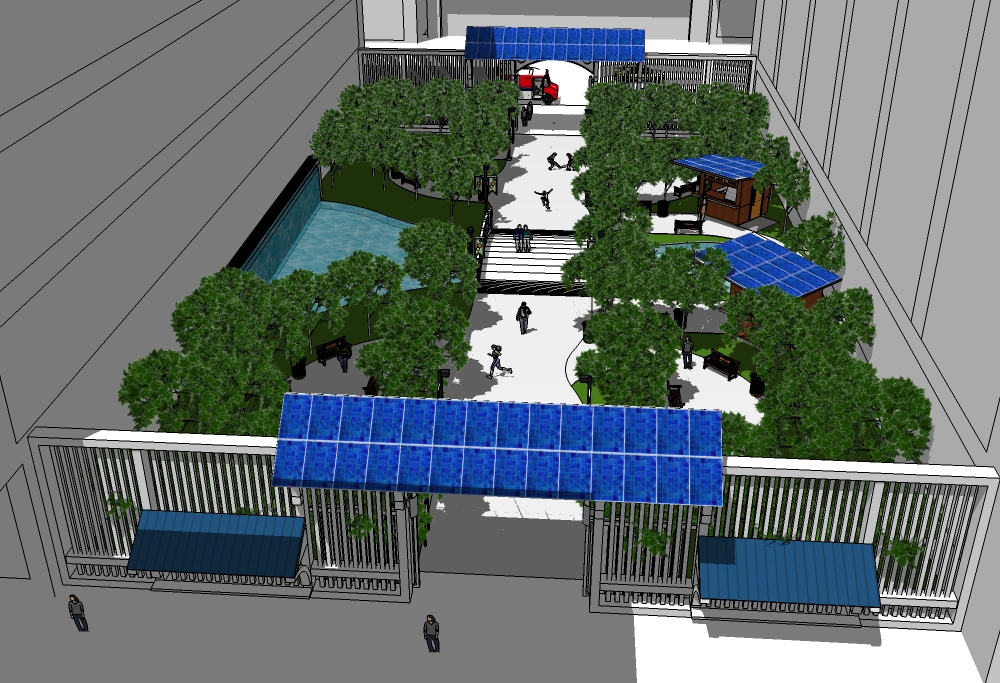
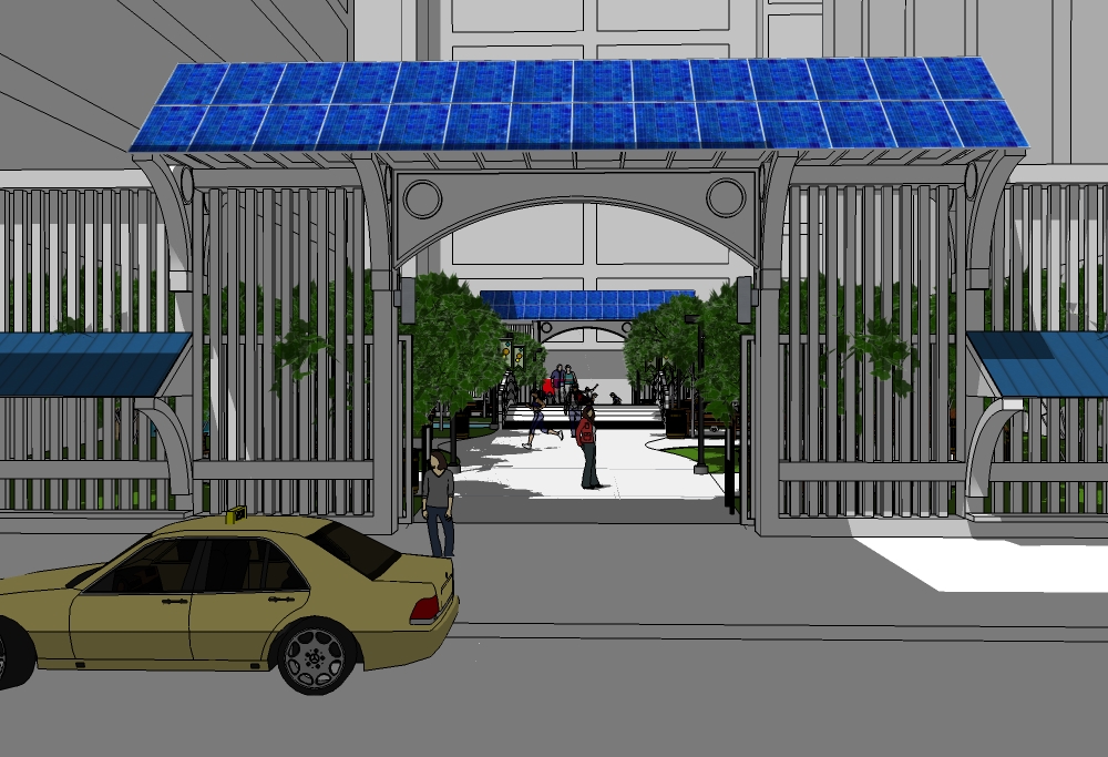
And finally...
-
@pbacot said:
I see you allow skateboarding in your park. Why not, it's not a crime!

looks good Bryan.

hopefully those trees don't have to compete too much with those buildings for .
. -
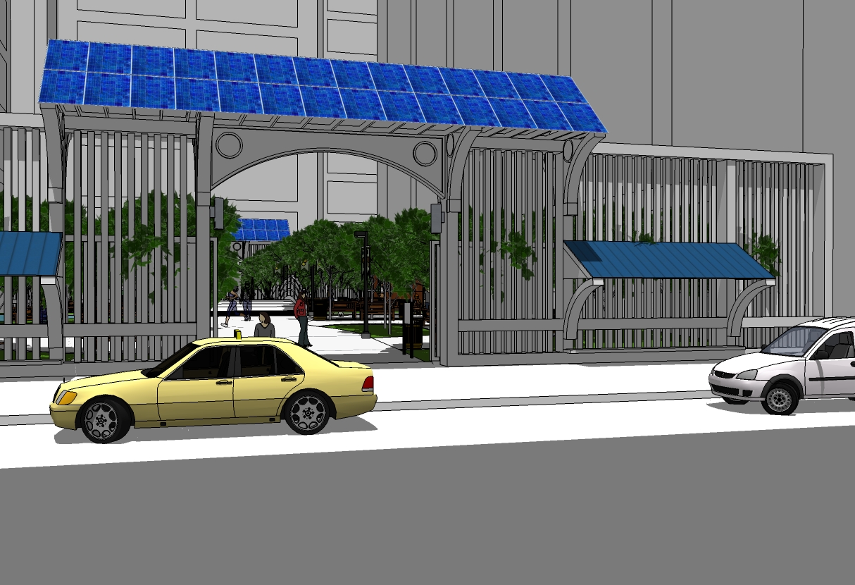
Street view and change of shadow.
LARGE picture.
-
-
Heh. Heh. I'd say those bridge rails are quite a challenge for the skateboarders.
As for the sunshine- hell, throw technology at it: solar tracking light collimators and light tubes or reflectors. After all, it is a model, right?
 -
@mitcorb said:
Heh. Heh. I'd say those bridge rails are quite a challenge for the skateboarders.
As for the sunshine- hell, throw technology at it: solar tracking light collimators and light tubes or reflectors. After all, it is a model, right?
Actually, there is a fair amount of light that is constantly reflected off the buildings. Modern building are more exterior glass than anything else.
I didn't think about that for the bridge design, but it makes sense.

-
And now time for a render?
-
@solo said:
And now time for a render?
 Not now. This is done for the time being. I'm moving it to the finished page.
I will eventually render it. Probably within the next few days and post it in the new thread.
-
Awesome Brian - when it's all planted out it is making a really cool place. I really like the little kiosk, though the roof there seems out of character with the entries!
-
@richard said:
Awesome Brian - when it's all planted out it is making a really cool place. I really like the little kiosk, though the roof there seems out of character with the entries!
Thanks Richard.

Yeah, I did some research on the design of the kiosks and they do fit the theme and are quite common in Japan. I thought roofs exactly like the gates might be to cliched. shrug What the heck.

-
Dear Bryan,
It seems to me that the main path through the park is too straight. There will be a tendency for the park to be used as a short cut and little else. I think the first thing one should see from either entrance is a foliage 'screen' (holly, bamboo, beech etc) which blocks the view of the exit. The railings look nice, but again should have a green 'screen' immediately behind to attenuate traffic noise and to create a sense of tranquility. I'm not sure I would want to sit in a park where I can see traffic passing on both sides. I think one should be able to sit around the ponds too, which means allowing space between the larger pond and the building.
The vertical face of the boundary buildings offer scope for climbing plants, such as clematis and jasmine. You could use weathering steel to make frames for climbing plants. The frames could overhang into the garden proving a green canopy. In fact, fragrant hardy plants/herbs like rosemary, lavender, etc., would be nice near the seating areas. A few tall trees would be nice to shield the view of the buildings/skyline and to attenuate noise reflected off the sides of the building. A wide, long rose pergola would do the same thing, and provide a seasonal attraction (also cherry trees etc).
There seems to be a lot of concrete, which will reflect noise and heat. Gravel paths would be nicer, and would allow free draining during rain storms, thus minimising run-off.
The pocket park is a nice idea. Is this a real project, or just an exercise?
Kind regards,
BobKind regards,
Bob
Hello! It looks like you're interested in this conversation, but you don't have an account yet.
Getting fed up of having to scroll through the same posts each visit? When you register for an account, you'll always come back to exactly where you were before, and choose to be notified of new replies (either via email, or push notification). You'll also be able to save bookmarks and upvote posts to show your appreciation to other community members.
With your input, this post could be even better 💗
Register LoginAdvertisement


