Re-doing old uni work for a portfolio
-
Hey everyone.
It's been a while since I last posted. Sadly, the same week everyone else graduated I was having surgery on my spine because I'd broken my back and not known for 18months, as you do. Which, of course, meant I missed the big rush for graduate jobs with being somewhat incapacitated. Now I'm back up and running and with the next run of grad jobs on the horizon I've decided now is the time to go back to my portfolio and improve on all the lacklustre clunky renders, construction drawings and sketchup work and try and turn it into something that doesn't make it look like I've just been sitting on my backside for twelve months.
I've attached some very basic "renders" that I had done through photoshop using some very, very basic sketchup models with textures pasted onto white faces that sadly now with a more critical eye look very clunky indeed and I'd dearly like to work up now that time is much less of a constraint and quality is the biggest concern. This means building up and improving some frankly, again, rather over simple and for a want of a better word crude sketchup models with the hope of turning them into something that I can use kerkythea and photoshop on to much better effect and show myself as a much more saleable candidate to potential employers.
I have included the masterplan which was created from a cad drawing which was used as a frame and then coloured and details added in photoshop for speed rather than quality to give an idea of what i'm working with/from. I have also included the clunky sketchup model with which I'm working and used view ports from to create the basic work I have. The work of Alex Hogrefe being what I'm aiming for in terms of quality but of course, I'm realistic in that I know that won't come instantly. I'd also like to add the details and textures to the actual model, perhaps even some lighting for night illustrations and some buildings that look like those from the actual site, I assume that can be done by using Gmaps on facades or creating look a likes or some other process I don't know?
This gets me down to the questions really. Is it best to sack the existing model off and start again, is it too ambitious to create something of a relatively large size with a good level of detail and accuracy for building renders from? Is a model built for rendering if accurate able to be usable for construction drawings in layout? I'm sure there's much more but I don't want to hit question overload. I've looked for the answers and sat through seemingly endless youtube videos and poured through Dan Tal's book endlessly without really ever finding any answers so I figure here is best to get my compass right so to speak with regards to working up my models into something less clunky.
-
You forgot to attach the images
-
-
-
-
Please just make sure images are a maximum of 1500 pixels wide, then you can upload them no problems.
You will get significantly more interest and advice if you just post the images.

-
@olishea said:
...You will get significantly more interest and advice if you just post the images.

Indeed. It's almost like "who cares" when they cannot see the images at the first glance (to decide if they really worth the click for a bigger size). Imagine sharing images and stories zipped on FaceBook.

Nevertheless, of course, welcome to the forums!

-
Hi,
Here is my suggestion based on the first attachment file you posted.
@garuf said:
Is it best to sack the existing model off and start again, is it too ambitious to create something of a relatively large size with a good level of detail and accuracy for building renders from?
Again based on the first model you posted it seems to be just perfect to apply the 'tradigital' technique explained in following video.
You don't need to spend countless hours working on 3d detail to achieve very good results. But if you want to make detailed 3d the best option will be to make new one using the old one as reference.
-
Sorry for the delay in getting back, life got in the way...
I don't share anything on facebook if I can avoid it... Ain't no one wants to see pictures of me.

I do see your point, I'll resize and put up them now. I just figured it was best to attach the actual model and the full res images rather than some heavily compressed reduced size images is all especially as the masterplan is a 1:200 plan and huge.
Here's the primative renders I built from the already uploaded sketchup model:
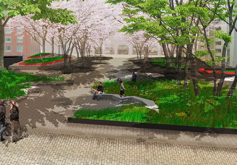
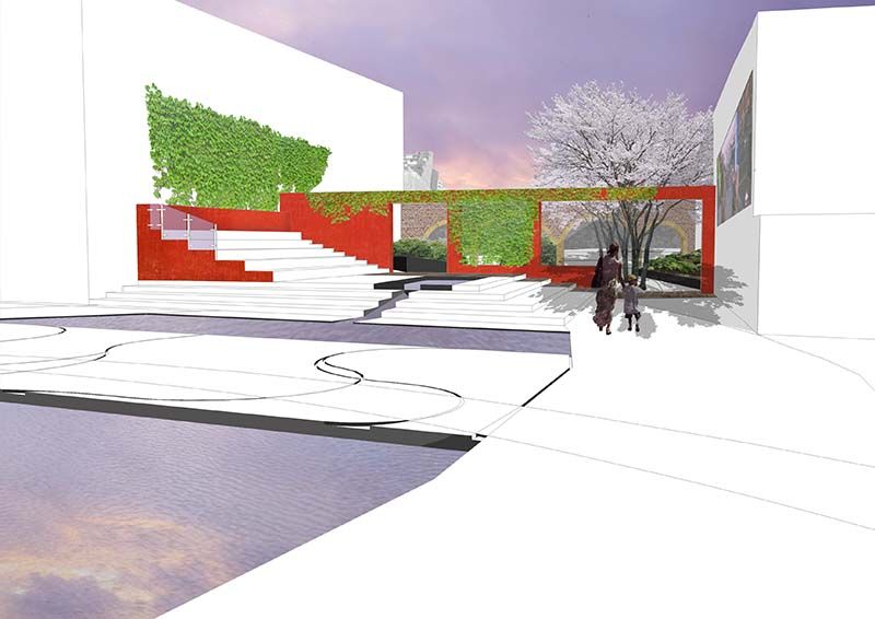
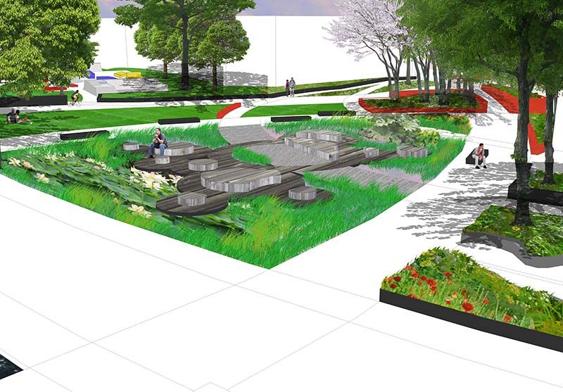
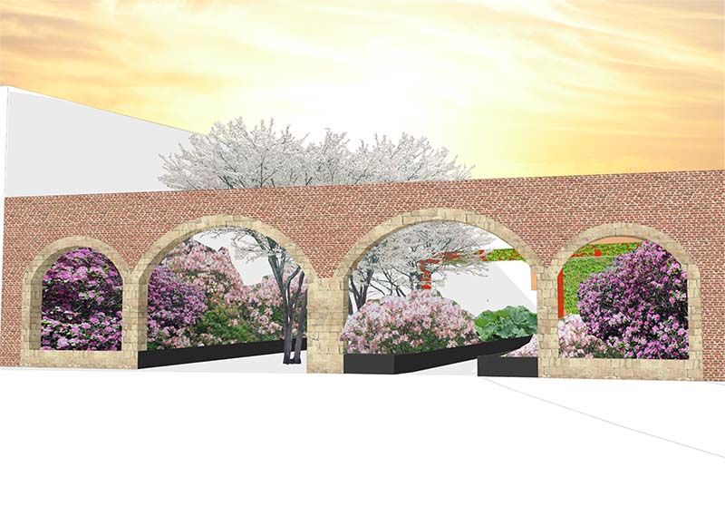
Here is a link to the finished plan view that came from the basic sketchup which shows the level of detail missing for my very basic renders and even this ommits a huge amount of detail.

<a href="http://s1339.photobucket.com/user/Gareth_Andrew_Callear/media/Masterplanflatbase_zps1bd82d58.jpg.html" target="_blank"><img src="http://i1339.photobucket.com/albums/o715/Gareth_Andrew_Callear/Masterplanflatbase_zps1bd82d58.jpg" border="0" alt=" photo Masterplanflatbase_zps1bd82d58.jpg"/></a>Thanks for the video link, Renderiza and the tips. What levels of detail should I be going to? I did try and draw every single pave but this just looked bad the renders I want to emmulate don't seem to have this issue or go down to brick level but the outcomes are hugely superior to my works see this example from Alex Hogrefe's site for what I'm aiming for.

Where do I even start?

-
Hi,
Saw this examples... http://www.alexhogrefe.com/
Reaching to that level of rendering skill will take lots of practice but that is obvious statement.

Anyways the example images you posted are nice starting point but let me give you some thought...
First using photo real images of trees, flowers in a very schematic layout of 3d modeling is something you might want to consider not doing. Instead try making everything same level of detail and if that mean sketching simple trees and so on it would make the whole composition feet together.
I personally like things that look non photo real (npr) and example video I posted to you show some really good examples.
Also if you still want to use images maybe use photoshop to destroy some detail so it doesn't look so real and then try something like PhotoSketcher to take away unnecessary detail. Here is link... http://www.fotosketcher.com/
Hope this helps...Cheers!
-
Ahhh yes of course, practice is a must.
Thanks for the tips on washing out the detail It's something I'd tried to avoid as coming from Landscape architecture there's already an assumption within the uni that all we do is play with crayons because everyone and there dog on the course did nothing but the hand drawn Tradigital method so I was looking to learn the more photorealistic styles to give me an edge as something different. I've also got to compete with the fact the uni acts embarrassed of us for a large part, so much so we don't appear in any official end of year publications but that's an aside to the real point!
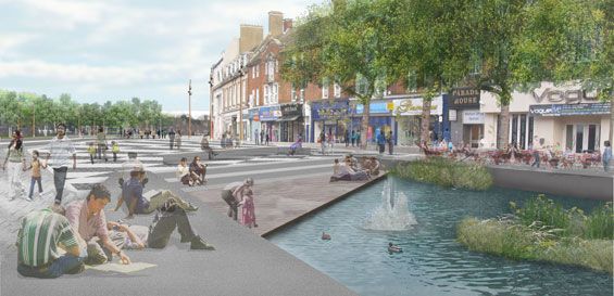
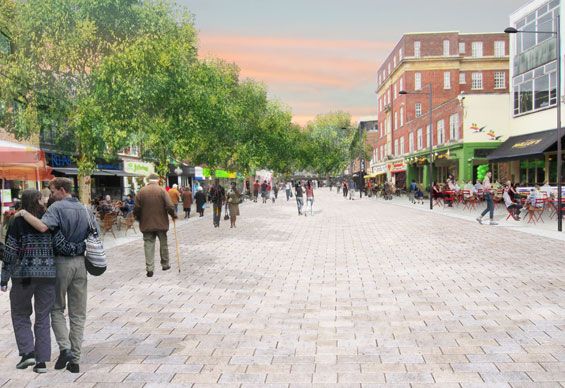
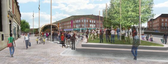
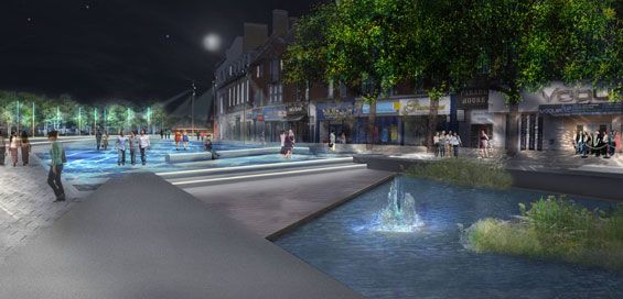
I had assumed these taken from the Watford project were done in sketchup and that's what I was aiming for as it gives a level of glitz I'd like to learn but perhaps they aren't sketchup models at all? I'd be happy if I could get my people and paving as good as theirs!
-
@garuf said:
Ahhh yes of course, practice is a must.
Thanks for the tips on washing out the detail It's something I'd tried to avoid as coming from Landscape architecture there's already an assumption within the uni that all we do is play with crayons because everyone and there dog on the course did nothing but the hand drawn Tradigital method so I was looking to learn the more photorealistic styles to give me an edge as something different. I've also got to compete with the fact the uni acts embarrassed of us for a large part, so much so we don't appear in any official end of year publications but that's an aside to the real point!
I also found this when I was at university doing architecture. They taught us absolutely nothing about presentation. There was no education in 3D modelling or rendering.
When I returned to uni for postgraduate (after spending 2 years learning rendering); they almost told me to stop making photo-real renders because it was "drawing attention away from the architecture". OK, so you want me to get the crayons out and make shit visuals like everyone else? Because people were asking "how do you do that in sketchup?" it somehow reduces your work into nothing more than CGI witchcraft. I was so frustrated.
Visuals sell a project. If you can't represent your design beyond bricks and mortar then the planning process seems to take much longer; clients need flashy deep imagery, not just plans/sections/elevations. Anyway, I find it fun.
The visuals you have posted above are composited. They have started with a very basic 3D model and composited several layers of trees and entourage and faked lighting effects in photoshop. I think they are OK, but rather generic and unfocused.
-
Hi,
This youtube channel have several episodes that have helped me understand some rendering concepts that may be of use to you as well.
-
Yeah Oli, we were taught nothing at all about how to produce the work, we were shown the tradigital as though it was the best we could be expected to produce but weren't given any guidance or tuition at all as to how to produce it. In fact thinking about it, we weren't really taught anything at all, if the uni hadn't panicked that no one knew how to use CAD and put on courses we had to pay for to learn the basics of it we wouldn't even have that. If you didn't go out of your way to learn everything yourself then you wouldn't learn it at all, the education was little more of a tick list on what you had to go and learn elsewhere, certainly not value for money at all and certainly not what I think when I think education.
Thanks for the input on the posted examples, I agree they're rather basic but they seem an attainable level for my current skill levels and though they don't have the super gloss renders client are so desperate to see, they're usable for selling my concepts, I think. It's certainly not levels of cgi witchcraft, I'd like to learn that but baby steps first, but definitely a step up from some crude pencil drawings that are so ubiquitous within my area and I think superior to my own work. I whole heartedly agree that a plan and section approach is nothing to 90% of people. But again, I'm well off topic. I enjoy doing the renders too, I just have very sloppy technique I'd like to learn how to improve.
Thank you again, Renderiza, I'll sit and watch that channel in the morning and see where it takes me. Thank you for the reply.
-
http://www.youtube.com/watch?v=zdgcQHjX_hw&list=UUbdyjrrJAjDIACjCsjAGFAA
This particular video is very good! Something definitely worth trying. -
http://www.youtube.com/watch?v=EqV2YzaRrXI This one seems really useful too, I'll be trying it and working into this over the next few days and hopefully something better will come out of this. Thanks for the hints again, everyone.
-
Just a quick question, looking at the sketchup model I'd dropped in earlier, what would be the best way of exporting just the ground plane line work to a new model or would modelling the buildings and then exporting them into the existing model be easier?
Hello! It looks like you're interested in this conversation, but you don't have an account yet.
Getting fed up of having to scroll through the same posts each visit? When you register for an account, you'll always come back to exactly where you were before, and choose to be notified of new replies (either via email, or push notification). You'll also be able to save bookmarks and upvote posts to show your appreciation to other community members.
With your input, this post could be even better 💗
Register LoginAdvertisement


