Sketchy edges appear in front of transparent pngs
-
Hi,
Recently I have been having a problem with my styles, where the edges are showing on top of "face me" objects that have a transparent png (even when removing the faceme setting or exploding etc). I have attached 2 images of the problem, this only happens with the sketchy edge style and a few of my own styles, default styles are fine. Has anybody had a similar problem or have any ideas what might be causing this? I changed some settings on my graphics card and thought it could be that but have reset it to its original settings but the problem is still there.
Hope someone can help.
Thanks
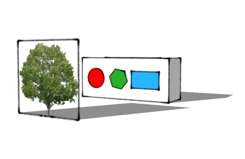
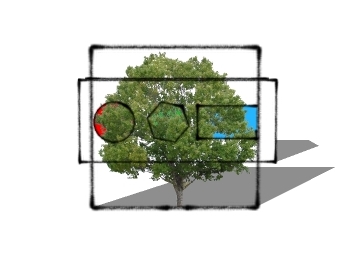
-
I'm not seeing that when I try it. Could you post your SKP file?
-
Example file attched, thanks.
I have recently upgraded my system, have a quadro fx1800 graphics card, the driver for this was recently updated, but im not sure if this is the cause. Its only with the sketchy edge options and some of my own? Its quite frustrating as ive had to resort to 3D components for the time being where 2D face me's would have been the better option. Any ideas?
-
It looks to me as if all you need to do is hide the edges of the tree component. That an make it a component again. If you want the tree to cast shadows you should run it through TIG's Image Trimmer so it doesn't cast a rectangular shadow.
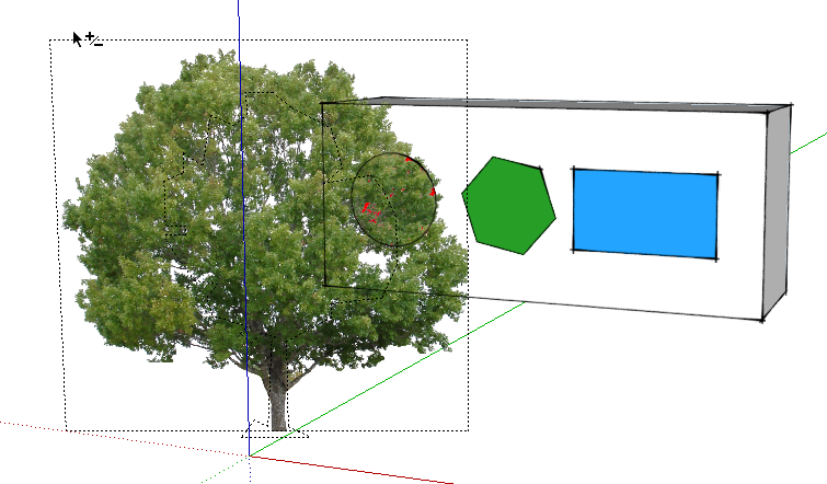
Here's a screen grab after hiding the edges but with Hidden Geometry turned on.

-
I think what Oly says is that edges of objects behind these transparent png components are shown through the component itself (like in your first screen grab itself).
This is a bug and has been there since these sketchy edges were introduced in early 2007 with SU 6.
-
My mistake. I thought he was talking about the edge bordering the tree component.
And yes, the sketchy lines showing through is a known bug.
-
Thanks guys, at least i know its not something i'm doing! I guess I've not used a sketchy edge look in front of transparent pngs before in this way as its the first time ive seen it... unfortunately my job now entails me to do this quite often:/. Would you suggest the only way around this is to hide individual lines that are behind the image?
Thanks again for your replies.
-
You could use other images (not transparent png's) but then you need to cut them around.
-
Yes thanks, I forgot about that! Although will probably opt for the former when using trees! Unless i can find some facemes that havent used transparent pngs??
-
I guess if I had to do that, I would make separate line exports and combine the images in an editor. You could then erase the edges where you don't want to see them.

-
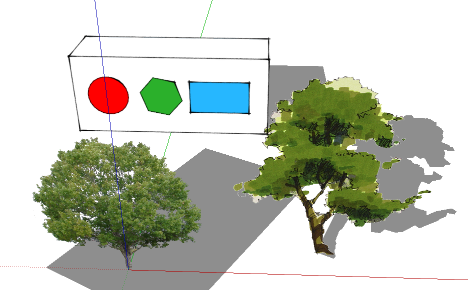
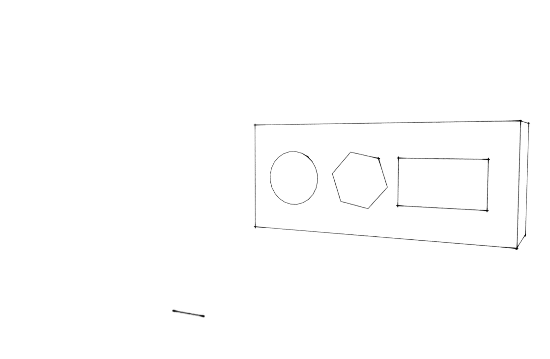
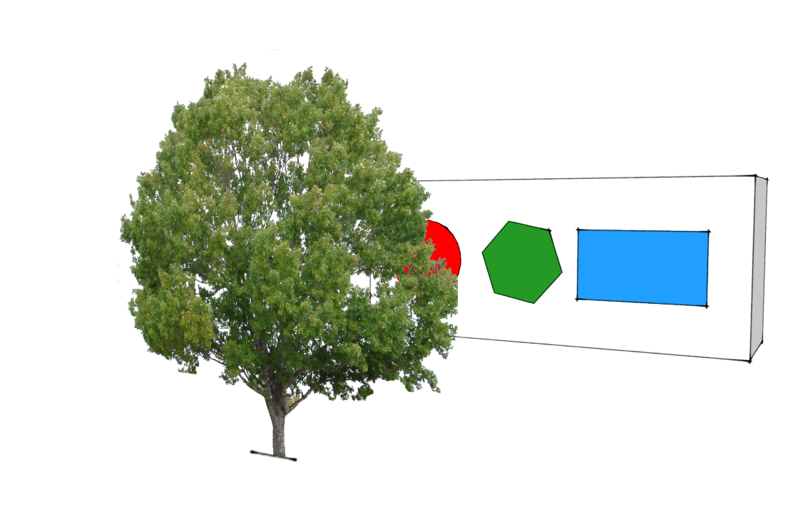
Yep, the sketchy styles/transparency bug. My work around is to create an opaque "bill board" object, placed closely behind the image (on a seperate layer) in the component. This way I can choose when I want transparency or not. This also comes in handy for conceptual work, when I only display the "billboard". See attached images.
Hello! It looks like you're interested in this conversation, but you don't have an account yet.
Getting fed up of having to scroll through the same posts each visit? When you register for an account, you'll always come back to exactly where you were before, and choose to be notified of new replies (either via email, or push notification). You'll also be able to save bookmarks and upvote posts to show your appreciation to other community members.
With your input, this post could be even better 💗
Register LoginAdvertisement


