Style Experiment
-
@unknownuser said:
@dave r said:
And I've made a feature request for that display style several times including in person at 3D BaseCamp last fall.
 Maybe it'll happen.

i just tried a quickie experiment and it went pretty good.. since you seem to be in an experimental mode today, maybe you can mess around with it some..
set the style with thicker profiles and depth cue (maybe around 4px at least) --not sure if this is absolutely necessary, it's just how i set it up..
export a hidden line view .png (doesn't need to be transparent at this point)..
open in photoshop then go Select -> Color Range…
click on the color of the face an/or background..
push delete..you should be left with only the line work on a transparent background..
(adjust fuzziness in the color range select or use refine selection in order to make adjustments as need be)
….
not sure but there might be something useful in there.. -
Jeff, I'll give that a try. Normally I just import the lines image onto a layer set to Multiply and I don't have to monkey with the white background. It doesn't affect the underlying image at all.
Sometimes, as in the case of the image where I show the background with the unsoftened edges, I make several lines exports at different sizes and resize them all down to the same size.
-
oh.. right, i guess i forgot what the context of this thread is

i mean, i think your examples look great as you're showing and there's no need to do what i mentioned above..
that's more/less talking about when you want to have textures in a render but still show some of sketchup's line work.. in which case, the sketchup output of the texture begins to fog the rendered version.. and the darker the you try to make the lines, the more fogged the rendered textures become..
so, on that note, carry on..
-
FWIW, when I want to use textures, too, I export a texture image with edges turned off and a separate image with the edges in hidden line. Then combine those with the render.
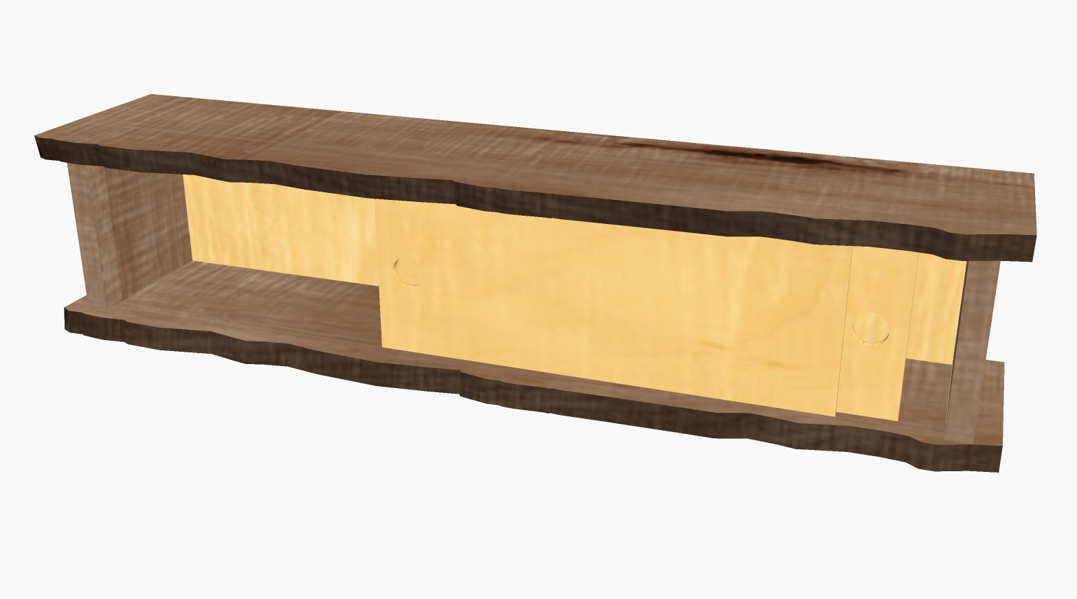
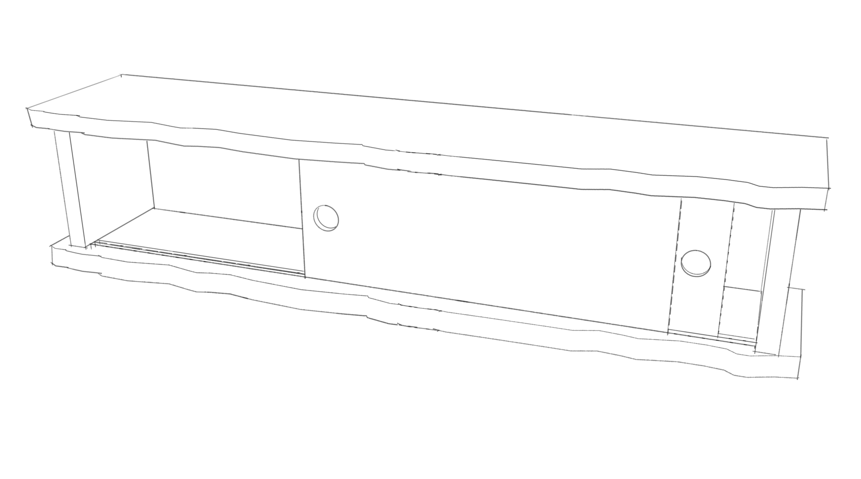
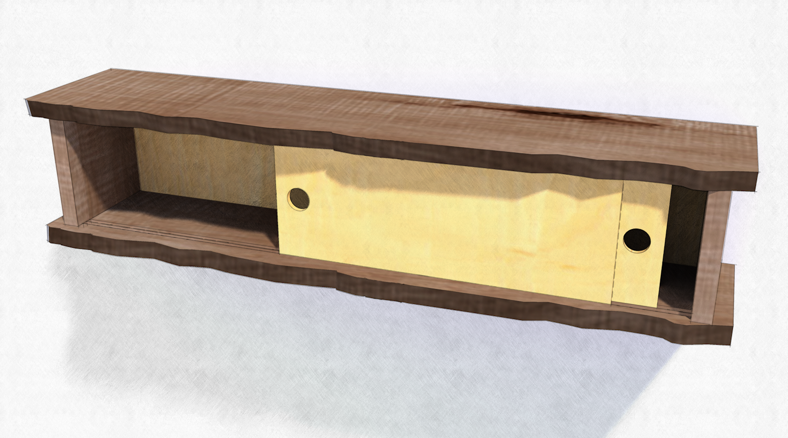
-
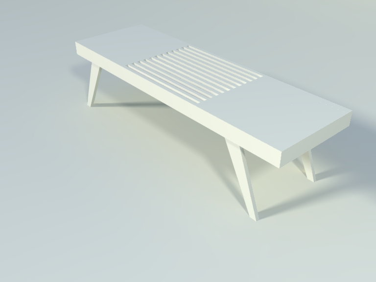
Where do I find Dave's grainy pencil style.
-
Walt, I don't know exactly which line style Peter used but there are a number of my pencil styles here.
FWIW, the pencil shading is not really a style. That part is created outside of SketchUp from either a shadows export from SU or from a clay-rendered image.
-
Oops
 Maybe that one is not readily available. Dave does have several styles for offer in the Sketchucation store.
Edit: it's called Grainy Pencil fine. Yes it is for the linework, not the shading.
Let's just have SU 2013 add AO, soft shadows, and sketchy shadows

-
I looked there but really couldn't tell which one it was I also have Dave's styles from SketchUpArtists.
-
I like that one you did of the house.
-
I hope I didn't throw things off. I appreciate the off-topic, Jeff and Dave, because sometimes the line overlay doesn't look good and I am back to wondering WT...hell I did last time and so on. Deleting background around linework might give some flexibility but can cause (low) AA to show I think.
-
@mwm5053 said:
I like that one you did of the house.
You mean me or Dave? But thanks! (confusion of stepping on someone's thread)
-
@ Peter Well I guess both I now see Dave had a house too but I don't think you where hijacking the thread this a good way to learn new ideas.
-
Walt, check your PMs.
Peter, no worries. It's all good.
I guess I haven't found a need to delete the background but then I am not doing renders with the model just floating in space and when I want the background to really disappear, I make sure to light it separately from the model just as I would if I were making a photo in a studio. I suppose it comes from years of experience in the days before really accessible digital editing.
-
Yes, those second two look the same to me. Perhaps the same thing is happening in both methods.
-
@dave r said:
Walt, check your PMs.
Peter, no worries. It's all good.
I guess I haven't found a need to delete the background but then I am not doing renders with the model just floating in space and when I want the background to really disappear, I make sure to light it separately from the model just as I would if I were making a photo in a studio. I suppose it comes from years of experience in the days before really accessible digital editing.
Dave,
If I understood Jeff he was speaking about how to clear the lines for overlay. Then I started thinking about something that is not a problem in our examples at all, but when you have some darker background.
Here are some screenshots. this is when you export hidden line all White and put into GIMP for overlay.
First is selecting all the white and choosing "edit /clear". You get whitish artifacts.
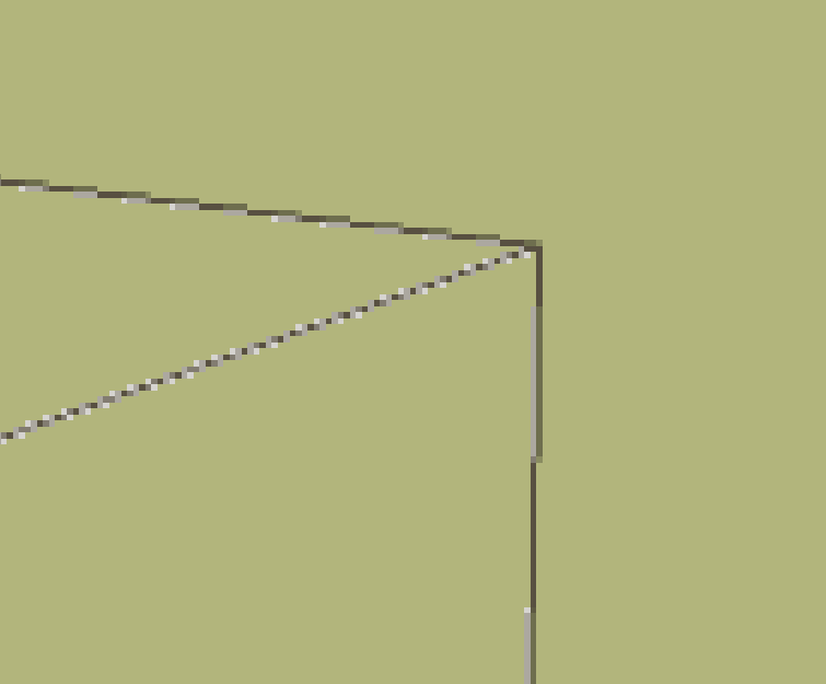
The second is just turning the lines-on-white layer to 'Multiply"
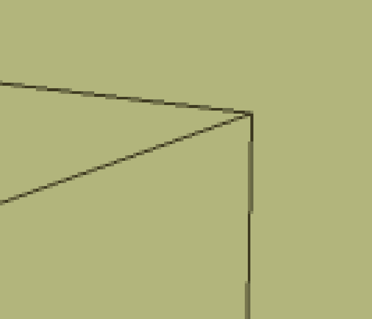
The third is selecting "layer/ transparency/ color to alpha", really no different in result or is it?
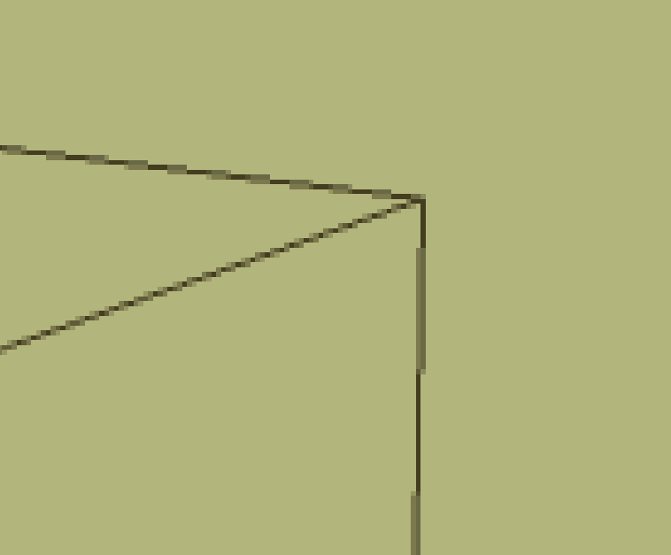
Regards, Peter
-
@pbacot said:
Here are some screenshots. this is when you export hidden line all White and put into GIMP for overlay.
First is selecting all the white and choosing "edit /clear". You get whitish artifacts.yeah.. that's the reason i was saying export the lines fatter than necessary.. i don't know gimp but in photoshop, you can refine your selection at micro levels..
so if you export them at, say, 4px wide, you can refine the selection down to two or one in photoshop to make sure you're getting only lines with no background artifacts.. -
OK, that's the trick. Gimp can do that too, with selection settings.
-
a quickie try at what i was imagining earlier..
(shiny metal materials with a environment sky (reflections).. i can't overlay from sketchup without fogging the materials/reflections so this is an attempt at getting only sketchup's line work)
and photoshop's refine/modify selection is a bit harder to figure out than i first thought.. might require some practice..
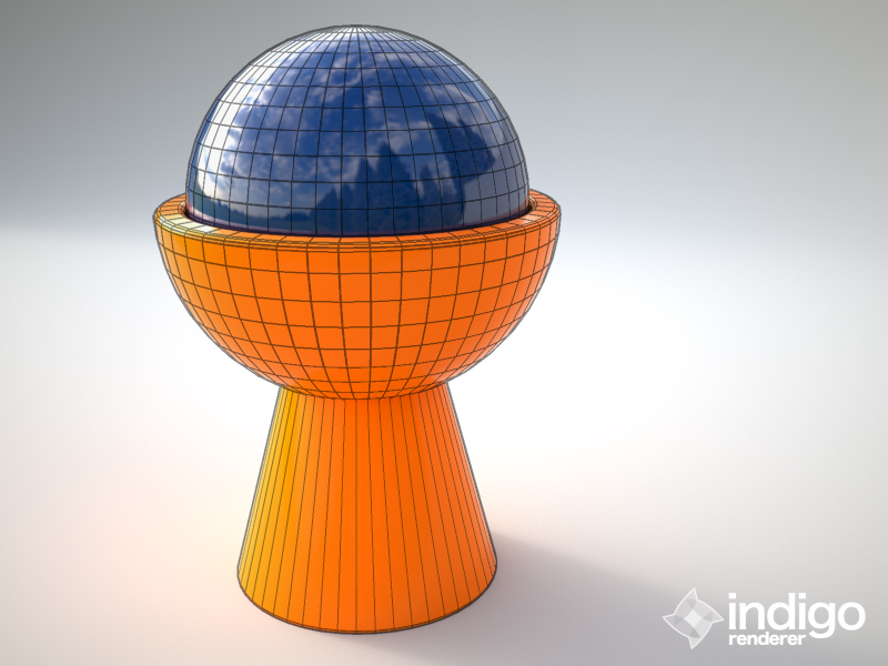
i'm on a computer without my models & apps on it today.. all this is just thrown together type stuff but i hope it gets the idea across
 )
) -
Jeff,
I could be looking at something different, but I don't actually see an effect on the image colors when I overlay a pure white SU hidden line image using Multiply.
Peter
-
@pbacot said:
Jeff,
I could be looking at something different, but I don't actually see an effect on the image colors when I overlay a pure white SU hidden line image using Multiply.
Peter
man.. you could very well be right

when i did that earlier, i exported the su model with the colors turn on (blue and orange solid colors.. those aren't actually textures on the model i used) and did my comparison using that in which case, the colors dulled and darkened..
but now i'm on my own computer and dont' have the model/outputs anymore.. guess i'll set up another render for testing..

[EDIT]
scratch that.. you're definitely right

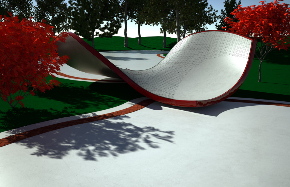
i tried it with a render i already had.. and i couldn't tell a difference in the white areas..
this one has a circle masked out.. and as far as i could tell with my eyes, the only thing different when turning the mask on/off is the lines turning on/off..
Hello! It looks like you're interested in this conversation, but you don't have an account yet.
Getting fed up of having to scroll through the same posts each visit? When you register for an account, you'll always come back to exactly where you were before, and choose to be notified of new replies (either via email, or push notification). You'll also be able to save bookmarks and upvote posts to show your appreciation to other community members.
With your input, this post could be even better 💗
Register LoginAdvertisement


