Photo-realism advice needed
-
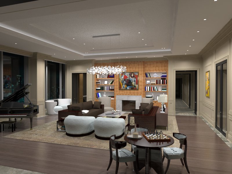
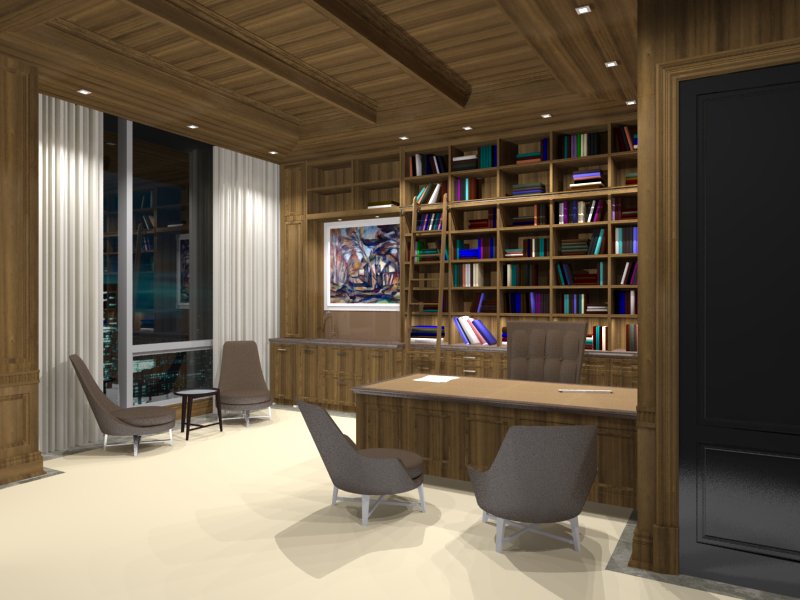
I'm not sure if I post here or if there is an alternate area where to post. I have two images where I need some criticism and advice on how to make them more photo-realistic. I'm not sure if it's a rendering setting OR if it's a photoshop strategy. IMO, it looks flat, kind of cartoonish, and needs more depth. All i can think of is Ambient Occlusion...
Please offer your expertise.


-
What render engine? looks like Podium.
-
-
One thing that always yells "render" to me is infinite depth of field. Reduce the DOF. In your first image, I would let the passageway on the right go out of focus a bit. Another thing is the repetition in the wood grain materials. That looks fake to me. I would use better materials for them.
Also things like the floating chair in the first image pretty much kills that on.
-
There are a few issues off the bat, repeating/tiling materials, materials that are not present see chair legs bottom image, or carpet looks flat, lighting looks hard causing hard shadows.
-
Thanks for your feedback, it's much appreciated.
Would the lighting be more of a Vray setting to cast darker shadows? Or would I need to do this in photoshop?
Hello! It looks like you're interested in this conversation, but you don't have an account yet.
Getting fed up of having to scroll through the same posts each visit? When you register for an account, you'll always come back to exactly where you were before, and choose to be notified of new replies (either via email, or push notification). You'll also be able to save bookmarks and upvote posts to show your appreciation to other community members.
With your input, this post could be even better 💗
Register LoginAdvertisement


