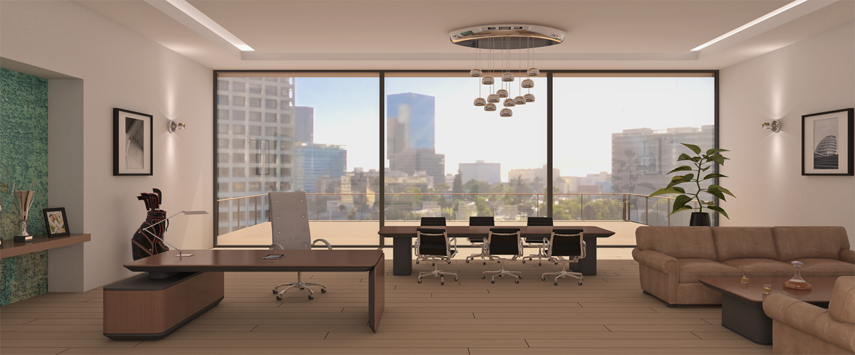
Apple office
-
The desk and tables are based on apple's ipad and iphone design. The couch is a free model provided by (forgot who). Rendered in vray 2400x1270px, 45min., used a second pass with AO only, some pp in ps. I'm still struggling with better quality of shadows (chairs at the big table). C&C welcome.
If any one has an idea of how to set up shadows to show them better, please talk to me or maybe should I just do them in ps?
cheers

-
A clean tidy render cmoreink, the only thing that bothers me is artificial lighting on a bright day with so much glass.
-
Can't help you with the shadows, but agree they need some more definition.
However, the overall scene is good and the photo match background is perfect.
-
Nice render. Regarding the contact shadows, have a look at this tutorial:
http://www.youtube.com/watch?feature=player_embedded&v=K-L5APsenhY
Around 5:25min it has a good solution to better the shadows for interior scenes.
Good luck!! -
@ chedda: thanks for your input and yes, I do agree with you on an artificial lighting in the scene. I'm still working on it and I'm trying to improve it, will post as soon as I'll be satisfied with it.
@ Bryan K: it's not a photo match, I used hdri image in vray and played with angles H/V to get it right.
@ jerisamui: thanks for the help
cheers
Hello! It looks like you're interested in this conversation, but you don't have an account yet.
Getting fed up of having to scroll through the same posts each visit? When you register for an account, you'll always come back to exactly where you were before, and choose to be notified of new replies (either via email, or push notification). You'll also be able to save bookmarks and upvote posts to show your appreciation to other community members.
With your input, this post could be even better 💗
Register LoginAdvertisement


