[WIP] Open-space kitchen
-
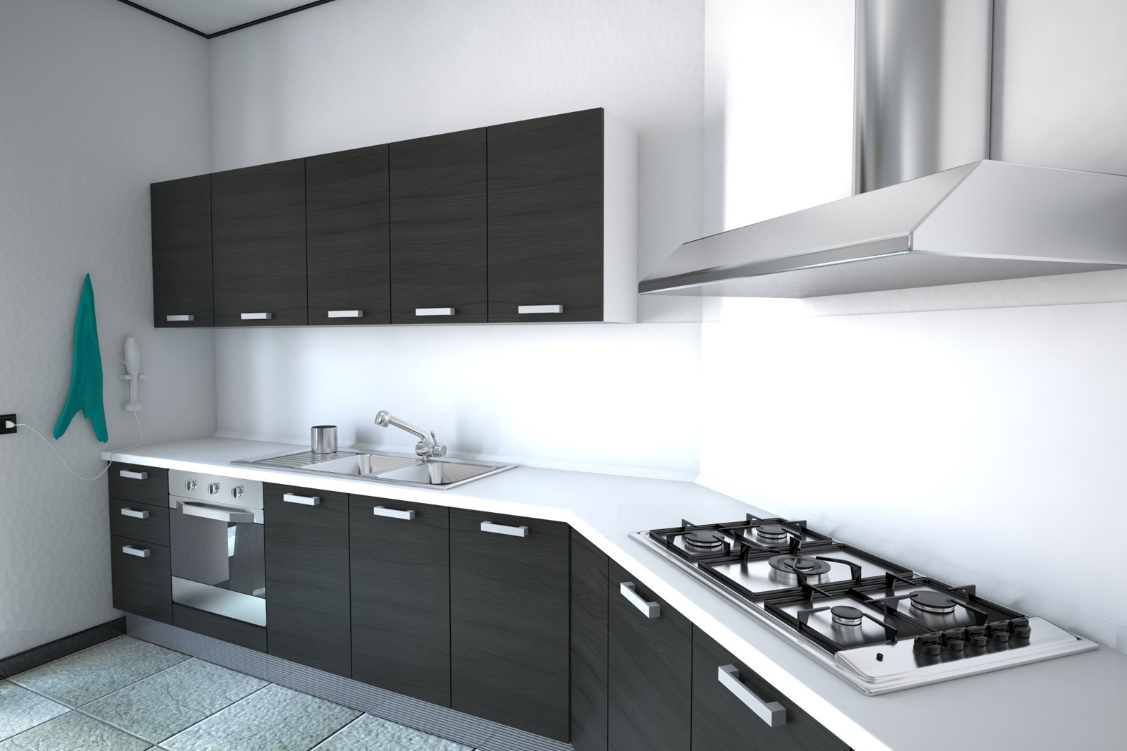
I'm trying to push a bit my skills with vray, still lot of work to do..
any critcism/suggestions from you vray masters would be very appreciate. in particular lighting-wise..
thank you.
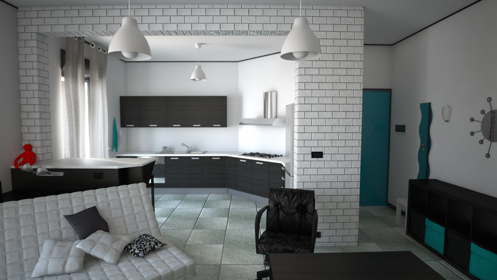
-
My personal taste would be to zoom in closer on the kitchen. The foreground is too distracting.
I would also have more light coming in through the windows.
Other than that, it's looking good!
-
thank you for your comment.
actually i'm preparing more than one scene, so there will be a couple of closeup for the kitchen itself..
also i'm planning to add some more details and objects here and there (and of course reduce the size of the white wall's bump ) and render some scenes with artificial lights.
i don't know about the lighting from windows..
but if i increase it, the white walls and flor near the windows look too washed out..
not 100% sure how to manage this..
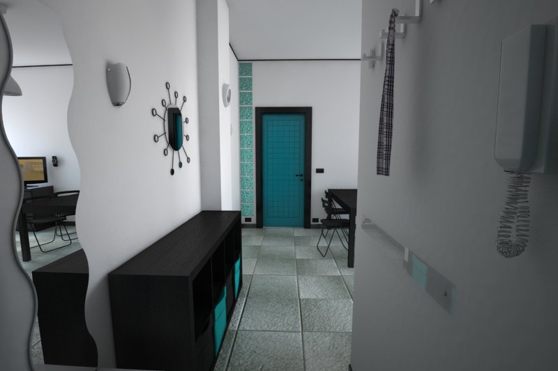
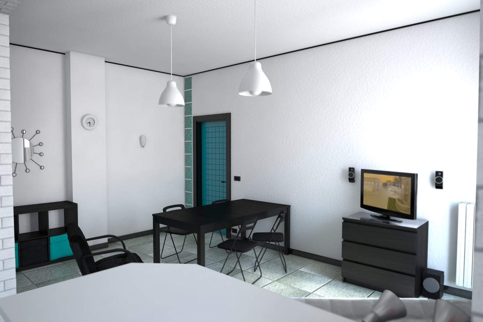
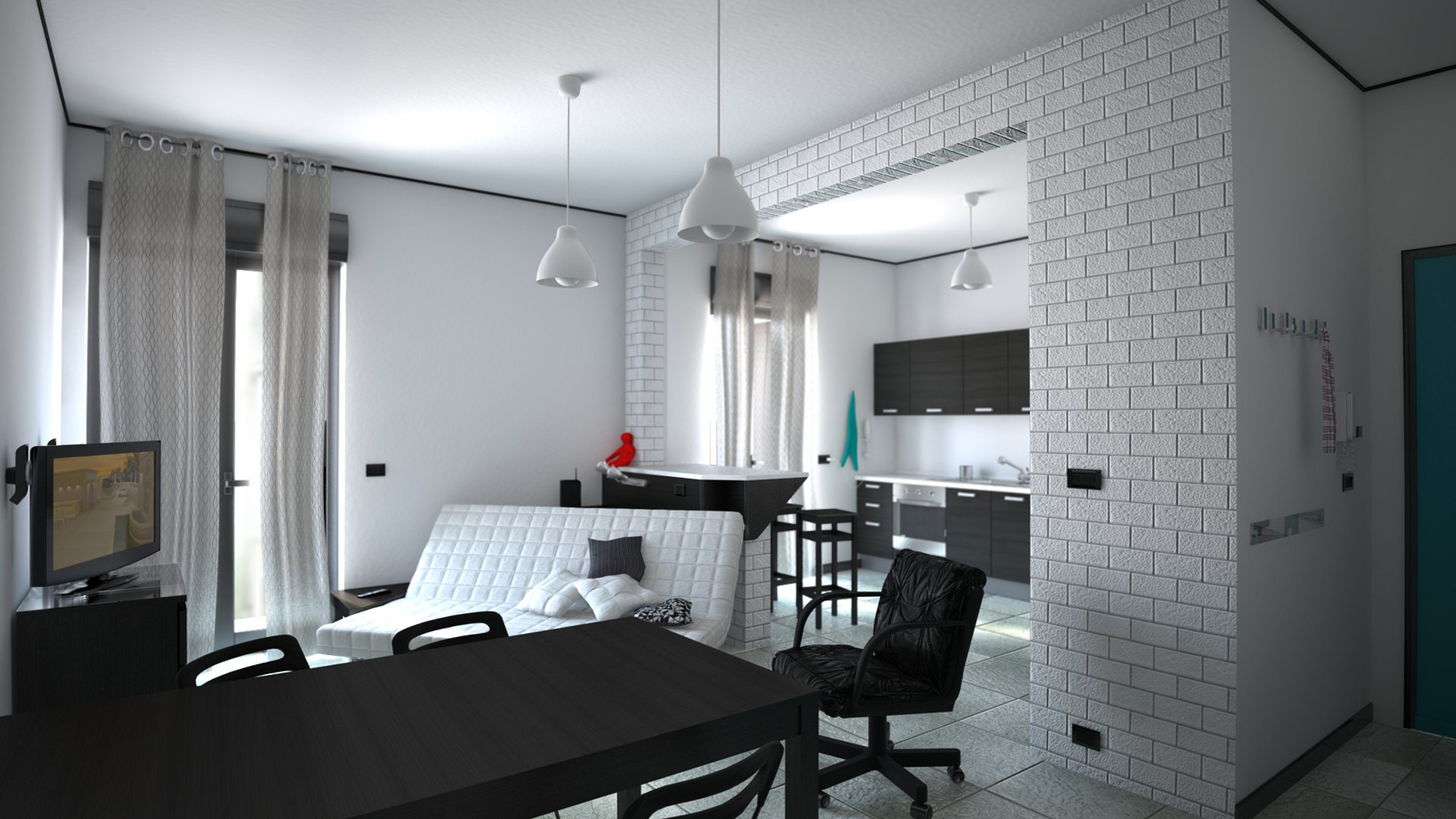
-
These are good looking renders indeed. Only two things attract my attention:
1 - work on lighting, try to give a color to the light that's coming through the windows. It's a bit too white right now.
2 - Try improving the floor material, it's not very realistic right now
other than that, nice job!!
-
grazie. i didn't think about give a color to the sunlight. maybe i can try to add little yellow. nice idea!
-
Oh! Those are better! Much better.
Hello! It looks like you're interested in this conversation, but you don't have an account yet.
Getting fed up of having to scroll through the same posts each visit? When you register for an account, you'll always come back to exactly where you were before, and choose to be notified of new replies (either via email, or push notification). You'll also be able to save bookmarks and upvote posts to show your appreciation to other community members.
With your input, this post could be even better 💗
Register LoginAdvertisement


