sketchucation logo sketchucation
    • Login
    โ„น๏ธ Licensed Extensions | FredoBatch, ElevationProfile, FredoSketch, LayOps, MatSim and Pic2Shape will require license from Sept 1st More Info

    Vertical space

    Scheduled Pinned Locked Moved Ideas Box & Board Issues
    21 Posts 8 Posters 7.9k Views 8 Watching
    Loading More Posts
    • Oldest to Newest
    • Newest to Oldest
    • Most Votes
    Reply
    • Reply as topic
    Log in to reply
    This topic has been deleted. Only users with topic management privileges can see it.
    • charly2008C Offline
      charly2008
      last edited by

      Why is there so much free vertical space at both sides?
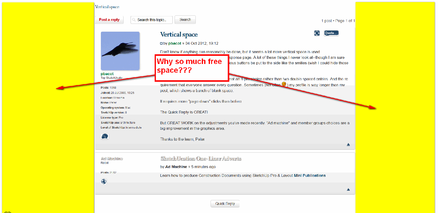

      2012-10-04_224215.png

      He who makes no mistakes, makes nothing

      1 Reply Last reply Reply Quote 0
      • pbacotP Offline
        pbacot
        last edited by

        @charly2008 said:

        Why is there so much free vertical space at both sides?

        Charly,

        Consider it a free bonus. ๐Ÿ˜‰

        I get a lot of space on the sides with my 30" screen but the forum fits about right on a 17" notebook. Your screen looks really wide. I was more concerned that in the screen space that they are using (probably based on an optimal width for a variety of screens) the vertical space between buttons and boxes seems high, and it would be nice if these things can be stacked more efficiently. For example there is a lot of space left over in the upper right on the page I am typing on.

        I have no idea what is possible with the SCF setup. Just commments.

        Peter

        MacOSX MojaveSketchUp Pro v19 Twilight v2 Thea v3 PowerCADD

        1 Reply Last reply Reply Quote 0
        • Rich O BrienR Online
          Rich O Brien Moderator
          last edited by

          @unknownuser said:

          Why is there so much free vertical space at both sides?

          To match the main site. Having a fluid width that adjusted to browser widthe didn't look right. We had it set for about a month.

          The main site couldn't be set to fluid width so we have a fixed width on both.

          Download the free D'oh Book for SketchUp ๐Ÿ“–

          1 Reply Last reply Reply Quote 0
          • GaieusG Offline
            Gaieus
            last edited by

            If you remember the old forums, the text width insidethe the forums width was also set to a relatively narrow, fixed width (some 640 pixels as far as I remember) for easier reading. Now the "full width" of the current posting area is about the same size so practically speaking, nothing has changed as you see the exact same width of text and attached images.

            What has in fact changed is that now external images embedded with the [img] tags are also resized to fit in the forum area (and are clickable to display full size). This is IMO an improvement though as previously some of these images broke out of the forum frame and forced the browser to side scrolling which is a very annoying thing.

            Gai...

            1 Reply Last reply Reply Quote 0
            • pbacotP Offline
              pbacot
              last edited by

              Well my comment is not so esoteric. I just find everything is spread out on the page and it takes scrolling and scrolling to make a post--except the Quick Reply : ).

              "Viewing Profile" is also an example of expansive layout needing a lot of scrolling and searching for what used to be right at the top.

              MacOSX MojaveSketchUp Pro v19 Twilight v2 Thea v3 PowerCADD

              1 Reply Last reply Reply Quote 0
              • GaieusG Offline
                Gaieus
                last edited by

                Yeah, the "View profile" page is something very exoticly spread. I was trying to tweak it today but to no avail.

                The other thing is the "Post Reply" page which would definitely profit something if I could find the way to append a "bookmark" to the "Post Reply" link (try this to see...)

                Gai...

                1 Reply Last reply Reply Quote 0
                • pbacotP Offline
                  pbacot
                  last edited by

                  Gai,
                  Yes that'd help, though you miss another chance to view the ad!

                  Peter

                  MacOSX MojaveSketchUp Pro v19 Twilight v2 Thea v3 PowerCADD

                  1 Reply Last reply Reply Quote 0
                  • GaieusG Offline
                    Gaieus
                    last edited by

                    OK, what about this link now? ๐Ÿ˜„

                    Gai...

                    1 Reply Last reply Reply Quote 0
                    • pbacotP Offline
                      pbacot
                      last edited by

                      Up to me? I'll take the first one!

                      MacOSX MojaveSketchUp Pro v19 Twilight v2 Thea v3 PowerCADD

                      1 Reply Last reply Reply Quote 0
                      • pbacotP Offline
                        pbacot
                        last edited by

                        I notice that on a 17" monitor (wide format laptop)(1280x800), Mac / Firefox, I need to scroll for the last bit to see the next page buttons (at the bottom of the page). Didn't ever see that before. This is sort of the opposite of the width issue noted above. Shouldn't most elements be within a standard window width? 15" or 17"? Especially navigation buttons? Just being helpful.... โ˜€Screen shot 2012-10-05 at 1.25.16 PM.png

                        MacOSX MojaveSketchUp Pro v19 Twilight v2 Thea v3 PowerCADD

                        1 Reply Last reply Reply Quote 0
                        • GaieusG Offline
                          Gaieus
                          last edited by

                          Didn't you incidentally zoom in? Press Ctrl+0 (zero) to zoom 100% on the website. The whole width is 960 pixels altogether so should fit on a 1200 something monitor.

                          Gai...

                          1 Reply Last reply Reply Quote 0
                          • BoxB Offline
                            Box
                            last edited by

                            It's a Mac Gai,, anything is possible.

                            1 Reply Last reply Reply Quote 0
                            • GaieusG Offline
                              Gaieus
                              last edited by

                              Well, Mac or not, 960 pixels (or 940 with 10 pixel margin on each side) is just 940 pixels.


                              940.png

                              Gai...

                              1 Reply Last reply Reply Quote 0
                              • wind-borneW Offline
                                wind-borne
                                last edited by

                                vertical space? 2 lines of post fill a screen ๐Ÿ˜ฒ


                                Screen Shot 2012-10-05 at 1.18.41 PM.png

                                "To read between the lines was easier than to follow the text."OSX 10.11.6

                                %(#BF80BF)[SU 8 pro

                                1 Reply Last reply Reply Quote 0
                                • EscapeArtistE Offline
                                  EscapeArtist
                                  last edited by

                                  I like the space. I have a 1920x1080 LCD and keeping everything in that nice little strip down the middle makes it easier to read. With web pages that go edge-to-edge I have to sit way back from the screen to see everything.

                                  1 Reply Last reply Reply Quote 0
                                  • pbacotP Offline
                                    pbacot
                                    last edited by

                                    That's not the space OP (I) was speaking of ๐Ÿ˜’

                                    I mean the waste of space (loose grouping of buttons, line spacing, extra features etc.) requiring much more scrolling down the page than before.

                                    I think you DO have to have sufficient side buffers so everyone doesn't have to scroll sideways on regular screens. (As a matter of fact, on a wide 17 in screen, I have to scroll sideways to use this forum now as well.)

                                    MacOSX MojaveSketchUp Pro v19 Twilight v2 Thea v3 PowerCADD

                                    1 Reply Last reply Reply Quote 0
                                    • EscapeArtistE Offline
                                      EscapeArtist
                                      last edited by

                                      That's true. I do find myself hunting for things that are a little spaced out, but I just blame myself for needing time to get used to the new layout.

                                      1 Reply Last reply Reply Quote 0
                                      • Dan RathbunD Offline
                                        Dan Rathbun
                                        last edited by

                                        @dan rathbun said:

                                        I also wonder why the forum Title needs to be so large it's uses 33px and has a 15px bottom margin, for a total of 48px in height.

                                        OK.. thanks Gai or Rich, I see someone added a specific CSS rule to remove the unneeded 15px bottom margin.

                                        Well 15px is a start for ya', Peter. ๐Ÿ˜„

                                        I'm not here much anymore.

                                        1 Reply Last reply Reply Quote 0
                                        • Rich O BrienR Online
                                          Rich O Brien Moderator
                                          last edited by

                                          Also try the Page Eraser Chrome Extension if space is an issue

                                          Download the free D'oh Book for SketchUp ๐Ÿ“–

                                          1 Reply Last reply Reply Quote 0
                                          • Dan RathbunD Offline
                                            Dan Rathbun
                                            last edited by

                                            Peter,

                                            Another option for saving vertical space and reducing scrolling, in topic pages:

                                            1. Goto User Control Panel

                                            2. Choose the Board preferences tab

                                            3. Select the Edit display options panel

                                            • Turn OFF signatures

                                            • Turn OFF avatars

                                            • (Your choice) to also turn OFF images in posts

                                            etc... click the Submit button, when done.

                                            I'm not here much anymore.

                                            1 Reply Last reply Reply Quote 0
                                            • 1
                                            • 2
                                            • 2 / 2
                                            • First post
                                              Last post
                                            Buy SketchPlus
                                            Buy SUbD
                                            Buy WrapR
                                            Buy eBook
                                            Buy Modelur
                                            Buy Vertex Tools
                                            Buy SketchCuisine
                                            Buy FormFonts

                                            Advertisement