Tropical
-
Nice photograph, David.
-
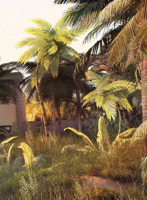
The grass was done using the instancing tool in Thea and brushed around the landscape.The post produced images have additional supplemental grass added in photoshop.
Here are 2 more images,the first from a different vantage point and the second a crop of the first showing the detail at 1:1 scale as the image was reduced in size for the forum.
The light in the first image was accentuated on the left of middle ground to suggest rays of light coming from the low sun.

-
Wow
-
Where is it? I am on my way to buy the ticket now.
-
Very beautiful. I usually paint landscapes. I am gearing up to do my first 3D lanscape and this scene is very inspirational. Can you tell where you got those palm trees please? And can you give me advise on how to incorporate a natural background. I'm using Kerkythea right now but I plan on buying Thea really soon. Thanks.
-
-
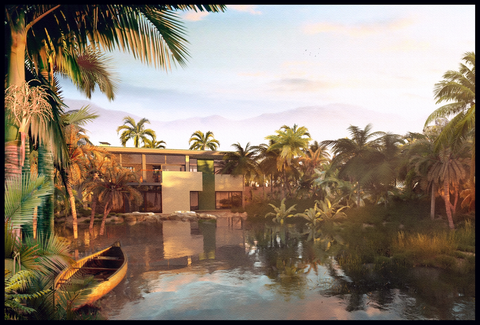
One more view with more colour saturation than the last couple.
-
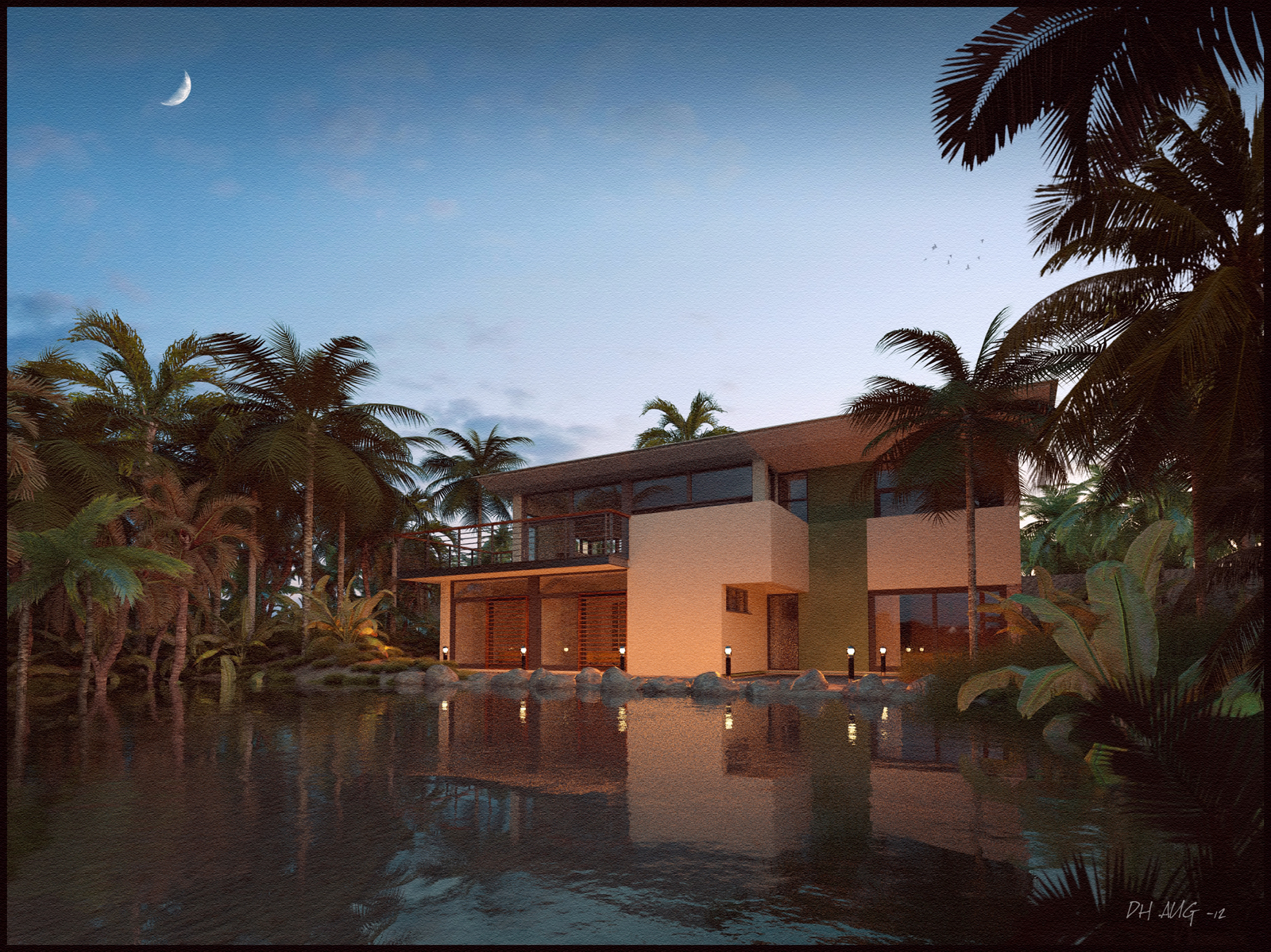
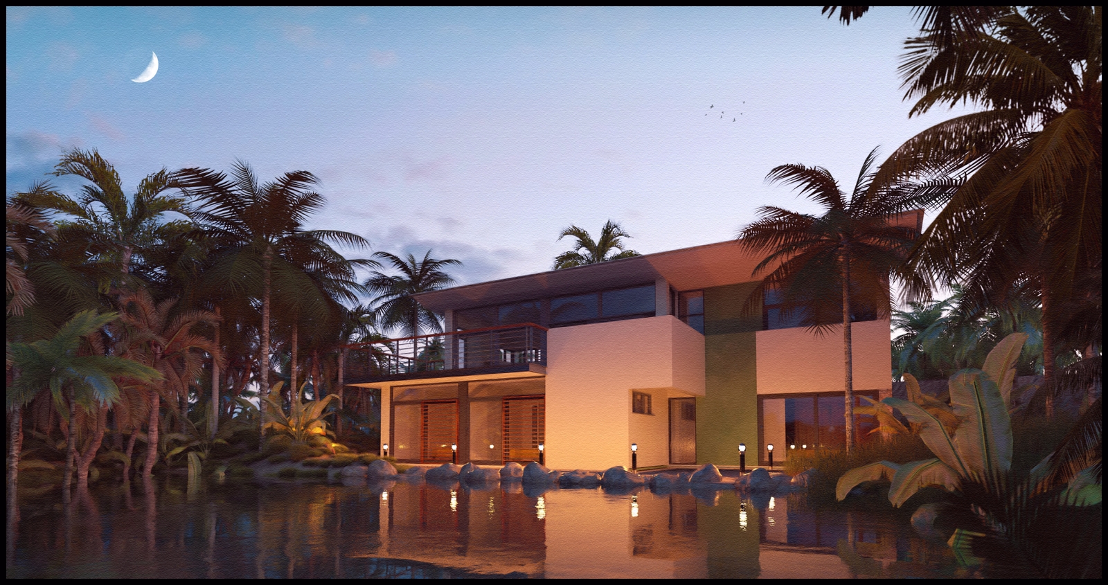
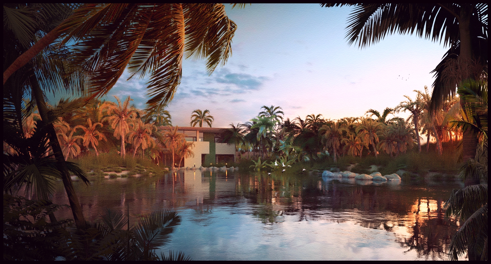
A dusk shot,again rendered in Thea and post proccessed in photoshop.
[EDIT]
I have also attached a cropped version with some slightly different colour tones(more purples and reds) but also a more rectangular proportion which I think works better for this image.The second image is also less grainy as it was from a thea render that was allowed to render for longer,thereby reducing the amount of grain in the image.
-
One more with some saturated colours and quite a high contrast
-
Looks like something done with VUE.
Very nice. -
Beautiful work!
 I really like the grass, although I've never cared for palm trees (they kept stationing me in Fla and I got sick of them, I like trees that provide lots of nice shade. I loved the big old Banyon trees down there, with all the Spanish Moss hanging down)
 -
That's it I'm over it! Not looking at your posts anymore! Every freakin time I just get depressed - 1. I want to visit your scenes and 2. I feel like a monkey's arse as a render artist!
Hello! It looks like you're interested in this conversation, but you don't have an account yet.
Getting fed up of having to scroll through the same posts each visit? When you register for an account, you'll always come back to exactly where you were before, and choose to be notified of new replies (either via email, or push notification). You'll also be able to save bookmarks and upvote posts to show your appreciation to other community members.
With your input, this post could be even better 💗
Register LoginAdvertisement


