A commercial and housing architecture project
-
hi ... it's my firs post in the gallery section ...
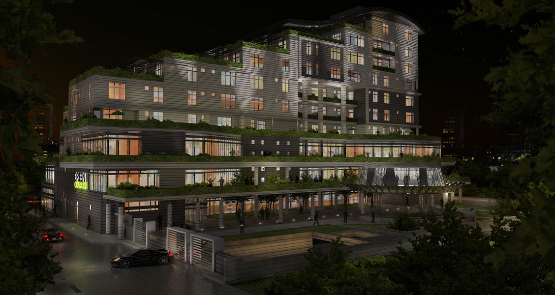
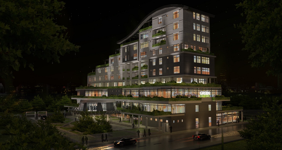
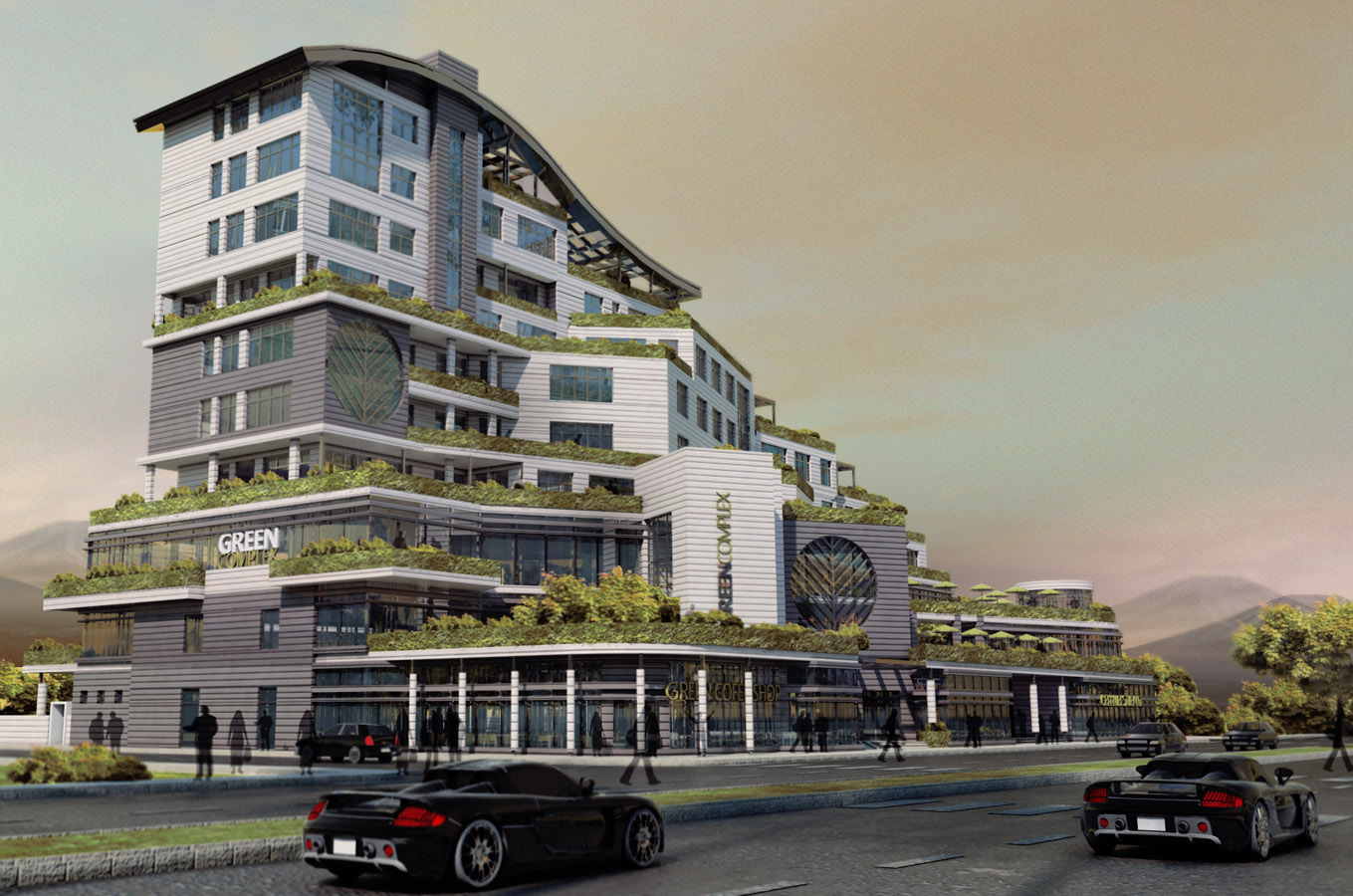
these works were be rendered 6 mounts ago .. VRAY renderer .. post prossesing by photoshop
...they are not my best works ... just a above normal work ....it doesn't have perfect texturing nor reflection - bump settings .. but I think its lightening is not so bad ... I will welcome your comments , dear SCF users ..

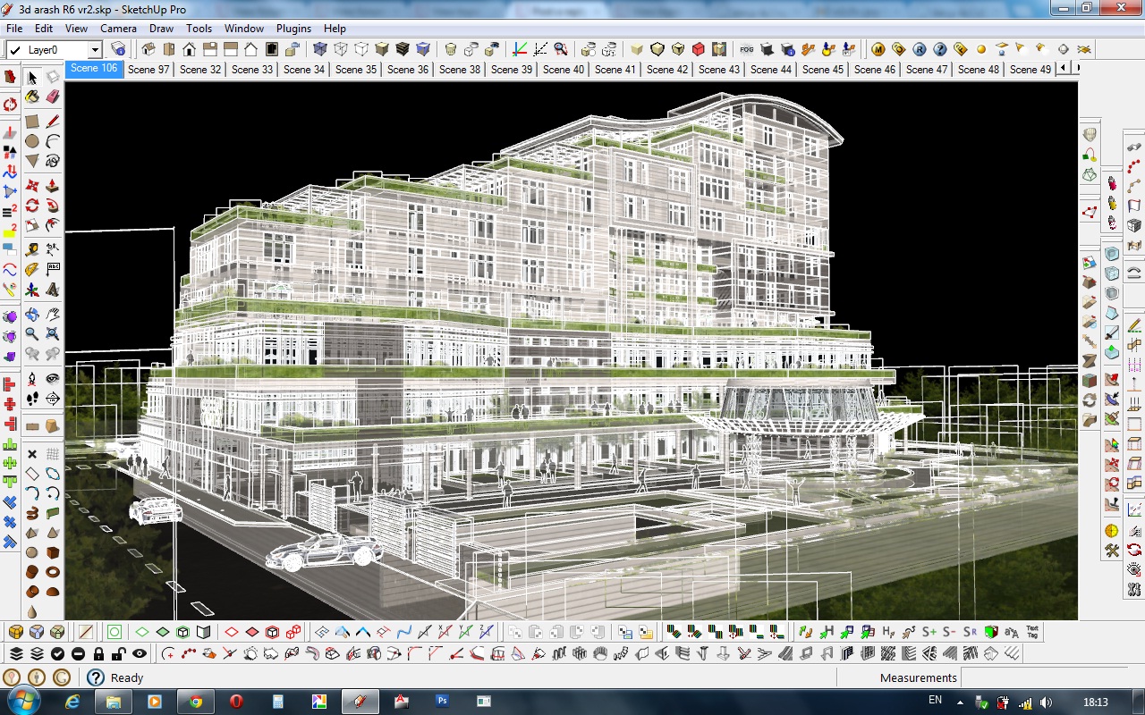
In the night views , I added a face with emmesive bitmap textured material beside glass of windows . a great time server with OK visual result ( not perfect )
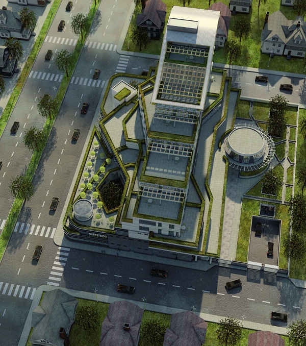
.. I also made some faces above model ( long distance above it ) to simulate shadows of clouds in bird-eye render
night
day
areal view ( bird's eye )
-
Nicely done though the Carrera GT's give me a green complex.
-
Some nice work. How long did tah project take?
-
i like it too...but the carrera gt's are really disturbing. first in front of a so called green complex and second that they are really rare on the streets, and then two at one spot?

-
thanks a lot ... this is not my own design ,.. I just made the model and rendering ... modeling takes 1-2 days .. and each rendering took about 0:30 for lightening ,etc and about 2 hrs of render prosses on my 4 core PC .. post prossesing ( photoshop ) was took 0:30 hrs on first night render and about 0:05 for outher night render besouse it was just a cloning ...
and there is a question : what's meaning of " carrera gt's " ? ( i'm not a native English speaker and I couldn't find the meaning in dictionary ) . if you mean that it's not a Ecotech design nor environment friendly design , I'm 100% agree with you ...
-
Very nice renderings. I like the use of emmissive materials. I agree it really helps for large and repetitive areas. Your colors and views are very nicely done, I like how the green foliage looks in your overhead view.
@the.pjt said:
and there is a question : what's meaning of " carrera gt's " ?
The black sports car in your renderings is very distracting, especially repeated. Maybe some Toyota Prius' would be more in keeping and less distracting.
-
further explanation: "carrera gt" is the model name of a porsche sportscar.
 and as it's price is around 500.000 $ it is not that often see on the roads.
 -
aha ..... he he he ..
 .. tanks for learning me the model of this car ...
you now , having a sport car is my wish ... and because I never have seen one of them in real word .. so used that car ...
but yes .. repeating one car is not so good .. we use different cars in real word ... but we use same component in unreal word to reduce the size of this world !!!!
 but I could change its colors randomly in Photoshop ...
and it could be better if I have used PNG people instead of shitelhouse ... but .. the texture were reached to it's maximum amount ...
I will post some of my other works .. maybe better 3D and renders ...
-
Very nice!
Better next time? This is great this time!
-
nicely done Pejman
my only critic from architectural view, is on strange composition of different styles.
I also like your soft ,pastel, colors at day render. -
thanks for all of your comments from all of you ...
@ MAJID : Architecture styles , architecture design ... I'm 100% agree with you ... I just made the 3D model and visual parts ...but you know .. I know the designer , he is one of my freinds .. the planing part of this projects took so many time .. about 3 or 4 mounts .. there were 56 type of residental plans .. and each floor had diffrent plan types .. he could limit planning and he should pay more attention to forms and compositions ... but .. it was his choise ...
AND..
dear Scatchucators :
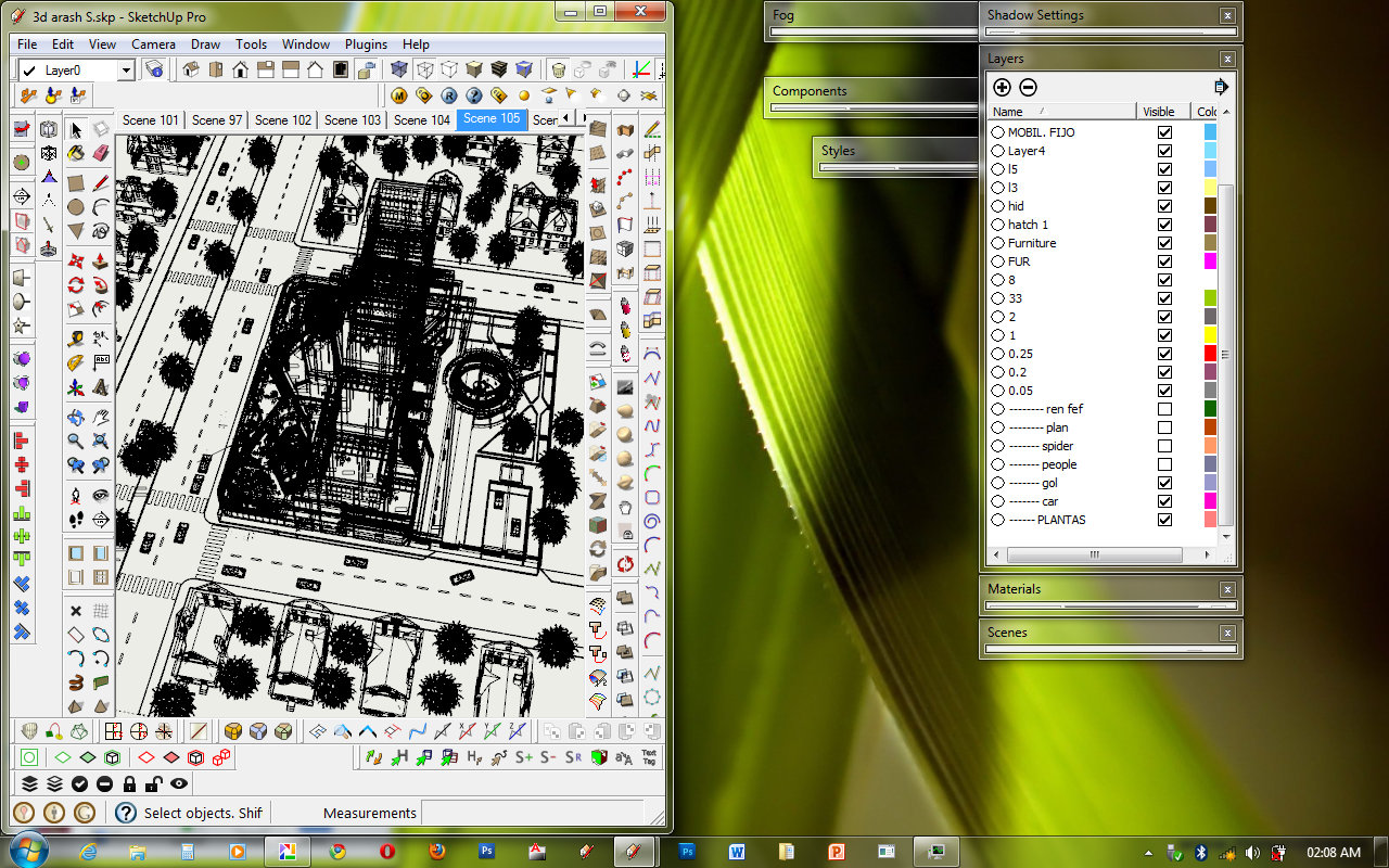
there is a surprice : I'm going to post some behind scene of night shots ...Here you are :

-
[quote="the.pjt"]it could be better if I have used PNG people instead of shitelhouse ... quote]
I don't think so - sometimes adding 'real' people can be more distracting, (not to mention more complicated styling them in a suitable way for the scene) and afterall we're supposed to be studying the architecture. I prefer to use 'shadow' people in my visualisations.
PS - like the 'cloud' effect
-
Great looking images, Pejman. Thanks for sharing
Hello! It looks like you're interested in this conversation, but you don't have an account yet.
Getting fed up of having to scroll through the same posts each visit? When you register for an account, you'll always come back to exactly where you were before, and choose to be notified of new replies (either via email, or push notification). You'll also be able to save bookmarks and upvote posts to show your appreciation to other community members.
With your input, this post could be even better 💗
Register LoginAdvertisement


