CONCEPT_CAR_LADYBUG_REVISITED
-
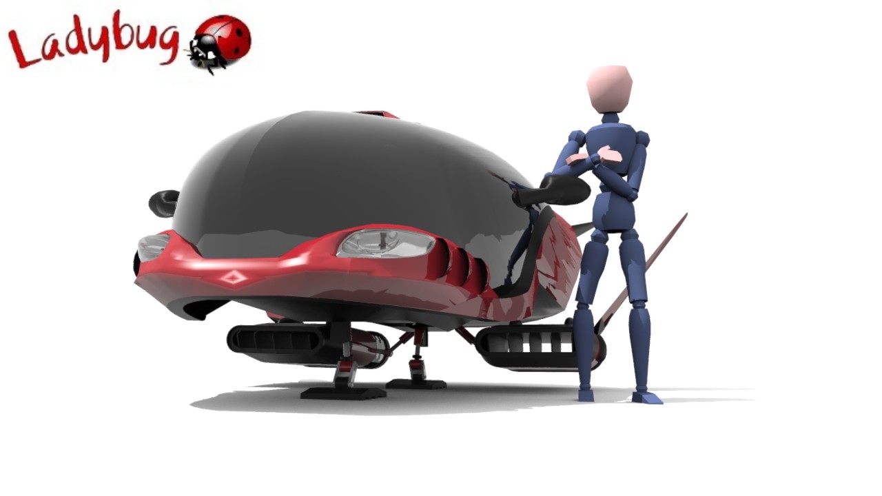
There's really bad banding in those images. Especially the last one around the cockpit. Pump up the render quality to do it justice.
Is the top of the cockpit the bonnet of a mustang?
-
@rich o brien said:
There's really bad banding in those images. Especially the last one around the cockpit. Pump up the render quality to do it justice.
Is the top of the cockpit the bonnet of a mustang?
Iv the renders at low quality for fast renders, will post better renders soon, spot on with the mustang, I copied the design for the top, mustang is my all time dream car, i didnt get it exactly the same but close, its a cross between a mustang and viper, cars i love, well spotted Rich

-
Finally this WIP is comming to an end, ill add this rendered image and will post up a few in the coming week, i must say im not normally a SCI FI modeller but i really enjoyed doing this model, it was a challenge to rig the trusters and landing gear for movement and i dont think it will be my last SCI Fi model either, What i have learnt from this is the beauty of imagination and the freedom to do anything in Sc Fi modelling, there are no set rule, no restrictions, again i will post more in the coming week but heres an image to view of the finished Ladybug concept.

-
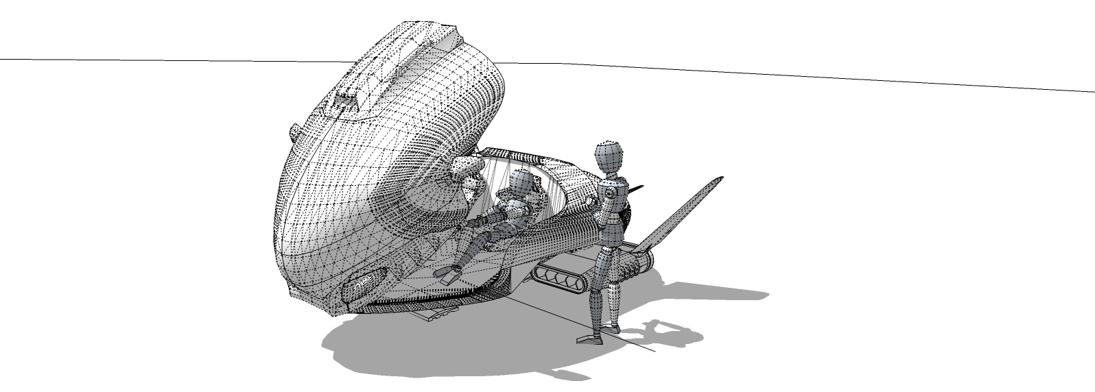
Can I see native SU in Monochrome with hidden geometry on?
There's some weird reflections going on. Is that ShaderLight cranked to the max?
-
Quility is maxed out
-
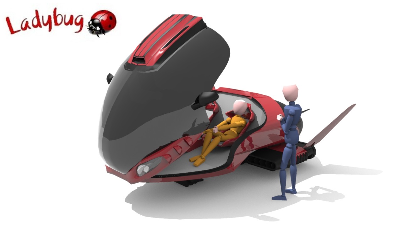
Does it allow the use of HDR images for lighting?
Or background plates?
-
@rich o brien said:
Does it allow the use of HDR images for lighting?
Or background plates?
It allows both Rich, just don't have a good Hdr to suit the theme

-
Try DeviantArt. There's some nice studio HDR images there

-
@rich o brien said:
Try DeviantArt. There's some nice studio HDR images there

Will do, cheers for the tip

-
-
Fun!
Looking good!
-
-
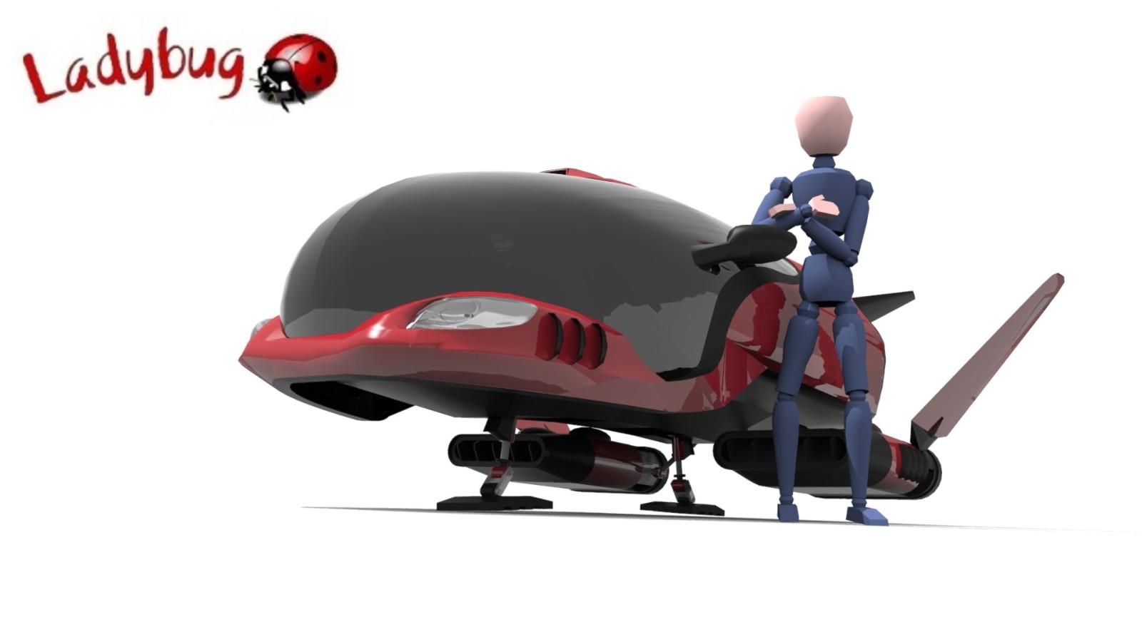
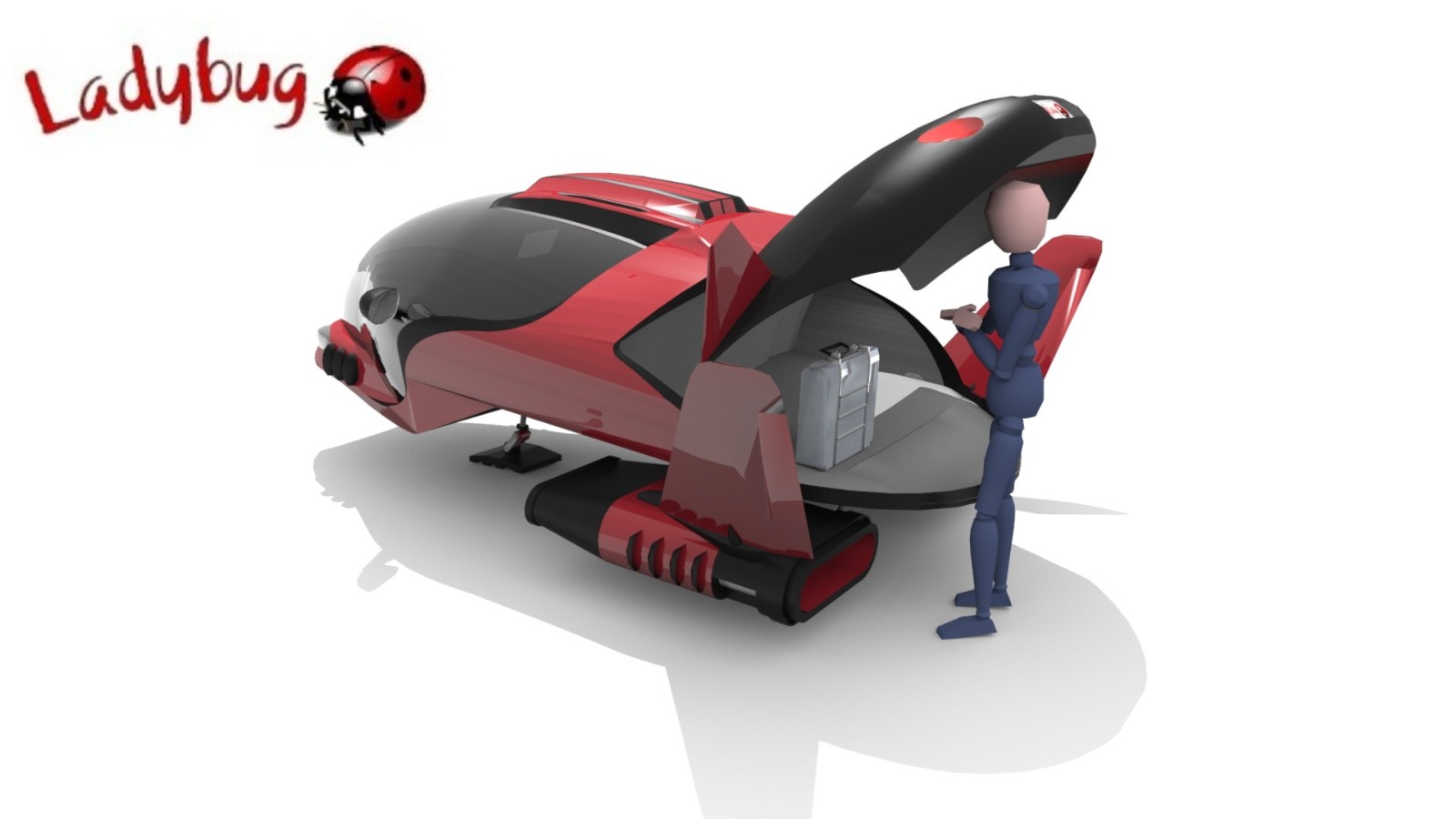
-
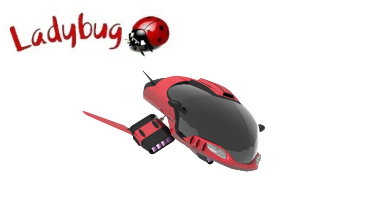
This wa my first SCI FI model but iv learnt alot since this and would like to revisit this concept again and start from the beginning, there were a few things i wasnt happy about with the end result and most of the topology was very much bad, so heres a start and hopefully i will update this each day i work on it comparing the topology of the old and new, maybe some others can learn from my previous mistakes

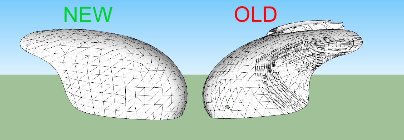
Im sure the image shows how the topology is very bad on the old model, the new 1 is much better and cleaner, but not finished, but you can see the difference already

-
Nice, and what are the differences in technique that give you the new topology?
-
A lot more awareness of managing the topology would be the main approach but tools Ill be using would be TTs vertex tools and to smoothen it out ill be using artisans SDS, Ill be making a high detailed and low poly version, I would like to apply the low poly version to a game made in unity to be played on mobile devices, ill also be paying alot more attention to how the thrusters will animate so it looks and works more effectively
-
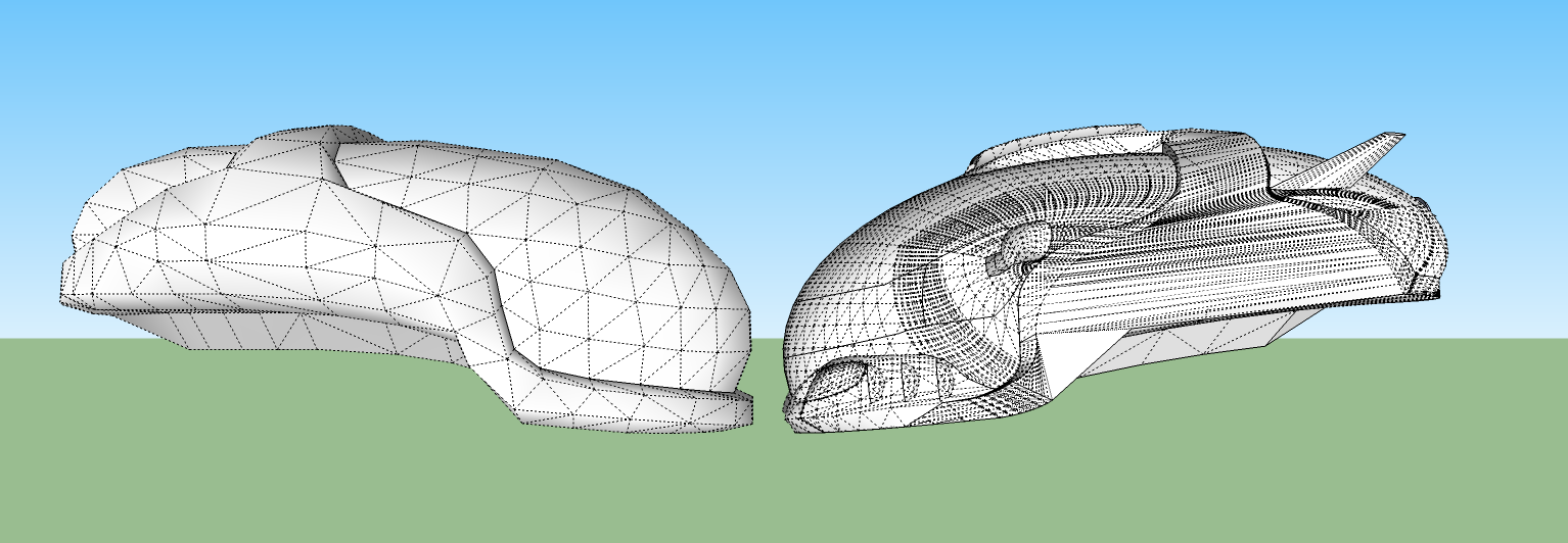
It just goes to show you sometimes its better to model from the start rather than trying to fix the original model, huge difference in topology here

-
Nice concept!
Who knows...Maybe in a few more years we can build this type of machines for the public.
-
Well there is something similar, don't know if you have ever heard of the mullor skycar, think that's what it's called, if you dig deep enough on YouTube you will find some test flights but height restrictions due to being a prototype, mine is just a further into the future version
-
Guess we are closer than I thought!
Hello! It looks like you're interested in this conversation, but you don't have an account yet.
Getting fed up of having to scroll through the same posts each visit? When you register for an account, you'll always come back to exactly where you were before, and choose to be notified of new replies (either via email, or push notification). You'll also be able to save bookmarks and upvote posts to show your appreciation to other community members.
With your input, this post could be even better 💗
Register LoginAdvertisement


