CONCEPT_CAR_LADYBUG_REVISITED
-
@rich o brien said:
What render engine is that? Do you AA turned off?
Shaderlight Rich, AA turned off??
-
Anti-Aliasing the edges are very choppy.
-
Dont see an option for that Rich, have you an idea where i can fix that in shaderlight?
-
Not a clue. Never used it. Does it have some type of choice of render options. Low-Medium-High or something to that effect?
The images look weirdly pixelated
-
@hussel hann said:
Hi there...
One of the reason I am always here in SCF is to see your continuous masterpiece, for my inspiration
My comment would be...
I think a ladybug should be more red than black. About 2/3 are red and the other 1/3 are black in terms of body color proportion. Imagine that the windshield is red, but then you will have a ladybug that fly backwards.

Two large black spots on each side of a ladybug wing that may be represent by turn signal lights, or anything might add more "ladybug looks" into the model. Side mirror more to the front wlll look like the ladybug antennas.Cheers Hussel for the praise, lol, i dont want to make it look entirely like a ladybug/ladybird, i just wanted to give it a shape that resembles one, also iv a logo for the side im working on right now which is a ladybug on a spot, if i made it look too like a ladybug im sure it wold take away from the design, after all no one wants a car with black dots all around it,

-
Rez is set low enough, 720 x 405 (16:9), iv the quality set at medium, maybe thats why i guess, i wanted to get fast renders for the project, ill do another with high settings and post it up shortly

-
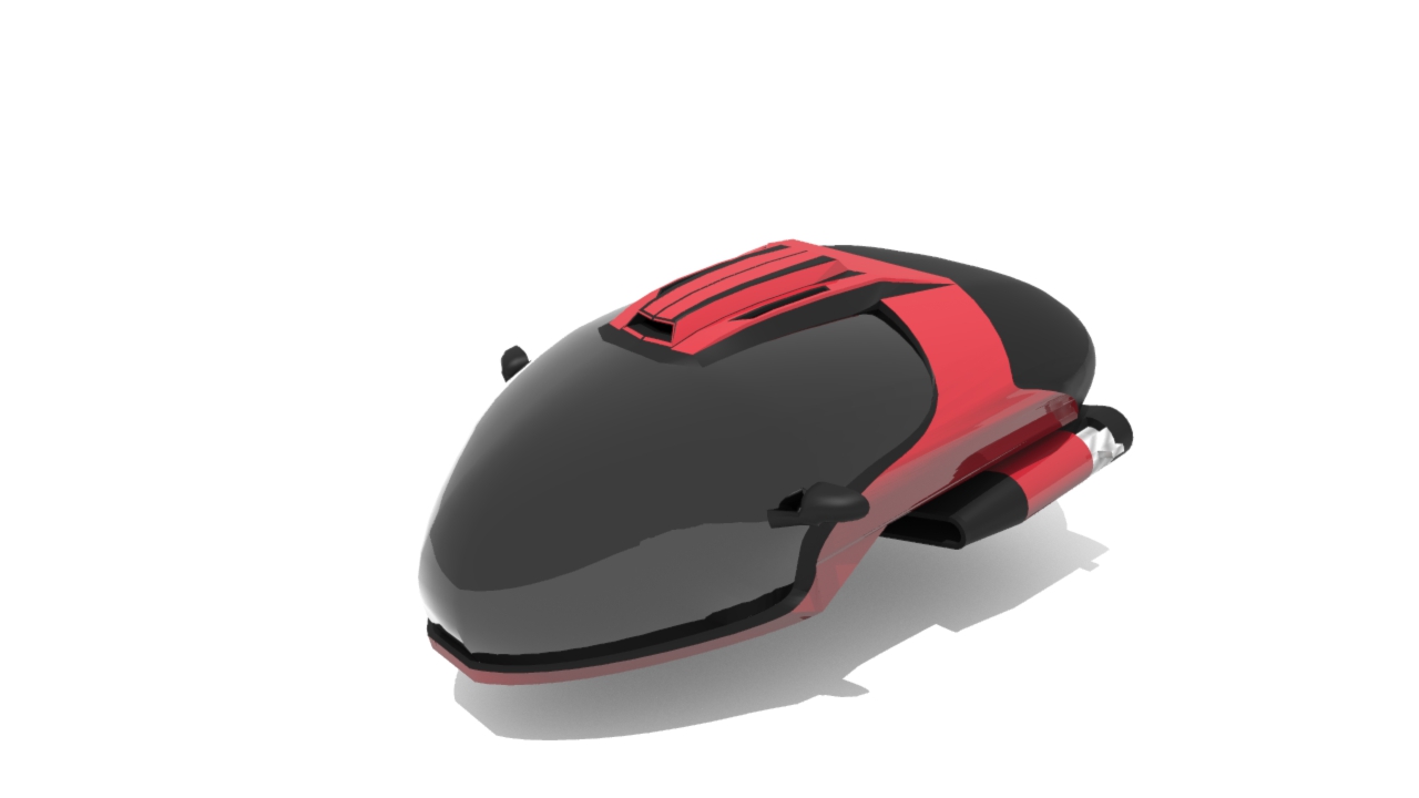
Ok heres a better quility render, it could be better but im only looking for fast renders at the moment.
You may notice there is some added to the under rear part of the ladybug, this is the future flyable version, not finished as there are still more to be added.
-
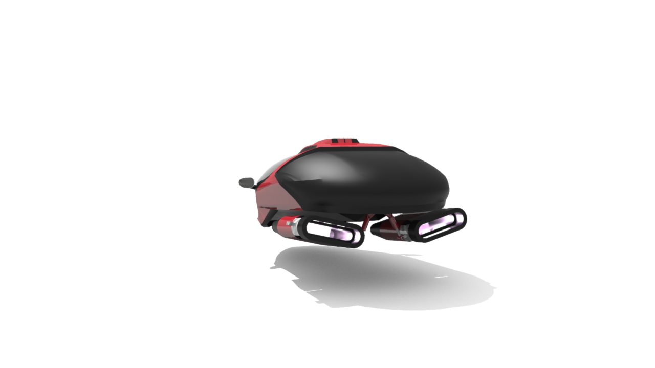
Heres another rear image with the trusters attached, going to start on light fixtures next.
-
More updates, iv done most of the interior and still more to be done, started on the rear lights, you will notice the back break light on the top which is lit up, the 2 lower lights need to be finished yet but have started them as you can see, and then ill start on the front lights once their done, not sure how ill do the front lights let but i have a few ideas,

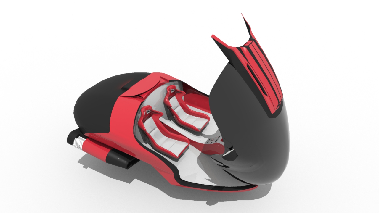
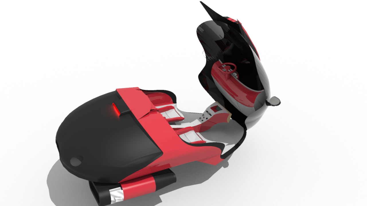
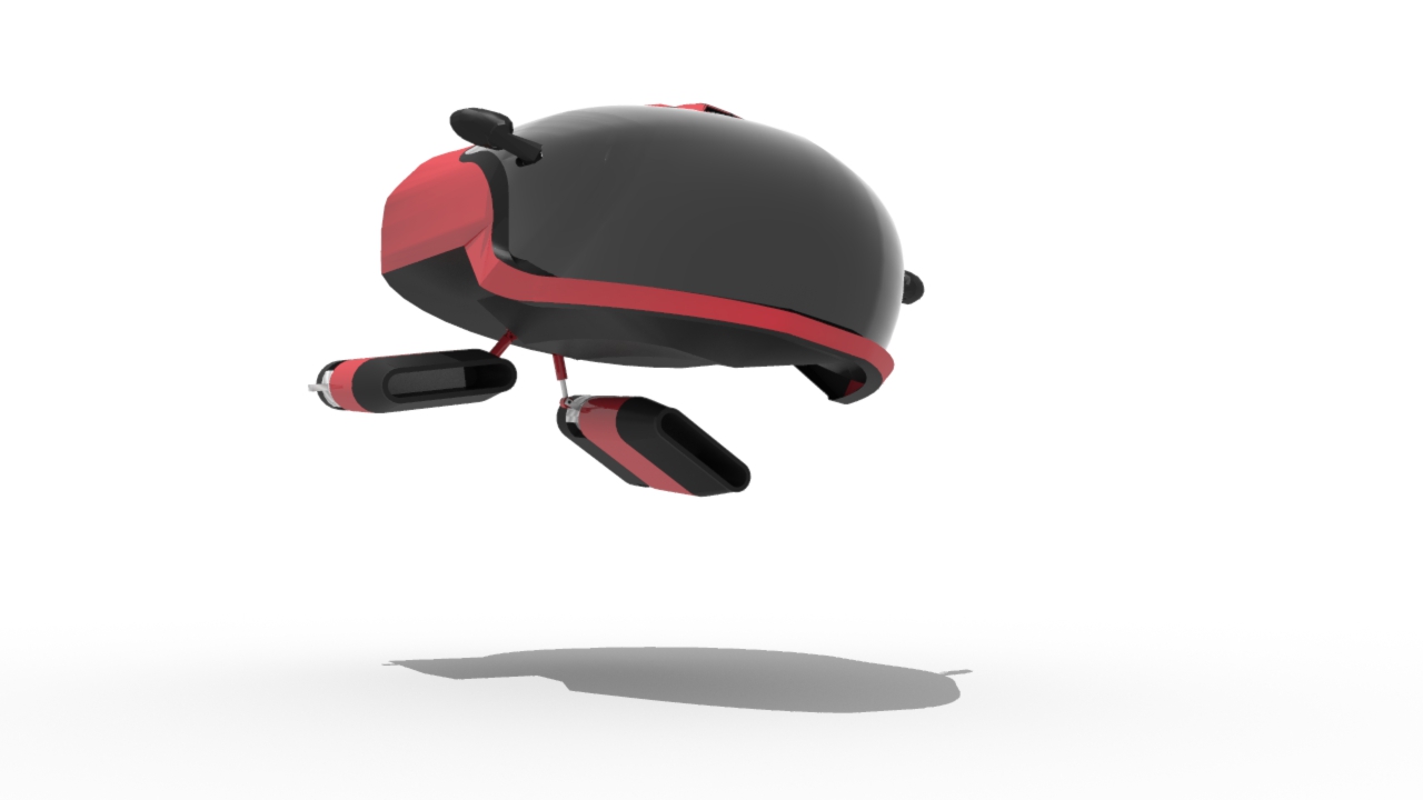
Anyone know of a low poly dummy i can use to illistrate 2 people sitting inside???
-
@iichiversii said:
@hussel hann said:
Hi there...
One of the reason I am always here in SCF is to see your continuous masterpiece, for my inspiration
My comment would be...
I think a ladybug should be more red than black. About 2/3 are red and the other 1/3 are black in terms of body color proportion. Imagine that the windshield is red, but then you will have a ladybug that fly backwards.

Two large black spots on each side of a ladybug wing that may be represent by turn signal lights, or anything might add more "ladybug looks" into the model. Side mirror more to the front wlll look like the ladybug antennas.Cheers Hussel for the praise, lol, i dont want to make it look entirely like a ladybug/ladybird, i just wanted to give it a shape that resembles one, also iv a logo for the side im working on right now which is a ladybug on a spot, if i made it look too like a ladybug im sure it wold take away from the design, after all no one wants a car with black dots all around it,

on second thought...yeah...you're totally right.

-
@unknownuser said:
on second thought...yeah...you're totally right.
I'm glad you agree Hussel, too much of a ladybug look would make this unattractive to the male of our species, lol, the logo for the side which I will reveal close to the end design will have a beastie ladybug look to it, it will all be revealed soon, not forgetting the other concepts I'm working on with the same design, for example wheels for a road version and so on, also the future fly able version you see now isn't finished, short wings have to be added to the thrusters, also the cockpit I want to redo so only the glass opens up leaving the upper air intake attached to the main body, I hope to get the lights finished first and to finish it all off I'll be posting an animation with all the finished designs, a bit more work to be done.

-
All rendered images are low Rez, I'm looking for quick renders to keep you up to date on my project, will be adding high Rez images and an animation once the project is near end, would love to hear feedback or advice on this concept, this is my first future car concept and I'm only new to the science fiction side of modelling, hope ye like it....

-
Father and son inspiration, happy fathers day

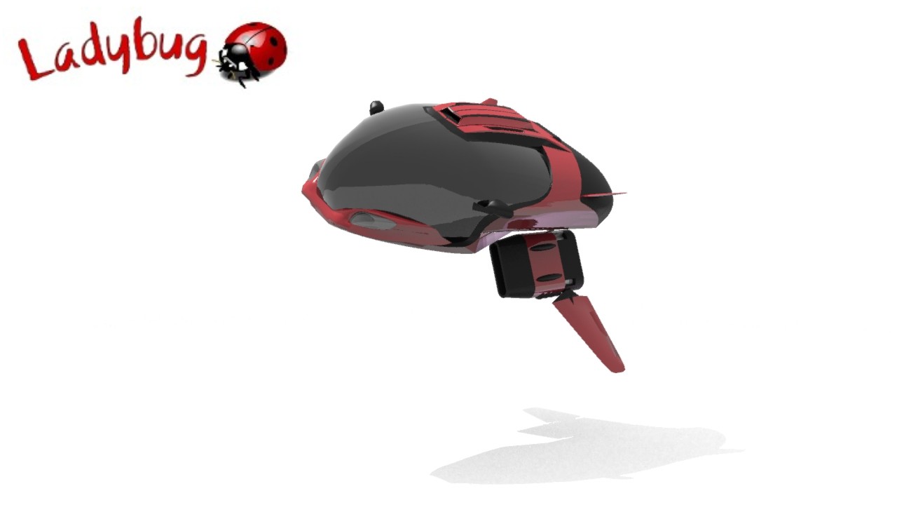
Almost there, a few finishing touches and it should be finished in the next 24hrs

-
a few more changes, still not finished, a few more changes, added a few figures to give a sense of scale

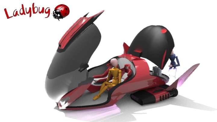
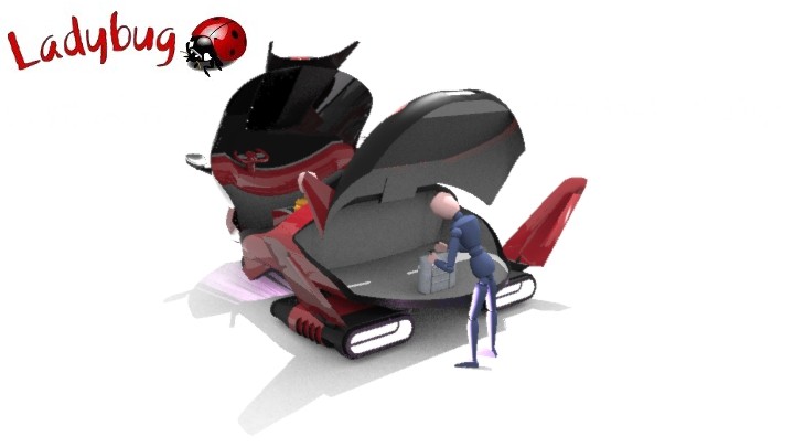
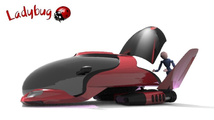
A Father and Son inspiration...

-
There's really bad banding in those images. Especially the last one around the cockpit. Pump up the render quality to do it justice.
Is the top of the cockpit the bonnet of a mustang?
-
@rich o brien said:
There's really bad banding in those images. Especially the last one around the cockpit. Pump up the render quality to do it justice.
Is the top of the cockpit the bonnet of a mustang?
Iv the renders at low quality for fast renders, will post better renders soon, spot on with the mustang, I copied the design for the top, mustang is my all time dream car, i didnt get it exactly the same but close, its a cross between a mustang and viper, cars i love, well spotted Rich

-
Finally this WIP is comming to an end, ill add this rendered image and will post up a few in the coming week, i must say im not normally a SCI FI modeller but i really enjoyed doing this model, it was a challenge to rig the trusters and landing gear for movement and i dont think it will be my last SCI Fi model either, What i have learnt from this is the beauty of imagination and the freedom to do anything in Sc Fi modelling, there are no set rule, no restrictions, again i will post more in the coming week but heres an image to view of the finished Ladybug concept.

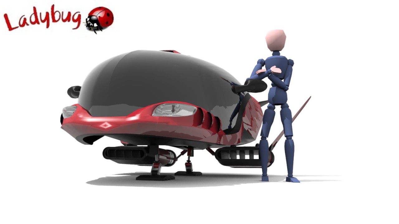
-
Can I see native SU in Monochrome with hidden geometry on?
There's some weird reflections going on. Is that ShaderLight cranked to the max?
-
Quility is maxed out
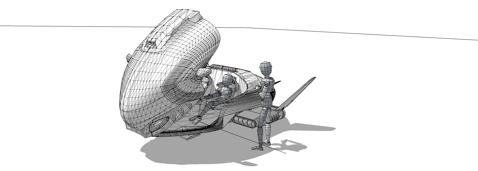
-
Does it allow the use of HDR images for lighting?
Or background plates?
Hello! It looks like you're interested in this conversation, but you don't have an account yet.
Getting fed up of having to scroll through the same posts each visit? When you register for an account, you'll always come back to exactly where you were before, and choose to be notified of new replies (either via email, or push notification). You'll also be able to save bookmarks and upvote posts to show your appreciation to other community members.
With your input, this post could be even better 💗
Register LoginAdvertisement


