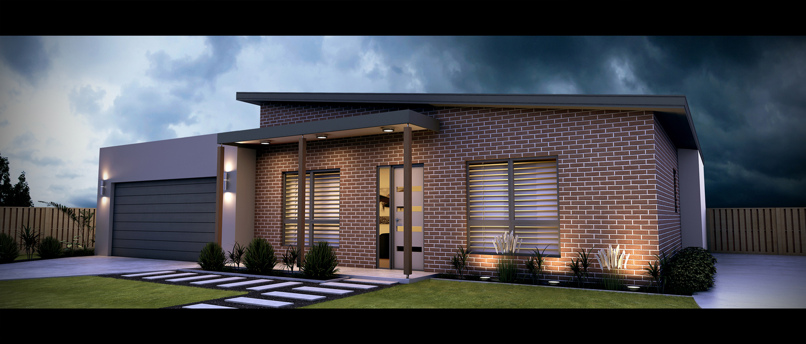
External render for client
-
Hi all - just thought id share a render i did for a client... would like to know your thoughts
using SU and vray + PS

-
You sure got a purty rendrin'...I likes it!
Wondering about the paved area on the right - is it a patio? If it is, you might want to add some furniture. It seems like a lot of empty paving.
The brick on the front facade needs to be adjusted to the right - you have vertical mortar joints on the corner (kudos for getting the coursing lined up with the window/door heads, though). You might also think about adding sills to those windows.
-
Looks great especially the saturation and balance of colour.
-
Nice dramatic tonality to this image. Great work. Perhaps the sky could be a bit more blue and the lights a bit more yellow to push the drama factor even further. Overall...great image. Agreed with the defining of the space on the right.
-
thanks for the feedback guys - appreciated

-
nice render ... ^^
-
Very nice, I like the moodiness of the sky, good for contrast with the subject, makes it stand out. A few details, but others have picked them up. Nothing that jumps out though. Hope your client likes it.
-
Very nice and very clean.
The sky might work better if it was flipped horizontally,that way you would have the dark clouds accentuated against the 2 outside lights.It would also pick up the reflected light on the right hand gable which seems to suggest the brightest part of the sky is to the right.
Hello! It looks like you're interested in this conversation, but you don't have an account yet.
Getting fed up of having to scroll through the same posts each visit? When you register for an account, you'll always come back to exactly where you were before, and choose to be notified of new replies (either via email, or push notification). You'll also be able to save bookmarks and upvote posts to show your appreciation to other community members.
With your input, this post could be even better 💗
Register LoginAdvertisement


