Living Room WIP
-
Great start
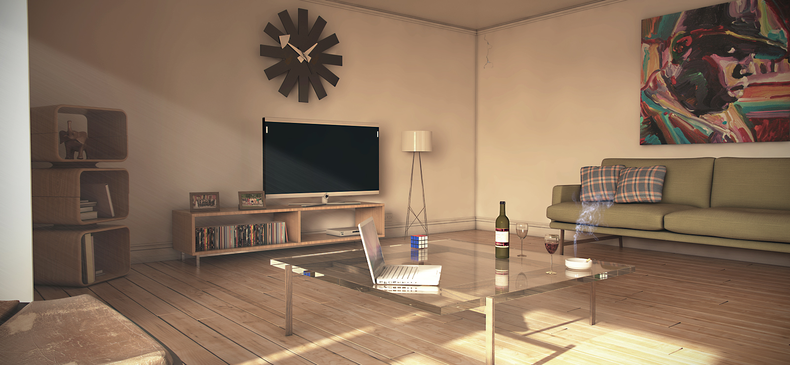
I think your lighting looks spot on. I would reduce the AO, I think its a bit heavy. In the corner of the room you can see a defined smudge course by the AO. This should be more subtle.Where did you get the curtain model. It looks fantastic.
Look forward to seeing your creation with textures.
-
Yeah, great start. The floor looks great, the amount of reflection is spot on! For soft shadows, make the sun size bigger (by default is 1, so make it @ 4 or so). In my opinion, the lighting is just a bit low, and I think it will be darker after applying all the textures. You could use some rect. lights in windows as sky portals, if necessary.
Cheers! -
Holmes 1977, thank you for commenting. I am not 100% sure where the curtain model came from, I have had it a while. But best bet would be the archive3d website. Yer AO probably should be more defined, I usually render it as a separate file so I can then edit it in PS, however to save time I didn't on this occasion.
Stefanq, thank you for commenting. Already got light portals in the windows, and had adjusted sun size to 2, maybe I should go a bit higher.I think your probably right about the lighter being a bit low, which is probably one of the causes of the shadows being to dark. Going to tweak the camera settings a bit more and increase the sun size some more like you mentioned.
Cheers

-
It has been a while since last update....
Still needs quite a bit of work, ambient occlusion probably still needs reducing a bit. Got a bit more time on my hands now, so more updates to come shortly.


-
hi,
second picture i better for me.
first picture:
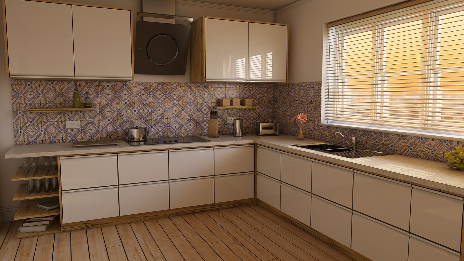
floor lamp is too small, glas material on table is too fat. Maybe try create light with hdri map and add some direct light on the windows

-
Excellent render.
I hope I'll be that good one day.
-
Thank you Bryan.
wychylylybymy, thank you for the C&C, I really like some of the work you have posted on here so C&C always appreciated. I am already using a HDRI and Light portals. I think I probably was a bit heavy handed in PS, blame it on working late.
Update below

-
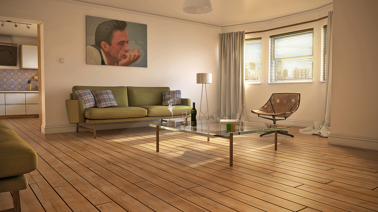
Looks very good, Nicholas. Maybe a rug under the table...don't know, it's like too much floor in the image
 .
.
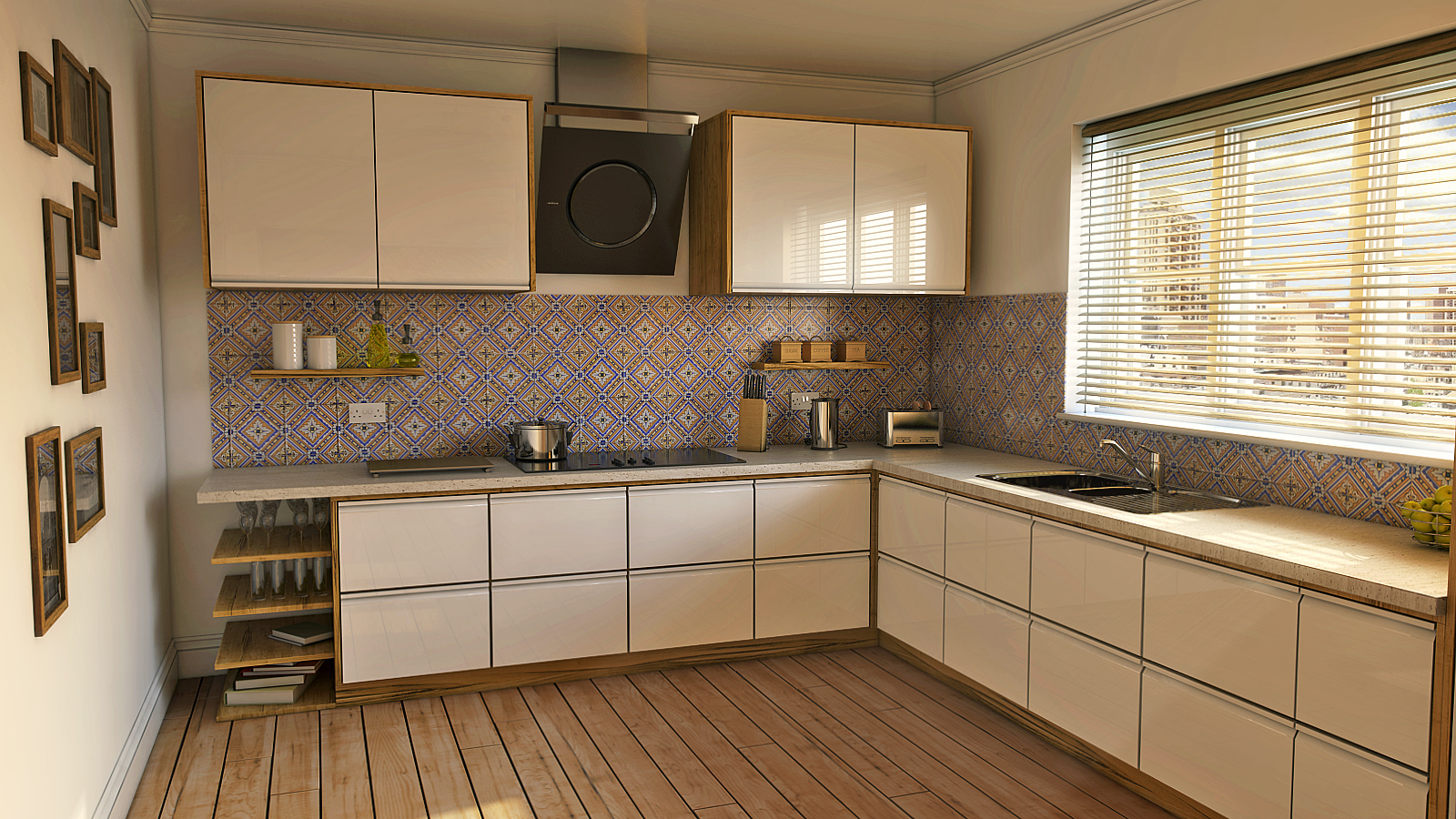
The drawers under the cooker could be problematic, if this is a real project. And AO it's a bit too much.
Cheers,
Stefan -
Hi Stefan, I think rug would be a good idea, the floor looks a bit bare. Not a real project, just a learning exercise, trying to improve my skills a bit.
Update below

-
Looks good.

I would tweak the floorboards. For me are too bold and close to vinyl floor.
PS. Sorry thegreek87 - I'm a carpenter by trade...I love wood - OK, you can ignore me...
Regards
Hello! It looks like you're interested in this conversation, but you don't have an account yet.
Getting fed up of having to scroll through the same posts each visit? When you register for an account, you'll always come back to exactly where you were before, and choose to be notified of new replies (either via email, or push notification). You'll also be able to save bookmarks and upvote posts to show your appreciation to other community members.
With your input, this post could be even better 💗
Register LoginAdvertisement


