Bank Design [prototype]
-
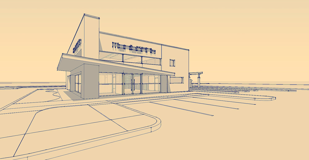
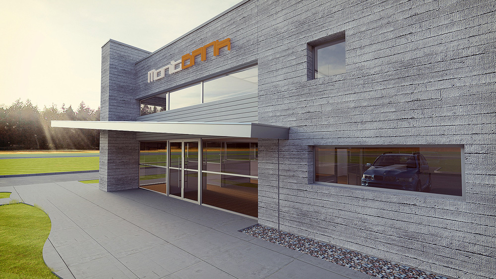
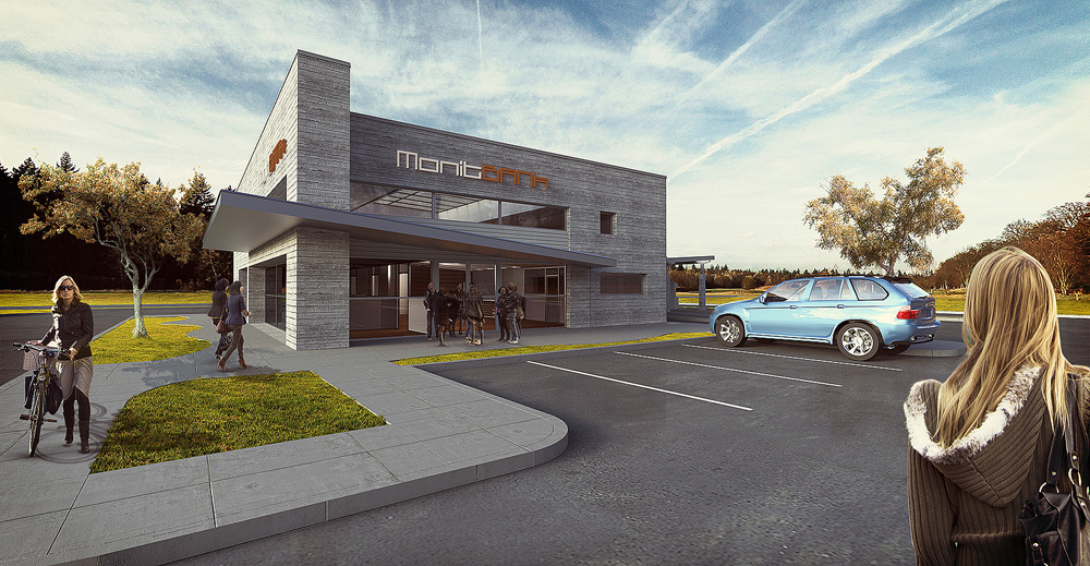
Here is a Bank Design we've been working on in sketchup and then a Thea Render.


-
That looks rather nice! Bit too much sharpening, though?
-
Looks great, Cheffey. Very realistic rendering. How is the canopy (over the entrance) constructed? Won't you need suspension struts? Also, you might want to rethink the font on the signage - it's hard to read (imho).
-
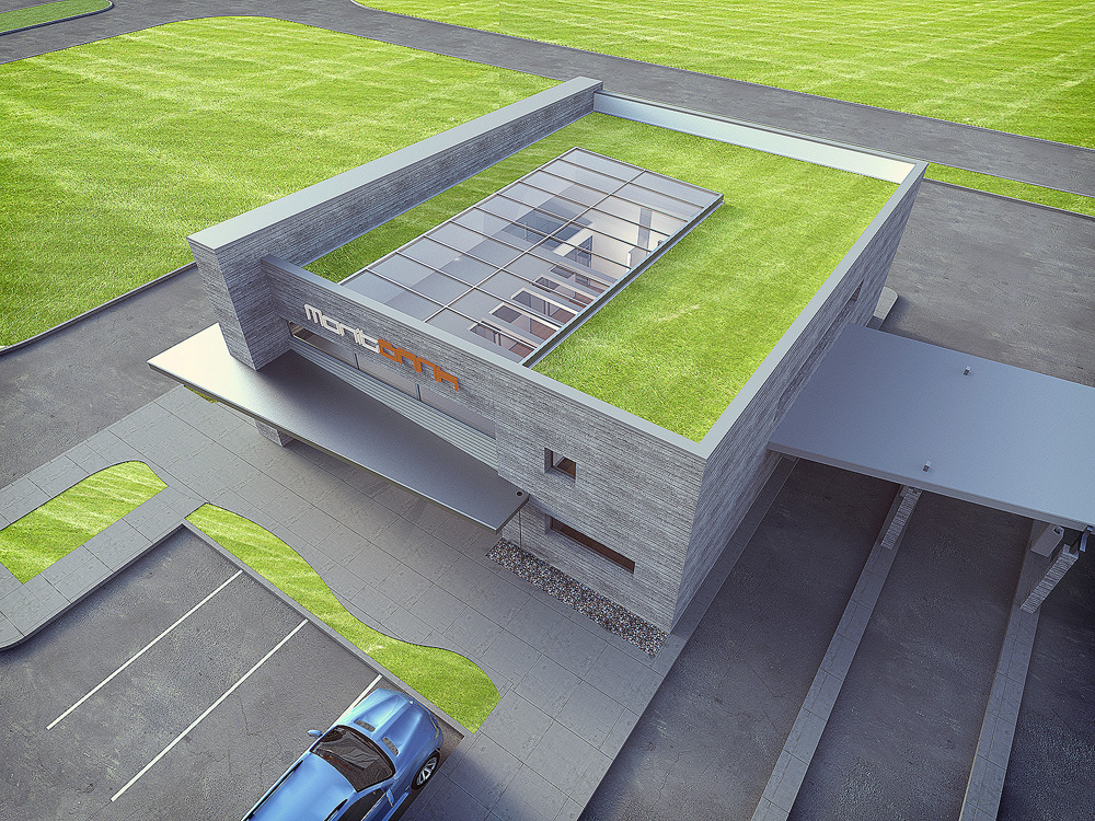
cheffey, nice design. I really appreciate the use of natural daylighting. Can the empolyees utilize the green roof for coffee breaks?

-
Really nice style, I like them. Maybe 3rd render has little to much of sterility(is too clean)? Nothing in addition, great renders!
-
Nice design and use of materials on the walls and also like the green roof...
What's appealing to me is the first render...
Thanks for sharing,
allanx
-
The design and concept are nice and clean and compact. Traffic flow appears well organized. I expect that this green roof, without regular ease of access will be out of sight, out of mind. The cost factor could be as much as three times that of a conventional roof, with or without the access. Are you in the process of developing site and building accessibility? I would suggest maybe look at transitions between horizontal surfaces and transitions at base of building.
-
TomDC: I'll post one without the sharpening I have a action that has resizing and sharpening in it and I have been meaning to turn down the sharpness for awhile.
Daniel: Your right about the text, I wanted to use something though that isn't readily apparent what it says for right now. It may have come off as strange though. I don't think we will have struts. Although every time the structural guy looks at our work recently, his eyes shift back and forth and he sighs a lot. Kind of like what the hell are these architects thinking. It's only a 4'-8" overhang we are hoping to get by without the struts but once the calcs are run we'll know.
Dale & mitcorb: The green roof system isn't accessible but it's all part of LEED certification where we have to have either 100% green roof or 50% vegetative roof with the rest meeting a certain reflective index. (White roof).
mitcorb: This is the next process and I agree we haven't put much thought into the horizontal surfaces beyond preliminary planning such as sidewalk sizes, building offsets & traffic flow.
Wow, thank you all for the comments. I hope to update this project based on your help.
-
If it isn't accessible then who is mowing it? and how?
Best,
Jason. -
A green roof, using the right grasses, sedums etc does not need 'mowing' as it is compact in its growing habit...
-
TIG is right on this.
We began using a sedum tray system many years ago. You basically put down a slip sheet for the rubber roof and lay the 24" x 48" x 6" trays out side by side to cover the roof. They cut any last trays using a recip saw to get it to fit. Then add a small "L" shaped trim, fill in the engineered soil, and sedum on the edge trays. They hold up great even in droughts because they are in the family of cactuses... cactii?Anyway, in the past when some areas begin to get brown they pick some sedum from a neighboring area of the same roof and throw it over the brown areas. With a bit of water it will grow back quickly. Typically when we do live roofs or green roofs we at least make the roof accessible via roof hatch, but with this a bank we decided to minimize entry points.
Green roofs also add tremendous insulation to the building, reduce heat island effect, and filter the water naturally as it runs through the sedum roof and drains down out the downspouts. This helps greatly if you were wanting to reclaim the rainwater for flushing toilets.
If you want to learn more take a look at http://liveroof.com/
It's a great system, probably the mercedes of systems. A lot of local people are developing similar methods. -
That's pretty cool -- I'm pretty architecturally stupid so all of this was new to me.
In the render it looks exactly like the rest of the grass, would that be true to life or is that simply "artistic license"?
Best,
Jason. -
That's definitely artistic license. I'll need to change that. It would be green with purples and yellows mixed in. So, much more interesting than what I'm showing.
-
Just remembered, here is the link to the large size version.
-
Cheffey
Typical NICE design from you mate - we've come to expect that! The materials AND lighting in the first shot are brilliant!
Hello! It looks like you're interested in this conversation, but you don't have an account yet.
Getting fed up of having to scroll through the same posts each visit? When you register for an account, you'll always come back to exactly where you were before, and choose to be notified of new replies (either via email, or push notification). You'll also be able to save bookmarks and upvote posts to show your appreciation to other community members.
With your input, this post could be even better 💗
Register LoginAdvertisement


