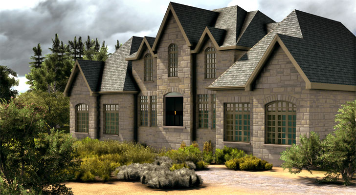
Stone House & Gardens
-

Warm up the light in post. It takes all of 2 minutes
-
You want your houses and women hot, your jazz and your drink cool.
-
Ah ha! Looking good.
-
@unknownuser said:
More...
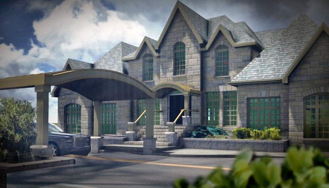
Stone shadows on the retaining wall are going the wrong direction. I really like the atmospherics.
-
@unknownuser said:
Some change in material..I reversed the stone wall texture but it still appears backwards....I'll have to do some work on that bump and the stamped concrete.
I don't see the stone as having been reversed, perhaps I used the wrong word. The basic texture needs to be flipped on the left to right axis and I don't think this has happened. Hope I am being helpful rather than a pest.
-
Nice work.
-
I like that presentation method. It looks like a nice model sitting on the drawing. Cool stuff.
-
Some ideas:

The blue gray plant has the texture and color of a large tarpaulin making it look like the contractors had not cleaned up yet. Perfect surfaces never look right for parking lots or driveways. A little shadow and a little surface wear help the drive become entourage rather than the focus of the image. The stark white line was a real eye grabber. Not sure a traffic indication is necessary, but if so I might suggest a line of gray cobbles set in the middle of the road. IT would tie nicely into the house. The hedge in the foreground was popped in to take care of the empty right lower corner and again serves to take the eye away from the road surface and soften some of the stone. The hege image I grabbed was too sharp and bright so I softened and knocked down the brightness and saturation. Also there was not enough contrast between roof and sky so I increased contrast locally to highlight the unique roof line. Shadows in the portecohere were a little too dark so I dodged those a trifle.
-
Nice. Like the driveway texture too.
-
Beautiful work. I've always been a big fan of stone houses, and this is no exception! Although I am also a lover of plantlife, so while the revised versions are better and better, I find myself missing the rugged look and feel of the first version, with all the native greenery.

-
Very nice, modelhead. I think, for such a large and expensive house, rather than a plain asphalt drive, I'd do a paving system. In addition to looking better, it would mitigate the surface run-off.
-
Looking great. I think it would look nice to see a double row of cobblestone (sailor coursed) along the perimeter edges of the asphalt. Perhaps also having the cobbles banded through the driveway in front of the house and in front of the garage. It would pull some of the texture from the house into the entrance.
Also, here is a really great resource for seamless hi-res paving stone images. Toward the lower right is the link to the seamless textures. There are multiple colors a bunch of different styles and patterns. Perhaps you could use them for your stamped concrete texture. - http://www.belgarddesignpro.com/category1.htm?section=12
-
Definitely a mistake to start showing them teasers too early in the game. Keeping it more nondescript in the preliminary phases would help them to focus on general layout and the overall flow. Plus, they may want to make clear with the clients that 3D is a representation of the overall spatial relationships and a rendition of the general feel of how materials fit together, but is still an artists interpretation. I think too, people often feel like just because it comes from a computer that it is just a matter of a few keystrokes and you can manifest an exact replica of the final results. They don't ever consider all the work and effort that goes into it, nor do they see all of the variables involved with how the lighting reacts to the materials. We can get it close, but never exact.
Perhaps if he does want to show clients "teaser" clips, then you can run them through a filter which will make them less specific to details and better for showing the overall scheme. Even just a B&W or Sepia filter might take their focus off of the colors and materials and see it more as a whole.
Overall though, if it is helping the client make decisions now, instead of when the construction is underway, then it could be better in the long run. As long as you have a revision clause set and the architect is aware of your extra time being billable, then hey...it's all good!
-
@unknownuser said:
Thanks gr8fzy1, I tend to agree with you. I am the same...I like to leave the green stuff alone if it is possible...knocking it down and paving it over is not something I would do. My version would remain much like the first...more like this....
That....that is....just......droooooooooools
-
Curious how you are working the updated modeling back into Lumion? Are you using the "reload model" button or bringing it in piecemeal?
It's looking very nice. Personally a tad too much fog for my taste. A little more punch in contrast wouldn't hurt either. Another nice little trick I've discovered is adjusting the fog height to make it less visible and then playing with the fog color to achieve a faked color / white balance.
Hello! It looks like you're interested in this conversation, but you don't have an account yet.
Getting fed up of having to scroll through the same posts each visit? When you register for an account, you'll always come back to exactly where you were before, and choose to be notified of new replies (either via email, or push notification). You'll also be able to save bookmarks and upvote posts to show your appreciation to other community members.
With your input, this post could be even better 💗
Register LoginAdvertisement


