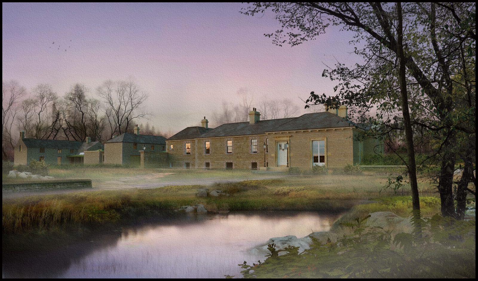
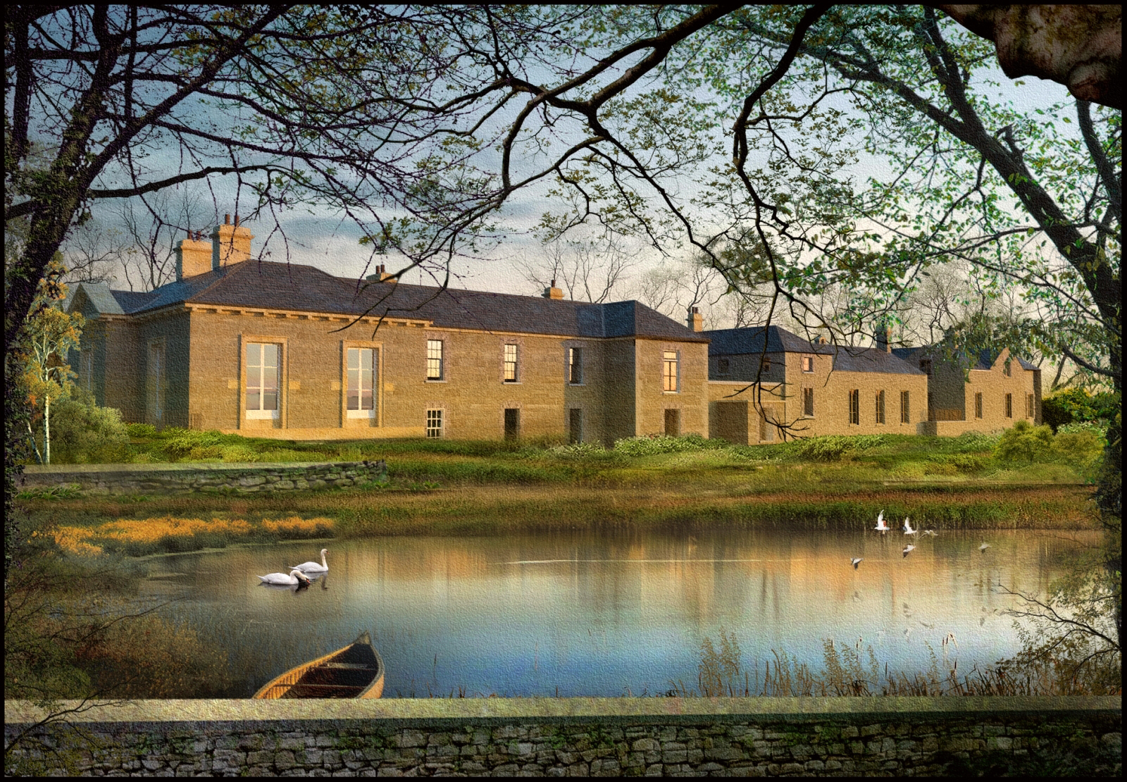
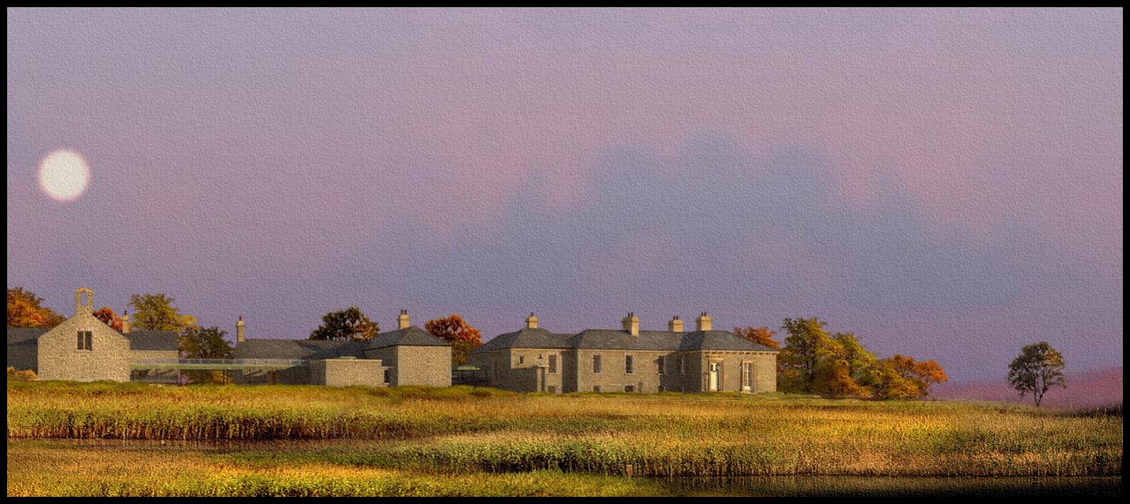
Manor house with early mist
-
A Manor house at dawn with some low level mist.I'll upload a step by step soon on creating the mist.
-
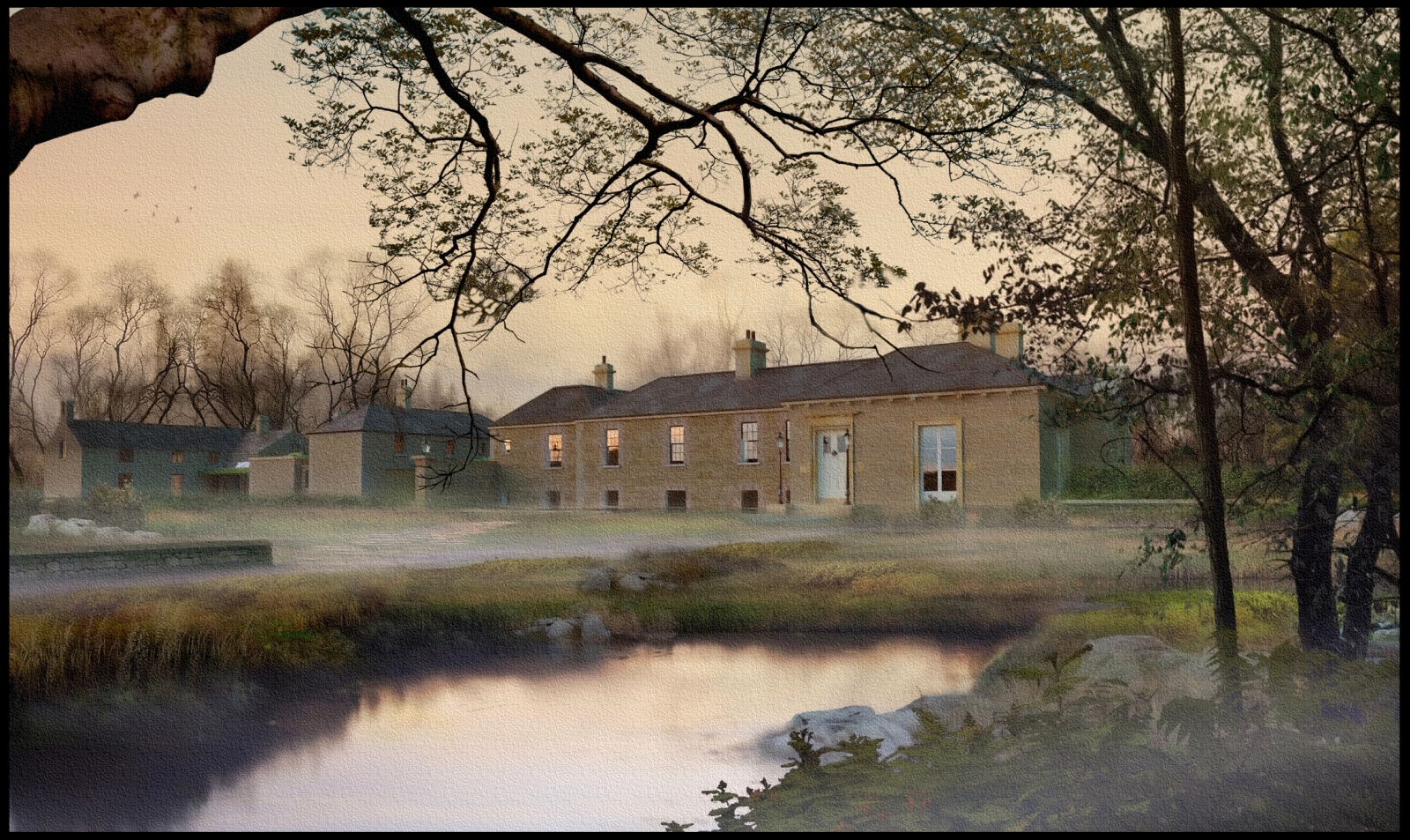
A variation on the previous image.I have revised the sky and added an additional foreground tree,also revised is the overall colour tone.
-
The fact that I don´t comment on your posts too often does´t change a thing about how much I enjoy them.
Beautiful work. I really like the atmosphere. -
Very very nice! It's not easy to create an image that evokes a mood, and you've done an excellent job with this!
-
beautiful!

-
Just beautiful.

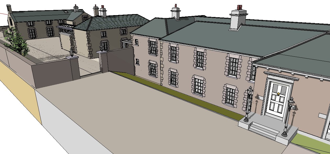
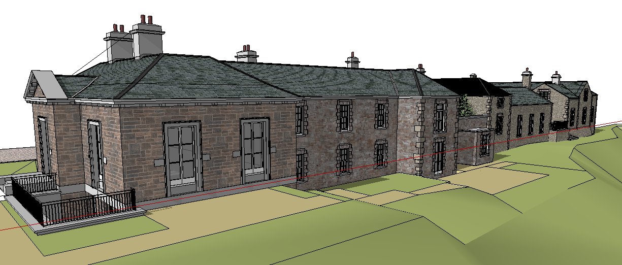
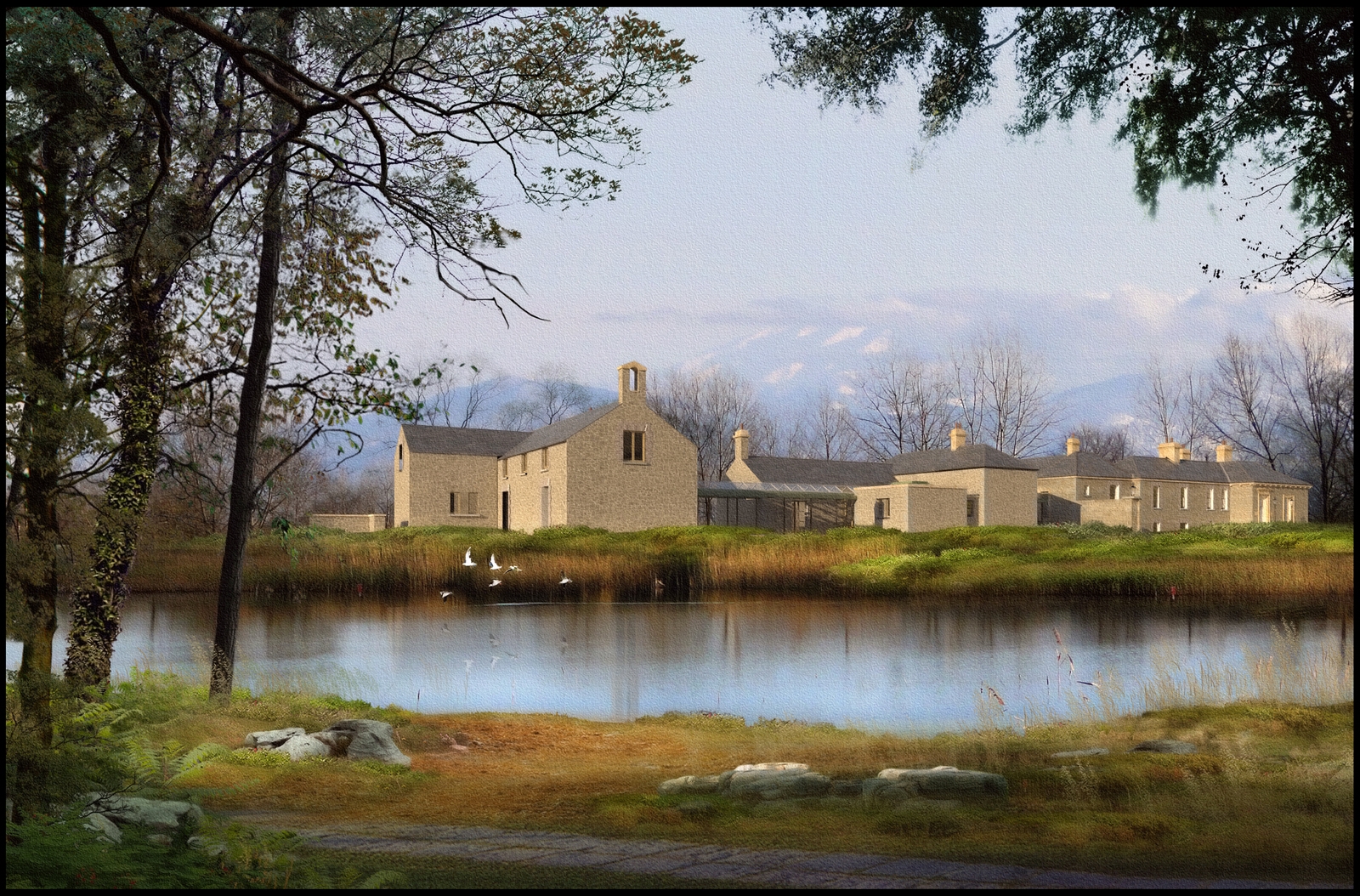
IS the main house sunk below the ground level?
-
As I have said before,It really is all about mood for me,and every time I do one of these images,I am always amazed at how a small tweak to the overall colour tones can alter the mood drastically.
The house is actually on a couple of different levels.I have attached 2 screen snaps showing the Sketchup model.Screensnap 1 is the side in this render.
-
very nice
-
Really great images! Do you have any tutorials or videos showing how you composite an image?
a fan of your work!
-
Check the post processing forum for some great tutorials
-
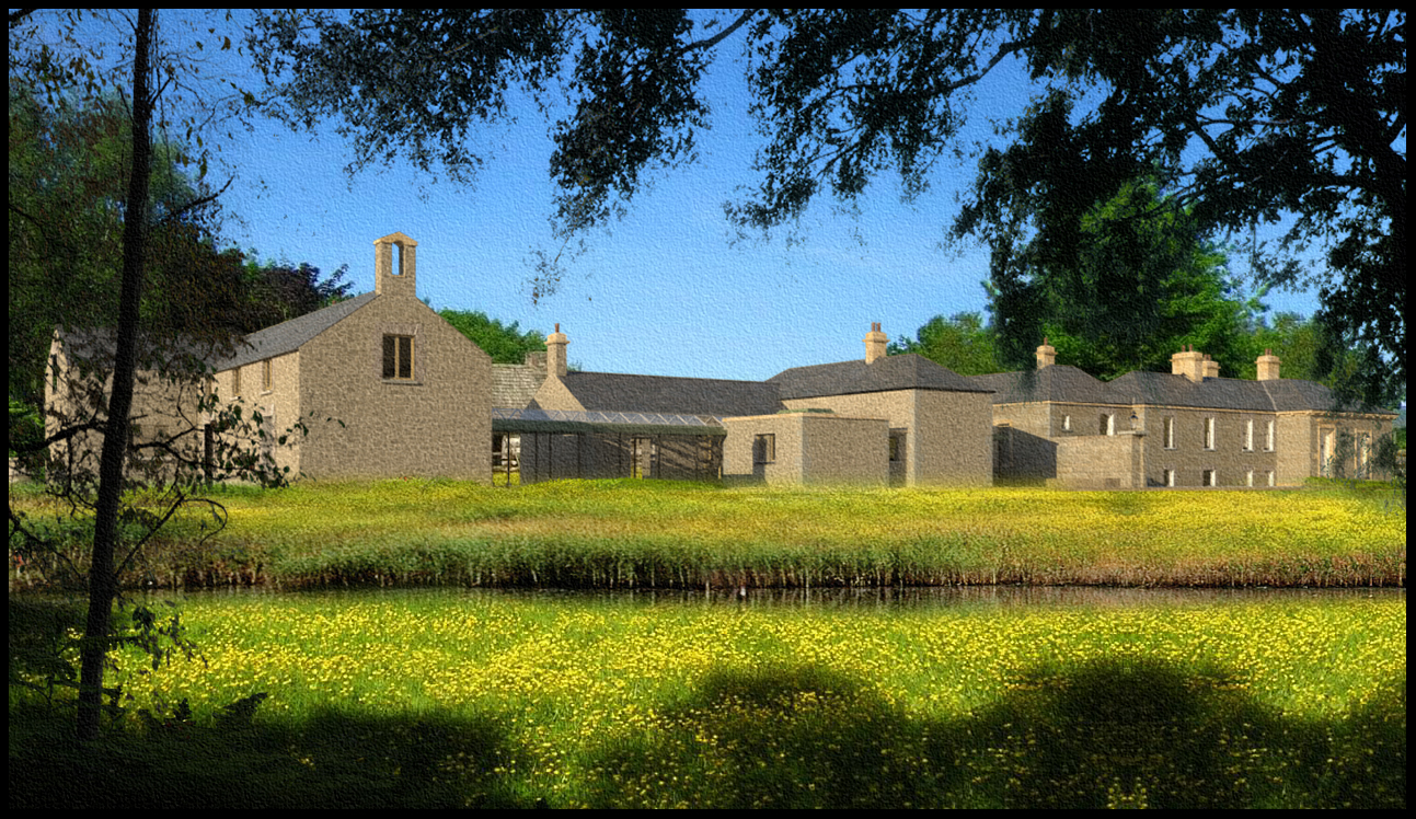
A view from the other side
-
Incredible job with the water!! Wind rustled area and trail of the swimming bird
 How did you do that?
Excellent ground cover variation. -
Bravoo!! Love it !
-
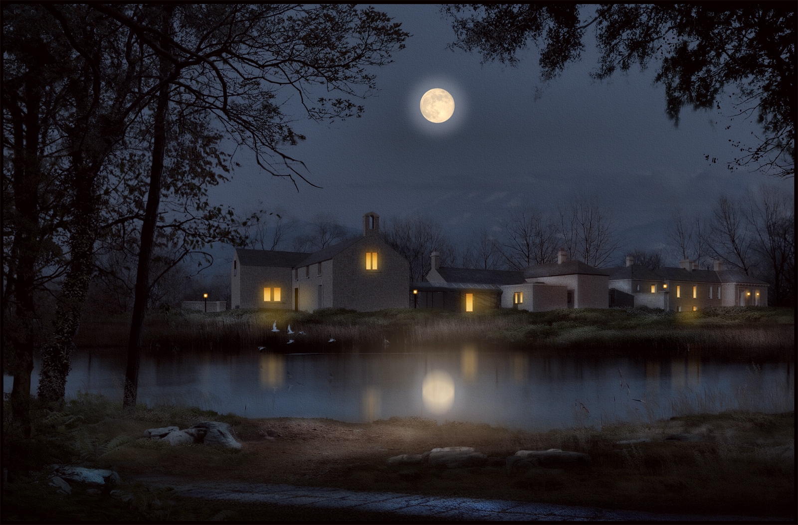
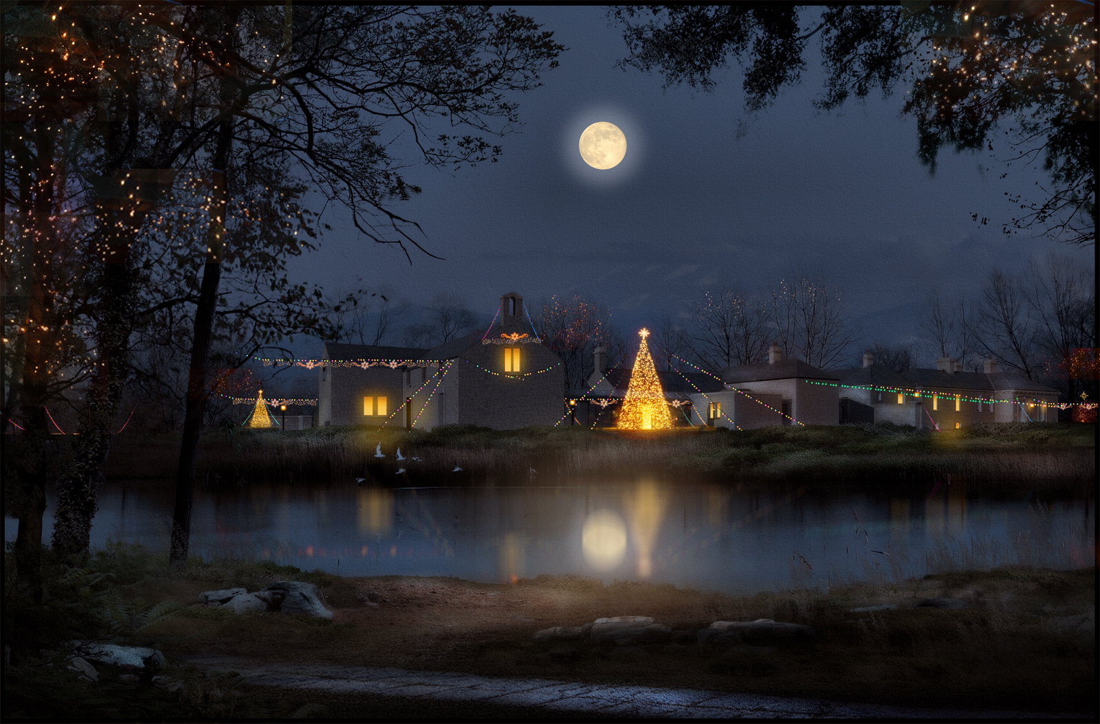
2 more from the lake side.The night shot is the daytime shot taken thru the step by step process I recently uploaded to the post-processing forum.The lights were painted in and copied around.
-
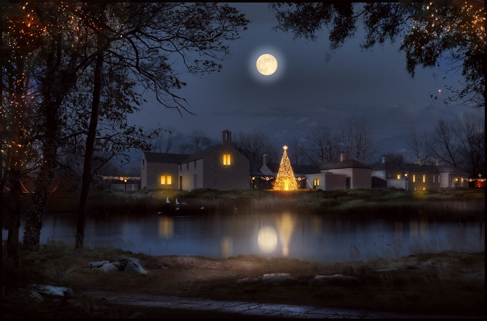
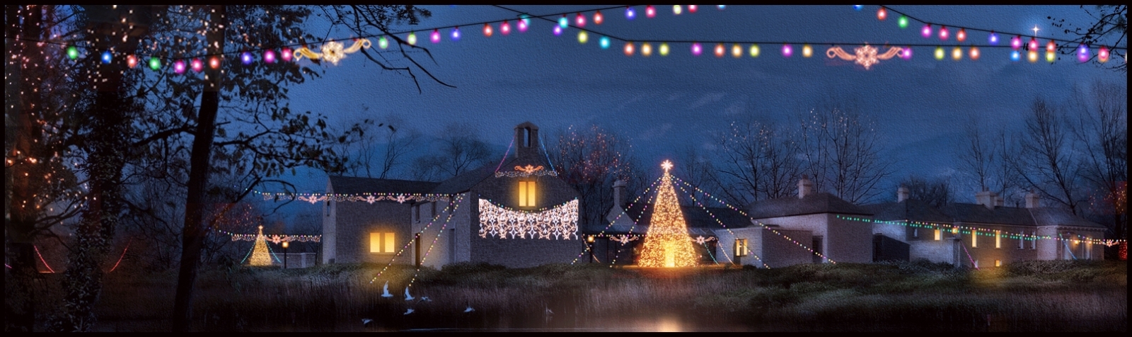
As its the festive season,Ive added some Christmas lights to the night scene.
-
Theres no such thing as too many lights...
-
-
Wow incredible
-
An un-cropped image with the full set of lights except the foreground ones which looked a little too clunky.
-
2 very different colour values for these 2 images.My preference is for the purple sky over the blue.I always find that blue skies are much harsher whereas soft evening light can create a mood much,much easier.
Hello! It looks like you're interested in this conversation, but you don't have an account yet.
Getting fed up of having to scroll through the same posts each visit? When you register for an account, you'll always come back to exactly where you were before, and choose to be notified of new replies (either via email, or push notification). You'll also be able to save bookmarks and upvote posts to show your appreciation to other community members.
With your input, this post could be even better 💗
Register Login


Advertisement