:Modern Home: WIP
-
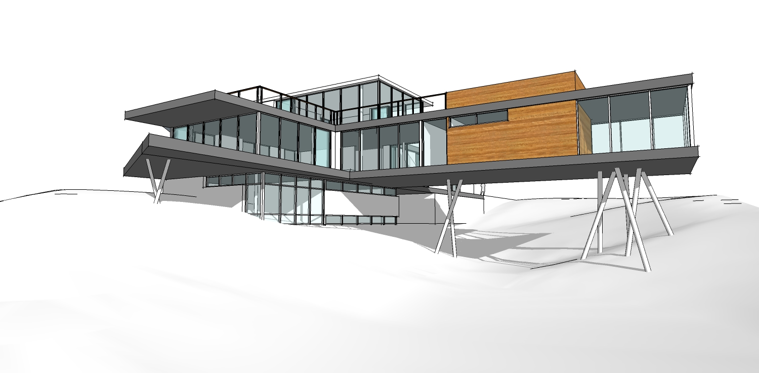
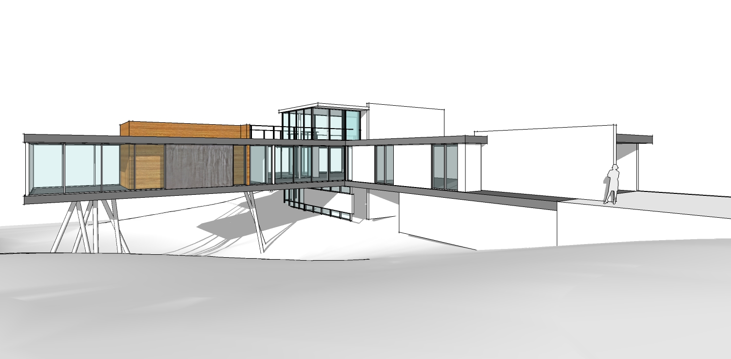
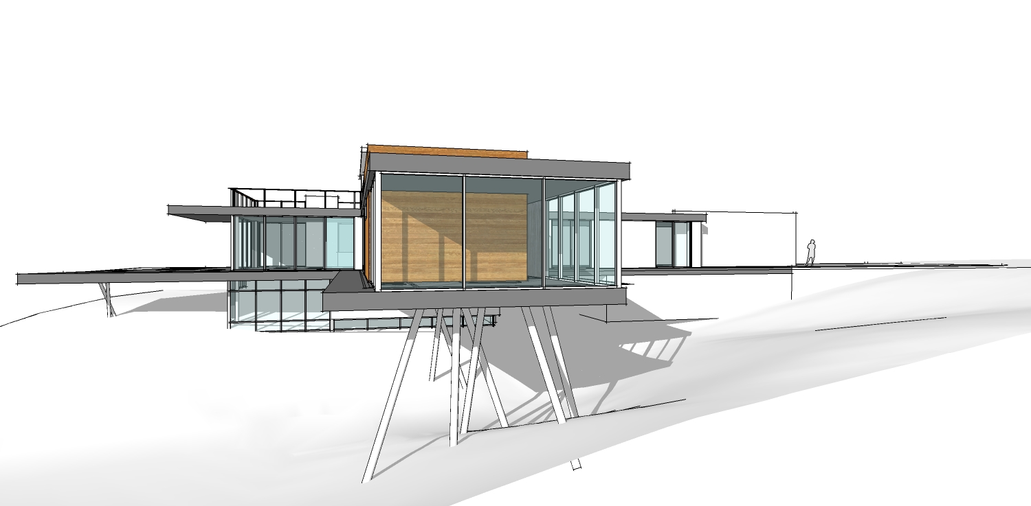
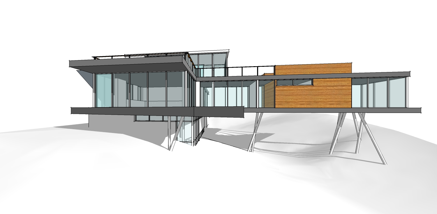
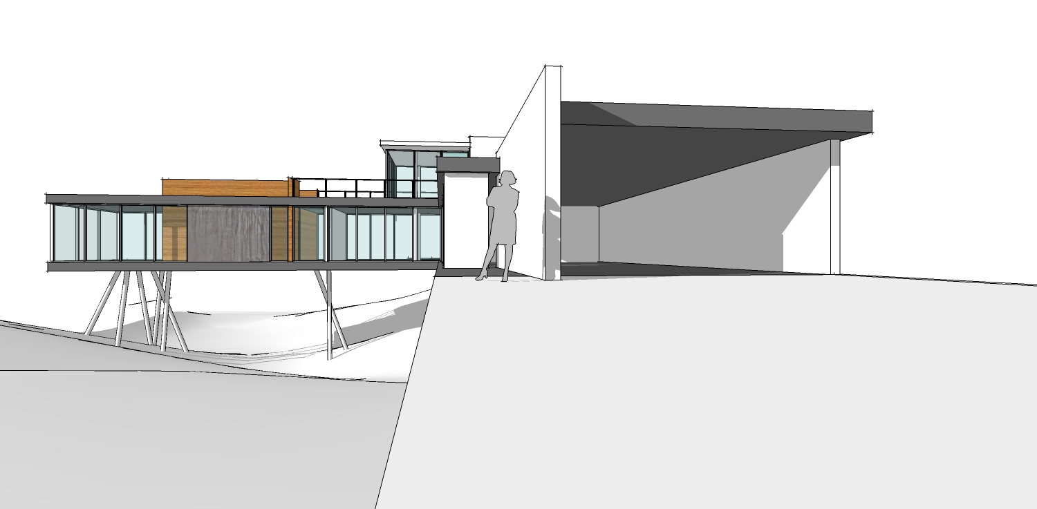
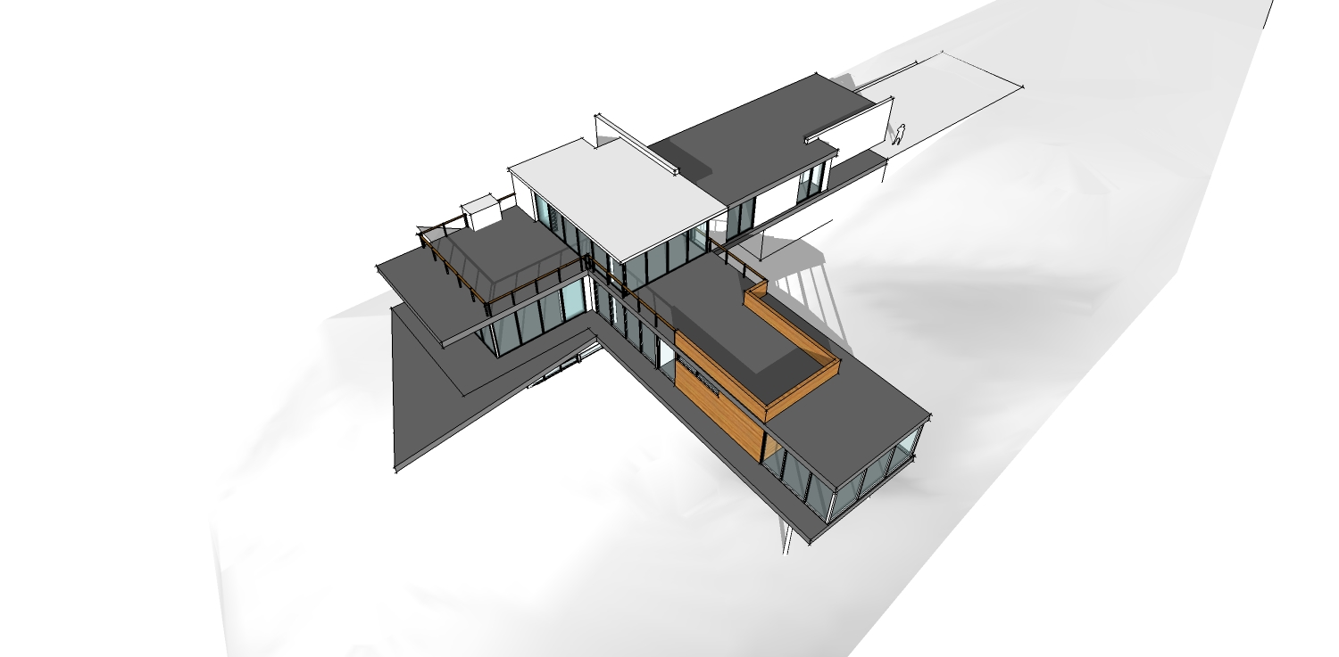
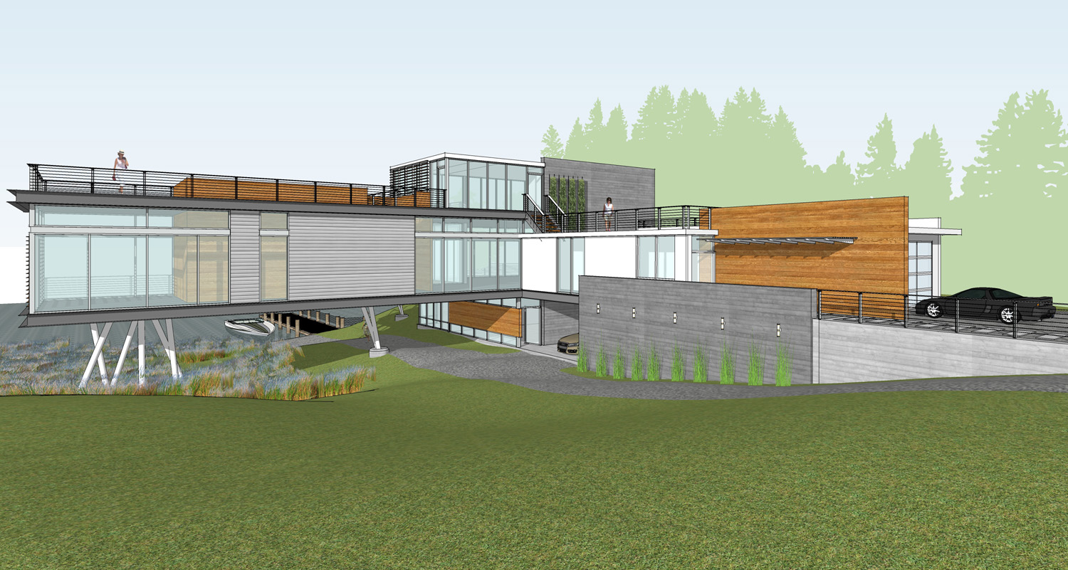
worked on it a bit more yesterday after the initial meeting.. started working out a few details and waiting on comments from the team... i'll have it a bit more detailed early next week. the materials are just placeholders for now..
-
I love the design - this would make a wicked render-this challenge.
-
What about spaces under the house? What use they have. Why don't you make them the part of the house too?
-
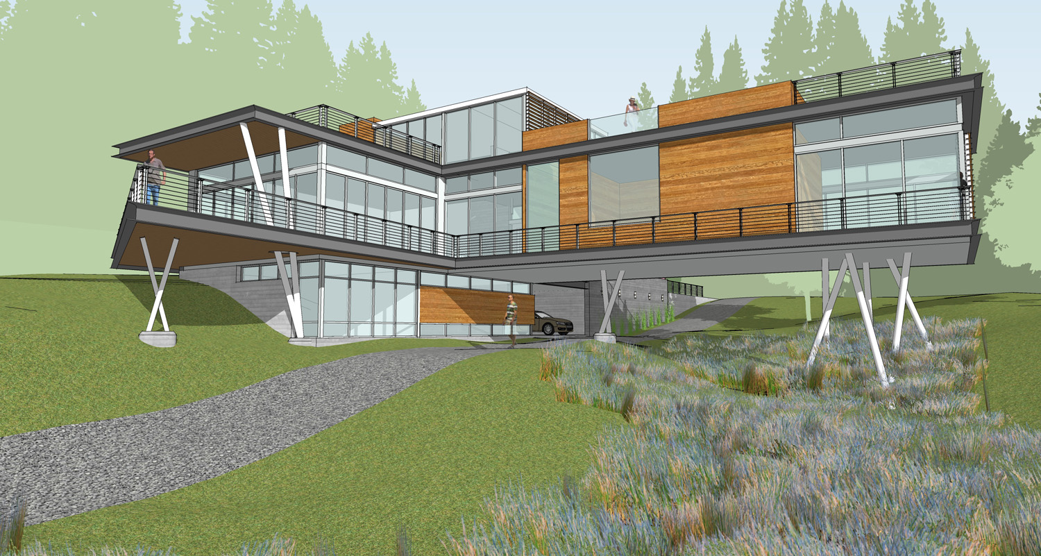
spaces under the 'main' part of the house will be some guest bedrooms, a carport, and workshop.. space under the 'leg' will be open with a drive/path down to the water
-
That's looking great already.
How did you make the slopes?
-
This space has no function. I suggest to make it a part of the house...
-
ah.. i see. that is a condition of the site.. the site setback is controlling the length and shape of the deck... in addition to the site setback, there is a 55' setback that follows the shoreline where you are not allowed to build any enclosed living spaces.... the house buts up against this setback and the deck extends out to the next.
bryan.. site was created using sandbox and the existing topo lines.. need to start reshaping that at some point.. i'm not very good at it though.
-
Very nice. I need to work more with sandbox. Did you also use Smooth or Subdivide and Smooth?
-
Dear Mark,
I remember North Carolina as being hot in summer and cold in winter. The open design is going to pose problems for heating and cooling. I think your structural engineer will have concerns over the long cantilevered floor too. They don't happen often in NC (hurricanes that is), but I'd be worried about the wind shear and lift on those structures. I could imagine the long cantlevered floor twisting/rotating about its centreline.
Kind regards,
Bob -
totally agreed...this is still totally concept phase. i dont think that long span will remain, as the client is hoping to put yet another garage under parts of this.. so that will allow us to bring a shear wall all the way down through the center of that, more or less..
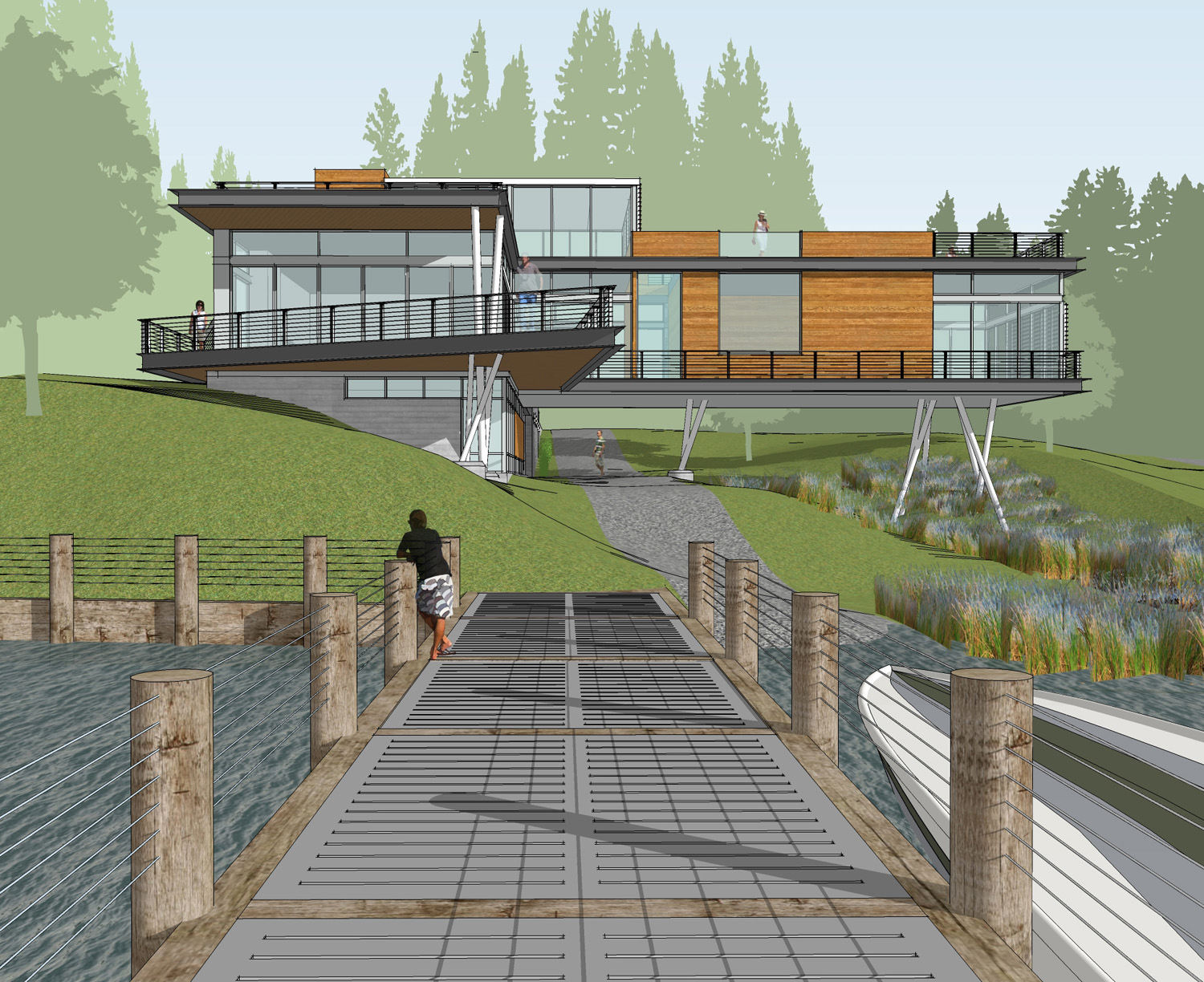
here are a few updated images.. i've got a bunch of them, but cant resize them right now.
-
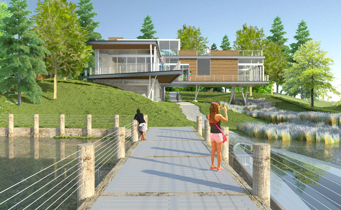
The veiw from the dock is stunning. Great work.
-
...thanks eric. so far so good with this.. clients are loving it, not many changes.
trying to crank out a render of the first viewpoint for our website, tonight..
-
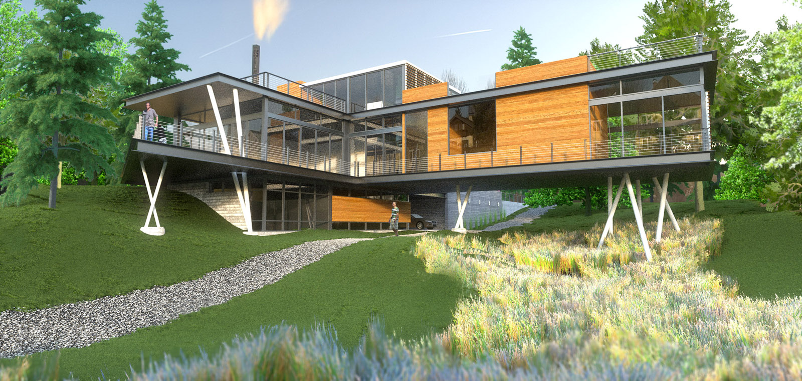
ran this through Thea last night... used instancing on the grass for the first time.. i guess its too dense? still trying to figure it out.. minor PP to get the foreground blur and attempt to fix some of the oddities in the grass...
-
What's going on with the chimney in that rendering? It reminds me of the local oil refinery...
More seriously -- and I mean this as an honest question, not a criticism -- how do meet energy code compliance with a design like that? Around here (Seattle) to get unlimited glazing you have to use windows with a .29 u-value, or thereabouts. Or is this a case of enough money will find a solution?
-
haha.. i didnt think it was so bad.. but someone else commented on that as well. its actually part of the HDRI and it happened to line up pretty well so i rotated it into position for fun.
that's a very good question and definitely something on our reality list that we're working on next.. just got in contact with reps about glass systems.
-
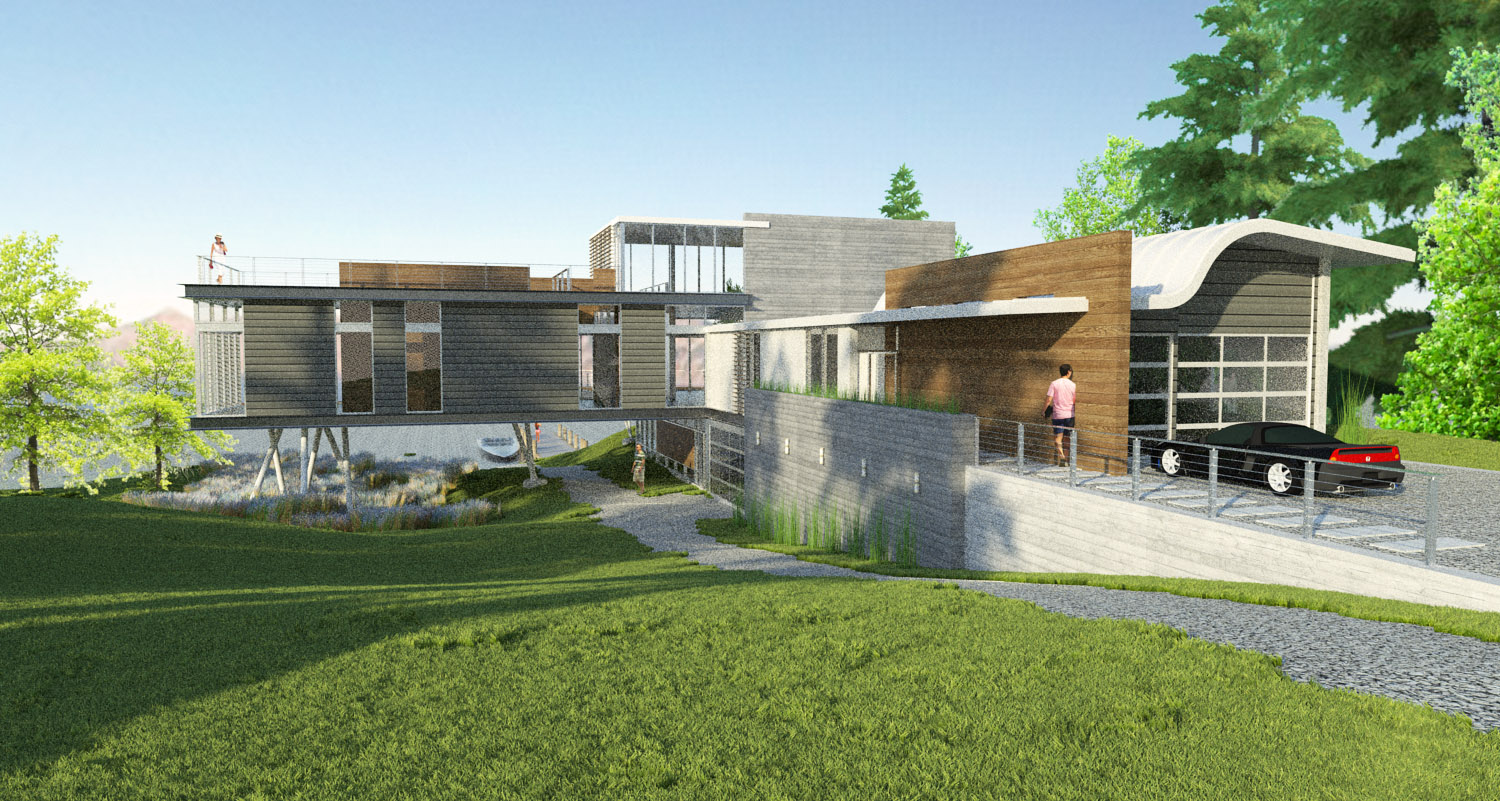
have been working on this, but don't have much to show...here are a couple of quick (and a bit noisy) renders..
-
these are a little grainy and low res, but some updates to the exterior and the first go at the interior..


-
Its been quite awhile, but this project is finally in the ground.
-
Cool!
Funny as it make seem, I often think about this thread. Nice surprise to see it pop up again. Thanks for posting the follow up. Hope to see more progress pictures.

-
wow! I like the design men!
View from the deck looks very good!
Hello! It looks like you're interested in this conversation, but you don't have an account yet.
Getting fed up of having to scroll through the same posts each visit? When you register for an account, you'll always come back to exactly where you were before, and choose to be notified of new replies (either via email, or push notification). You'll also be able to save bookmarks and upvote posts to show your appreciation to other community members.
With your input, this post could be even better 💗
Register LoginAdvertisement


