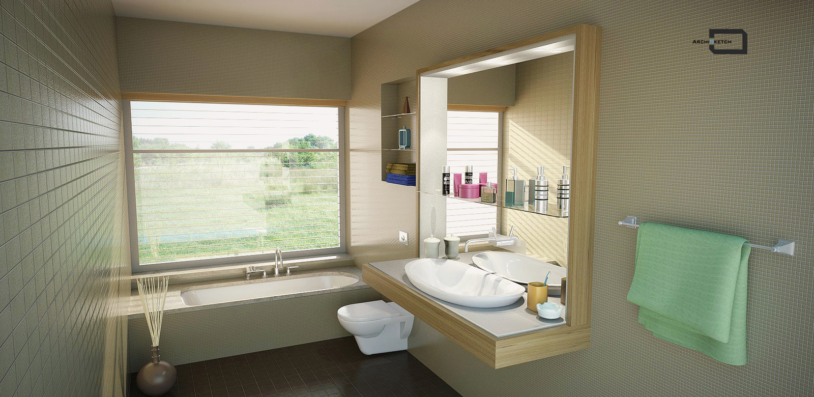
Bathroom render
-
Hi all,
post my new bathroom render,c&c are very welcome as always
Thanks

-
I think your imagem is really nice, as long you request some C&c, allow me:
At your mirror, you should use an ies light or if you already did, use another, cos this one is bluring only and not giving realist form and the bg maybe is too bright (the skylight).
Now one question: above the toilet (i dont know how to say the name of the bevel in at the wall in english) isnt the hardest place to pick your towel? just think about, too high and an object to difficult even more your access.
Well done!
-
Crisp and clean!

Why three different tiles?
I see you did the background in post process, as it does not show up in mirror image.

-
Thanks,
just to ply to your comment - ies light pretty strong - 4,500 intensity,maybe it seems blurry because of glow effect that i have used in Photoshop in post-production,
about height of towel to access - it's about 135 cm from the floor,exactly like front towel rack height -
i just said about the rack because i think is kinda hard to access it.
Hm, analysing again your work, tell me about the dimensions of your wall, cos to fit a towell inside the rack, your wall might be very large.
On the mirror reflection, why we cant the the outside? The wall tiles are differents?
-
Very nice render! A couple comments.
I really like your idea of combining the vanity design with the mirror and it's certainly executed well.
Wouldn't there be a line where the mirror meets the frame? would make it easier to understand visually. The faucet in the mirror is confusing. Not sure what the reflections and the rectangle mean, how it actually sits. The glass shelf will be much thicker.
Is the toilet in scale?
Design wise: The shelves look fine to me, but I would expect a towel bar nearer to the bath as well. I would put extra space in the tub deck near the head, not the foot--or equal. You also might consider do you want the tub head next to the toilet or opposite and further away (but the user faces the toilet, common)? If possible move the toilet away from the tub.
Thanks for posting. A good example of interior PR.
-
yes,there are two kinds of wall tiles...
reply to pbacot - let me disagree with your design comment - if you have rectangle proportion of bathroom - this is an arrangement - order is from the door when you entering - first sink,then toilet,then the tub,and this on one line - there are no situation of both using the toilet and the tub
-
This is a common arrangement, yes. Luxury homes often have nicer arrangements--if you have the room, and this looks like a really nice home.
-
@amorp said:
Hi all,
post my new bathroom render,c&c are very welcome as always
ThanksCan you please post SU Model file for me and everyone?
I'm new member so i want to practise in your file and learn your experience. OK?
Thanks. -
Hello,
The scene is beautiful, but nobody can use that hidden toilet!
-
Very nice render, clean, nice converging lines on the tiles. Design-wise I would at least flip the tub around so my head wasnt next to the toilet and all the plumbing would be on one wall. But render-wise, very nice. Nice textures, nice lighting, realistic camera angle.
Rob
-
@julyyen said:
Hello,
The scene is beautiful, but nobody can use that hidden toilet!
i don't know in which world of luxury and plenty you live in,but there are places on our planet with "modest" and economical planning where this kind of bathroom layout is typical reality - it's 90 cm width between tub and sink
-
Hi.
Very nice work. Very convincing.
However, that appears to be a wall hung toilet whose rim, I would think would be at about the same elevation as the rim of the tub, which would be about 16". This would give more space for floor cleaning underneath the fixture. This also means that the toilet drain enters the wall rather than the floor and would require a wall of greater depth for the piping to turn down through the floor plate and to house the apparent electronic flush controls. You have utilized that depth to provide the towel niche/shelves and the mirror inset. Nice treatment with the etched "escutcheon" at the lavatory faucet controls. -
Thank you for your comment,
you absolutely right about toilet's sitting elevation,somehow i missed this point although i am aware about it. -
That's a great render!.
Where did you get the wood and floor textures and maps? I love them!.I would try another background, but the rest is just great.
Keep the good job.
-
Thanks,
you can go to this site,register and download for free ceramic tiles on wall and flooring - http://texture.altaeco.com/en-index.asp
wood texture don't remember now,this site good too for download textures and cutout people http://vyonyx.com/category/down/tex/
Hello! It looks like you're interested in this conversation, but you don't have an account yet.
Getting fed up of having to scroll through the same posts each visit? When you register for an account, you'll always come back to exactly where you were before, and choose to be notified of new replies (either via email, or push notification). You'll also be able to save bookmarks and upvote posts to show your appreciation to other community members.
With your input, this post could be even better 💗
Register LoginAdvertisement


