Competition entry made with SU + LO
-
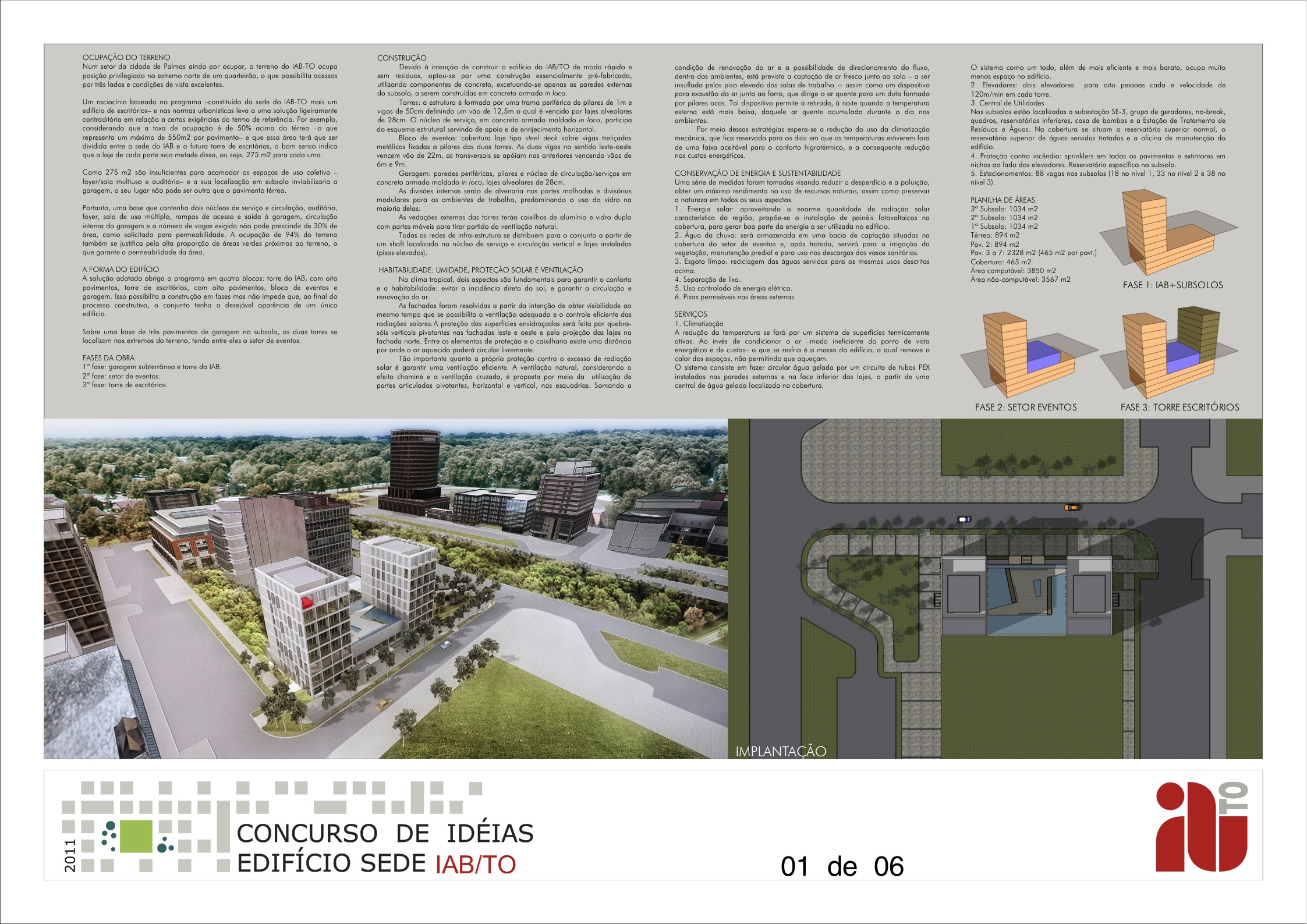
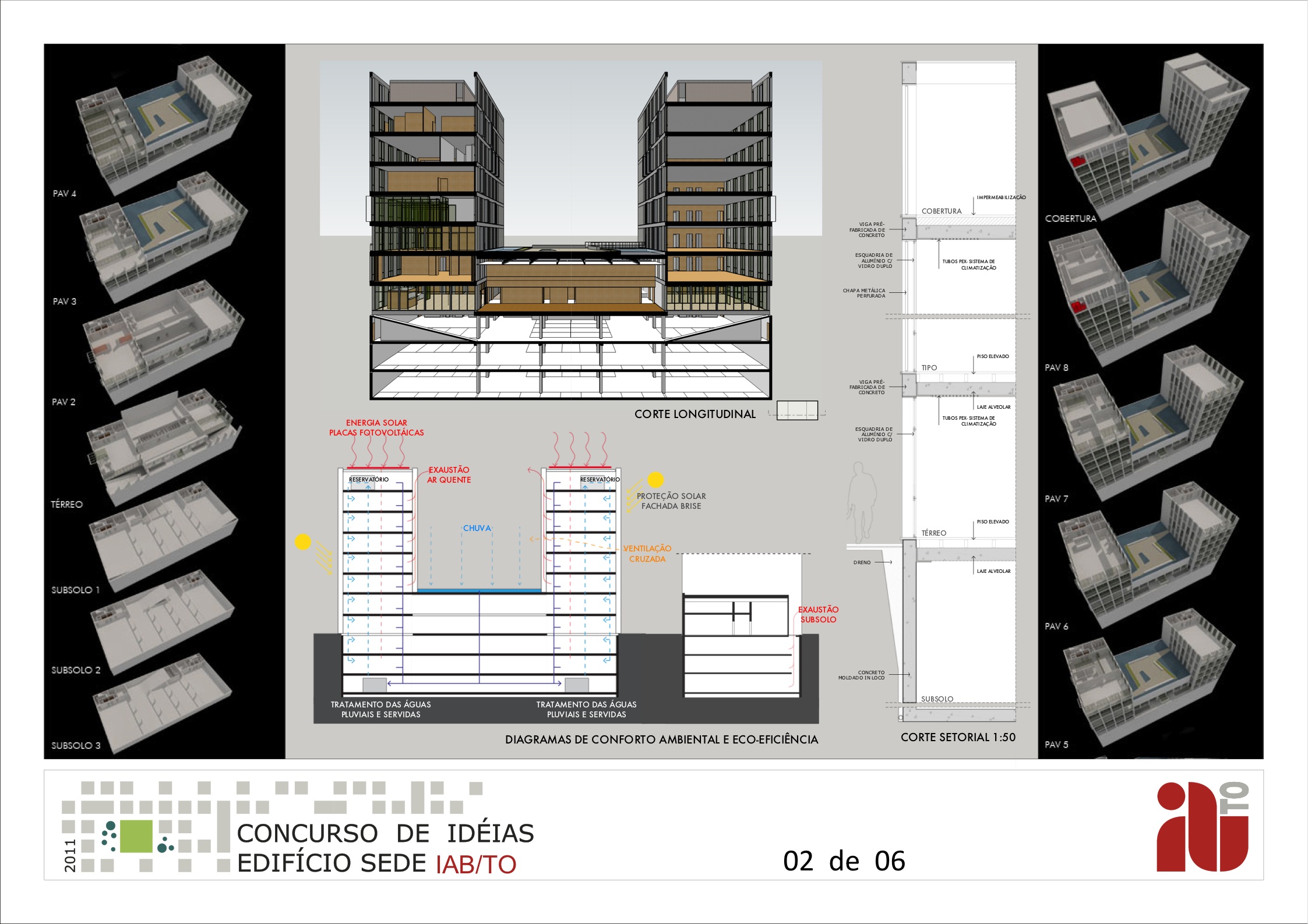
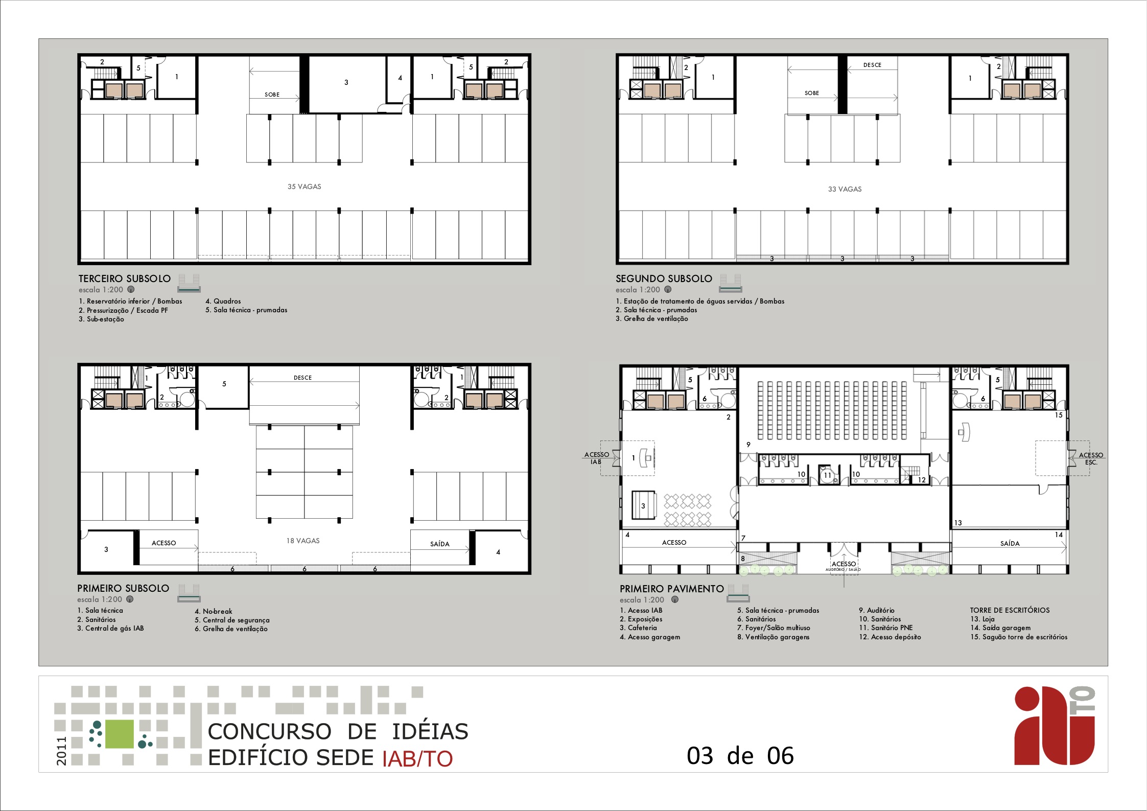
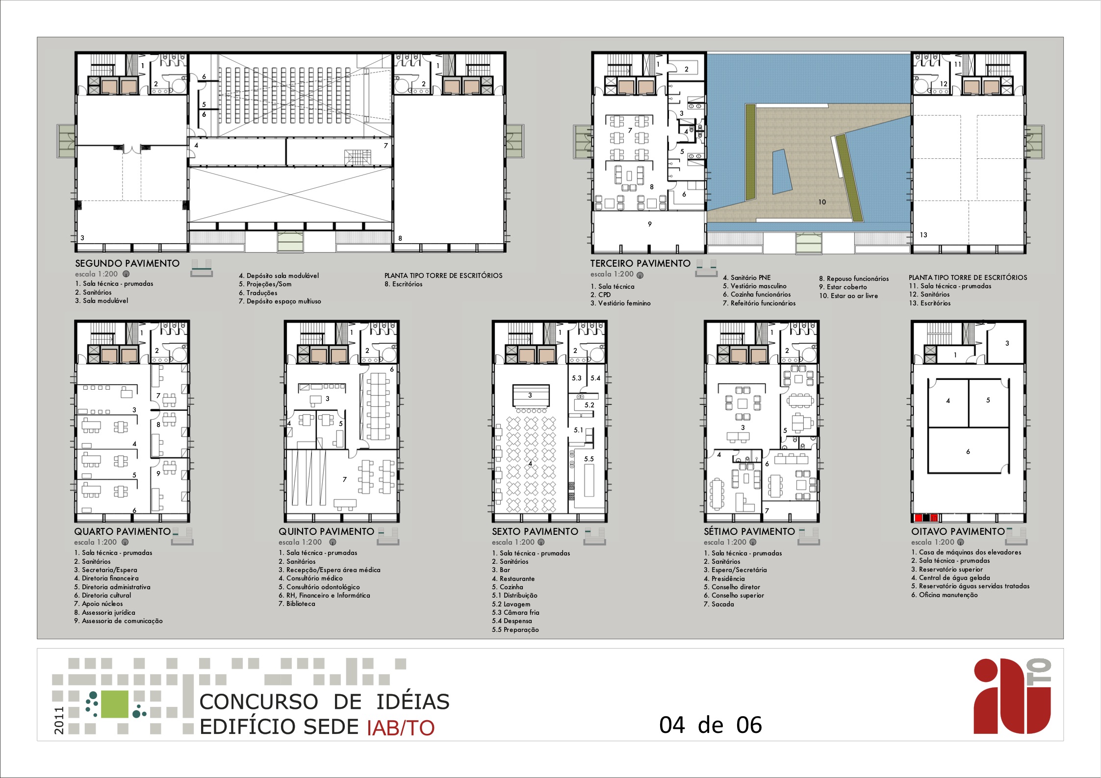
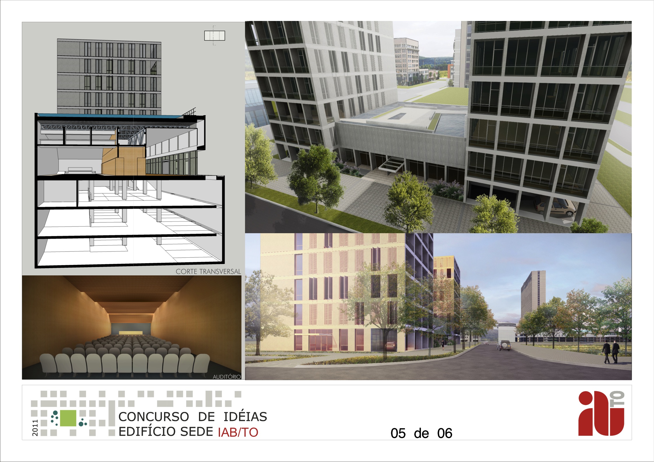
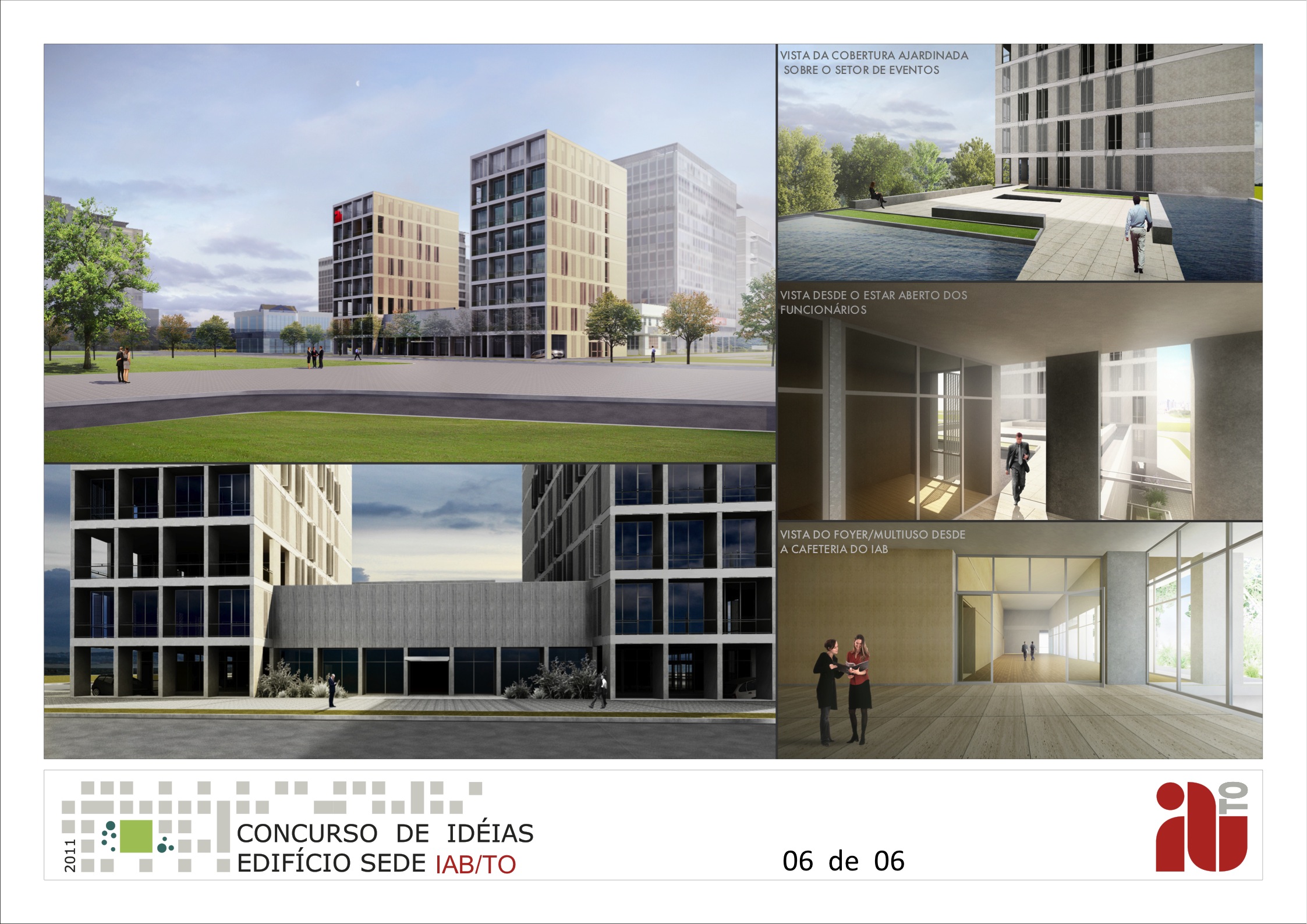
these are the 6 sheets I produced for a recent competition using just sketchup and layout. renders in podium withh pp in photoshop. post processing by gabriel johansson.
the building is for one of the state chapters of the brazilian institute of architects.
[attachment=5:w2hn14k5]<!-- ia5 -->PRANCHA_1.jpg<!-- ia5 -->[/attachment:w2hn14k5]
[attachment=4:w2hn14k5]<!-- ia4 -->PRANCHA_2.jpg<!-- ia4 -->[/attachment:w2hn14k5]
[attachment=3:w2hn14k5]<!-- ia3 -->PRANCHA_3.jpg<!-- ia3 -->[/attachment:w2hn14k5]
[attachment=2:w2hn14k5]<!-- ia2 -->PRANCHA_4.jpg<!-- ia2 -->[/attachment:w2hn14k5]
[attachment=1:w2hn14k5]<!-- ia1 -->PRANCHA_5.jpg<!-- ia1 -->[/attachment:w2hn14k5]
[attachment=0:w2hn14k5]<!-- ia0 -->PRANCHA_6.jpg<!-- ia0 -->[/attachment:w2hn14k5]
-
WOW that looks like a lot of work. Good job. Did you win?
-
Very professional presentation.

-
Thank you for sharing this. Looking good, I like page 6 the most.

What cached my first eye in a bad way was repeatable textures used (small but...), the toilet strait from the main entrance, and overall too technical look. Guess that with Photoshop, or GIMP the pages could be more like your beautiful renders, with more integration of the content. I guess it's hard to achieve it with Layout. How much time for laying this out. Is it hard work flow? -
@slimdog and ecuadorian,
thanks. no, I did not win. what pissed me off about the results is that, for the millionth time, the jury disregarded the competition rules and awarded first places to designs that did not comply with the program and/or proposed solutions that are not practical to be built in the boondocks (which is where this place is).@srx,
thanks too. yes, there are some tiling textures on the sidewalks. I did not bother with those because it would not be too noticeable and because paving is supposed to tile. but this could be improved, of course. about the technical look, I do not see a problem there. competitions are not artistic affairs. some technical sheets are to be expected.about my workflow, I do not think it was too hard. I worked on it for about a month, on and off. what helps me is that I design in 3D: I do not work in cad and later create the 3D model. thus the design progresses with the model and when one is finished the other is finished too. from there it is a matter of extracting the plans and sections from the model and exporting them to LO. this involves some preparation but way much less than working in both 2d and 3d, as is traditionally done. I did the whole project on my own and had help in the final week with the layout and post processing parts.
-
really nice work.
 Which podium version have you used?
 -
-
Edson, really fine work. You make me want to get back into layout, which I used to use a lot and for some reason abandoned.
Did you import the text into LO or do it directly? -
Edson - VERY meritorious work all round there mate, from design to renders to boards!!!!!


-
@dale said:
Edson, really fine work. You make me want to get back into layout, which I used to use a lot and for some reason abandoned.
Did you import the text into LO or do it directly?thanks, dale. the only imported text was the one on board 1, which was too long to be typed in LO.
-
@richard said:
Edson - VERY meritorious work all round there mate, from design to renders to boards!!!!!


hey, richard. thanks a lot. I do appreciate your comment.
-
Edson.
Very neat project...I mean neat as in cool to look at as well as neat in an orderly way.
Nice work!
paul
-
@pmolson said:
Edson.
Very neat project...I mean neat as in cool to look at as well as neat in an orderly way.
Nice work!
paul
thanks, paul. I must say I enjoyed doing this competition a lot.
Hello! It looks like you're interested in this conversation, but you don't have an account yet.
Getting fed up of having to scroll through the same posts each visit? When you register for an account, you'll always come back to exactly where you were before, and choose to be notified of new replies (either via email, or push notification). You'll also be able to save bookmarks and upvote posts to show your appreciation to other community members.
With your input, this post could be even better 💗
Register LoginAdvertisement


