Newbie Show & Tell
-
Thought I would share my humble SU projects. I discovered Sketchup a few hours before I discovered this site and, of course, registered right away. I have limited college level experience using a basic drawing software for a cartography course - way back in the 80's. (Geography/Urban Planning major). No experience with 3D modelling, though.
Since childhood I have loved to create dream homes on paper. Takes me a fraction of the time to do this using SU. (Saves paper too!!)
Here is a jpg file captured using Infranview. The "GROUND LEVEL" label stays in place and is coloured blue, but the other labels keep moving around and are coloured black. Is this because the room labels are on a face whereas the "GROUND LEVEL" label is on nothing (blank space)? I read something somewhere.

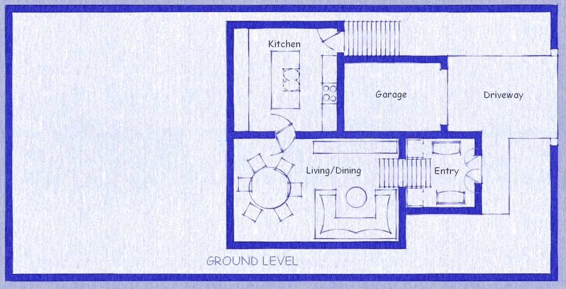
I played around with the styles window a little (edited "Clipboard with fine marker"). There's probably a style to exactly replicate a blueprint, but this works for now.This is the skippy file of my Floor Plan. Can see project organization here. Trying to keep organized using layers, making components and groups. Also made my first Scene. I'm using a very basic/inexpensive Compaq laptop, so I know I'll need to turn off a lot of stuff to prevent crashes.
skippy file
Please criticize to your heart's content. I want to improve.Coming next the rest of the floors and then.... start making this thing 3D!!
-
Hi GB,
Your image did not attach (that "multiple attachment" is broken so you need to attach everything one by one).
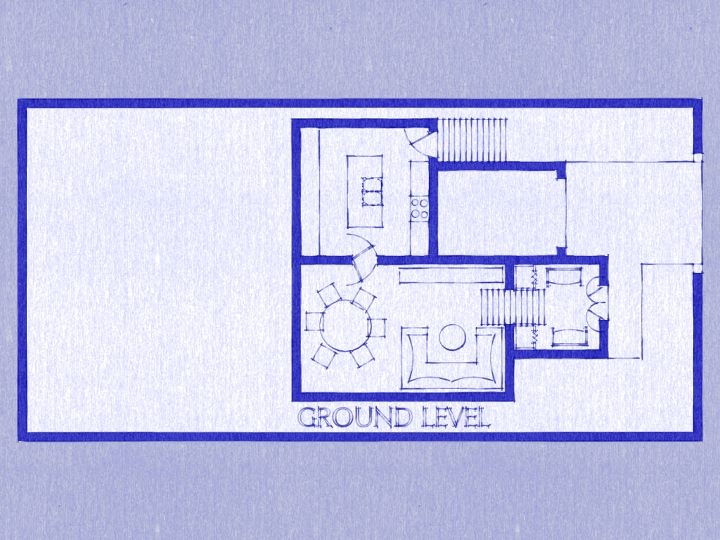
You use screen text for your labels. These are always relative to the screen and never really "attach" to the model itself. For labelling therefore you could use 3D Text instead - maybe without extrusion (thickness). Somehow like this:
-
Hello again,
I've finally finished the floor plans for my humble house. Now I can move on to raising the walls. Here are screen shots. I used a different Style (Brush Strokes on Canvas). I also found the "Blueprint" Style in the "Assorted Styles" folder. I had a few annoying 'issues' while doing the floor plans.- I drew little pictures to represent furniture so I could scale the rooms somewhat. I made components or grouped these furniture pics. I also added colour/texture to the furniture. Whenever I deleted walls and redrew them, various faces (the floor) would be deleted and redrawn automatically (OK this normal). The problem is that when the new face was redrawn, the floor texture would hide the furniture texture (only the outline would show). More annoying the new face/floor would hide the texture of some components/groups like doors and stair sets. Sometimes the blue colour that I filled the walls with would 'bleed' over into everything else, forcing me to spend hours re-tracing the walls until it corrected itself. (I made the walls using the rectangle tool.) (I mostly use the rectangle tool.) So long rant over - if you experienced users could give me some workflow hints or advice that would make this process go faster, that would be great. Otherwise I had a fun couple of days, working on my house plan. Here's the pics. Next post should show come walls.
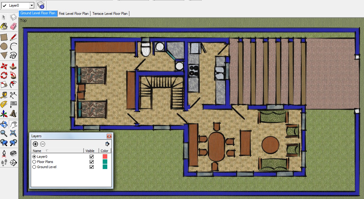

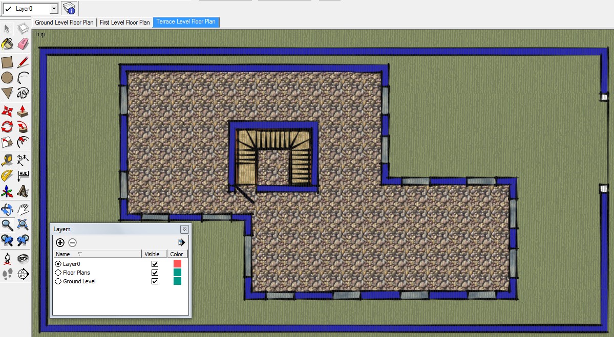
P.S. I plan to raise the walls using the push-pull tool from these floor plans. Is it possible to preserve the scenes as they are now so I can carry on with the 3D models? Should I copy/paste to a new document? Should I copy/paste to a new layer? You may notice in the layers window I have put all the 2D floor plans on a layer named 'Floor Plans' so I can hide it while working on each level of the house.
**Another annoying problem is I cannot delete the layer named "Ground Floor". I have checked carefully for any remaining items on that level but can't 'see' anything. Must be one little pixel somewhere messing up things, eh?
Well thanks in advance to all who have viewed this thread and especially to Gaius who I know will respond even before I finish editing this post!!
- I drew little pictures to represent furniture so I could scale the rooms somewhat. I made components or grouped these furniture pics. I also added colour/texture to the furniture. Whenever I deleted walls and redrew them, various faces (the floor) would be deleted and redrawn automatically (OK this normal). The problem is that when the new face was redrawn, the floor texture would hide the furniture texture (only the outline would show). More annoying the new face/floor would hide the texture of some components/groups like doors and stair sets. Sometimes the blue colour that I filled the walls with would 'bleed' over into everything else, forcing me to spend hours re-tracing the walls until it corrected itself. (I made the walls using the rectangle tool.) (I mostly use the rectangle tool.) So long rant over - if you experienced users could give me some workflow hints or advice that would make this process go faster, that would be great. Otherwise I had a fun couple of days, working on my house plan. Here's the pics. Next post should show come walls.
-
Hi GB again
Well, you have a couple of issues here. Mainly workflow. I understand that you want to start from 2D but SU is really a 3D application so filling your rooms with 2D "place-holder" furniture is not the best idea. These 2D groups/components are automatically "glued" to the face they are placed on but once you delete the face (in any way), this gluing feature is gone and the two, coplanar faces in the same place will always cause Z-fighting (that flickering effect).
As for your floor disappearing all the time... There could be a solution; group your entire floor face and then lock it. It will prevent any unwanted changes.
As for "keeping" the 2D plan... Certainly you can do that - just place your 3D walls on a different layer. Here is a (very basic) example for a similar house:
http://sketchup.google.com/3dwarehouse/details?mid=ff5e479bc33c72c1b9c95966dbc09e1Go through the scene tabs to see what I mean. With each scene, the visibility of different layers is associated. However keep one very important rule in mind: never put "raw" or "loose" (ungrouped) geometry on any other layer than Layer 0. In fact, always draw on layer 0 and never even change the active layer otherwise this is what happens:
[flash=600,470:t6e0e569]http://www.youtube.com/v/fBdP499iw0Y?fs[/flash:t6e0e569]
Finally (for now, until you have some specific issue with your model again), I would leave those fancy styles to the end. They may look nice but will slow down your computer's performance after a while as well as they are much harder to work with than with a simple style. In fact, I would not even texture until I am done with (at least most of the) modelling. Without textures, you can much better see if you are faces are oriented correctly (always white outside; never those blue back faces...) I know you are impatient and would like to see quick results and your model in its full beauty but just listen to me.

-
Those are nice styles on your floor plan images.
One thing you could do to keep the furniture from disappearing into the floor is move all those components up above the floor plane. In your 2D plan view you won't see that they are higher than the floor.
-
Thank you for the helpful tips. I agree that I need to work on my workflow. In these pictures I've gone back to the default style of a newly opened .skp file and minimal texture on window frames. You are right, Gaius, it is much easier to work with a clean model.
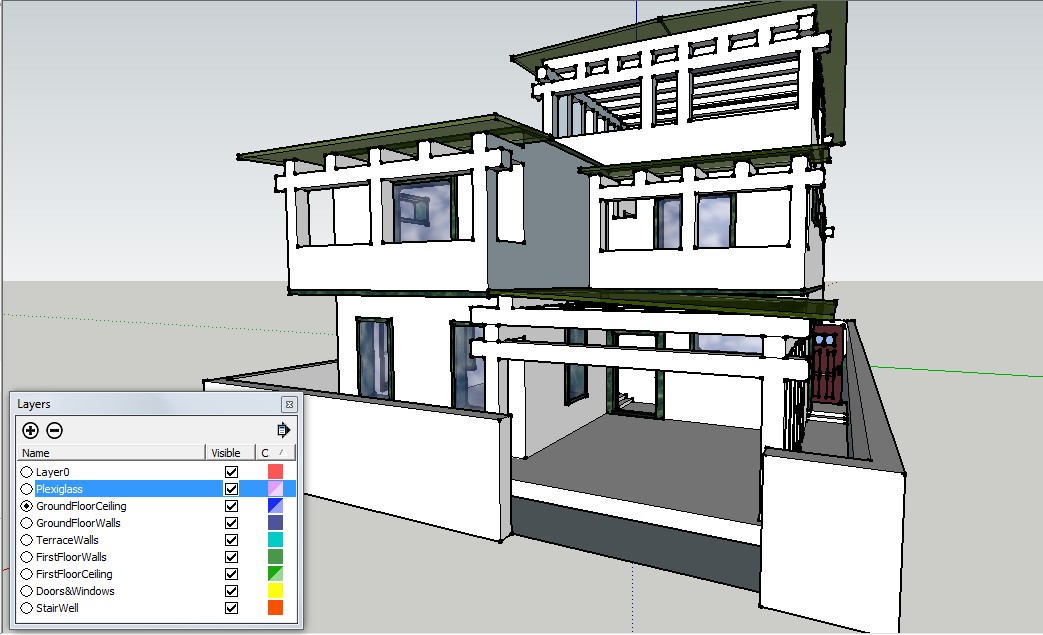
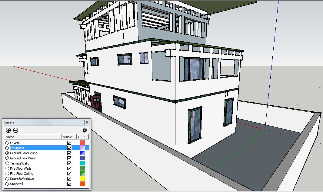
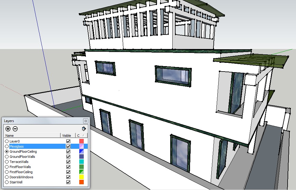
I will continue to add details to this model, but won't bore you with the details until I have a rendered version. I plan to model all structural details but will import furniture, light fixtures and other decorating details.
Things I learned...- Grouping each floor as soon as the first entity is drawn and placing on a separate level.
- Hiding other layers while editing one layer/floor at a time. (This was especially helpful while working on the stair well.)
- Using the colour feature in Layers Window to keep aware of which layer I was editing. Also I kept the Entity Window in the bottom left corner to stay aware that each entity was on the correct layer.
- Occasionally I forgot to double-click a group to work on it and new entities ended up outside the group and the layer.
Thank you Dave and Gaius for the helpful advice. I think I'll start another house to practice keeping my workflow organize. Later I'll go back and add details to the first house model.
-
@greenbelt said:
- Using the colour feature in Layers Window to keep aware of which layer I was editing. Also I kept the Entity Window in the bottom left corner to stay aware that each entity was on the correct layer.
No, the way you are using layers is absolutely wrong! Always follow these rules:
- Never put anything but groups/components on other than Layer 0!
- Do not even change the active layer (the round radio button before the layer name) to anything else than Layer 0 (since then you will be adding primitive geometry to the currently active layer).
- Now as you have already screwed up, use this plugin to put everything back to Layer 0
In SU, if you do not follow these rules, you will soon get to a point where you are extremely confused and cannot manage your model.
Imagine that you draw your primitive geometry on Layer X - and of course, also keep its group on Layer X. Later you change your mind (you will, believe me) and put the group onto Layer Y - but the geometry inside is still on another layer (maybe even on several layers as you may have forgotten to switch the active layer here and there). Total chaos.
Layer 0 has a special feature; even if you turn its visibility off, all primitive geometry on this layer will still be visible. I.e. this is where you keep this geometry then separate this geometry by grouping / making components finally control the visibility of these latter (only) by putting them on other layers.
-
I totally agree with Csaba about using layers. In fact I would highly recommend that you go to the SketchUp Help files and read the page under Does SketchUp Support Layers.
Layers are only used to control visibility. Create primitive geometry--edges and faces on Layer 0. Make components or groups of the geometry and give them layer associations as needed.
Keep plugging away and you'll get it.
-
I also keep all entities on Layer0 and groups/comps on layers - with one (usually) exception; I often move window glass faces to a separate layer named 'glass'. It is often convenient to be able to turn all glass visibility quickly on/off.
-
@bjornkn said:
I often move window glass faces to a separate layer named 'glass'. It is often convenient to be able to turn all glass visibility quickly on/off.
Well, do that when you already have some routine and confidence in what you are doing (I often disregard my own suggestions above - but then there is a reason and there must be some discipline behind...)
-
@gaieus said:
but just listen to me.


Good tips, Gai!
Greenbelt,
As a professional designer, I find your plan presentation style fresh and funTry this, from one of the Masters, Krisidious: http://forums.sketchucation.com/viewtopic.php?f=18&t=723#p4177
and http://forums.sketchucation.com/viewtopic.php?f=18&t=752(Still looking forward to "pt 3")
But you seem well along the way already...
Peter
-
Don't mean to bump this mundane thread to page 1 again but had to thank Peter for his compliment. I'm a rank amateur as far as house design goes (emphasis on the 'rank'.) Using SU makes my houses look sooo goood. The credit is all Sketchup's. Also followed your links to the 2 Tutorials by Krisidious. I too am waiting for Part 3!!! (hint Kris if you read this
 )
)Thanks Gaius again. I downloaded the plugin. Here is another way I am organizing which bypasses my obsession with layers. (jpg below) I think that bad habit got hardwired into my old brain when I used that old drawing software in Cartography class. Until I 'un learn' I will avoid using layers for a while. Anyways I desperately need to learn some actual modeling skills.

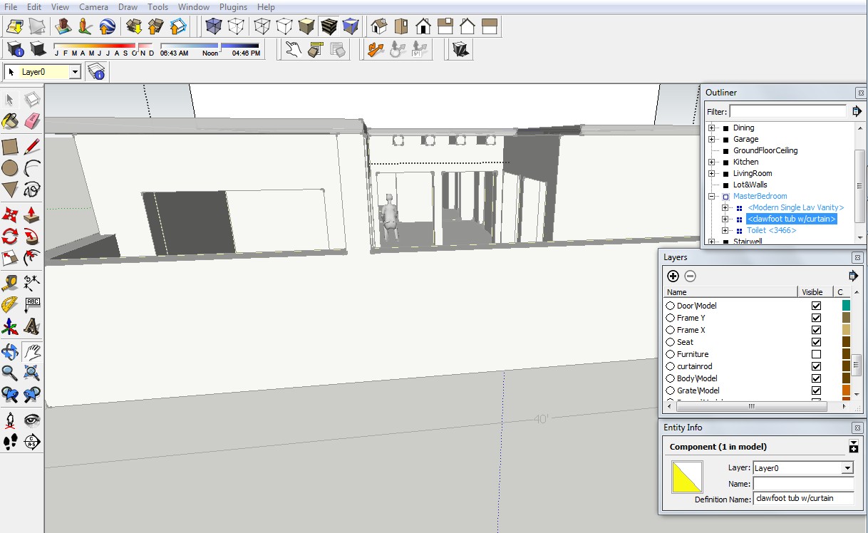
I find using the Outliner Window to select and move objects around is easier than double-clicking to open endless nested groups/components. Since the active thing is highlighted in the Outliner Window, I can also keep track of 'where' I am. (I often get lost...still )
)I do have one layer that I made and use called Furniture. The rest of the layers came with downloads. I keep all stuff from 3D Warehouse here and turn it off to save my little laptop from over heating. Helps me size my rooms. The Google 3D Man models are great for making sure there is enough headroom under staircases, or space for movement around furniture. Also use them to scale stuff I get from 3D Warehouse. Some of those toilets were HUGE!
One question about the hidden furniture layer. Saving, moving around, etc. is still a bit slower even with all that turned off. The file is bigger even if I can't see the furniture and this still slows down my little laptop, correct?
Sincerely, Greenbelt
P.S. in case you're wondering my 'name' is referring to an urban planning concept not to martial arts. The first forum I ever joined was a SimCity fan site and I've kept the name ever since. BTW has anyone modeled stuff for SC4 using Sketchup???
-
Outliner is a good thing to use - make sure however to close or at least minimize it before using some of the plugins that add considerable amount of geometry to your model (like the Fur plugin or such) as SU will try update it instantly and you will get lags very easily.
As for layers, here is a good video why not to put ungrouped geometry on other than Layer 0 as in SU, layers are merely for controlling visibility and not for separating geometry.
[flash=600,470:2givdic7]http://www.youtube.com/v/fBdP499iw0Y?fs[/flash:2givdic7]
Hello! It looks like you're interested in this conversation, but you don't have an account yet.
Getting fed up of having to scroll through the same posts each visit? When you register for an account, you'll always come back to exactly where you were before, and choose to be notified of new replies (either via email, or push notification). You'll also be able to save bookmarks and upvote posts to show your appreciation to other community members.
With your input, this post could be even better 💗
Register LoginAdvertisement


