Amateur Hour
-
Hey folks,
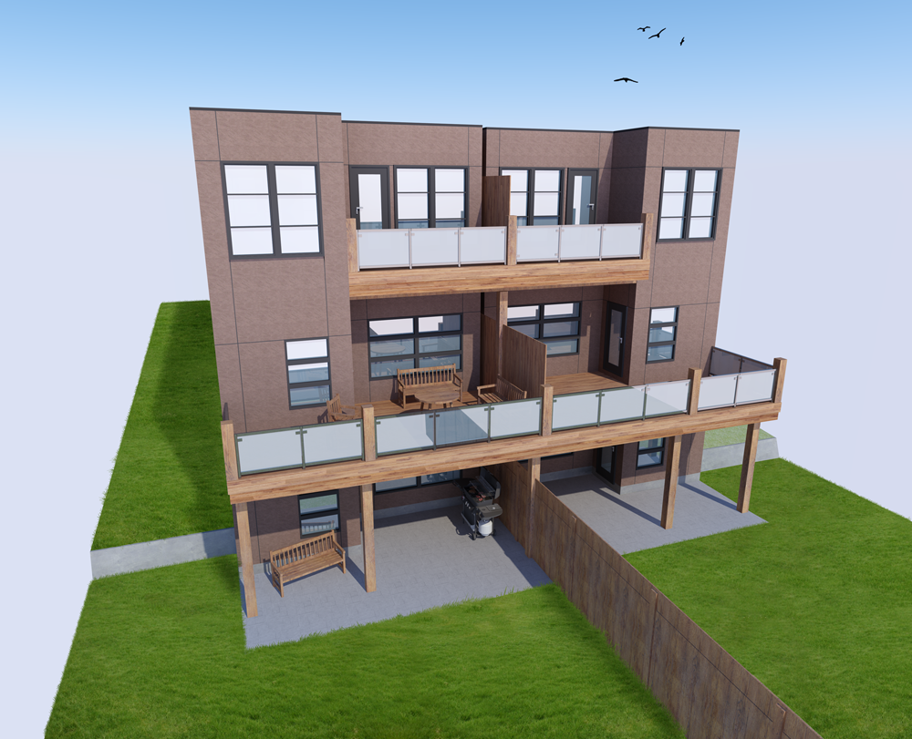
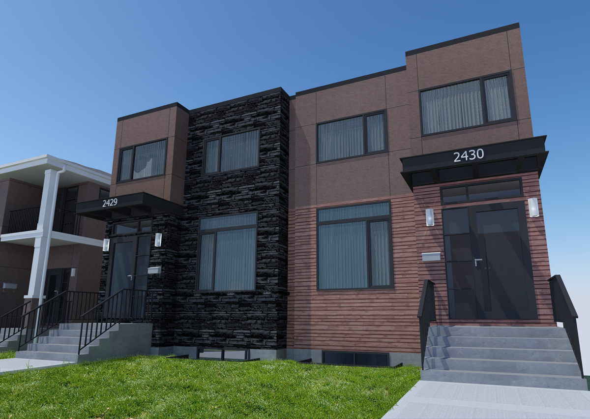
I'm working at an Architectural firm, where the boss has me creating high resolution renders for our client. The deadline seems flexible, so I'm hoping for some criticism.
I've got sketchup7 and Podium V2 at my disposal, as well as Photoshop (the source of the grass).
So what do you think? Be as brutal as you need to.
-
You need a horizon & some entourage otherwise it's a flying in space view. The viewpoint is showing the depth of the balconies i know, but nearly always a standing eye view works nest IMHO.I like the grass, the glass needs work on the balconies. Once you have an entourage and a background image the glass will start to become believable as it shows reflections.
-
Your exterior wall textures are tiling noticeably.
From one amateur to another
-
a bit more context would be nice - if you want just have a site plan or something, or white block model. are there other buildings near to it?
-
You're right, that would make a world of difference.
I have three models to build (front and back), so I'll put them side by side for the next set of renders.
I suppose I should find some better Stucco textures, too. How does everyone else deal with the repeating textures issue? Find a site that makes giant textures, or build your own textures in photoshop? -
I agree with all the comments above.
I have been struggling for years to get my renderings to look more realistic.
Ultimately, there are several factors that contribute to make the image photo-realistic...
(Quality of textures/materials; lighting; scene setup; level of detail modeled; etc... and this list goes on...)Look at other renderings to see how people deal with the horizon and context (eye level helps a lot!)
Here is a rendering I did last year: (it's not great, but I think it's decent...)
http://goo.gl/IoWPGAs for the textures, you can find tons around the web. Find one that is close to what you need and modify it.
I often use http://www.cgtextures.com/
the larger the better... if you want to make your own you should try pixplant - http://www.pixplant.com/Good luck and post the results!
-
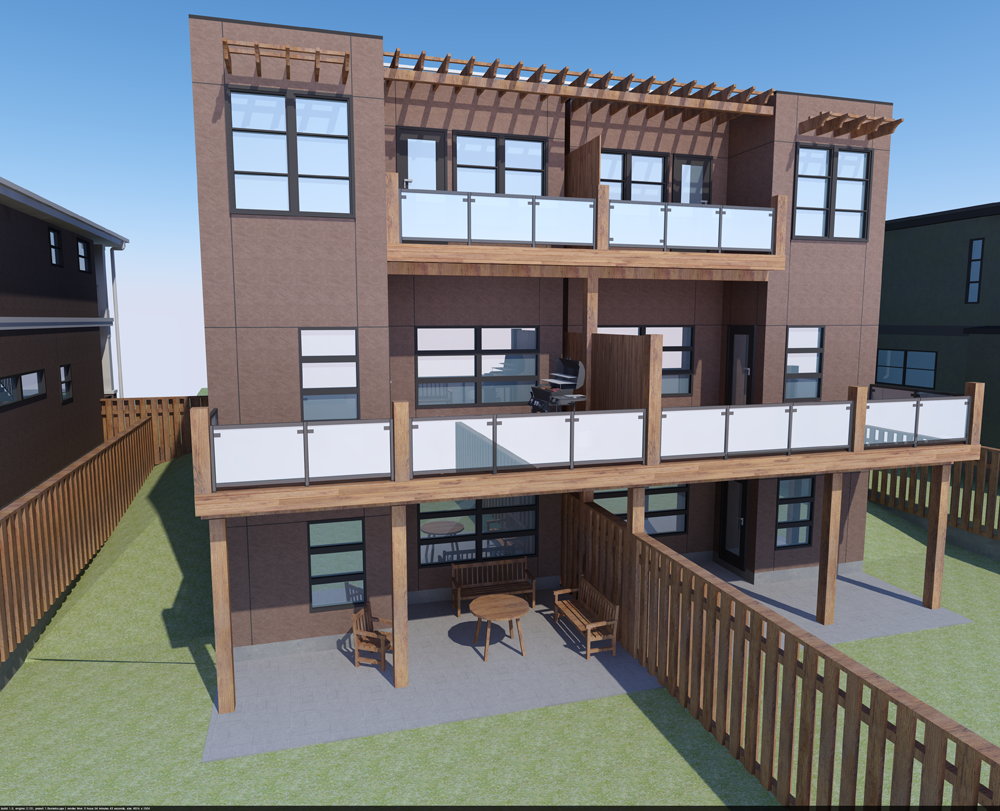
Kyle, nice begining. You might want to extrude the vertical posts on the fence - when opening, that is the first thing I noticed. Also, the concrete texture on the ground floor patio is too clean and bright, doesn't look natural. Arroway textures has some nice concrete textures, and probably stucco, too (Arroway textures are larger than the 1024 pixel size SU can handle, so will need to be resized if used). I believe at the front of the materials thread there is a list of sources, also.
On the windows, you might try inserting closed blinds and drapes immediately behind the windows, and reduce the opacity of the glass, for a more realistic look (there are condos immediately across my office, and through the reflections I can see white blinds and drapes on all the windows - where open, it's just dark gray).
Is that a short retaining wall on either side?
-
Kyle,
You said your boss wants high resolution renders, what resolution?
I'm assuimng he also wants photoreal right?
-
One other thing: the hard crisp edges on the corners are very difficult to find in the real world.
Edit: Another other thing. More to design: There needs to be some transition between the ground and the construction. This may help it visually to appear more natural in its setting.
-
@Daniel:
Good to hear someone criticizing the textures. I wasn't hearing anything about them from the boss and coworkers, but now I know to find something better
I'm loving the idea of drapes and blinds behind the window. Really love it. It'll especially help hide the fact that this model is just a "shell". Thanks!@mitcorb:
Would a small chamfer on the walls make a difference? How about on the wood?
When you say transition from ground to construction, are you referring to the flat concrete pad? For the most part, everything else is shrouded in grass.@solo:
Correct on both counts. Poster sized images (how big?? Nobody tells me nuthin!), and as photoreal as possible. ...I've pretty well been asked to raise my game, ASAP. I like the challenge, but I think Podium can only go so far.What do you folks find speeds up your modeling time the most? Would I be correct in assuming it's having useful components ready and at hand?
I've got a second image attached... it's a shit test render, but it's helping me see what a difference getting rid of the "floating in space" look makes. I... still need to implement all the changes everyone's suggested. If it weren't for all the work around here, I could get some work done!
-
@unknownuser said:
I like the challenge, but I think Podium can only go so far.
IMO, you are right, Podium is entry level (and the developers are conscious and deliberate about this, in order to keep it an easy to use render solution), for the next level you will need to look at something with some balls, bells and whistles.
The next step up would be Twilight or your could go even one step higher and try Maxwell, Vray, Thea, Indigo or even Vue (for exteriors)
-
My two cents are based on what we do at my office: photo-realistic is less important than communication. This rendering with just a few tweaks would be fine with some Photoshop work. There are four things that I would do:
- Rendering - Stucco texture (as people have mentioned already) is too repetitive.
- Rendering - Glass, especially on the railing, should be transparent. In my office, it doesn't matter what is real, glass has to be transparent.
- Photoshop - Grass. Use a splatter brush to erase around the edges of the patio and fences so it looks like the grass has height and irregularity.
- Photoshop - People and trees, people and trees. Trees in the background, sky with some clouds, a few people for scale and feeling. There is an interesting thread on different ways to add people.
That's my two cents.
-
Hi, icedkasz:
Yes on the small chamfer, or something like it.
For transition, at the very least, raise the floor level and or the porch level several inches, to depict a first line of defense against inundation.Water is your friend/ water is your enemy.
-
I'd also suggest reviewing your camera position, the more natural (human perspective)the more realistic.
-
Solo is right,a good model can be made redundant at early stages by not picking your viewpoint.Pick a point at eye level and follow on from there,and then don't go for the first angle that you think works.Most of the best images that you see here are usually from testing/trying different angles/views but the angle you are working with is not natural.I have attached a pdf based on watercolour painting(uploaded previously)but although we work digitally,the same criteria apply.
-
At eye level or not, something like these trees that Oli posted a while ago often come in very handy when dealing
with an empty horizon:
http://forums.sketchucation.com/viewtopic.php?f=40&t=27540&hilit=trees -
I don't think I have seen your question at the Podium forum.
Might be worth your time to ask some dedicated Podium users
how they would approach your task.@solo said:
IMO, you are right, Podium is entry level (and the developers are conscious and deliberate about this, in order to keep it an easy to use render solution), for the next level you will need to look at something with some balls, bells and whistles.
The next step up would be Twilight or your could go even one step higher and try Maxwell, Vray, Thea, Indigo or even Vue (for exteriors)
Would your employer be willing to expend the time & money to get into a more advanced application?
Could you post an example of what you would consider "photo real enough"?
Paul
-
Kyle, much better on the fence. I believe what Mitcorb was refering to on the transition ot the ground is that siding materials do not always extend down to the ground, especially if it's wood, E.I.F.S., or metal. Below the siding you'd see the foundation, or it would transition to a more impervious material (like stone, brick, concrete) which would extend down below grade. Also, you'll notice in the real world slabs on grade, such as that patio, are usually slightly above grade; if at grade as your showing, that gradd will eventually grow over the edge, and rainwater will probably flow onto the porch.
What speeds up modeling time? Many factors, but I think (IMHO) the most important is becoming a proficient modeler, to begin with, which takes practice. Also, using components - not just ready made, but while modeling. If all those windows are going to be the same, why model each separately? Plus, it makes editing so much easier.
-
Health issues knocked me down, but I'm back for another try. The project itself was scrapped, but I'll still trying to learn something here.
On top of that, I think I'm going to continue learning the basics of 3d modeling and presentation before switching to a more powerful renderer.
-
Looks good! These are definitely presentable to a client. I would use photo shop to insert a different sky - something that isn't solid blue. Maybe the birds are distracting from the first image.
Cut bait and move onto a new project. With illustrations, you have to know when to say when...especially in a working office with budgets/deadlines!
Hello! It looks like you're interested in this conversation, but you don't have an account yet.
Getting fed up of having to scroll through the same posts each visit? When you register for an account, you'll always come back to exactly where you were before, and choose to be notified of new replies (either via email, or push notification). You'll also be able to save bookmarks and upvote posts to show your appreciation to other community members.
With your input, this post could be even better 💗
Register Login


Advertisement