Manga exhibition stand
-
Hi Guys,
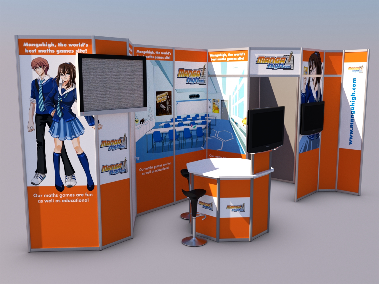
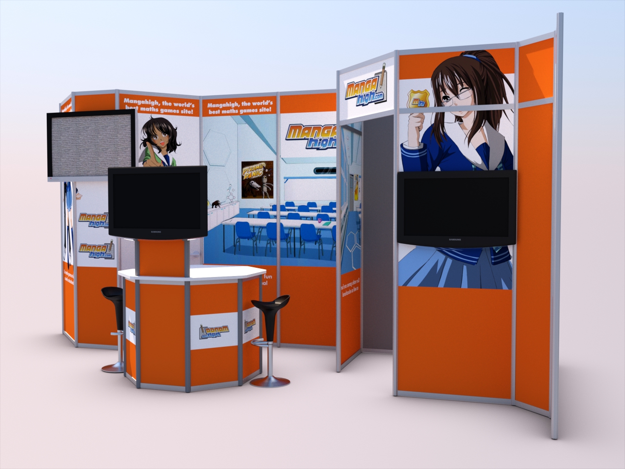
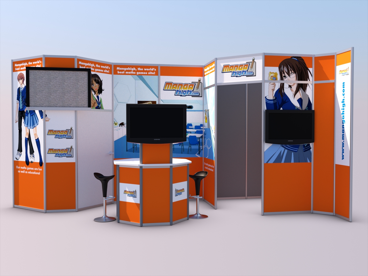
I've been working on a design for a customer of mine and this is the final product. All made using our modular aluminium system with the customer producing the graphics.
Renders were done with Arion Render, left each one for about 20 minutes.
Comments and feedback always appreciated.
Puck
-
I think you should include somthing in the render to better understand the scale of the stand and use some more interesting lighting and enviroment. Also why not include some pictures for the TV's, because they look kind of boring now.
-
Yep, Speaker is right on both counts. I'd say add a couple of images of people in outline transparencies. I'd get rid of the monitor on the right as it breaks the image behind it. As regards the TV on the left, I'd move that to the third panel from the left and fix it under the panel image if it fits, if not I'd find a monitor that does. Also place some images on the display monitors
The modeling and composition looks good however

-
EDIT if you are looking for rendering/modeling tips just ignore my post


I think this has a lot of potential.
I would exchange the orange color to something cooler like black or gray.
The mangahigh sign shouldn't have a white background just go with the your main color (at the moment the orange).The tv on the left shouldn't cover the graphics next to it. Also it sticks out from the panel so you can see the backside of it > not nice.
I would use a bigger panel (or two) for the tv and only put graphics/text underneath.
The other tv is in the belly of the girl - not really good either i think.I would exchange the empty classroom pic in the middle for something that has more life. (teacher/students)
Why do the panels next to the door have transoms in them? i would take them out. (poor girl is beheaded)
Maybe some spot lights on the top the panels?
Definitely turn the tvs on.
-
Very nice! I've done "some" (not very much really) exhibition design and this is very well done.
Hello! It looks like you're interested in this conversation, but you don't have an account yet.
Getting fed up of having to scroll through the same posts each visit? When you register for an account, you'll always come back to exactly where you were before, and choose to be notified of new replies (either via email, or push notification). You'll also be able to save bookmarks and upvote posts to show your appreciation to other community members.
With your input, this post could be even better 💗
Register Login


Advertisement