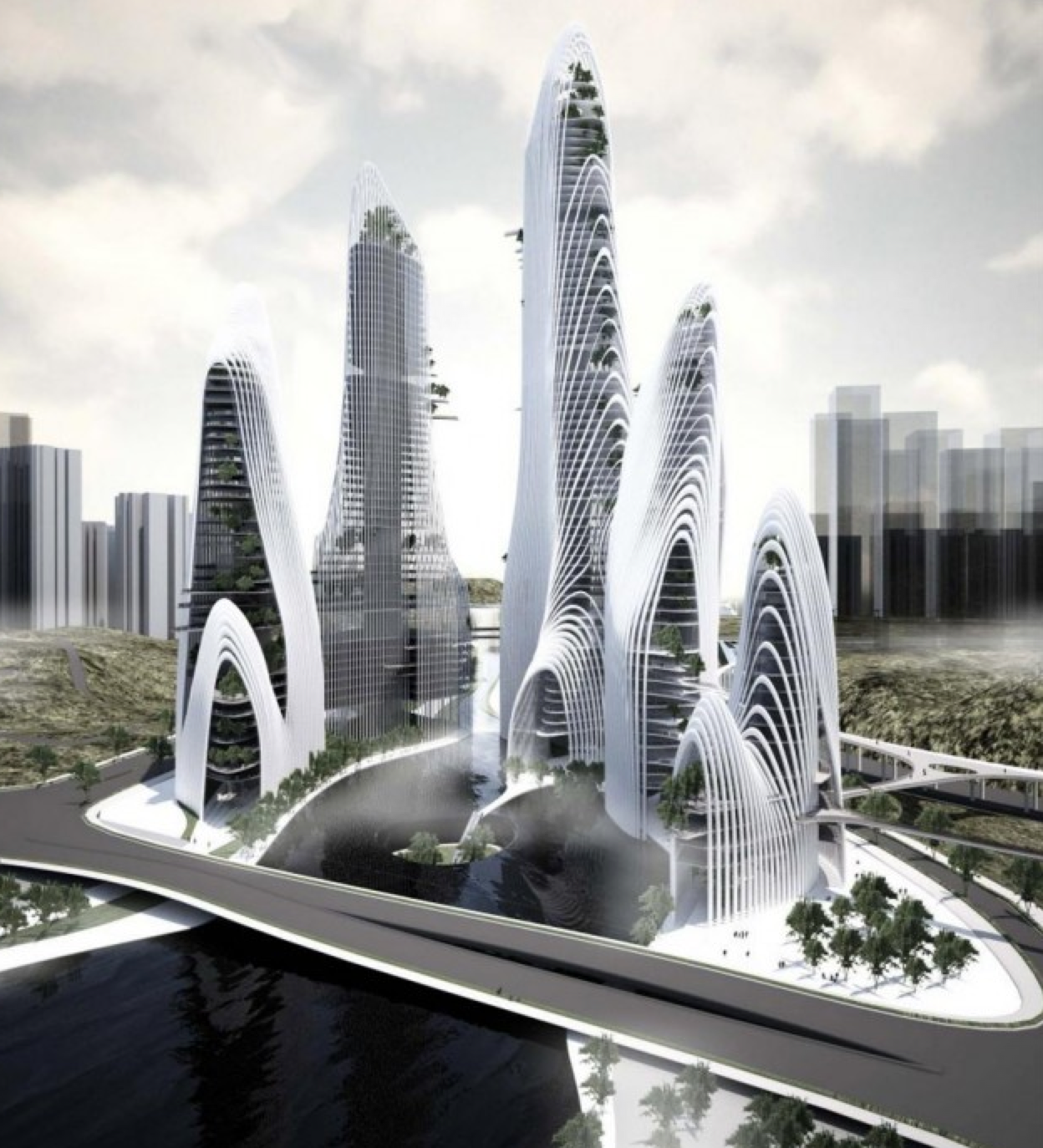
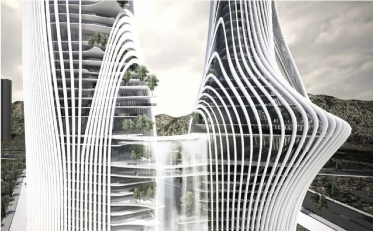
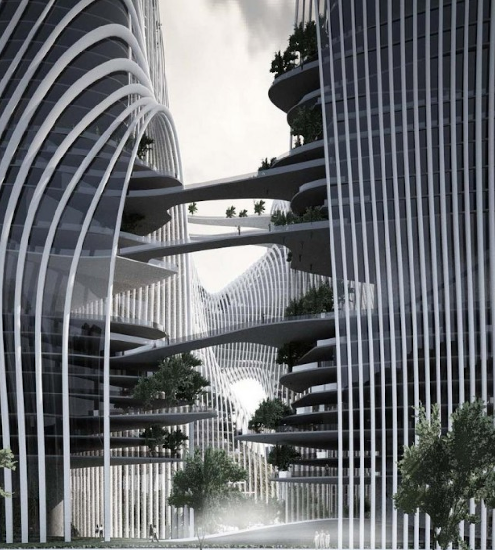
A Thread for Fine Design
-
Yow! that is serious.
-
@dale said:
Making me wish I didn't give up vinyl!
Oracle Delphi Mk VI
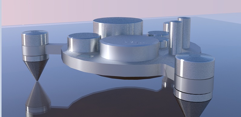
http://www.oracle-audio.com/?action=produit_show&id=1Great turntable! I saw this amp in my head when I looked at it. Quick rough model and I am still coming to terms with render settings (obviously)but I thought they would look cool together. Could even be Mono's so there would be two of them. I think that would look sweeet! The knobs are above the feet volume on off etc
-
That's perfect. Now I really do want to spin some vinyl.
Got any Ideas for speakers?
-
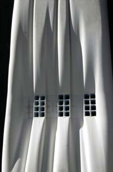
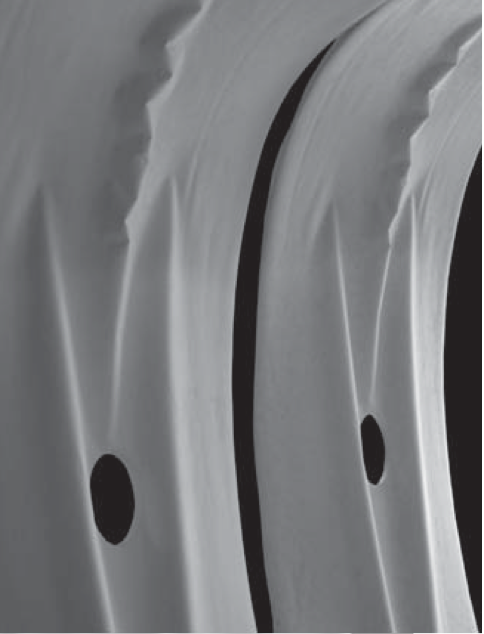
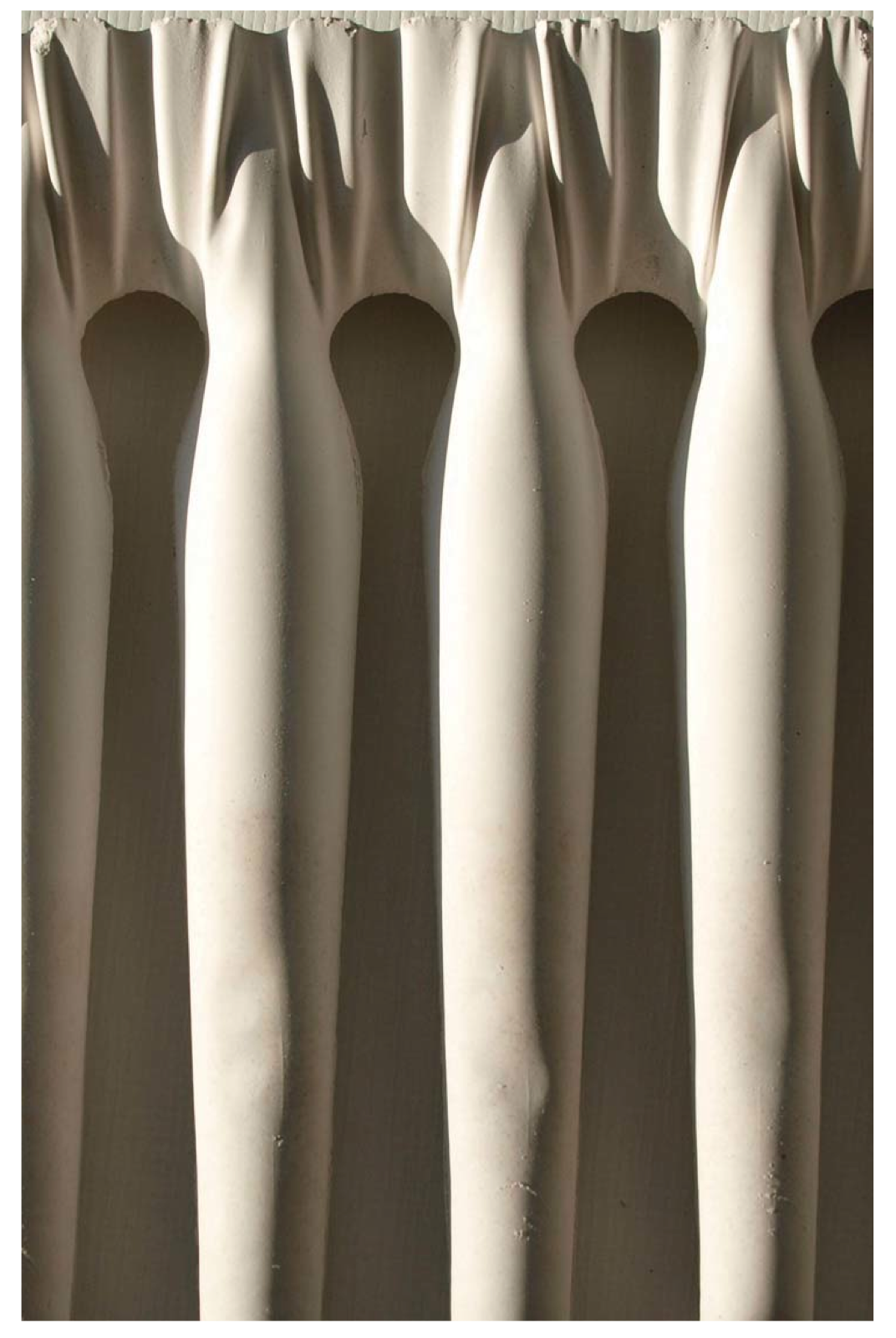
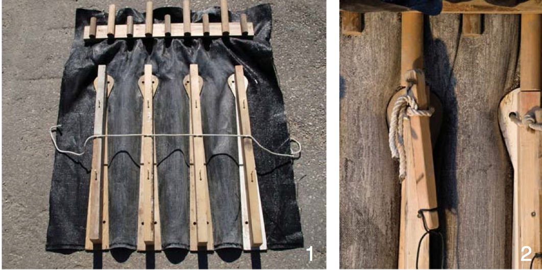
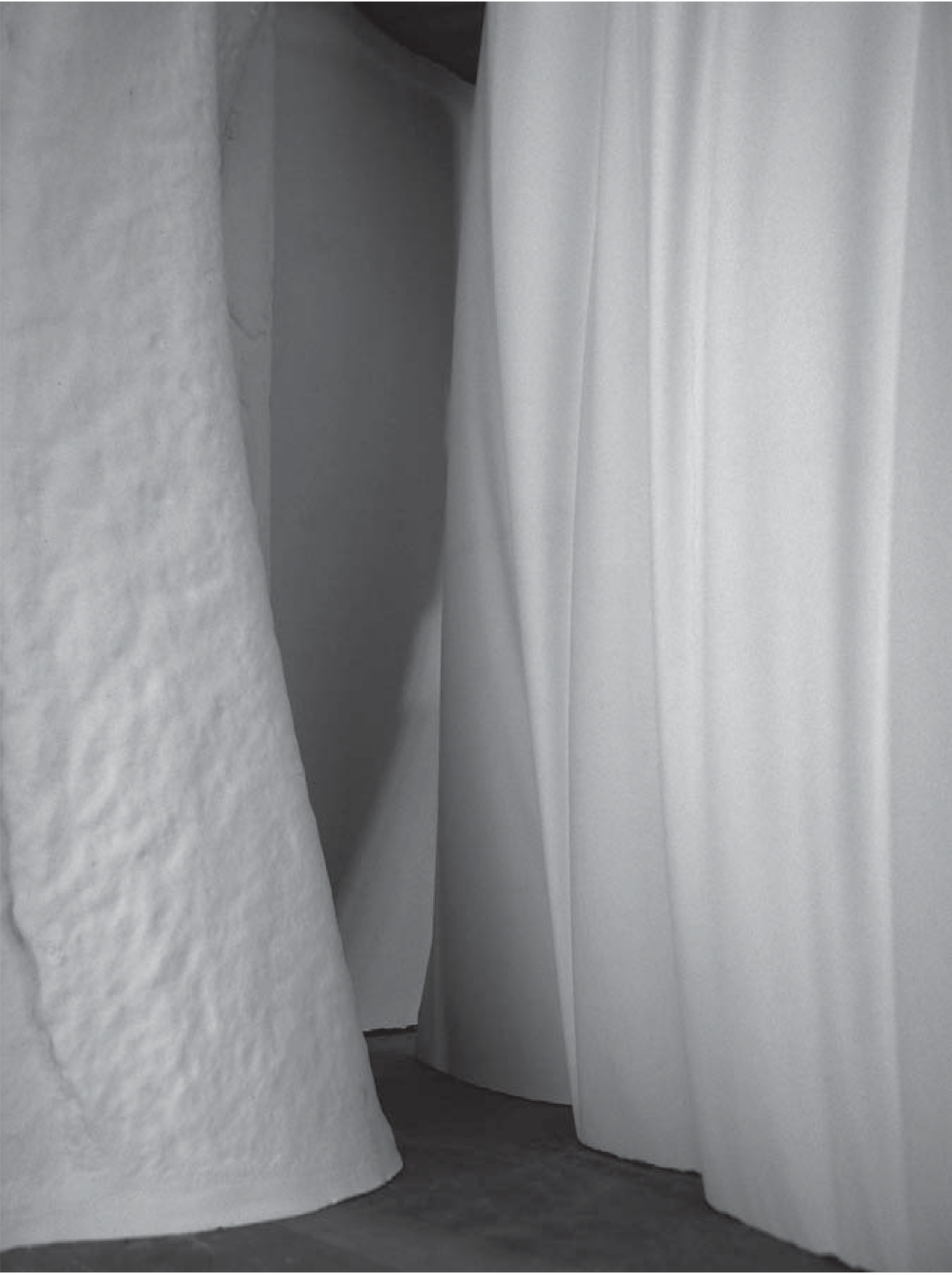
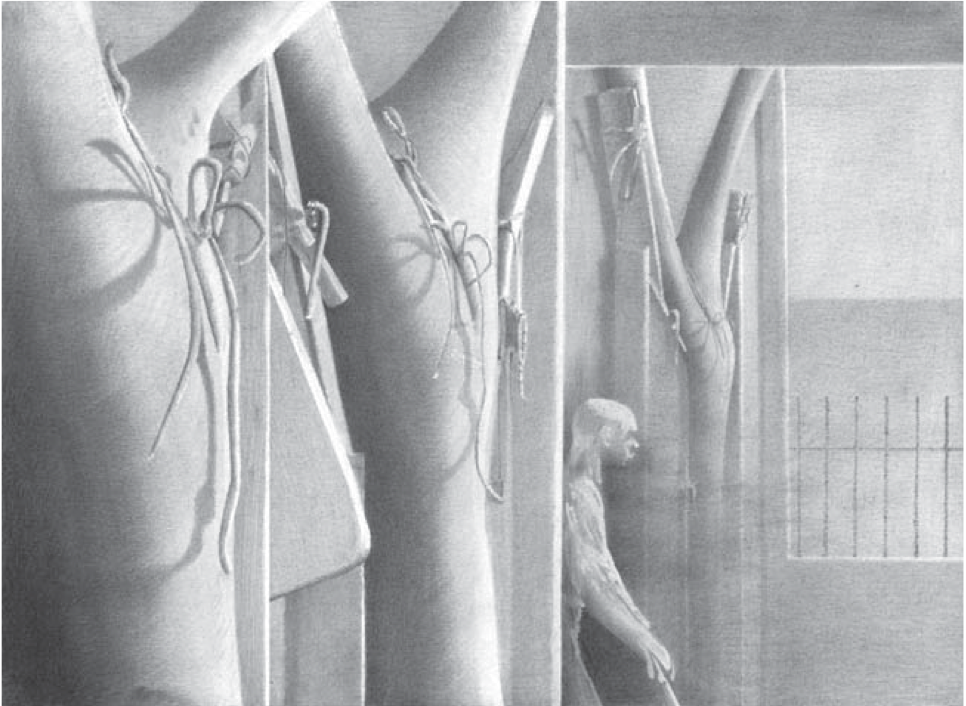
The Beauty of Fabric Cast Concrete
-
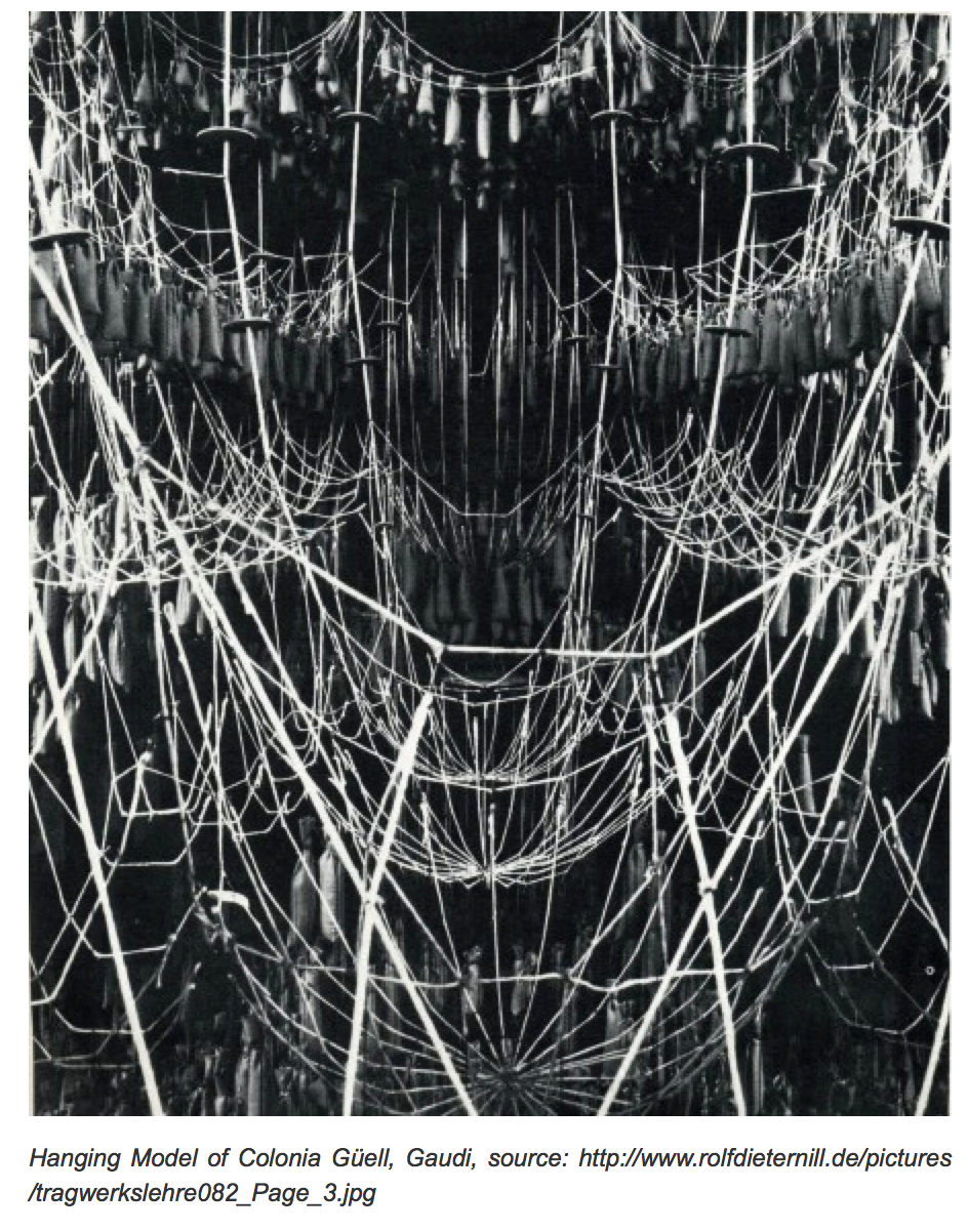
Those images and an overview article in your link reminded me of Gaudi, and a book about him in which were some photographs of his inverted catenary studies using weights and fabrics as visualization models. I believe they were used in design of Familia Sagrada.
-
I think he used inverted catenary curves.
-
Ah Yes Gaudi.
Here is a photo of one of his string models. I read somewhere once that the models were 1:10 scale, and the weight placed on the strings was 1/10,000 the load they would carry.
-
-
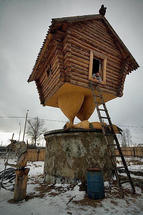
The Izbushka (house, hut) of Baba Yaga. Built by Vasily Kozin, near St.-Petersburg, Russia.
Baba Yaga is a hag or witch in Slavic folklore. She flies around on a giant mortar, kidnaps (and presumably eats) small children, and lives in a hut that stands on chicken legs. In most Slavic tales, she is portrayed as an antagonist; however, some characters in other mythological stories have been known to seek her out for her wisdom, and she has been known on rare occasions to offer guidance to lost souls. She often fulfills the function of donor; that is, her role is in supplying the hero (sometimes unwillingly) with something necessary to further his quest.
According to Russian folklore, Baba Yaga dwells in a "cabin on chicken legs... with no windows and no doors". Baba Yaga herself usually uses the chimney to fly in and out on her mortar. The door sometimes appears at the other side of the hut; to see it, a hero should say "Hut, O hut, turn your back to the woods, your front to me" and thus force the cabin to turn around and reveal the door.
-
..... should we also add 'Eccentric' design

-
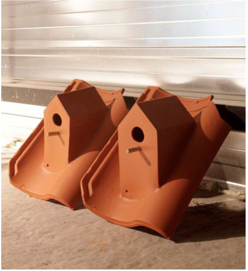
Well some designs are for the birds, and Baba Yaga's house did have bird feet.
-
-
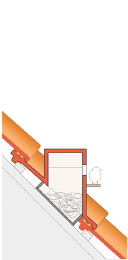
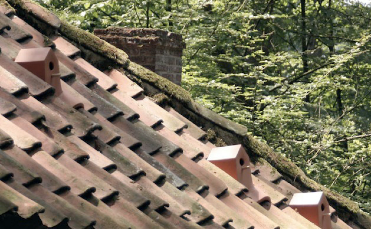
dale the concrete looks fabulous, thanks for posting. Roof tile bird houses are a great idea, although I can't help but think you'll be hearing lots of scratching and pecking through the roof?
-
.... something less grandiose but never the less impressive design in my opinion.
Today I came across Cadaval & Sola-Morales' X House in Cabrils, Barcelona, Spain.
http://www.ca-so.com/proyectos/Casa%20X/Casa%20X.htm
The design addresses the brief which must have been, views from all important rooms! This image explains the design concept.

The plan flows well and delivers some interesting shapes and volumes ..... and not to forget 'views'!

The building plot is an awkward one, a steep hillside. These sections show how the designer got around the problems.

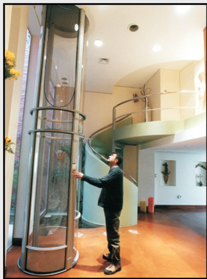
Personally I would have at least allowed for future lifts in the house, something along the lines of the Vacuum Elevators http://www.vacuumelevators.com/gallery.php
-
That is on fine residence Mike. I am wondering about potential overheating without some kind of shading on those main windows.
As for the elevators, I can't just let that one remain at the bottom of your post. I almost missed it, and that is one sweet system Once again http://www.vacuumelevators.com/gallery.php
-
Yes indeed, solar gain could well be an issue as Spain is a hot place!
I like this lift, so clean. It doesn't take much space either. I think consideration should be give to future lifts in domestic designs. This opens up more possible usage ..... now that I am approaching my more senior years, i tend to think more about these things ALSO the senior citizen sector of the Western World populations are increasing!
-
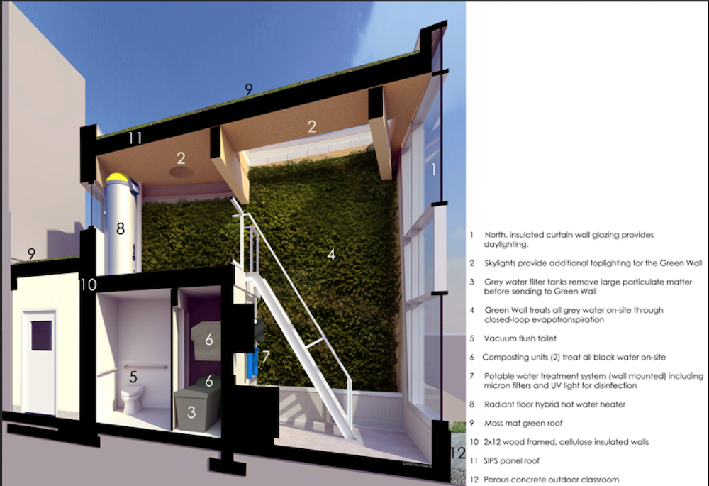
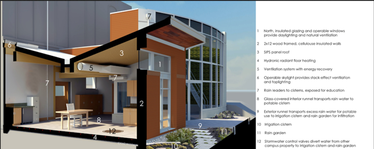
The Bertschi School of Living Science
KMD Architects http://www.kmdarchitects.com/work.php?id=11&pid=243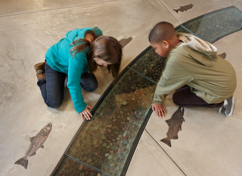
-
@mike lucey said:
Yes indeed, solar gain could well be an issue as Spain is a hot place!
I like this lift, so clean. It doesn't take much space either. I think consideration should be give to future lifts in domestic designs. This opens up more possible usage ..... now that I am approaching my more senior years, i tend to think more about these things ALSO the senior citizen sector of the Western World populations are increasing!
"Wrinkle Power Rules," I am with you Mike.
-
Winning micro-housing design on display in NYC

Mayor Michael Bloomberg’s adAPT micro-apartment design competition has a winner! Check it out here, http://www.gizmag.com/winning-micro-housing-design-nyc/25989 Its nothing ground breaking, just good solid adaptation of things that work well.
-

...... initially I thought, yes! ..... the no .... then yes again. What do you think? I imagine the question, 'where do I sit?' comes to mind

Sensei
Design conceived in terms of space and utility, sensei gathers two different objects in one same product, being these, two chairs or a small table. http://claudiosibille.com/sensei.php
Hello! It looks like you're interested in this conversation, but you don't have an account yet.
Getting fed up of having to scroll through the same posts each visit? When you register for an account, you'll always come back to exactly where you were before, and choose to be notified of new replies (either via email, or push notification). You'll also be able to save bookmarks and upvote posts to show your appreciation to other community members.
With your input, this post could be even better 💗
Register LoginAdvertisement


