Some Council Houses!
-
@unknownuser said:
Why do council houses almost always look like council houses. Is it a case that architects that can 'do', and those that cannot design council houses.
I really don't think that's the case. Remember Bob, the design is almost always diluted by the client and planning officials. And I'm pretty sure most Architects don't discriminate about what type of job they take on especially during the current economic climate (hate that expression). There isn't much picking and choosing! it would be nice though. A council house can still be a beautiful and fulfilling challenge.
I can't see a client saying "oh he's a bad architect, he can design our council houses!" quite the contrary.
Unfortunately, this is the situation we face in England. A plague of neo vernacular pastiche architecture.....a country of tacky dolls houses. Maybe I could change that!!

-
Dear Oliver,
My comments were made slightly tongue in cheek, but only slightly. We have some really bad examples of council housing in Oxford, such as Blackbird Leys, and so I tend to rail against featureless shoe boxes (http://en.wikipedia.org/wiki/Blackbird_Leys).
Talk me through this would you Oliver. You start with the same land, the same bricks and mortar and the same (or similar) man-days of builders effort, so why do many (not all) council houses look so dreary and featureless. When inner city building land is so scarce and costly, why is the roof space totally ignored (mansard roof?). Is it all down to the number of units on a particular site, the cost per unit, and the property developer trying to maintain his profit margin high by going for the cheapest build possible.
One last, and quite controversial question. Do beautiful presentations and renders promote bad planning and architecture by creating an illusion of a model community and a village-like atmosphere? Discuss.
Kind regards,
Bob -
Render = OK
Design = ???Who was it that thought that making the gable-ends of some small articulated forms 'lopsided' made them look 'nice' ?
Forms should 'follow function'... and also basic 'structural rules'... and common-sense...
A gabled-roof is at its most functional if it's 'symmetrical'... UNLESS there is some underlying reason that it should not be so [we see none ]...
]...
"Occam's Razor" = don't make something more complex than it needs to be...Render scores 7
Design scores 3 -
Oli???
Mate in your last posted pic there is some crooke mapping of the entry tiles, mate this is not like you!!!!

-
I know they are pretty damn ugly but really I can't do anything about it. I was literally handed drawings and told to "render this!" only had a day to model it. The roof pitches make me cringe.
Cheers for pointing that out Richard!

@unknownuser said:
creating an illusion of a model community and a village-like atmosphere
well if you got that impression my work here is done!!

TIG I agree entirely, but like I say it's out of my hands. If you cannot justify it then it shouldn't be there. thanks for the 7 out of 10! it could be worse!

-
From me a 7/10 is pretty good

-
Minor observation: the streetlight should be at the rear of the pavement next to the 50mm pin kerb
-
7/10, 8/10, 9/10, then 1/5 2/5 etc etc...
We are reaching the bottom now, wow
Great work oli as always.

-
cheers michalis, i just wish the subject had more balls!
@unknownuser said:
Minor observation: the streetlight should be at the rear of the pavement next to the 50mm pin kerb
yeah you would think that wouldn't you, its an existing lamppost, dunno why's it's like that.
-
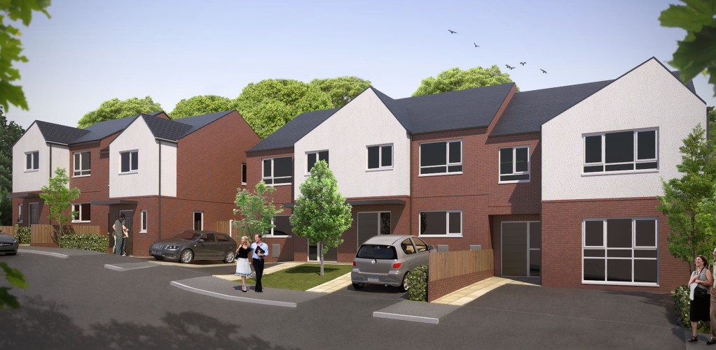
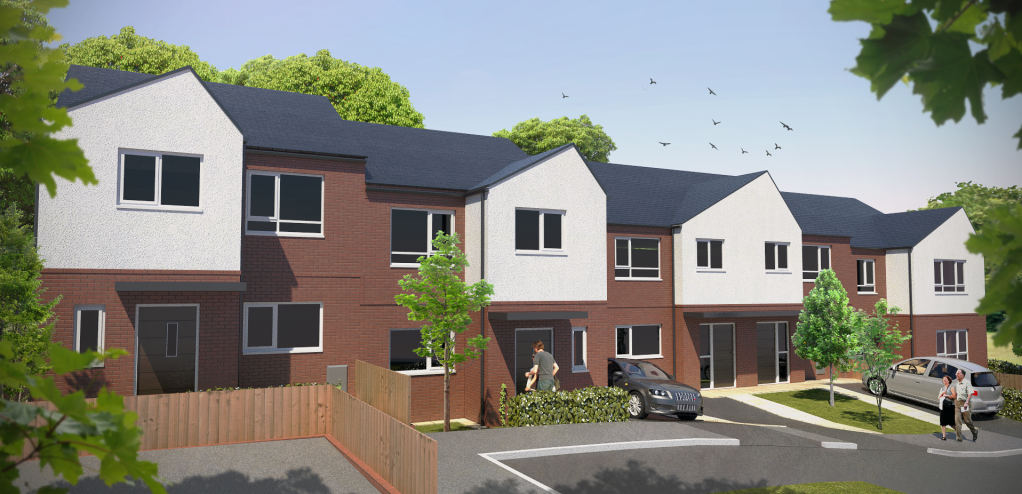
another site, another nightmare

-
Dear Oliver,
In reality there is going to be at least two cars per household. What would that look like?
Kind regards,
Bob -
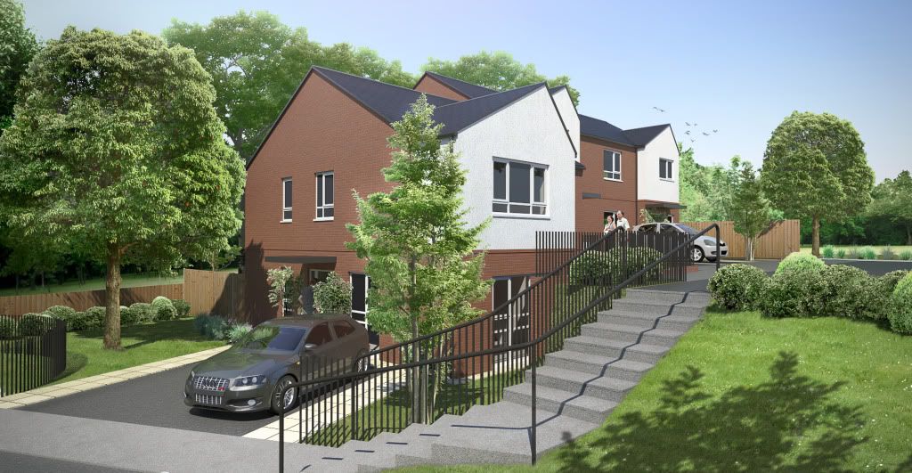
another site. difficult topography but 'archiland tools',' drape construction points' and 'triangulate points' were life savers! thanks all ruby developers!!

-
@olishea said:
another site. difficult topography but 'archiland tools',' drape construction points' and 'triangulate points' were life savers! thanks all ruby developers!!

Nice renders Oli but goddamn, council houses never look any better do they?? Ouch! Designer needs to get some different sources of inspiration or something.
-
tell me about it
 bloody doll house! thanks for commenting.
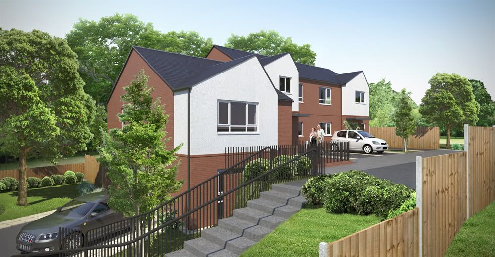
look at the view out of the ground floor window....brick retaining wall haha
-
Oli,
The last images are really nice, Congrats. About the design, It is much better than what I have seen in Luton (After two years there)...OMG!!! terrible architect...
In France It's sometime terrible too, but looks more like "push-pull boxes"...
-
-
very good renders. They give a perfect impression of the project.
-
lol cant think of any other way of saying it, its technically correct!
fred: a push/pull box sounds quite appealing haha!
cheers for commenting!
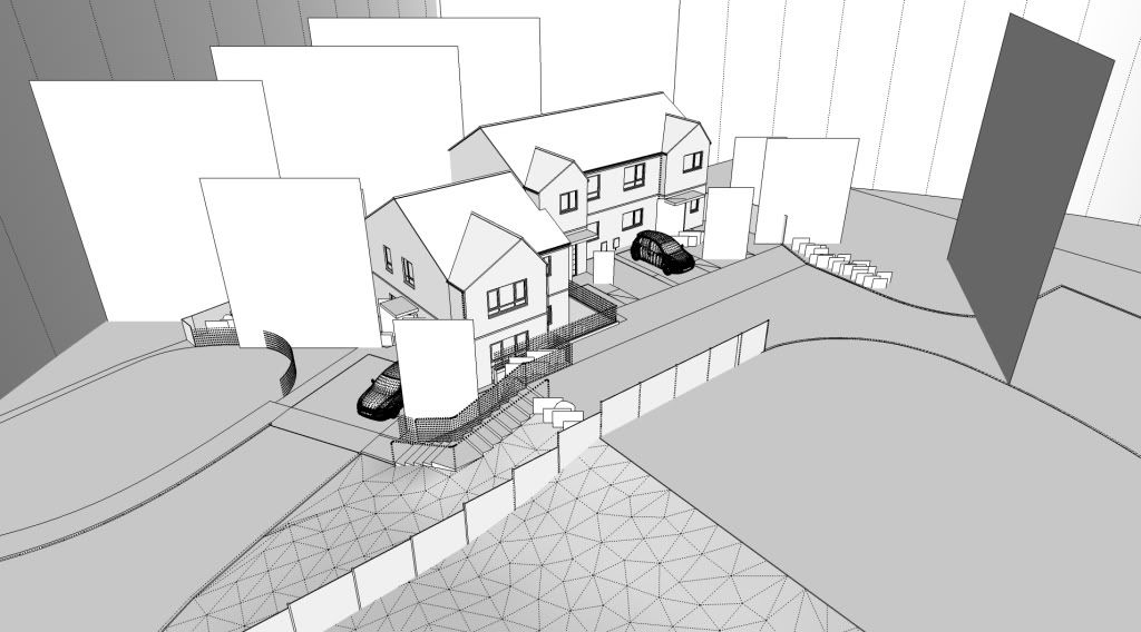
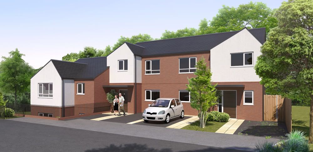
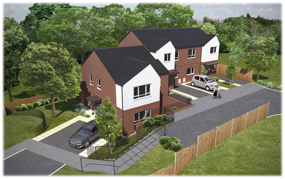
Here are the final images, 2 of them are similar to give the client choice of angles. I wasn't completely sure what they wanted! I also threw in a birds eye view!
Hidden Geometry view:

-
Surprising renders
Little problem : your shadows are on the same side of the sun. The sun comes from the right as it can be seen on the trees, and the shadows on the ground and the house go also to the right at the opposite of the shadows of the trees.
Maybee two suns on this planet ?
-
haha yeah the trees aren't great. i kept forgetting to mirror them for each scene. cheers
Hello! It looks like you're interested in this conversation, but you don't have an account yet.
Getting fed up of having to scroll through the same posts each visit? When you register for an account, you'll always come back to exactly where you were before, and choose to be notified of new replies (either via email, or push notification). You'll also be able to save bookmarks and upvote posts to show your appreciation to other community members.
With your input, this post could be even better 💗
Register LoginAdvertisement


