WIP - Villa Da Lezze: OPEN To Everyone!
-
Its strange how both turned out different...
-
When I saw the drawing I noticed that that building is completely symmetrical. Therefore, I modeled only one fourth of the house as a component.
-
@charly2008 said:
When I saw the drawing I noticed that that building is completely symmetrical. Therefore, I modeled only one fourth of the house as a component.
I was gonna do that too, but I decided against it for some reason.
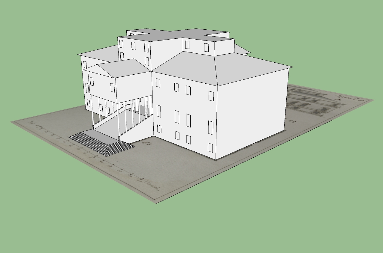
So far I've completed the entrance and the official window positions, when I'm done I'm gonna explode all the groups and texture the whole thing! I know I should think about it but who said anything about me thinking?
-
This could be a nicely detailed model....hopefully you will not just project the textures. I get so tired of seeing people model a box and project textures and call it a structure. Take the time and model it correctly and only use the prints for reference.
Scott
-
@unknownuser said:
I get so tired of seeing people model a box and project textures and call it a structure. Take the time and model it correctly and only use the prints for reference.
Amen!
-
Double here man!
-
Hi,
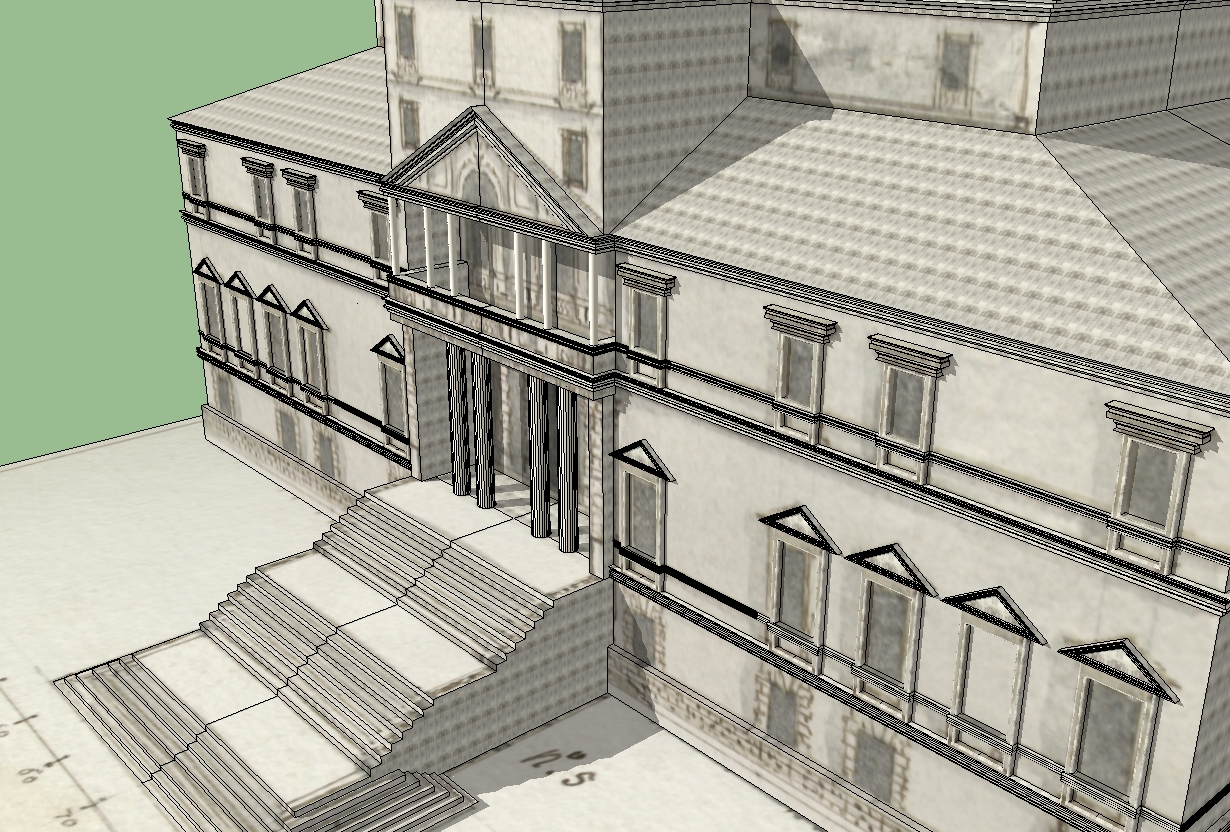
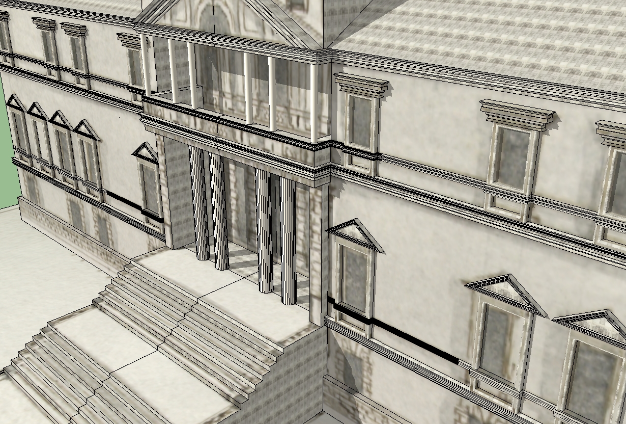
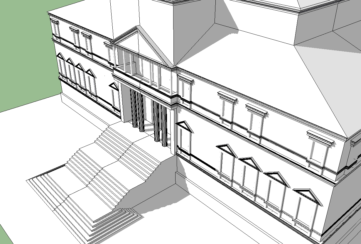
Have been working again on the details. In view of the floor plan I was thought that the balcony may have only a little overlap because it is based on The columns.
Karl
-
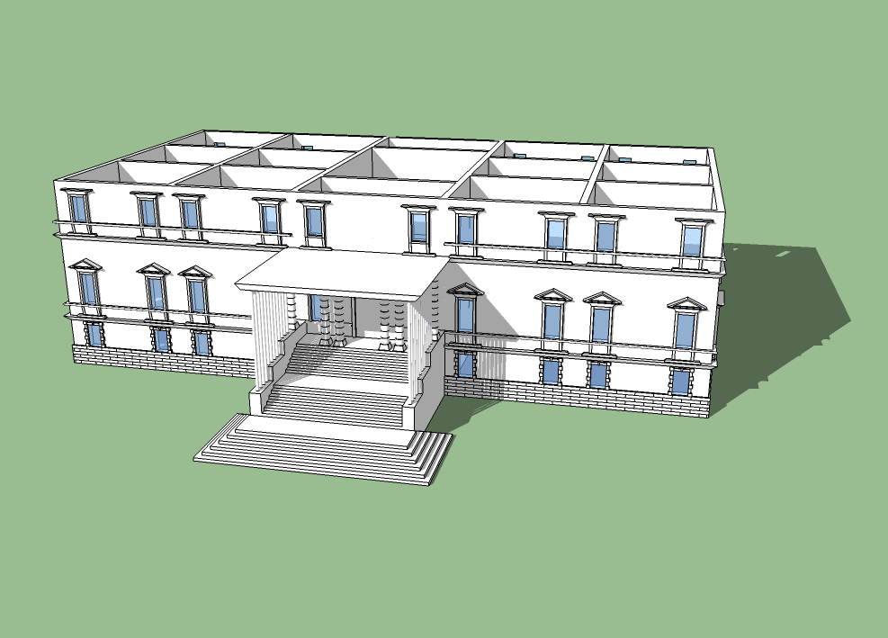
So here is my first attempt... pretty new to SU

-
So who has the entrance correct? 2 of you have drawn it quite projected with rows of columns and 1 of you has drawn it as tho it hardly projects at all. Interesting stuff tho, great to see old blueprints come to life in 3d.
-
KXI - Could you post where you found your background? That is a really nice one!
-
Also, my guess is that Karl (Charly2008) is the closest to being correct - though I think the top hipped section steps back in line with the main entry to give more prominence to the entabulature gable.
But it's just a guess ...
-
@mtnarch said:
KXI - Could you post where you found your background? That is a really nice one!
I'm not sure where I got that one... maybe its built in?
Also I think Karl is wrong (no offense), the drawing put little circles that I interpreted as pillars. Then therefore the pillars were supporting a roof, its a difficult and very old plan. I'm just having trouble modeling plans from my house and its just 10 years old!
I'm feeling a bit of remorse with this project, I'll revisit this one.
-
I think the drawing is showing the ballistrades along the railing that goes up the stairs, so that's what the circles are. But that's just my interpretation.
-
Should we have a discussion on the plans on a different thread? Because I'm re-doing this project and I don't want to get it wrong.
-
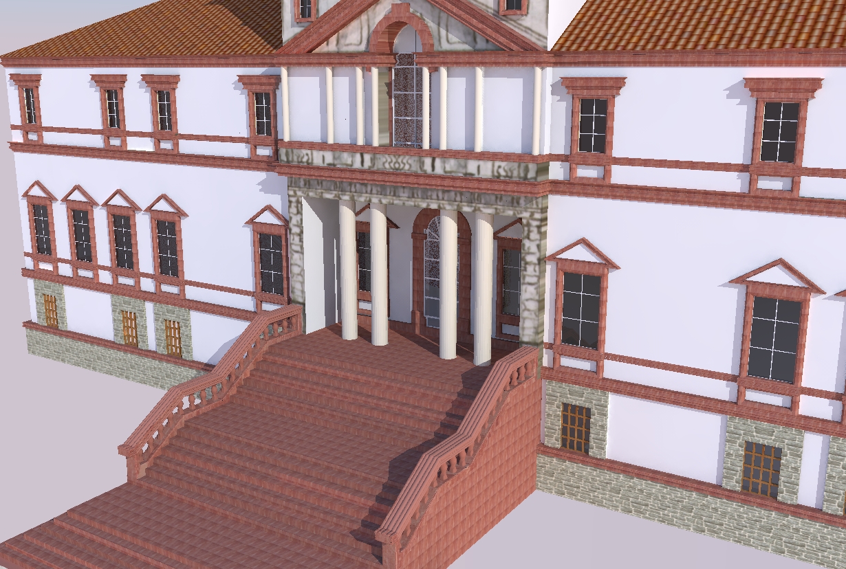
The most difficult is the portal front because there no side view and the drawing is too vague.
-
Charly I'd say based on what the plan and elevation are showing, yours is the more accurate interp. Howver the main columns at the entry way look more varied in the elevation, other than that it's looking good.
-
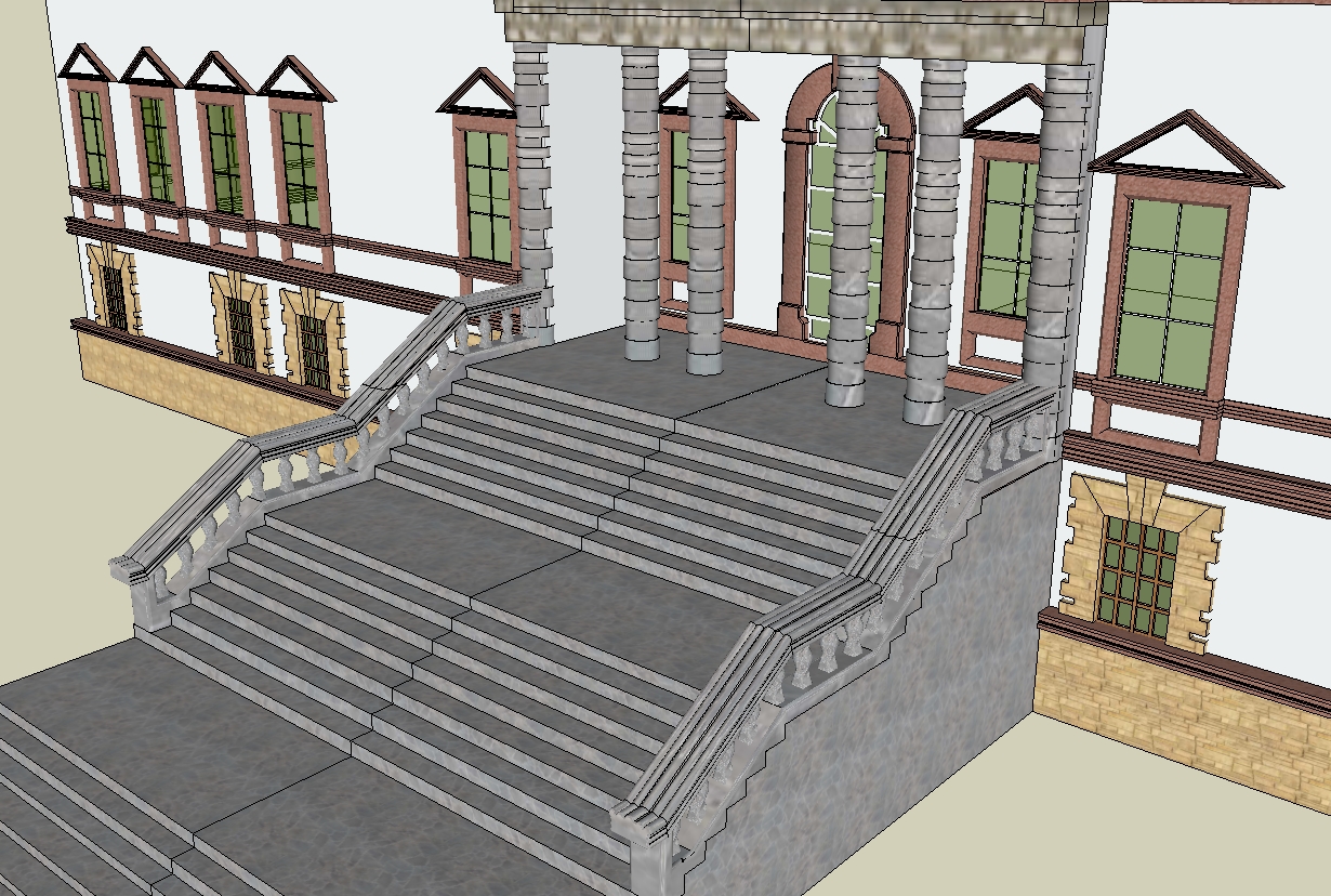
Some more details.
-
I tried your view and I found out this:
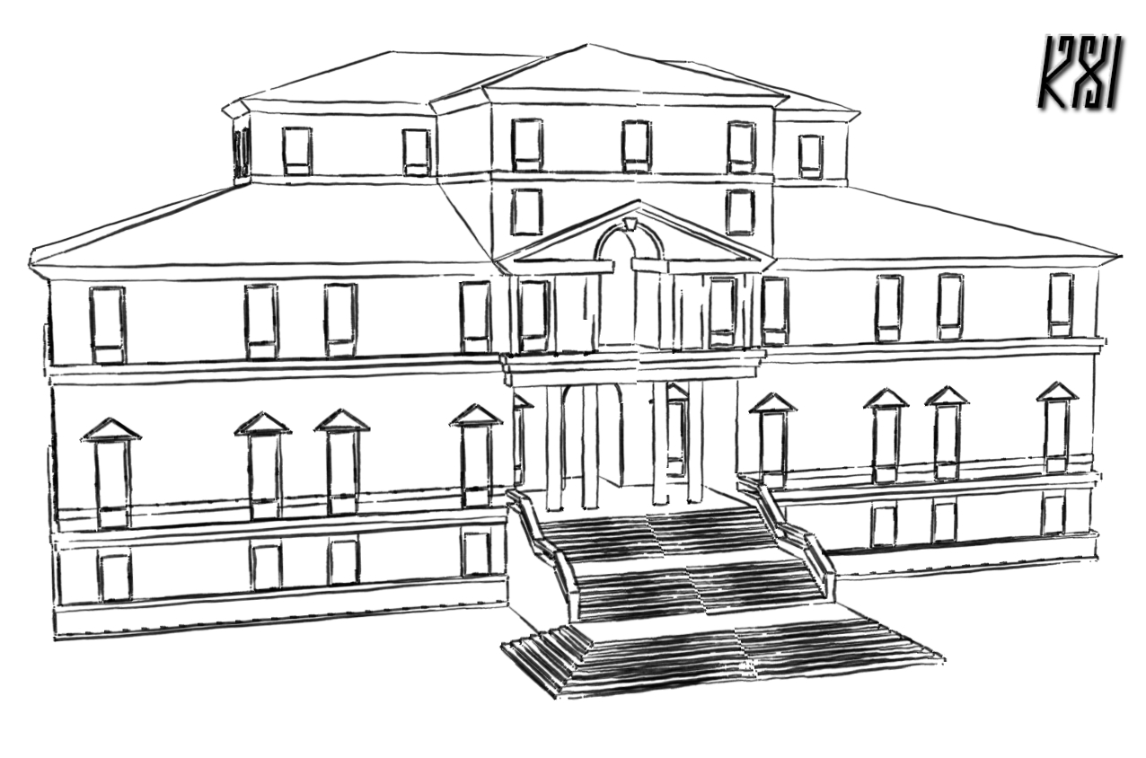
I'm guessing the real question is the upper archway a window or a door?
Because if its a door then I'm correct with pillars on the stairs.
But if its a window then its your version.So which is it?
-
Hi,
Good work, all of you. Thanks for posting. This is interesting.
I'd vote for Charly coming closest (and KXI latest drawing). There can be a door with a shallow balcony. A common device. Also I don't think the upper block of rooms comes forward of the main front wall at all.
Peter
-
I haven't thought of that possibility, so your suggesting a shallow balcony - about barely or no standing room - and the higher arch is a door size window decoration? Interesting I'll play with that.
BTW, I'm still looking for those textures, post or PM me if you have suggestions. I'll also be looking for a few components to ahem "slay this beast".
Hello! It looks like you're interested in this conversation, but you don't have an account yet.
Getting fed up of having to scroll through the same posts each visit? When you register for an account, you'll always come back to exactly where you were before, and choose to be notified of new replies (either via email, or push notification). You'll also be able to save bookmarks and upvote posts to show your appreciation to other community members.
With your input, this post could be even better 💗
Register LoginAdvertisement


