Charly I'd say based on what the plan and elevation are showing, yours is the more accurate interp. Howver the main columns at the entry way look more varied in the elevation, other than that it's looking good.
Latest posts made by archytextural
-
RE: WIP - Villa Da Lezze: OPEN To Everyone!
-
RE: SU-Maxwell- scale model in wood
I like images 2 and 6 the most. Nice focus on the buildings and great lighting
-
RE: WIP - Villa Da Lezze: OPEN To Everyone!
I think the drawing is showing the ballistrades along the railing that goes up the stairs, so that's what the circles are. But that's just my interpretation.
-
RE: Couple NPR WIP's. Let me know what ya think
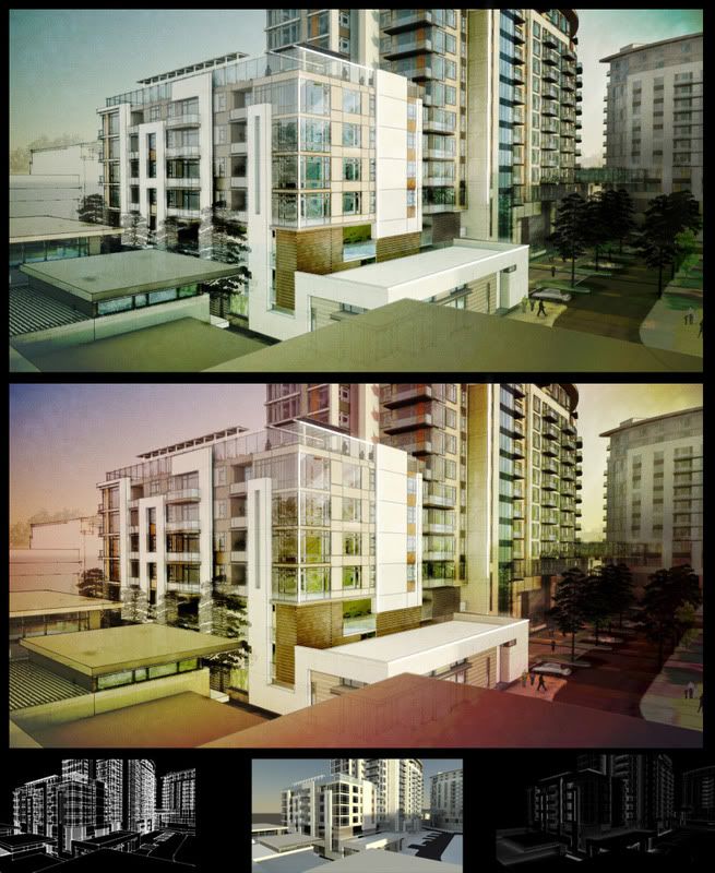
Thanks for the feedback. I agree the pump station rendering trees are a little bold. I need to run a seperate pass of just the trees so I can tone them down a little and let the foreground be the dominate item in the image. The effect on the interior is several layers of photoshop work, sketchup styles and 2 renderings in mental ray ( 1 Ambient occlusion and 1 materials) blend in photoshop and there it is.
-
Couple NPR WIP's. Let me know what ya think
It's been a while since I've posted here and thought I'd throw some images up for critique. Thanks for looking.
Office building
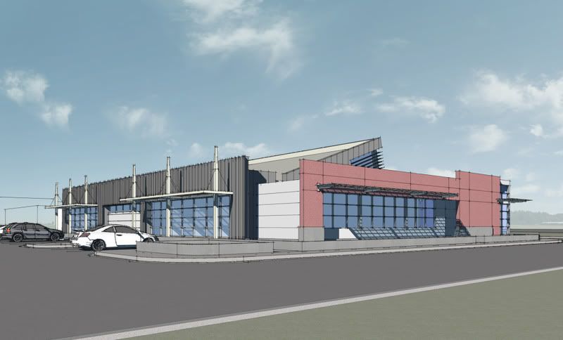
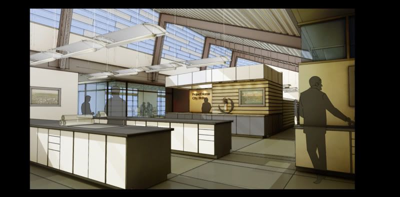
Senior housing
Pump Station
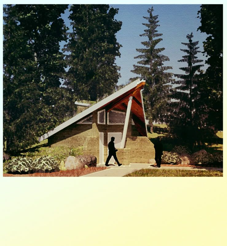
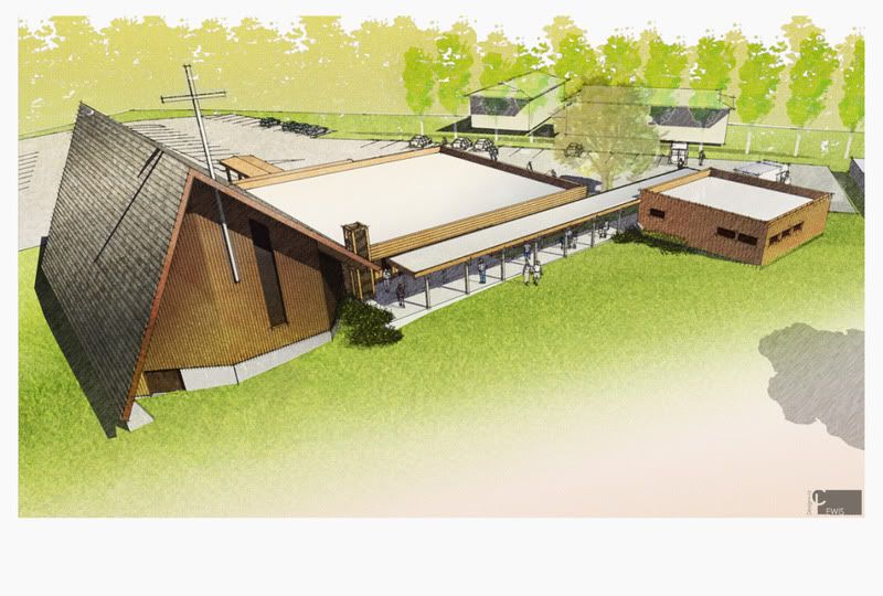
Church Addition
Chris "archytextural" Lewis
CLewis Design+Viz