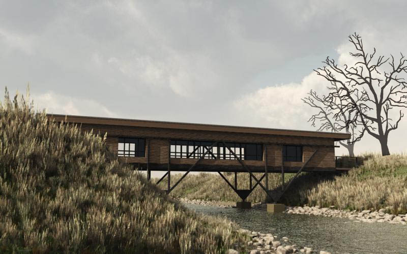
WIP Bridge House - Trees or no trees?
-
Hi, definitely trees (maybe winter trees?). Perhaps one or two on the left side of your image (actually it's a bit "empty") in order to balance the horizontality of the house.
-
I like it as it is, the focus is on the bridge house, maybe one or two dead trees will give it an ominous interest and a gloomy sky.
-
would like to see more of the building than bushy foliage! maybe from riverbed looking up, could get some quite dynamic reflections

-
Hi Pugz: maybe flip the image over - we tend to read images from left-to-right, so we follow the bridge across the river... And I agree with solo re. the trees. Apologies for the crude image attached....

Great render, anyhow
 Nice work.
A.
-
Beautiful image, Twan; I like it the way it is. It has a beautiful austerity to it, and focuses mainly on the structure. Two questions about the structure: 1) why doesn't it reach the top of the river bank? and 2) why does the truss structure (appear to) stop at the window heads and not extend to support the roof?
-
Hi Everybody,
Thanxs for the feedback. I also like the mood of the picture as it is, but I think I'm going to ad a few trees just to give it a try. Maybe some Ash trees with sparse foilige. I made the model after seeing a reference picture on the internet. In that design the support beams don't support the roof. The model can do with some work. ( interior lighting and some extra exterior details ) Will post a version with trees tomorrow I have enough time tonight. It's very hard to combine a non artistic job ( pension advisor ) with my Hobby ( dreamjob ) SU and Rendering and a social live
 haha
hahaGreetz From Pugz ( Twan )
-
[Update] Hi Guys, A bit late but I made one with Trees. But I may have overdone it a bit
 haha. wanted to post it sooner but Vista decided to do a update overnight so my first render was lost
  Love some comments on this one. And Yes you can comment freely and without fear of offending me ( This will not turn out in a Golden Frog Soap

Greetz from Pugz
-
I think you have done a really nice job with this one and I much prefer this version to the original. The background gives the building more presence. I would prefer to see more color, though. Perhaps sprinkle some bright flowers among the grasses in the foreground? Maybe put hints of furniture inside the house? Also there seems to be a bunch of disconnected leaves at the gap to the right above the house. Is there a problem with the sky to the far right? You might experiment with different Vue atmospheres also.
Which version of Vue are you using? It is really hard to beat it for massed vegetation.
-
They're both great images; I couldn't say one is better than the other.
-
Fine work you have here.
Something about the left end where the porch meets the embankment doesn't seem quite natural enough against the vegetation.
Hello! It looks like you're interested in this conversation, but you don't have an account yet.
Getting fed up of having to scroll through the same posts each visit? When you register for an account, you'll always come back to exactly where you were before, and choose to be notified of new replies (either via email, or push notification). You'll also be able to save bookmarks and upvote posts to show your appreciation to other community members.
With your input, this post could be even better 💗
Register LoginAdvertisement


