Client bathroom remodel (my first shot at rendering)
-
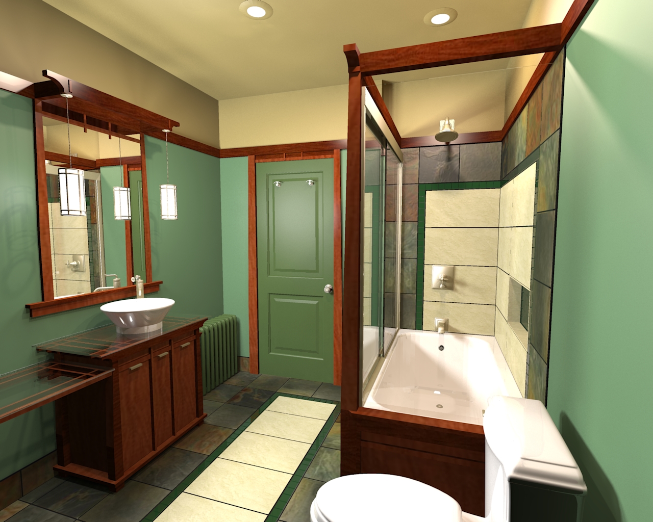
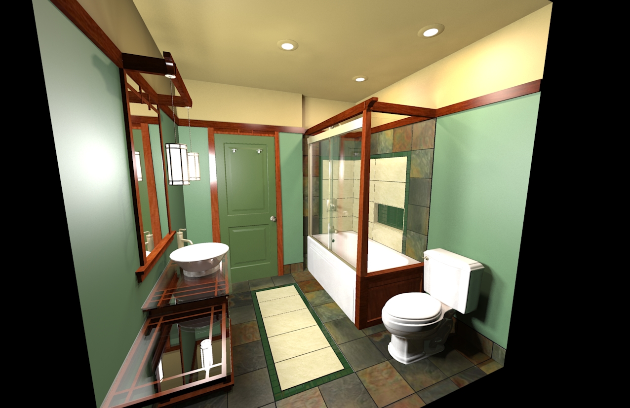
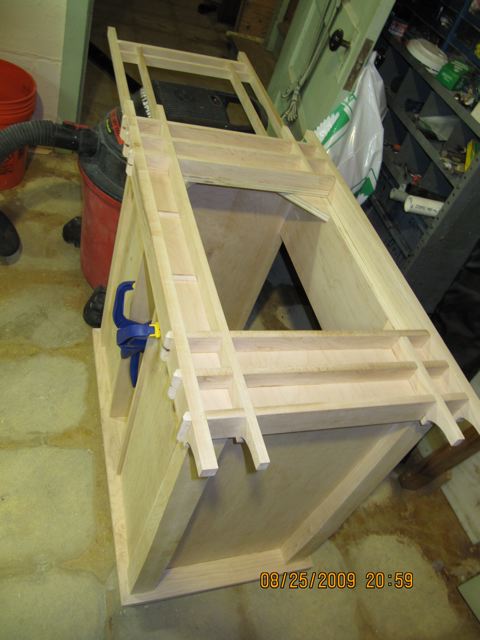
Hello everyone. Just wanted to share my first shots at rendering. I am a interior design student that is starting up my own company. This is a client's bathroom in a Russell Barr Williamson prairie style home that is 3/4 of the way done. My original design was with sketchup a few months back (have been using sketchup for about one year now) and the sketchup model is actually designed with all wood work built in sketchup the same way I have built it (I am doing all custom wood work myself.) Well...my client is playing on the beaches of the Virgin Islands so I had a weekend to try to learn Kerkythea.
Obviously the room does not have any of the accesories that will end up in the space itself and the colors are very close but not quite perfect yet. The slate tile is a bit lighter that that is the room so I will need to tweak that yet and the glass tiles in the floor and shower walls are a bit too glossy compared to the real ones but all in all I am pretty pleased with just how close it is to the real thing.
So I hope you enjoy and please feel free to comment. Like I said I am new both to kerkythea as well as sketchup and am looking to improve.


-
Looks good especially for just starting with Kerkythea but I would work on the camera angles, kinda distracting the way they are now.
Mike
-
If you are on a Windows machine you should look at Twilight render. It does a wonderful job and might help you with the artificial lighting. Also, I agree with the camera angle comment, especially on the second render. You should try to get more of a two-point perspective. Excellent job overall. Personally I would lighten the colors of walls and ceiling, but I'm not the client.
-
Thanks everyone. Ya...I understand what you mean about the camera angles. I did it because it gave a full view of the space and gave me an opportunity to see everything while I played with everything. For final renders I will change the camera angles to give the space feeling but for learning the software it worked ok. Ya...I know what you mean about the walls. They are not that dark in real life. I spent sometime in Kerk getting the color right with my paint deck next to the screen with the material editer but when rendering it is darker than the real thing. Same with the beige ceiling. Both are a little dark. There are other things but I will keep playing with it until it is right.
Thanks for the comments. Its great to learn from everyone!
cheers!
-
 Wow this is really creepy, I did a Bungalow House not to long ago, maybe two weeks and it has bathrooms just like your, down to the color, tiles and wood trim.
Either way I like it a lot, good job. -
@unknownuser said:
Wow this is really creepy, I did a Bungalow House not to long ago, maybe two weeks and it has bathrooms just like your, down to the color, tiles and wood trim.
May be the same client


Looking good so far, my only crit is the FOV, but I do understand why folks do that for small rooms like this, It just looks unnatural.
-
Wow horseman...that is creepy. Have you been in my clients house! LOL. Everything is custom...I know because I designed and built all the wood work myself. Colors and style are representative of the homes style though so that doesn't surprise me. I was trying to keep true to the homes history with a stylish twist.
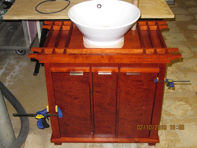
Heres a photo of the vanity...this is before I had the doors hardware on, side makeup table and the glass is on order...but it will give you an idea.


-
Thanks solo. I will play with the field of view when it comes time to do final renders. It does seem a bit stretched and obviously with it being outside of the room it sorta puts in a different plane.
Appreciate the comments.
Thank you
-
A few updates on the room. Window, door, and medicine cabinet not done yet but gives you an idea.
-
Its hard to believe that this is your first try at rendering, There may be stuff you can still learn about "photo real" techniques, but if you are offering services as a interior decorator, your renders are good enough, and IMO you should focus on showing the design, rather then perfecting photo real skills. My advice would be render to appeal to your client, and accessorize with their preferences.
-
Thank you Honoluludesktop. I appreciate it. I actually just got my dream job in a kitchen bath design studio so I am realizing exactly what you mention. It's all about helping the client see the design. The project itself is whats important. I am flattered that you say it is hard to believe. I promise it really was my first time attempting it. I had studied the forums for a long time before hand so that made it much easier but I was pretty pleased when it came out looking pretty close. I agree...its not photoreal by any means. I would like to get to that point some day and each render I have done since these has improved but I will play with that as I get more free time. For now I will settle for learning a little more and more each time I do it.
cheers!
-
wow...amazing work with both the render and the real life stuff. some inspiration for myself.
-
Very nice.
Hello! It looks like you're interested in this conversation, but you don't have an account yet.
Getting fed up of having to scroll through the same posts each visit? When you register for an account, you'll always come back to exactly where you were before, and choose to be notified of new replies (either via email, or push notification). You'll also be able to save bookmarks and upvote posts to show your appreciation to other community members.
With your input, this post could be even better 💗
Register LoginAdvertisement


