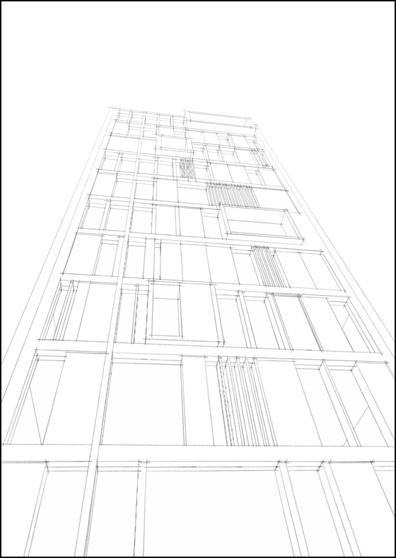
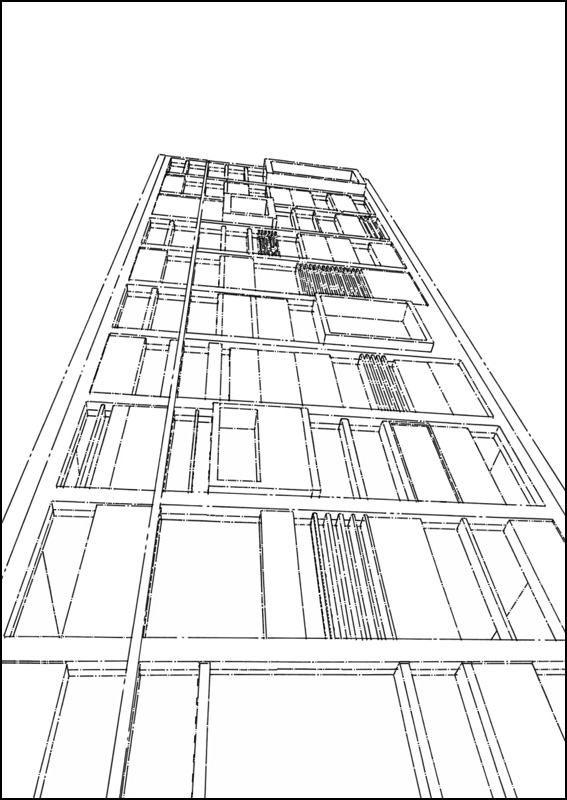
Push/Pull Tower + model/render challenge, page 2
-
i understood what u meant mate don't worry!

massimo: that looks great.....is it straight from sketchup?

-
seriously? haha nice, please share this style!

-
Yeah, I made this for fun trying to learn "Style builder" grabbing some lines from LC's real sketches.

-
Added in previous post.

-
-
how do you import it? mac

-
Hmmm, I can't help you. Don't know how to do that on mac.

-
Surely dropping the file in styles will do.
-
sorted! i had to make my own styles folder, it doesn't create one by default (or at least I cant find it)....thats weird.
thanks massimo it looks great
-
-

-
awesome line style!!

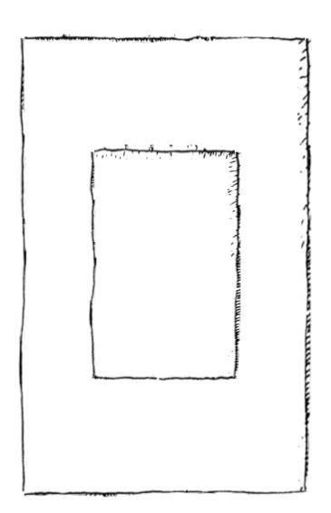
something more corbusier style, the golden rectangle:
-
thats really nice pete
-
Oli,
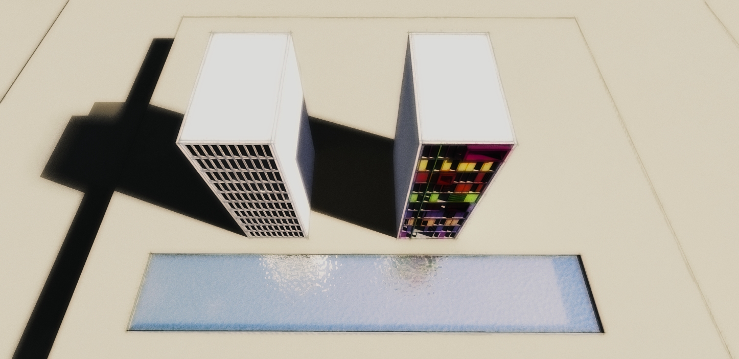
Thanks for the tower - this was a fun diversion. I took a little different perspective!
Bytor
-
-
Played a bit with your beautiful images, hope you don't mind Oli. Heavy PS

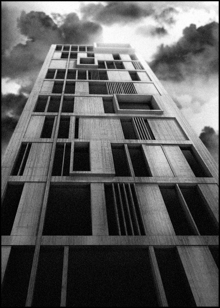 More DOF + volumetric light + some cloud effect overlayed on the tower + a bit of grain
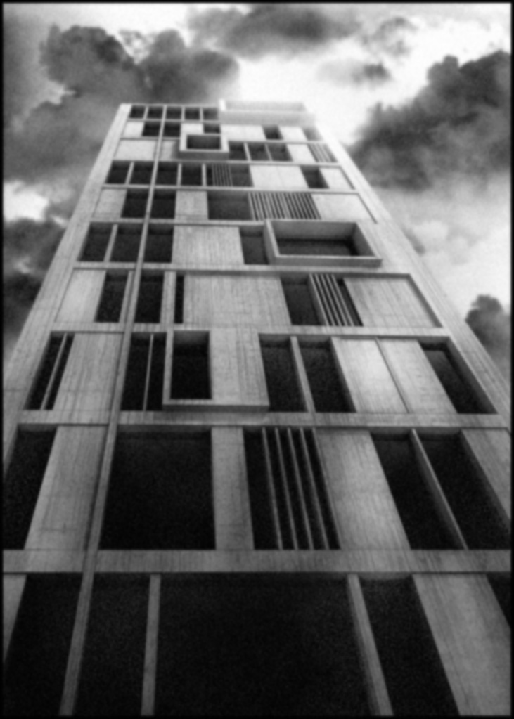 More DOF + volumetric light + some cloud effect overlayed on the tower + a bit of grain + gaussian blur
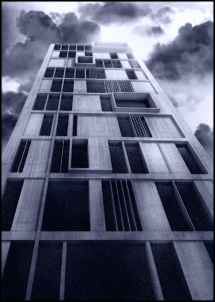 More DOF + volumetric light + some cloud effect overlayed on the tower + a bit of grain + gaussian blur + beyond edger filter + a bit of blue.
 -
no i dont mind massimo, do what you like. this is an experiment thread. great images...i like your first one best, inky blue looks cool as well.
bytor I love it! so simple......looks great! funny how just a splash of colour can completely change the mood of the architecture!

Please guys be as experimental as you like.....its not a competition or anything....so dont be afraid to have a go and have fun!!

-
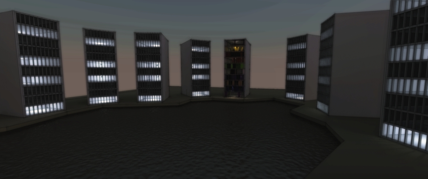
Welcome to Twilight Towers!
-
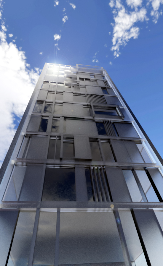
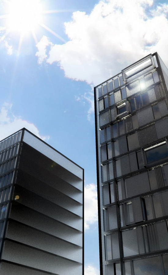
Glass towers. Paul Scheerbart would be happy.

-
But not sure that form before function is the good way of architecture

Else this remember that (click text underlined for photos)
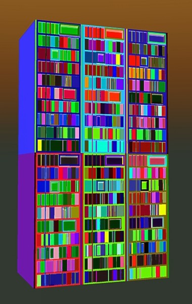
Thx to Chris Fullmer and his crazzy Random Painter
Module by Olishea (Click if scrollbar)
Hello! It looks like you're interested in this conversation, but you don't have an account yet.
Getting fed up of having to scroll through the same posts each visit? When you register for an account, you'll always come back to exactly where you were before, and choose to be notified of new replies (either via email, or push notification). You'll also be able to save bookmarks and upvote posts to show your appreciation to other community members.
With your input, this post could be even better 💗
Register LoginAdvertisement
