Rendering Challenge - Bathroom sink
-
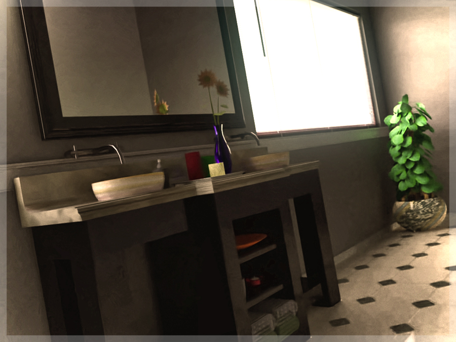
Here's a go using Fryrender...I only let it cook for 3 hours on my laptop, then did some post work in photoshop. I'll probably let it go overnight and update tomorrow.
-
@earthmover said:
Here's a go using Fryrender...I only let it cook for 3 hours on my laptop, then did some post work in photoshop. I'll probably let it go overnight and update tomorrow.
It's hard for me to evaluate this view.
It may be just me, but the only feature I can really see and evaluate from this view is the daylight effect on the far wall. And of course, the excellent plant. But I would to see more of the shadows to the right of the plant to see how well the daylight effects are working.
If you decide to change the model, pehaps you can put the window on a different wall so it illuminates the sink more directly, and raise the camera above the sink so we can see it better.
-
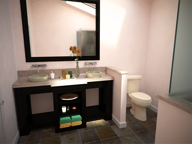
Here's my Vray try, 12 mins at 1024x768. Only sunlight, coming through skylight. Some post pro, brightness/contrast adjustment, vignette, and resize.
-
Darn everybody is still doing better than me! Oh well I am learning a lot.
KT - MLT for an 1.5 hours....
-
Some people are adding lights above the mirror.
Unfortunately the ones I grabbed from the 3D Warehouse added about 300,000 faces to my drawing.
But Ms. SketchUp could see better if there was some light up front.
-
@tallbridgeguy said:
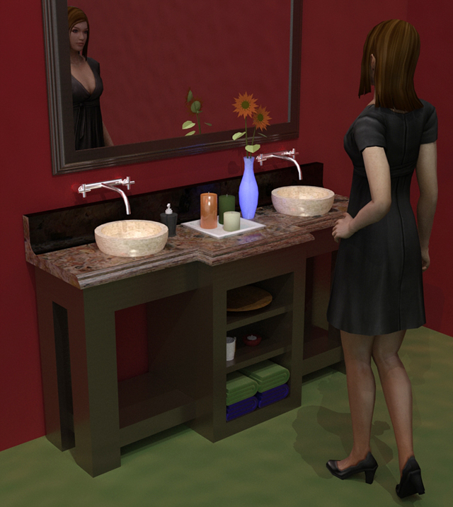
There is no way I can compete with the last two renders so I cheated and added a diversion....and tried to add a story. I used Kerky with no clue about what I am doing....it seemed so simple in the brochure. (ha)
Trying to make a decent render shows how hard it actually is (well for me.)Thanks for the challenge!
I assume you have already read getting started tutorial and tutorials master list.
Add more light and use some nice materials from file repository or Documentation and Sharing > materials and turn on soft shadows. Perhaps you could use some IES lights, easy to set, but you need to get definition files from manufacturers website. Bevel all edges... or use DOF to soften sharp edges. -
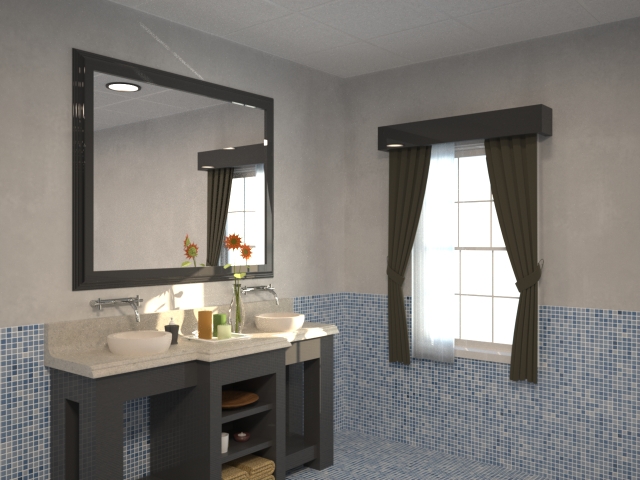
I actually ran a render of this same vanity awhile back to give a client an idea of the difference between straight SU output and a rendered output. This was done in Maxwell at only 640x480. I'm afraid I don't remember how long it rendered. Probably 30 minutes or so. It was pretty quick and dirty so many of the materials are garbage. I nearly redid it when I realized how bad the material was on the base cabinet but it got my point across so I let it go.
-Brodie
-
@unknownuser said:
I actually ran a render of this same vanity awhile back to give a client an idea of the difference between straight SU output and a rendered output. This was done in Maxwell at only 640x480. I'm afraid I don't remember how long it rendered. Probably 30 minutes or so. It was pretty quick and dirty so many of the materials are garbage. I nearly redid it when I realized how bad the material was on the base cabinet but it got my point across so I let it go.
-Brodie
This is a good image. It quickly shows how just a little refection - the mirror and the faucets - can improve a rendering.
Of course, adding reflection to the rest of the surfaces (almost all of them are somewhat reflective in real life) will add even more realism.
-
earthmover-great image there

-
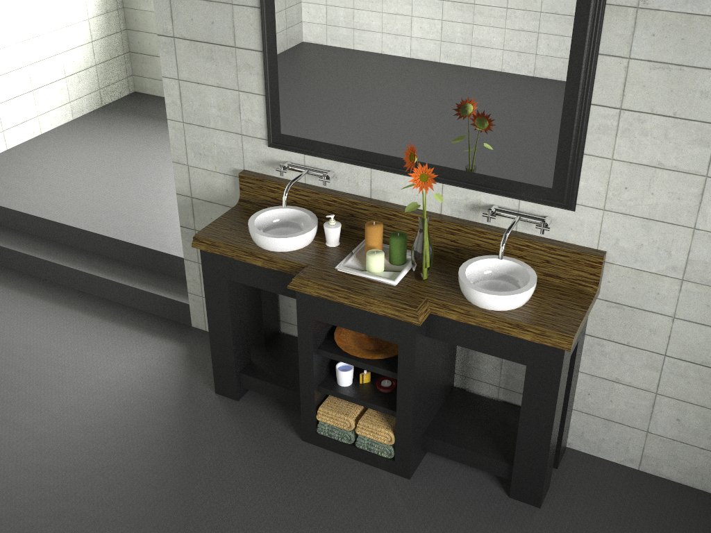
Just some stuff i had done with the same model when i was trying my hand at Vray!
I liked the realism of the wooden texture, though the aesthetics are questionable!!
-
@shwetabhseth said:
Just some stuff i had done with the same model when i was trying my hand at Vray!
I liked the realism of the wooden texture, though the aesthetics are questionable!!Nice rendering shwet - I like the lighting and the way details such as the towels are brought out.
Now, as you say, we need to find a better room to put a wooden lavatory in.

Also, as another rendering adviser once told me "The secret of reflection is having something to reflect", the mirror, from this perspective, would be more interesting if it had something to reflect.
-
Thnx Al!
Well about the wooden lav, these days its common practice with minimalistic designs making there foray into mainstream!
And i couldn't agree with u more about the reflection....but i was a noobie when i did this...tho i am not better but i do understand these things around! ...
...
I really appreciate your comment!and now...i think i might do another render with this model, something which makes me understand if i have bettered myself or not!
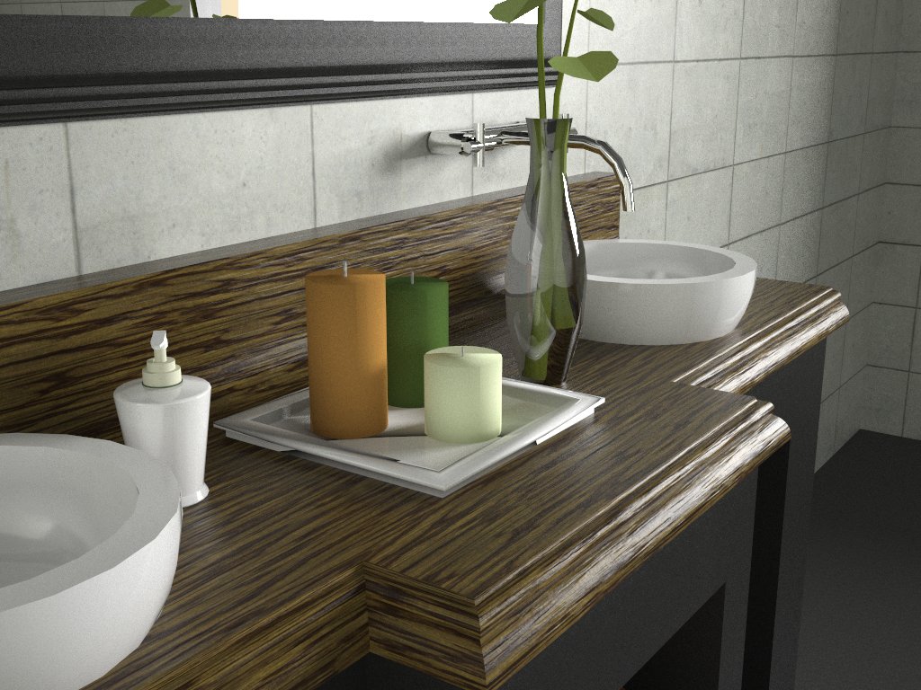
-
@shwetabhseth said:
and now...i think i might do another render with this model, something which makes me understand if i have bettered myself or not!
Nice work. Very realistic. Great job on the glass vase. (I have run into this same vase in other models, and it is always a challenge.)
And good choice of view and lighting to emphasize the highlights and reflections.
I don't know if you have been reading another of my threads about reflection
But I was arguing that almost every object in this model could have some reflection set on it (maybe not the towels), but I bet candles reflect light as well.
-
Sorry, i just started on the forums and this was my first post up here! hope to make my presence felt in the future though, so i haven't been through your post.
Just went thru it though.I must comment that the way you have specified each of the inclusions in that thread is positively comprehend able and pretty well laid out. Cheers for that!

i hope soon ilk be able to apply these in a better render in the spirit of learning.About adding reflections to all materials-It increases render times immensely, and i would also like to add that everyobkect we see, rather than having normal reflection, which we generally enable in rendering engines, instead has Specular reflections which is harder to understand and work with in rendering engines i believe.
I think i would go through your thread and add some qualitative information to it.
-
@shwetabhseth said:
I think i would go through your thread and add some qualitative information to it.
Thanks for the comments,
I extracted some of your comment, and added it to the Reflection Thread, along with a response.
-
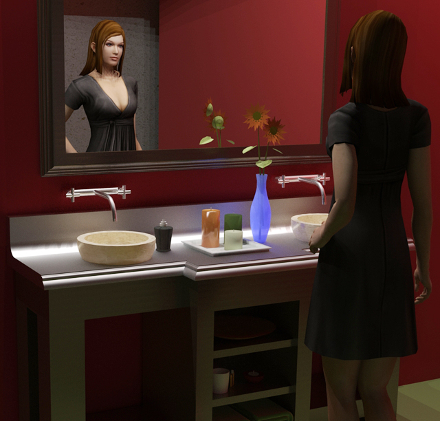
I tried a little different light setup, not great but I think a little better. I looked back at the other sink renders and most seem to be in the daylight.
Is daylight easier/harder to do than a night scene?
-
Not necessarily but if you have large windows (not very particular for bathrooms though), you need not deal with global illumination. So maybe yes, easier but only from laziness point of view

-
Thanks Gaieus, I was also wondering about making photo-realistic images. Is the goal the closest to "real" as possible or to make it interesting to the viewer? I tried having someone in the scene because I wanted it to look more like real life. (I know it doesn't)
A lot of the images on this site are fantastic but there never seems to be any "life" in them. I would like to see some more emphasis on rendering an image like a well thought out photograph, with people/dogs/etc...
thanks for the help!
S -
@tallbridgeguy said:
Thanks Gaieus, I was also wondering about making photo-realistic images. Is the goal the closest to "real" as possible or to make it interesting to the viewer? I tried having someone in the scene because I wanted it to look more like real life. (I know it doesn't)
A lot of the images on this site are fantastic but there never seems to be any "life" in them. I would like to see some more emphasis on rendering an image like a well thought out photograph, with people/dogs/etc...
thanks for the help!
SI suspect this could be a whole separate topic with lots of responses. I think there are a couple different reasons you don't see more "life." In arch-viz, which seems to predominate this sight, people are secondary as they tend to draw the eye away from the subject (ie. the architecture). Flipping through any given architecture magazine the only people you're bound to see are in the ads.
The other reason, I think, is that people are very hard to get right. This is a particular problem with SU which doesn't play well with lots of polygons. One photorealistic person can take longer than the rest of the modeling/texturing together. And if you don't get it just right it can detract from the rendering. Even if you do cutouts, I've seen a lot of fantastic renderings spoiled by badly integrated cutout people.
Typically for little side projects like a bathroom for SCF I don't both with people, but for my final renderings for work I almost always add some. I've used both the iClone people from the 3d Warehouse (which are pretty good so long as you don't get too close) and cutouts. The cutouts tend to separate the photoshoping men from the boys, so to speak (I'm probably at the adolescent stage). There are some great examples of cutouts integrated seamlessly into beautiful renders on this forum (Teofas having, figuratively, written the book imo) but they're far and few between.
-Brodie
-
Thanks Brodie, I just found it odd that the quality of the photorender is often more important than the subject matter. For example I design bridges and if I do a great photorender (ha!), the public will comment on the picture and not the bridge!
I guess I would like to see a topic where the subject matter is also addressed. Did the image "sell" you the design or is the photorender the dominant feature.
Thanks for the great feedback!
s
Hello! It looks like you're interested in this conversation, but you don't have an account yet.
Getting fed up of having to scroll through the same posts each visit? When you register for an account, you'll always come back to exactly where you were before, and choose to be notified of new replies (either via email, or push notification). You'll also be able to save bookmarks and upvote posts to show your appreciation to other community members.
With your input, this post could be even better 💗
Register LoginAdvertisement


