Lego Model
-
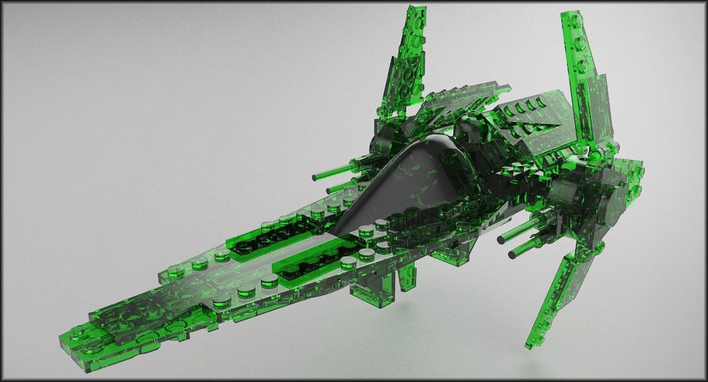
The XXL version.
 ...looks good
 -
Really nice Eulgrand.

Too kind words Oli.
-
We've all had a lot of fun with this Lego Model, Want to try another Rendering Challenge?
(I know space ships are more fun - but lets see what we can do with something else)
Bath Room Sink Rendering Challenge
-
BOOOOO!!

we want childish things to render!!

but yeah ok, I think we were getting a bit carried away!
-
@olishea said:
BOOOOO!!

we want childish things to render!!

but yeah ok, I think we were getting a bit carried away!
If this catches on, I'll pick something childish next week.
Also, other people could suggest things.
What I had in mind for this was that we would take existing models, and show what we could do to them, A lot of rendering contests run by vendors (us included), are often influenced by a really neat model. It will be interesting to see what we can do if we all start with the same model, and apply different techniques. This is not a contest to see who has the best rendering engine - but rather to see who knows how to use the one they have the best - including SketchUp itself, Photoshop, etc.
-
It just has to be required that you crazy render people tell us non-render people what you are using to render!! Of course some other vitals would be nice too: render time, biased/unbiased (when it's an option), textured in renderer or in sketchup, etc.
I desperately want to make the plunge, but with so many options, a thread like this gives a good comparison.
-
@jwlyon1 said:
It just has to be required that you crazy render people tell us non-render people what you are using to render!! Of course some other vitals would be nice too: render time, biased/unbiased (when it's an option), textured in renderer or in sketchup, etc.
I desperately want to make the plunge, but with so many options, a thread like this gives a good comparison.
That's fair - lets mention the renders used and the features used so that people not yet using external rendering engines can learn more from the presentation. (However, jwlyon1, remember that you can do almost everything you see in the image from one renderer in the other renderers. Often it is the visual design abilities, the creativeness and the talent of the operator which is creating the good images - not necessarily fundamental qualities of the renderers. - But you will see which renderers are available, at, (at least from the users of this forum), what rendering engines are in use by SketchUp users.
Also, go ahead and ask questions about the rendering you like. It would add too much detail to each posting if the artist had to explaing everything that was going on. I think we would appreciate comments like "That floor looks good - how did you do it?"
-
@olishea said:
no i mean the images further up... the metallic looking ones. app
I've been having so much fun posting to this thread, that I got confused on which comment referred to which image.
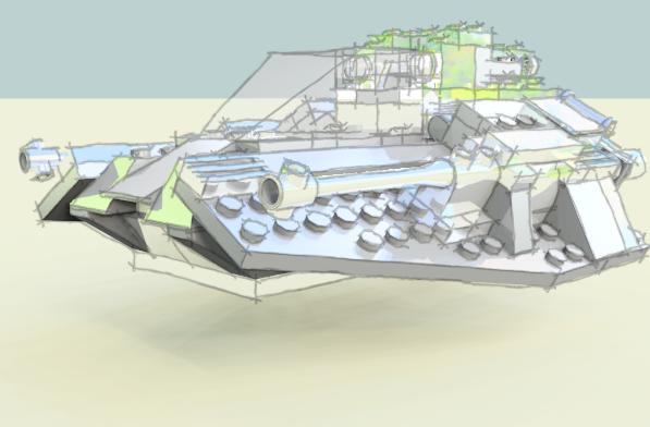
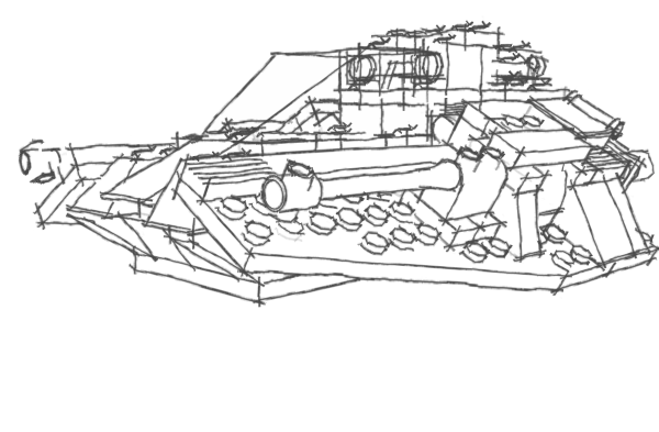
Although IRender nXt can render edge lines directly, you can achieve a similar effect using Photoshop (or almost any paint program with a "Multiply Mode") to paste a SketchUp hidden line on top of a rendering. (When you paste the edges after rendering, they do not appear in reflections. But it still works pretty well)
See: Rendering Tip - Edge Lines
This is an rendered image where I pasted the edge lines from SketchUp after rendering.
This let me use some Sketchy Edges.
(Rendered with IRender nXt using automatic Edge Line overlay feature.
Colors from original image with Reflective properties added in SketchUp.)Edges saved from SketchUp:

-
@unknownuser said:
Cobra Tank
 (click if Scroll bar)
[attachment=0:3sbvb0d4]<!-- ia0 -->tank.jpg<!-- ia0 -->[/attachment:3sbvb0d4]
Whew - it is a lot of work to add all those colors.
Here is a Crayola color version.

(Rendered in SketchUp with Crayon Watermark style)
-
Here is a new image.

(Rendered with IRender nXt using edge line generation)
-
-

-
For the next workshop, I chose something fun again - cars.
Come check it out: Rendering Workshop - Model Cars
Hello! It looks like you're interested in this conversation, but you don't have an account yet.
Getting fed up of having to scroll through the same posts each visit? When you register for an account, you'll always come back to exactly where you were before, and choose to be notified of new replies (either via email, or push notification). You'll also be able to save bookmarks and upvote posts to show your appreciation to other community members.
With your input, this post could be even better 💗
Register LoginAdvertisement


