Yet another depressing image of doors
-
And there you were thinking I'd get tired of doing those!

-
Oh I like what you're trying to do here!
Maybe I need to see something more or something less, I'm not sure. What about some noise? -
Yeah ... it still needs a bit of Photoshop love. Maybe even some noise, as you suggest. Kinda ironic, considering this was rendered with Indigo.

-
Hi Stinkie,
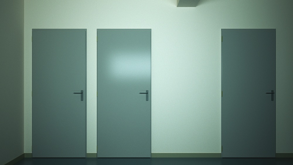
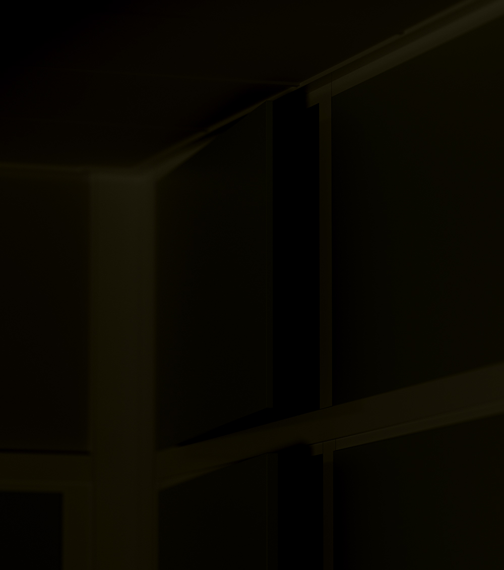
Any reason why the door frame is kind of small? Those standard doors usually have bigger ones.
Looking at the shadows, it seems that the door sticks out of the door opening (the door seems to cast a shadow on the frame), while you would expect the opposite.
I know it is knitpicking, but in this kind of art I think it could be important to get it right?Otherwise, another consistent work. Alienating to the extent you almost don't want to know what is on the other side of the doors.
-
Hi Kwist.
The doors aren't regular doors. They're closet doors. And they are indeed sitting on the frame. I modeled them off a photo, so they should be fairly correct. Mind you, I chose them because they looked peculiar.
As for what's behind them, a mate of mine suggested:
-
cruise tickets;
-
a set of really nice kitchen knives;
-
a tiger that hasn't been fed for a while.
-
-
S to the T to the inkie,
Bring the late night nightmare doors of "what's happening now."
I do feel these.
Wondering about the room opposite, rather then within however... The light reflecting in door number 2 feels artificial, like it's bounce light from a projector, or it's one of those doctors office things you look as x-rays on...
Though it's just light on the screen at this moment, next slide up is likely an x-ray of a "skinned baboon" or something bring that to the fellow slumped at the end bar stool -- his nightmare is real.
Durant "who has the keys?" Hapke
-
@durant hapke said:
late night nightmare doors
Close. These are 'I'm wide awake 'cause I'm having a panic attack and it doesn't look like this night will ever end' sort of doors.
@durant hapke said:
Wondering about the room opposite
Hmm ... That gave me an idea. Thanks.
-
Your render is too "explicit" for my taste and too rich in details... (coloured doors, skirting board, door frame). I'd go for something more "implicit" and minimalist.
These are photos of real products.
-
I'm unsure whether reducing the scene even further would be a good idea. When one pushes minimalism too far, things tend to become boring. Let me put it this way:
Mondriaan = good
Judd = bad
-
I agree about the reflection on the door, doesn't seem right. inspiring work again stink, although i don't know why!
i think the 'depression' comes out from all the little details....the hinges, the skirt etc. lose these and you will lose the image.
-
I absolutely love this image Tom, and especially your subversive thinking (arch-vis-wise) behind the series. The harsh stark coldness of the lighting, the institutional colours and composition are absolutely perfect IMO. Lighting reminds me of the brilliant cinematography in the "gloom" scenes in Nochnoy dozor.
-
Thanks, lads. Glad people like this stuff.
-
Mate I agree with Kwist here that the door shadow are confusing! The centre door handle is really showing the use of multiple emitters with multiple shadow casts!
I like the level of detail!! I like this image too, has a nice disturbing emotion attached as durant suggested ( I think
 )!
)!I think your using modo now hey? Can you hide the foreground emitter from reflections? I know you can in maxwell!
Mate here is a thread from the maxwell forum about light fall off that you may find very interesting and informative!
-
Hi Richard.
There can't be multiple shadow casts in that image - yours truly is far too lazy to use more than one emitter.
It isn't Modo, it's Indigo -and as far as I know, it currently isn't possible to hide emitters from reflections. I could be wrong, though.Thanks for the link. Looks like an interesting read. I feel I should point out, though, given your and Oli's comments, that 'correct' lighting (or correct IOR's, or ...) isn't very high on my list of priorities. I have nothing against it, obviously, but the concept as such, odd as this may sound, isn't extremely useful to me.
I am going to read that thread you linked to, though. I like to know what I'm perverting.
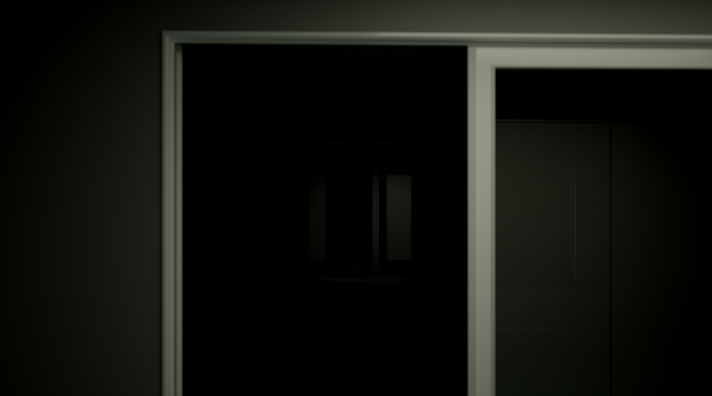
Here's another one. Not sure what to think of it yet (yay/nay), as it's hot out of the oven.
-
Stinkie,
Unless I'm barking up the wrong tree, it seems obvious to me that you're subverting architectural visualisation, your aim seems to be to create hyper-real images rather than photoreal, disturbing rather than flattering, rather than trying to emphasise architecture's hallowed intellectual place in the natural world by simulating naturalistic photography and materials you are emphasising just how un-natural and oppressive buildings can be (and usually are). Therefore the standard arch vis criticisms (modelling, materials, composition, lighting) don't really apply, or rather they are arguably inverted.
I'm not kidding when I say that I wouldn't change a single thing in either of the images in this topic: in the first the institutional colours, stark lighting, emitter reflection on the door and the glimpse of that wonderfully functional-and-yet-aesthetically-extraneous little downstand beam combine to create an image I would gladly pay to view printed at huge scale on photopaper on a gallery wall. The second image is perhaps a little more obvious, as the gaping void of the almost-seen room is more than a little reminiscent of horror movie semi-reveals, but I still love it. These two images make me want to scrap my current typical "make it look good" vis project and present my boss with an utterly depressing elevation with harsh lighting and no sign of life. Brilliant!
Keep posting this stuff, I love it.
Jackson
-
Jackson -
You've pretty much nailed it. As for the scale of the final, printed thing: I fully intend on not making it huge. The actual size will be 24,34 cm x 13,52 cm. I even intend on making a few that'll be around, say, 7 cm x 4 cm. I want people to get up close.
You're right about the second image. It's not as good as the first.
Bruce -
I've tried that sort lighting a couple of times, and as of yet I've not managed to make it 'work'. I'm not giving up, though. There's gotta be something I can use that for. In due time, eh?
-
@unknownuser said:
As for the scale of the final, printed thing: I fully intend on not making it huge. The actual size will be 24,34 cm x 13,52 cm. I even intend on making a few that'll be around, say, 7 cm x 4 cm. I want people to get up close.
Oh, in that case I wouldn't dream of paying to look at this low-res sh*t.

-
S to the T,
You are bringing.
Exciting Jack action -- you are transcending the screen.
Jackson's points are insightful and I Jack bird am in registration.
Landscape of the dream, the meat puppets portal into this orbit.
These would speak clearly to them.
Durant "proper no" Hapke
-
-
@unknownuser said:
Stinkie, I like to experiment with the Indigo exit portal. It allows a lot of interesting set-up arrangements. It doesn't have to be just a hole in a wall it can be used in a lot of interesting ways.
I hadn't thought of that. May indeed prove an interesting thing to explore. Thanks for pointing that out.
@durant hapke said:
you are transcending the screen
One day, Durant, one day.
@arail1 said:
@unknownuser said:
Judd = bad
Hmmm .... sure can't agree with you there.
De gustibus, eh? As far as I'm concerned, the difference between Mondriaan and Judd is not unlike the one between a Neutra and a K-Mart. I hate Judd - his work, his messianistic pose, his afwul writings. (Though I must add Mondriaan wrote some terribly daft things as well!)
Here's a new one. Getting the light/dark right is quite hard, as Photoshop, XnView and Picturenaut all display the image slightly differently. Printing will prove quite a challenge, no doubt.

Hello! It looks like you're interested in this conversation, but you don't have an account yet.
Getting fed up of having to scroll through the same posts each visit? When you register for an account, you'll always come back to exactly where you were before, and choose to be notified of new replies (either via email, or push notification). You'll also be able to save bookmarks and upvote posts to show your appreciation to other community members.
With your input, this post could be even better 💗
Register Login


Advertisement