Behind the [cg]Scenes
-
If nothing else cgScenes plugin demonstrates:
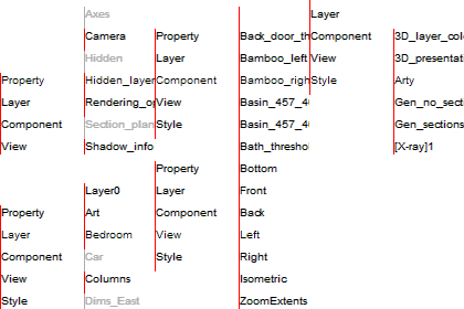
How to manipulate a lot of information in a small interface - by moving it:
How to generate a complete set of graphical information needed for building from a Sketchup model (as Mike Lucey inferred I think)
Even the detailed design intent of cgScenes is novel.
cgScenes is designed to reduce the number of open windows.
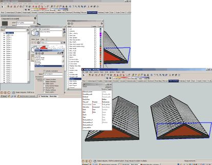
For example, if the SU layers window is open, you will see any amendments made in cgScenes instantly changed in SU layers - that is, you don't need SU layers window open.
cgScenes is an alternative, not a replacement. How much functionality is provided in cgScenes is determined by its usefulness. Changes made directly in SU are mirrored in cgScenes by clicking "Refresh" (this should be automated later).
It is simple to right click a scene tab to delete or rename it; on the other hand, to rename a layer, the layer window needs to be open; it is simpler to handle layer renaming in cgScenes. Hardly an expert but I have found the most useful cgScenes functions for modelmaking are showing and hiding layers and components, and alternating between scenes, views and styles (sections, no sections, layer colours etc.).
I suspect it is much the same for those who just want to better understand the model and what is required to build the real thing. And it is this that just might get people to think about using software as machines instead of substitute paperwork.
What do think?
Chris
PS updated version:
Release 1.01 includes the following amendments:cgScenes R1.01 (basic config).zip
Added sketchup.rb (thanks to Tomasz SCF)
Added scene setup for new files
Right aligned menu for easier toggling
Rename layer function
Excluded Layer0
cg -
Thanks for the update.
You are right writing about cgScenes window. Thanks to this unique dynamic layout an user will be able to access all parameters of a model through a single window.
Tomasz
-
hi trying out ur pluggin and i can see its strength, maybe im alone here, but i would like to see it not activate the scene when i browse on it, but rather once i double click on the scene name, this would allow u to move quicker through the scenes without having you pc hang on heavy scene, also i would like to see an eyeball next to layer names to toggle visability rather than having to tick it on top, and lastly, it would be awesome if sun shadows on and off was a option for scene states.
thanx for the pluggin
 its very handy
 -
Yep, I like it a lot. Thanks
-
@unknownuser said:
... not activate the scene when i browse on it, but rather once i double click on the scene name
... to see an eyeball next to layer names to toggle visability
... sun shadows on and off as a option for scene states.
Here's a possible version:
[aspects = Properties to be saved, Layers, Components, Views and Styles]
Use cgScenes:
left column to browse (1st click) and (2nd click on same name) to open scene and current aspect
middle column to open aspects for current scene
middle column layer menu to sort layers by abc or visibility and to add and name new layer (I think this convenient for layers)
middle column components menu to show or hide all current scene components (pending)
right column to browse (1st click) and (2nd click on same name) to hide/show properties to save, layers and components, and change views and styles.
Use SU context menu to add, delete, rename or describe a scene
Use SU layers to rename or delete existing layer
Use SU layers to select layer colours
Use SU shadows toolbar for on/off and timescgScenes is part of a bigger idea called namesets. Nameset design is frugal, boasting:
The smallest practical resizable window for everything. In cgScenes columns are fixed in number but vary in width; rows have fixed heights but vary in number. However, any number of columns and rows can be accommodated, but with only pertinent cells displayed.
One type of click, stab or poke, in deference to the guy down the manhole with a handheld.
Words used for meaning, selection and navigation - no icons, scrollbars and so on.
Sliding columns to indicate what the machine is doing and where to click.
Apart from anything else the idea is to shift the focus onto what is being created.
Here is release 1.02 just for study. If you have time, have a go and let me know what you think, or anyone else for that matter.
extract to plugins; open from plugins menu
Thanks
Chris
-
Great tool..really really like it a lot
Is it possible, you know when you click on sketchups components, it give you little thumbnails...cant you hack into that and use that code to put in your one so if you click on scene 1 / components / and the name with a little mini icon next to it.
just a thoughtPS: is it a difficult thing to write to make scenes group able ( like one group can be collapsed and contain say 7 scenes)
-
@silver_shadow said:
Great tool..
Thanks but please call it a machine; it has moving parts, that's why it can handle so much in a small interface. I want to try and push this term, because while there are machines to help banks and other big companies, the rest of us are offered digital versions of paperwork. We really need to build our own digital machines.
Thanks also for your suggestions. The design is really restricted to animated words, but I will see if there is some other way to better recognise components. Did you notice that the bounding box of the selection is highlighted (same as Outliner)?
The second is very important not just for scenes but also for components. I have been working on a way to make collections and groupings that define such sets for use in SU and elsewhere. Each component should be able to be included in several different sets, not possible with SU I believe. It becomes a system of linking and crosslinking which takes a little time to work out. I am thinking of restarting with a simple version just for scenes as you suggest.
Keep in touch
Chris
-
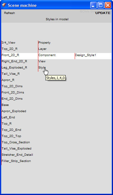
Chris, this is an interesting machine. I think it needs something, though. See the attached screen shot. I've chosen Style but it appears as if Design_Style 1 is a component. Of course I know better but there could be instances of things with the same sort of names in the third column. I think the center column should be able to roll up higher than the top of the first column so that the selected entry can also be in the white bar.
It would also be nice to have a scroll bar on the right. In the model that was open for that screen shot, my screen isn't tall enough to show the entire list of components and it's kind of tedious clicking through them to get to the bottom of the list.
That particular model has 942 component instances although there certainly aren't that many visible in the scene. Is it possible to list only the components that are in the camera's field of view?
-
Just to add my $0.02 - my instinct in that situation was to want roll the mouse wheel to scoll the columns. I think scroll bars would take away from the beautiful interface, but simply reacting to a scroll event would be perfect.
-
@jim said:
... but simply reacting to a scroll event would be perfect.
So you do have a soul! More tomorrow (China time) ...
Chris
-
@dave r said:
Chris, this is an interesting machine.
I am pleased to hear that, and more pleased that you acknowledge it as a machine. This is most important; for so long John and Jane have been palmed off with digitising what they do instead of having machines to do it for them.
@unknownuser said:
I think it needs something, though. See the attached screen shot. I've chosen Style but it appears as if Design_Style 1 is a component.
Styles is the only aspect that requires moving both the centre and right tumblers and I screwed up the logic, meaning the centre tumbler didn't move up. But tumblers? Sorry about the metaphor but it is an essential part of all nameset machines. Perhaps you can imagine them as in a slot machine or a combination lock. Except in this lock not only does each combination set up some action but also tells you what you have selected (ground plan>layer>walls - on/off). The error is corrected in version 3 which will be released as soon as the Mac compatibility is sorted out (topic)
@unknownuser said:
It would also be nice to have a scroll bar on the right. In the model that was open for that screen shot, my screen isn't tall enough to show the entire list of components and it's kind of tedious clicking through them to get to the bottom of the list.
Yes I understand but I know I should not compromise the basic nameset design tenet that the interface should only include animated words. (Jim's suggestion fits with that and the tumbler metaphor - thanks Jim) but I think the fall-back (man down the manhole test) must always be the stab with a mouseclick, stylus or finger, and a solution found in restructuring the words. Version 3 introduces:
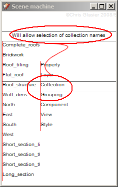
This will collect components into collections (spaces, floors, buildings, roads, areas ... ) and groupings (furniture, fire precautions, uses, colour schemes). Done in the javascript they can be used to aid modelmaking and scenes but they are not absolutely tied to it dimensionally or otherwise; one component can be used in many collections or groupings; and, over time, more devices can be added to order them into time-related packages, purchasing procedures and on and on.
@unknownuser said:
That particular model has 942 component instances although there certainly aren't that many visible in the scene.
Are none on different layers? Are all layers visible? Would you use Collections and Groupings if I provided them?
@unknownuser said:
Is it possible to list only the components that are in the camera's field of view?
That sounds very interesting. Can you or anyone else expand on this idea?
My regards
Chris
edit: see also http://forums.sketchucation.com/viewtopic.php?f=180&t=19978
-
Chris,
I like the term 'tumblers' for these.
You asked if any of the 942 component instances were on different layers. The answer is yes, they are. My large projects are furniture models. Each part will be associated with a layer. So for a table there's going to be layers for: top, aprons (skirting), legs, stretchers, etc. There will also be layers for dimensions. I might end up with a dozen layers holding dimensions because I want to hide some but not others for a given scene. I'll have exploded views and views of just some parts so I make copies of the model and move them off to the side. An exploded view might show legs, aprons and stretchers but the top might be hidden. That means that anywhere in the model the leg components have been copied to, they'll be visible. The camera position takes care of the rest.
This is a different model. It doesn't have near the number of component instances. In the first image you can see everything. All layers are turned on and Zoom Extents was used.
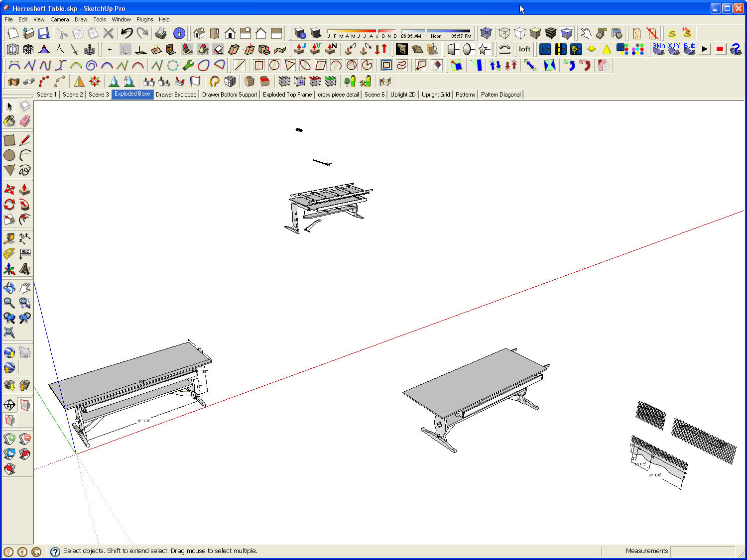
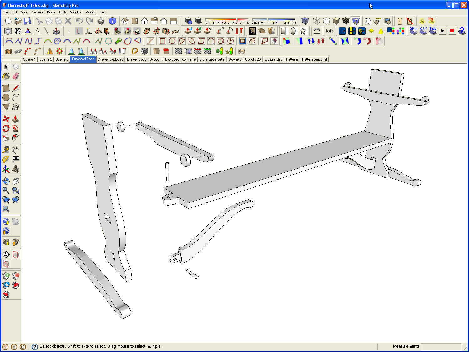
Here's the exploded view of the base assembly. All of the components visible here are also visible elsewhere in the model. You just can't see them due to the camera view. There are six instances of the leg component but only two are visible in this scene. CG Scenes lists all instances of the component so it is trial and error to pick one from the tumbler that shows in the scene. Components that are on layers that aren't visible also show making the tumbler longer.
-
@dave r said:
Chris,
I like the term 'tumblers' for these.
Then tumblers it is!
Thanks for explanation. Do you think the simple way would be to trap the click on a component that interests you in the SU display. Immediately the tumbler(!) rotates putting the component name in the focus line for turning off. In this case the length of the tumbler is irrelevant ... or is it?
I could do that but would need some help with observers as I don't know much about them.
What do you or anyone else think?
Chris
-
Trapping a click on a component could be good. That happens with the Outliner. But, in the outliner, you can also click on the component in the list and have it highlighted in the model.
-
@dave r said:
Trapping a click on a component could be good. That happens with the Outliner. But, in the outliner, you can also click on the component in the list and have it highlighted in the model.
Single selected components in cgScenes are highlighted. If this doesn't work in the version you are using, please wait for v.3. BTW this plug-in doesn't pretend to be a substitute for SU windows; just a way to make certain oft repeated tasks easier.
Thanks anyway for your comments. Always useful.
Chris
-
Chris,
Thanks for developing this machine. I look forward to any additions to it. Great job!!
If I can make a request, 2 other entities that one may want control scene visibility are dimensions and labels.
Cheers,
CMD -
@cmd said:
Chris,
Thanks for developing this machine. I look forward to any additions to it. Great job!!
If I can make a request, 2 other entities that one may want control scene visibility are dimensions and labels.
Cheers,
CMDThanks for your supportative comments.
What I am planning is:
Releasing version 1.3x, mainly derivative of SU functionality in an animated form. This has been held up because of unexpected problems achieving Mac compatibility.
Developing version 2.xx - principally new name structures and devices that can be used to help model making but also provide direct links to real world activities - searching, advertising and so on - as well as the dimensioning and labelling you mention more directly associated with the display format of the model. A balance between the words and the music, if you see what I mean.
My regards
Chris
-
@dave r said:
Trapping a click on a component could be good. That happens with the Outliner. But, in the outliner, you can also click on the component in the list and have it highlighted in the model.
Please see this topic for update. Highlighting is now essentially bi functional.
Thanks for bringing this up - very useful feedback.
Chris
Hello! It looks like you're interested in this conversation, but you don't have an account yet.
Getting fed up of having to scroll through the same posts each visit? When you register for an account, you'll always come back to exactly where you were before, and choose to be notified of new replies (either via email, or push notification). You'll also be able to save bookmarks and upvote posts to show your appreciation to other community members.
With your input, this post could be even better 💗
Register LoginAdvertisement


