Hospital Wayfinding Schematic Design Presentation Sheets
-
Have not posted any work in... well, it's been a while.
These are presentation sheets that I did for a meeting. Really rough ideas.
Just thought I would share.
-
Some more...
-
and....
-
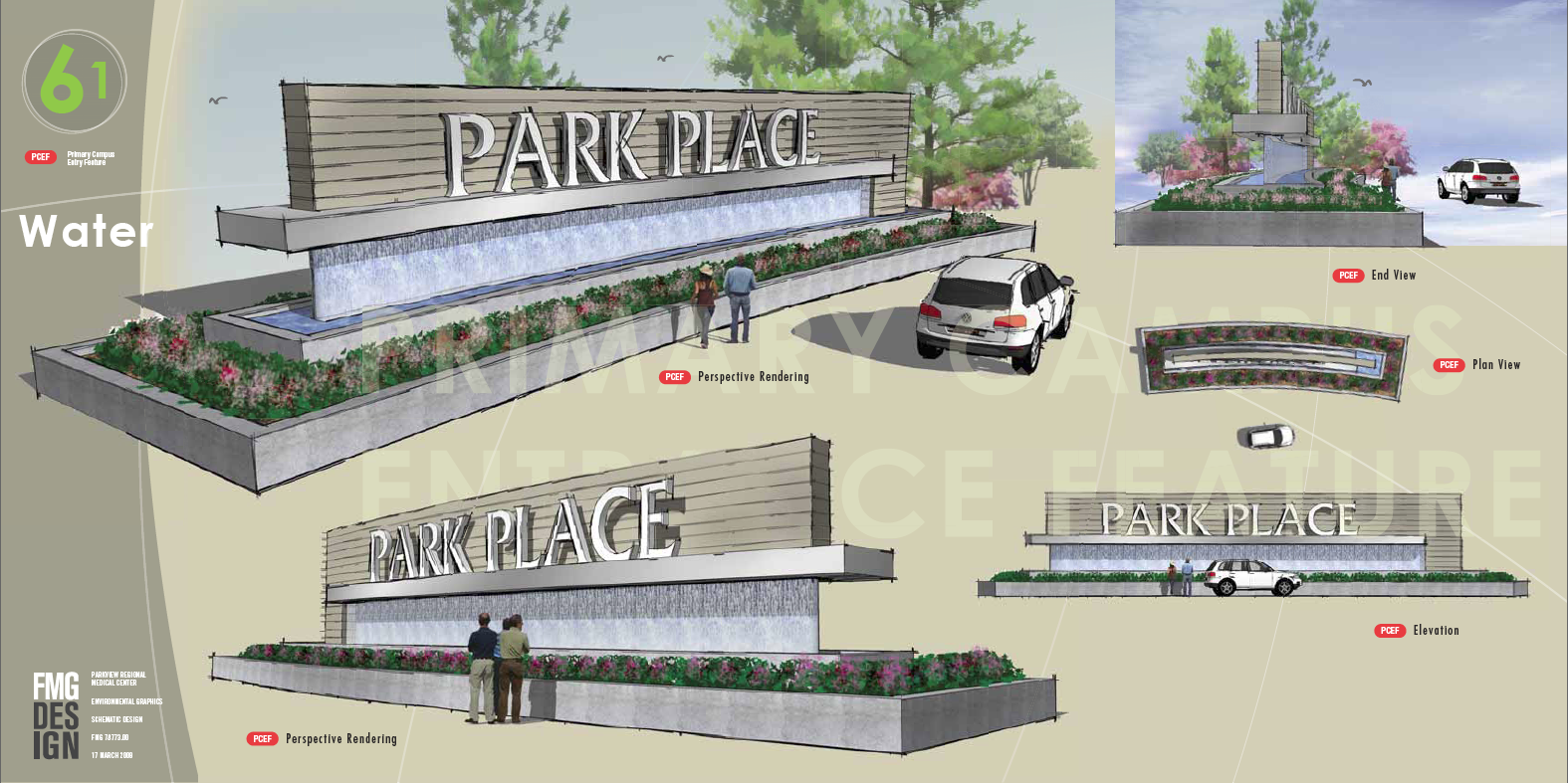
As a presentation, I think there's a little bit to much in each page, the costumer could be confused about it.
In the other hand, I loved the sketchy styles... I'm architect, and I basically doing all my 3D work in SU, with no render engine for the past 5 years... it saves so much time.. is unbelievable!
In many cases (I haven't found any in 5 years after my graduation for me) is all that's needed. A good 3D model, with a well done sketchy style.
Good Stuff.
-
I totally agree with you Gaucho. My boss likes it to look busy like that. Not really my style but, hey, he signs my checks.
BTW the se sheets are 36" x 60" when we print them out for presentations. My boss likes to "overwhelm" the client.
Thanks for the critique.
-
Wrecknball,
Very artistic presentation. Did you do the final presentation with layout?
-
I'd downplay the cars ... after all, what's the presentation about? Cars? Signage? I'm not so sure with the images!
Otherwise, I think the images look very good.
Keep it up!
-
Really nice presentation sheets. Great work.

Apart from that I also think its altogether a bit too busy a bit too many cars and all together a bit confusing as to what is the main object of presentation. My suggestion would be to keep the color on the main focal objects while everything else like people and cars remain in monochrome or sepia tone. -
@unknownuser said:
I'd downplay the cars ... after all, what's the presentation about? Cars? Signage? I'm not so sure with the images!
Otherwise, I think the images look very good
.I agree, but I really like the images
-
@unknownuser said:
I'd downplay the cars ... after all, what's the presentation about? Cars? Signage? I'm not so sure with the images!
Otherwise, I think the images look very good
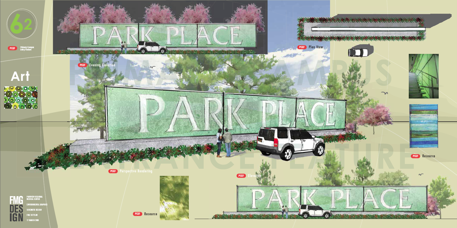
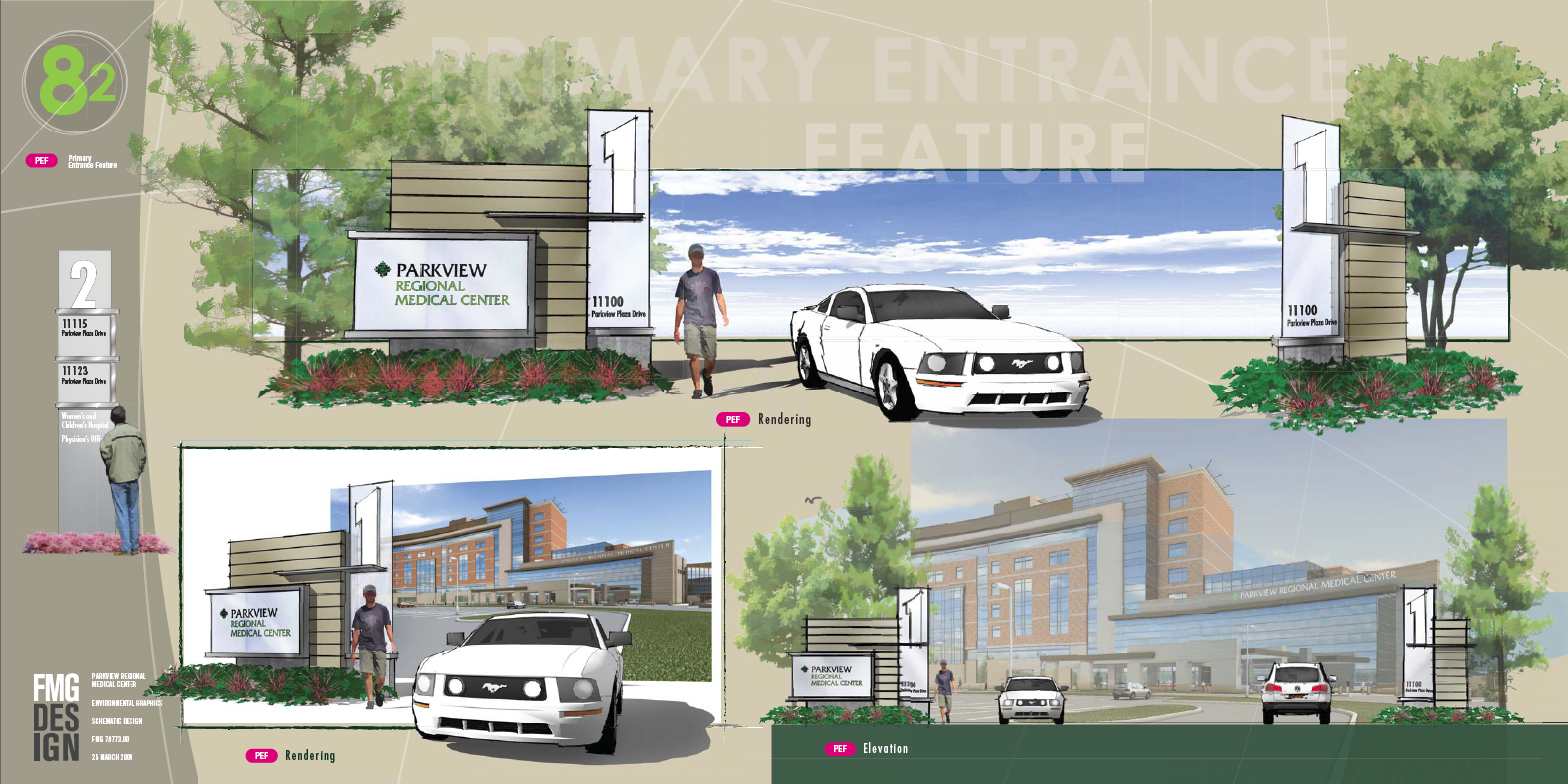
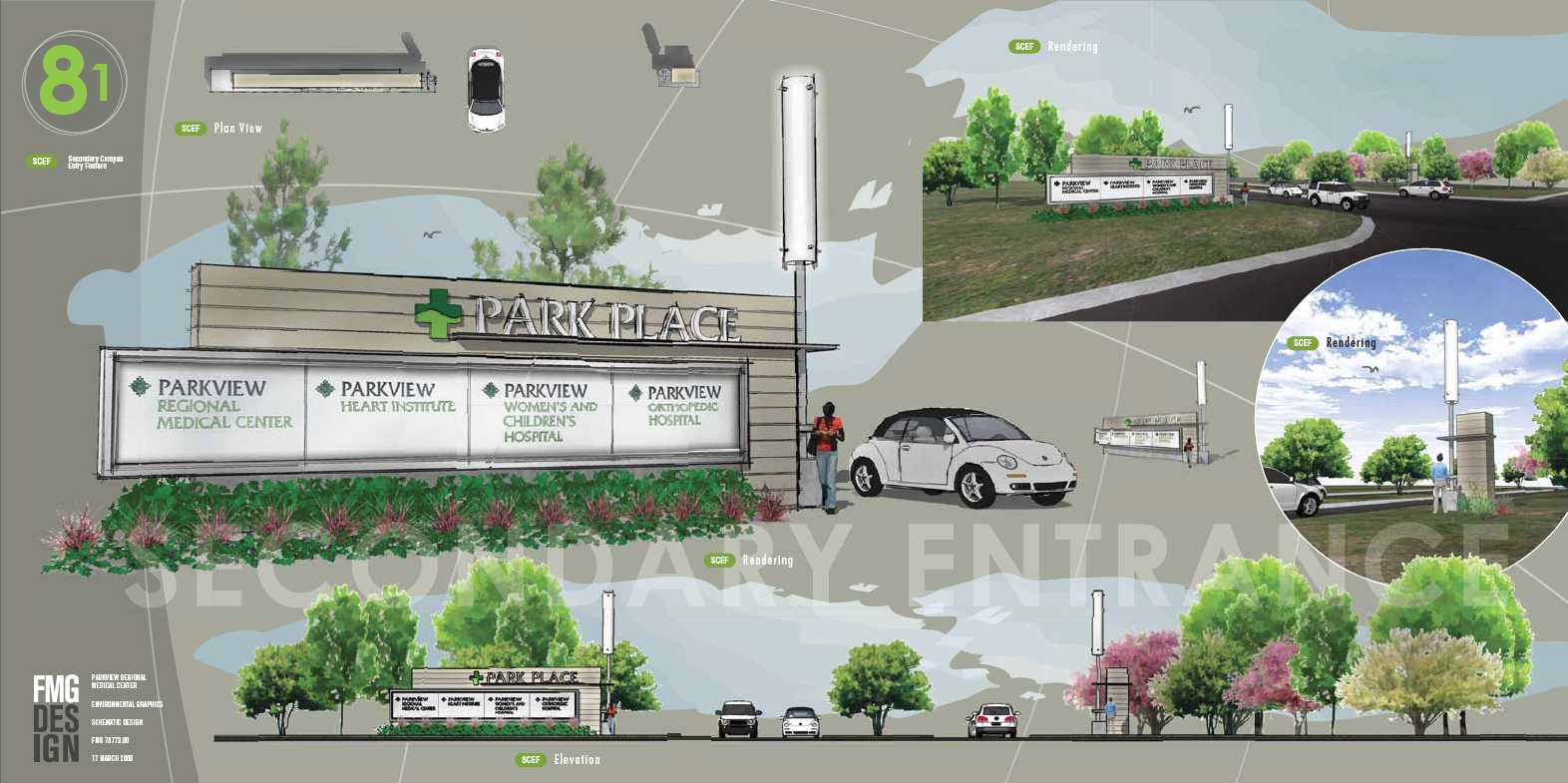
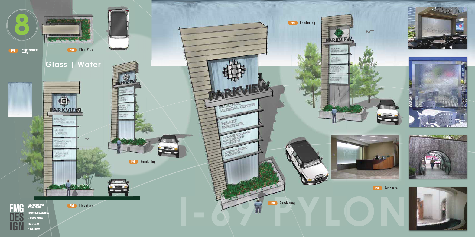
Thanks for the advice guys. I totally agree with you. The reason that we do actually show the cars and people that way is to give the designs a sense of scale. The client always wants to be able to see how big these things are going to be in relationship to their building or site. As these are signs that are directing people from within their vehicles it is imperative that we show that relationship.
-
@unknownuser said:
by honoluludesktop on Thu Mar 26, 2009 2:59 pm
Wrecknball,
Very artistic presentation. Did you do the final presentation with layout?
Neglected to answer your question...
All the images are straight from SU7, tweaked in Photoshop and the layout was done in Illustrator.
Hello! It looks like you're interested in this conversation, but you don't have an account yet.
Getting fed up of having to scroll through the same posts each visit? When you register for an account, you'll always come back to exactly where you were before, and choose to be notified of new replies (either via email, or push notification). You'll also be able to save bookmarks and upvote posts to show your appreciation to other community members.
With your input, this post could be even better 💗
Register Login


Advertisement