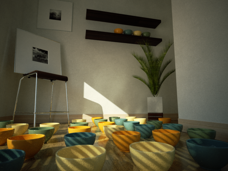
INDIGO STUDY INDOOR SCENE
-
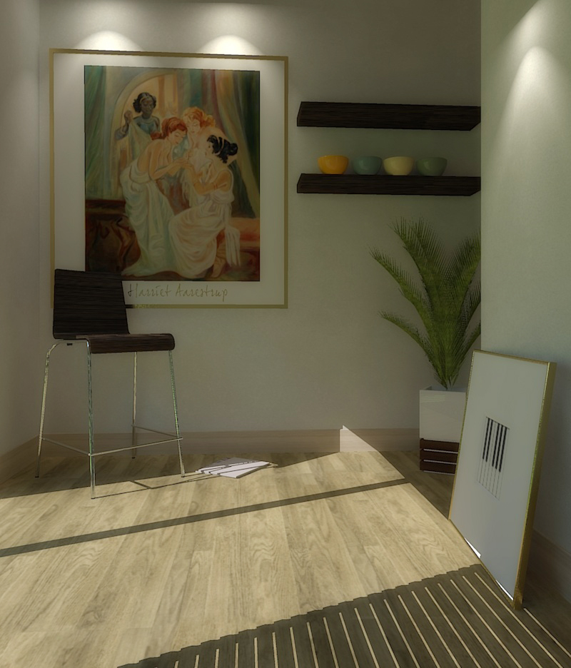
Just trying another image, another ies-light and with a HDRI background...
Added a touch bloom in post pro...
Render time: app. 9 minutes...
-
What a fun little project....it's great to see all the different results. Perhaps we should all go back and edit our posts to make sure they reflect machine size and render times, for comparison purposes. I think today I'll give the scene a go using Modo.
It would be nice try a similar thing with a shared exterior scene. Anyone got one?
- Awesome video Kwist!
-
Hi Pibuz,
...An animation containing your scene.
Hope you like it
(I used a shitload of rubies to get the animation go smoother than the default SU output. Way too tedious)
I gave you credit in the titles.Here it is:
http://youtube.com/watch?v=vEZm-20dVKE&fmt=18[flash=800,533:ltuk2qzp]http://vimeo.com/moogaloop.swf?clip_id=2954360&server=vimeo.com&show_title=1&show_byline=1&show_portrait=0&color=00ADEF&fullscreen=1[/flash:ltuk2qzp]
. -
Thanks Pibuz!
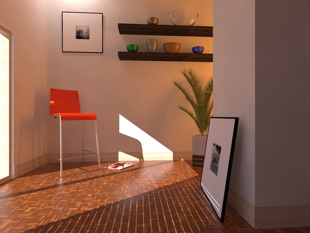
This has been a cool little community effort. Here is my go at it - played a little with the lights and materials. Straight Kerkythea output, 11+ min. for the # 6 default setting on a Q6600 quad core.
-
that good lighting and texturing was the thread, and that's good to see so many programs rendering participating.
This is a clear example of the integration with the various programs with sketchup -
Beautiful Pibuz.
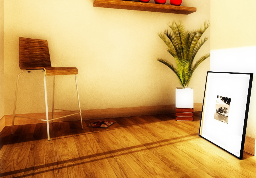
I had a go with your scene using Vue 7's Radiosity engine. Quad core Q6700 - 50 mintues on Ultra with quality boost set to 2.5.
-
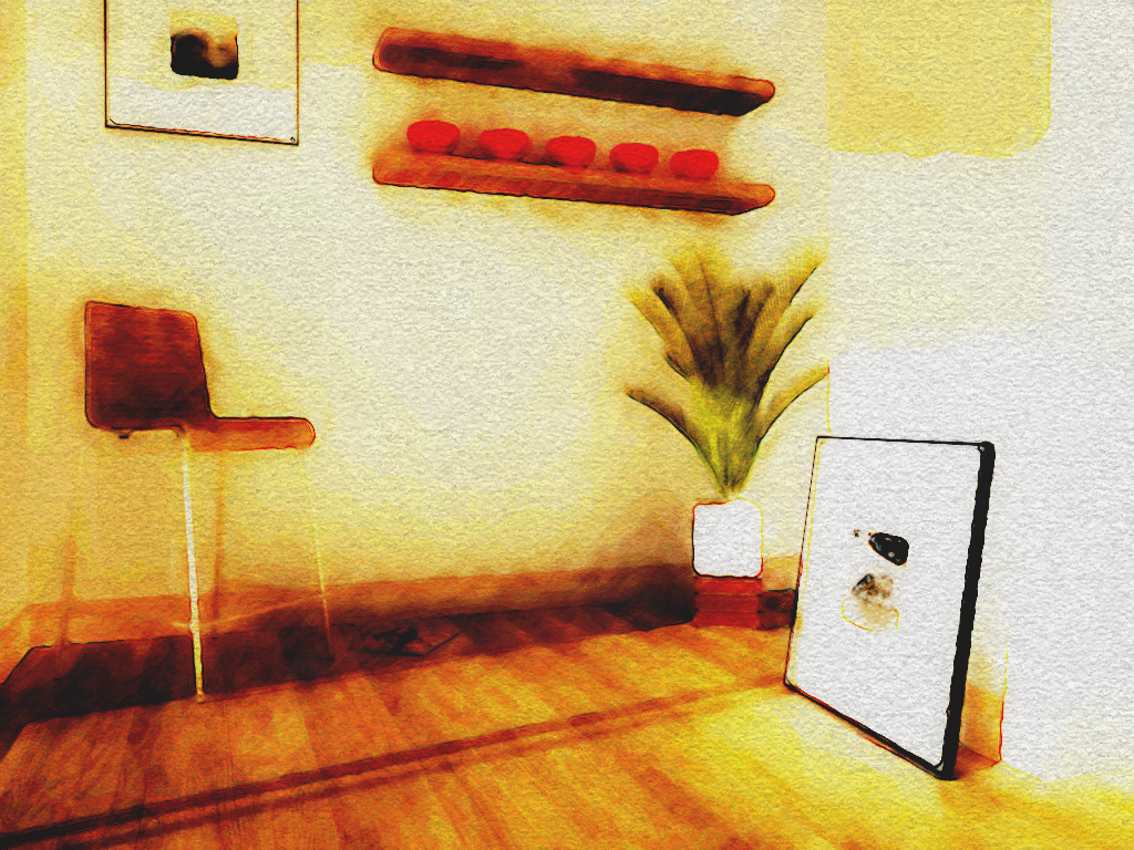
Thought I'd add an NPR to the mix -
-
Hi guys! What a funny topic!


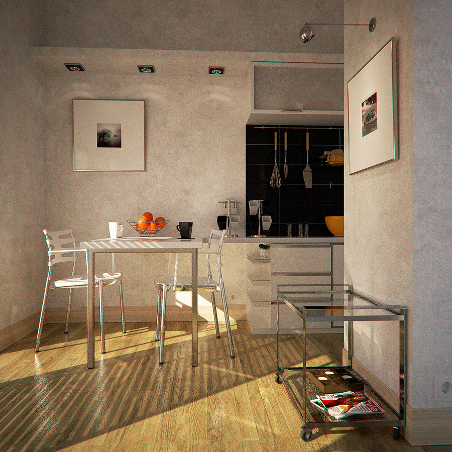
So, i'm going on with the refinement: some minor work on the objects, and some overall changes.
Crits and comments as always!Kwist: thank you for the credit!!!!
-
Looking good there, Pibuz!

The details in the scene are wonderful.
Is the glass on that trolley a specular or a thin glass?(minor crit: The void above that shelve still is a bit odd from an architectural viewpoint .)
-
@pibuz said:
Perhaps I could fill the shelf with cooking books of recipes!
People would have quite a hard time reaching those, I think. Even when standing on a chair.
-
...yeah...you're right....
(My mom is 1.52m tall..lilliput....and keeps yelling at me for that damn shelf) -
@pibuz said:
.. pushpulling the back wall forward to reach the edge of the shelf...
I think that would be a plausible option.
Either it becomes wall (dry wall), or filled with a closed cupboard (e.g for goods you rarely use). -
Thanks Kwist! Your opinions always mean a lot to me!
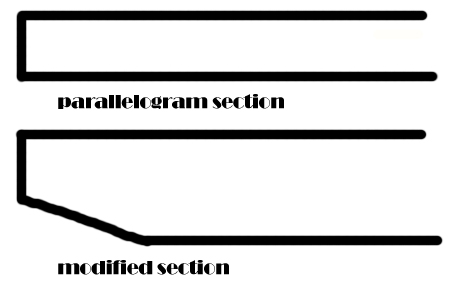
The glass on the cart is thick, with a little absorption (you can see a pale green/blue colouring the edges): it isn't a simple parallelogram, 'cos I often see some beveling applied to the down face in real glass carts (about 4cm), so i scaled (with centerpoint as the base point) the face a little..
It's hard to describe... I'll attach a PS sketch..
I agree with you about the upper shelf


Don't know how to solve that little problem: I even thought about "filling" it by pushpulling the back wall forward to reach the edge of the shelf... Really don't know...
Perhaps I could fill the shelf with cooking books of recipes! Still....
doubts doubts doubts..
Help guys!!!EDIT
added cart glass section sketch
-
@kwistenbiebel said:
Hi Pibuz,
...An animation containing your scene.
Hope you like it
(I used a shitload of rubies to get the animation go smoother than the default SU output. Way too tedious)
I gave you credit in the titles.Here it is:
http://youtube.com/watch?v=vEZm-20dVKE&fmt=18hi, what the software that you make the animation ?
-
I think he used V-ray for sketchup!
-
Hi Jon, excellent image, tips and tricks for those who use kerkythea?

-
YEAH JON! COOL MOOD! Seems like a sepia image, but it's the tones only! Really effective!
I wouldn't be bothered if I'd see a gangster or something going out this room..
Really, cool pictures too!
And excellent vases! Are they from the warehouse? could you link us? please? -
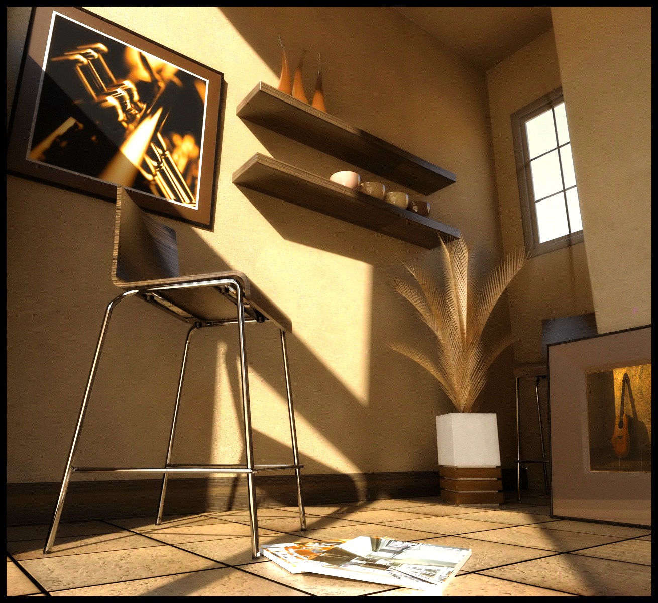
Hi, guys.

Here's my try at this...
-
Heres my go at it:
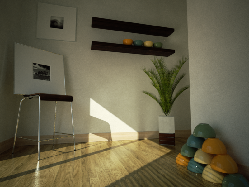
Dammed indigo taking forever.
-
Hello! It looks like you're interested in this conversation, but you don't have an account yet.
Getting fed up of having to scroll through the same posts each visit? When you register for an account, you'll always come back to exactly where you were before, and choose to be notified of new replies (either via email, or push notification). You'll also be able to save bookmarks and upvote posts to show your appreciation to other community members.
With your input, this post could be even better 💗
Register LoginAdvertisement


