My Works - (Completed and wip) update 02 - 24 - 09
-
Great work rcossoli
allanx
-
Tanks allanx!!
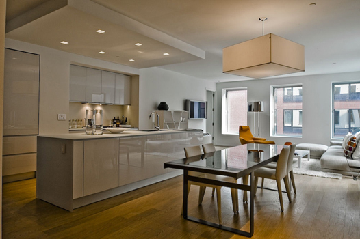
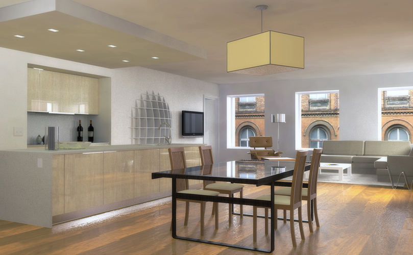
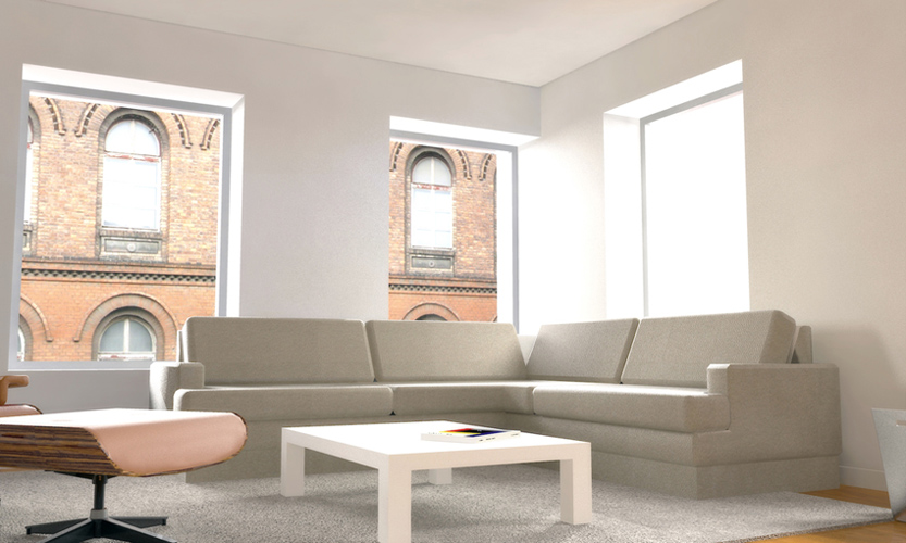
...and this is a work of practice, take the first iamgen as a base and try to do something similar, both in modeling and in the light, not at all like output and not entirely happy, but things like this do serve a lot making practices in configurations of lights, reflections, textures and other things.
-
that looks really good. give your images slightly stronger, darker colours, and you are at the original. great stuff!
-
Tanks plot!
with the tone of the image I'm finding out how to improve it in photoshop, changing some things very clear in this comparison of the original -
These look great, rcossoli. On the very first image, the curve on the pool's ladder can use some more smoothing.
-
the theme of the ladder as it was not the amount of aunmente sides of the circle to use the basic shape is so divided, in modeling is not noticed but in rendering, with the reflexes and others if they feel a pity, what step in the same umbrella if you look good.
forgiveness for my very bad English
-
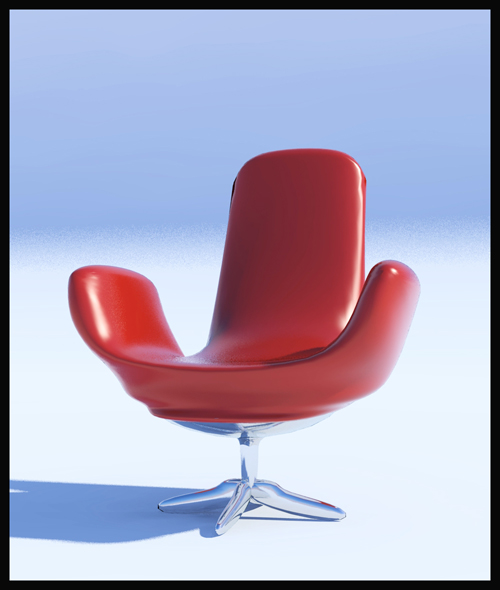
I think we all know this plugin ... the first test that I work with, we should improve a lot ...
-
MORE KERKYTHEA RENDERS!!!!
PD: Thanks to pibuz for your frame&picture (on left) in the 1st picture, are very well modeled and the truth I could not stand the urge to use it

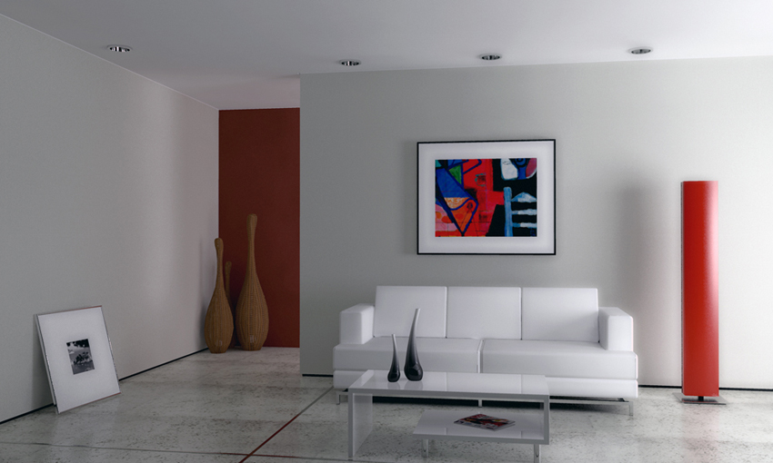
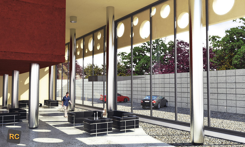
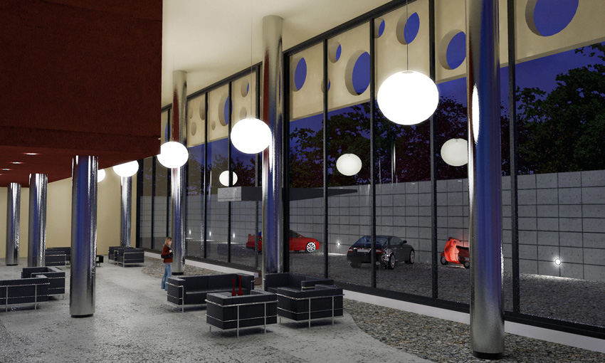
-
Looks like you and Kerky are getting along quite nicely. Keep at it.
-
Great work, rcossoli ...!! Great work...!!

Keep 'em comming...
-
thanks for comment, the truth that I love working with kerkythea has a great future and I think makes a great pair next to the PS, which is inevitable for a good render today, greetings to all.
-
great work .. God bless u

-
Thanks men!
C&C are welcome
-
Looking good!
you should try out the warehouse http://www.sketchucation.com/forums/scf/viewtopic.php?f=81&t=16231
-
Thanks daniel
here is a picture of something quick test of the model warehouse, I did a while, just to test, you should make another with more time
-
Nice!

-
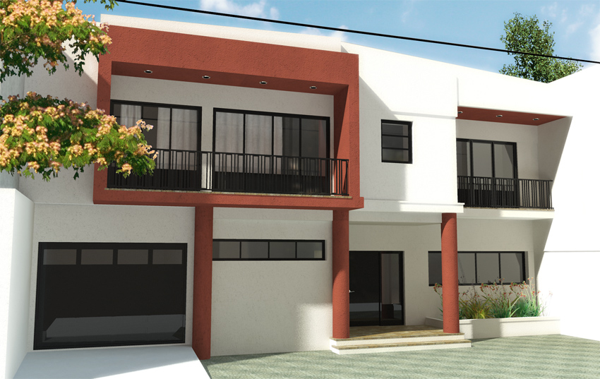
hello, this picture is the front of a house, a simple modeling and kerkythea rendering with hdry ligthning , was to test the colors of the facade.
sketchup + kerkthea + photoshop
-
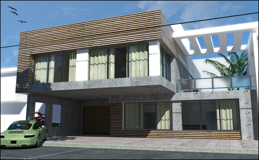
a new exterior of a house designed by me, and modeled for a long time.
C&C are wellcome
-
wow I have a lot to learn
-
thanks zumo, and if you want to learn these in place, without doubt, this forum is very good.
Hello! It looks like you're interested in this conversation, but you don't have an account yet.
Getting fed up of having to scroll through the same posts each visit? When you register for an account, you'll always come back to exactly where you were before, and choose to be notified of new replies (either via email, or push notification). You'll also be able to save bookmarks and upvote posts to show your appreciation to other community members.
With your input, this post could be even better 💗
Register LoginAdvertisement


