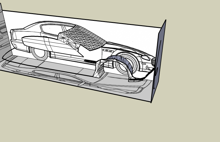
Car (W.I.P.)
-


-
 You couldn't have waited until it actually resembled a car, you just HAD to post it after like a half hour.
 -
Guys, just a heads up, let's keep this civil please.
Kevin, please try evaluating your posts before submitting them, use a little judgement as we do not want another 30 plus pages of crap like the last one.
Thanks.
-
Oh Cmon Pete, That Was Fun

-
Hi Kevin,
**First.**You should align the blueprints. It seems to me that they're not aligned.
For instance the blueprint of the rear of the car should be lowered.
Second. In order for someone to help you (if there's someone still available) it might be useful attaching the skp file.
Third. When drawing a line in space you should always use at least two blueprints to detect the endpoints of the line. It seems to me that you only use one sometimes, like in the side windows of the car. This is very important. That's the role of having three blueprints.
Fourth. It would probably be easier starting by using the method that Pete clearly illustrated in the other thread (video). That method, also helps to undertand how blueprints work.
You make contours of the three blueprints, you pull them, you intersect everything and you erase the extra parts.Finally. Think twice before posting one-line comments and one-word comments, they usually aren't that useful.
Hope this helps.
(Try to reply to this post after facing these issues)
-
Kevin,
Using SketchUp to build a car is NOT a good idea unless you are highly skilled. I suggest you think about a new model and we will work with you on it

Mike
-
mike, if you read some posts (soon to be deleted)
"before getting a $2000 CAD program" so im just using sketchup until then lol
(I NEED TO STOP LOLing!) -
It might be a good idea, by the way, to try the demo of Moment of Inspiration. That app may be somewhat more useful for obtaining the sort of shapes you're after.

MoI, 3D modeling for designers and artists
MoI is a new 3D Modeling/CAD application for designers and artists. Offering a blend of precision and freeform NURBS drawing tools, it sports a unique user interface that operates seamlessly with a pen tablet.
(moi3d.com)
-
It's already apparent that your geometry is a mess. Try to keep your polygons cleaner and more evenly spaced. This will help make it easier to add details down the road. Also, as mentioned, you need to align your blueprints better.
Maybe you should start by modeling the garage that the car is going to go in. Then move up to the car itself. The gallery is already over saturated with "look at my car WIP" threads.....why not do something original?
-
earthmover... I couldn't agree more.
-
Even with a "$2000 CAD program" you need to be highly skilled to draw a realistic car.
Mike is right. Start with something more simple, this will help you improve your skills.
If instead you keep on trying with the car, try to answer our posts.guzman.
-
@earthmover said:
Maybe you should start by modeling the garage that the car is going to go in. Then move up to the car itself.
or at least individual components of the car, if architecture isnt your thing.. i'd say the simplest thing to start with would be a wheel/tire.... start out with that maybe.
-
just do your thing don,t take any notice of the "wise guys" comments whatever floats your boat and gives you a charge

-
Yeah, just try it, you only have to know how to handle with polygons. But I should make the car with lesser poly's. Now you use too many polygons. The best is to do your best on this car. And a lot of practice is very helpfull! Then in the final you can make cars in sketchup ! (maybe its better to draw your own blueprints, and make completely your own car. Then you can make it a bit diffrent than the blueprint...)
-
Well i while Back i said,
@kdsdesign said:
mike, if you read some posts (soon to be deleted)
"before getting a $2000 CAD program" so im just using sketchup until then lol
(I NEED TO STOP LOLing!)Also I made a quick car tutorial. but thats about it
-
hows this car getting on then KD? sunk any more time into it? i'd quite like to see the finished article.
Pav
-
Hi Kevin,
Hope you dont mind,
I've seen your new cars, and your tutorial in the 3DWH,
car
car tutorial
you're really getting better !About the tutorial:
- you still need to align the blueprints: wheels in the side, front and rear view should be at the same height, but the idea is correct and the result is not bad
- you could use scenes to make it easier to use
-
thats the simple way
-
what is?
Pav
-
the tutorial

Hello! It looks like you're interested in this conversation, but you don't have an account yet.
Getting fed up of having to scroll through the same posts each visit? When you register for an account, you'll always come back to exactly where you were before, and choose to be notified of new replies (either via email, or push notification). You'll also be able to save bookmarks and upvote posts to show your appreciation to other community members.
With your input, this post could be even better 💗
Register LoginAdvertisement


