Chilean Embassy Addition (the interiors)
-
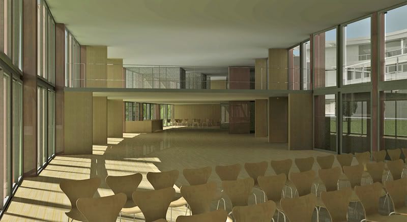
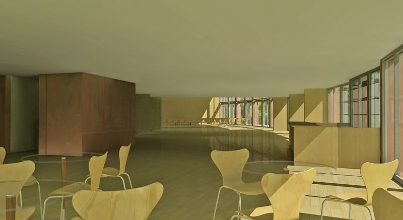
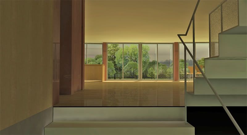
a couple of interior views of the project posted here:
http://www.sketchucation.com/forums/scf/viewtopic.php?f=81&t=14873


-
Holy Smoke Edson,
These are really great renders. Any background on how they were done? Great light and all. The ceiling looks so perfect (it would be nice to actually have one so uncluttered...) One thing, to be picky, Some of the shadows make it look like there are two suns. Thank you for posting these.
Peter
-
Very nice, Edson!

This Podium? What was your lighting setup?
-
thanks, guys.
@pbacot,
perhaps the ceiling is "too perfect". i should have put some dummy light fixtures on it. the middle one could also be a little bit darker. about the two suns, all i can say is that there is no other source of light than global illumination.@stinkie,
it is podium, yes sir. i used sepos_smooth_settings preset, dark slider at 45 and "use sun for shading" on. -
WOW!
-
In one of the images, it looks like the floor pattern flows around with the building.
...If it does, HOW did you do that?
-
btm,
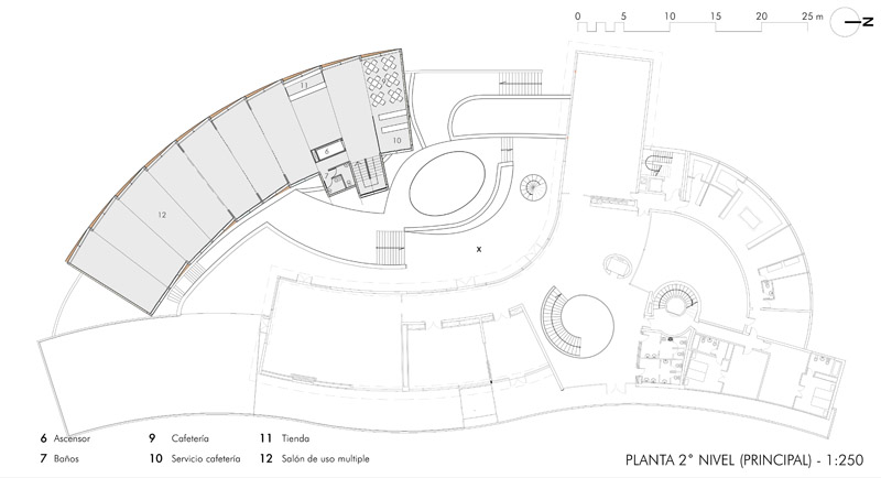
as you can see in the attached image, the plan of the addition is a curved space that is the result of adding 10 radial modules. what i did was to apply the floor texture to each of them and then re-position the texture accordingly, always parallel to the main facade.

-
Again, very nice though I find some of the materials a little bit too glossy for my taste (most noticably the floor)though this is quite common in podium renders I find.
-
@dzinetech said:
Again, very nice though I find some of the materials a little bit too glossy for my taste (most noticably the floor)though this is quite common in podium renders I find.
thanks, dzine.
i would not blame podium for any excessive glossyness. reflectiveness is something one assigns to specific objects in podium thus the only one to blame is the author not the software.
-
as usual, looks great Edson.
-
Hi, very good images, never work with Podium, we must seriously investigate the truth.
I saw some details that play against the waves as they appear in the ceiling, is probably due to the adjustment of illumination in PhotoShop (or some similar program) I think that happens when you see a texture just use a color of SketchUp, when adjusted parameters is also stained.
It is also wise to the railing that appears on the 1st and 3rd image give him something more thick to go well inthe images, modify something so that the shadows are not as harsh as the sun in that position ever casting a shadow so precise and defined.
Nothing more to add, I believe, very good job, and also outside! -
Edson, in regard to the view with all the trees:
I like all the renders, but in the view with all the trees the lighting on the trees does not match the lighting on the model. The trees seem to be flat cut outs that are lit from the opposite direction from the model itself.Are the trees individual face-me components or is the background one giant flat photo placed behind the windows. The funny thing is that I like the look even though I recognize the lighting direction is different. It may seem obsessive, but I will take face-me components and tweak them in photoshop to get them to agree with the prevailing light of the model. It may be a technique not suited to a production environment but perhaps worth considering.
-
Edson, What a prestigious commission. Congratulations! I am not a podium user, how did you create that particular tint on the rendered surfaces?
-
@roger said:
Are the trees individual face-me components or is the background one giant flat photo placed behind the windows. The funny thing is that I like the look even though I recognize the lighting direction is different. It may seem obsessive, but I will take face-me components and tweak them in photoshop to get them to agree with the prevailing light of the model. It may be a technique not suited to a production environment but perhaps worth considering.
roger,
in fact, there is one big flat image at the back of it all. in front of it there are several face-me components from the podium library.looking at this from a rendering artist's point of view - for whom the render is the final product - i would be in total agreement with you. however, as an architect, i see renders as a means to test a design solution. the objective is the design, not the render. of course, these renders could be improved if I did as suggested but the project itself would gain nothing from it.
and since i run a very small practice and do most of the work by myself, you can image how much incentive i have to go back and improve those images.
thanks for the comments. i will bear them in mind anyway.
-
@honoluludesktop said:
Edson, What a prestigious commission. Congratulations! I am not a podium user, how did you create that particular tint on the rendered surfaces?
hi honolulu,
i just gave a touch of yellow in postprocessing. in fact i learned most of the tricks I use from this post from kwistenbiebel. -
Edson, these are beautiful. The colors are so warm and inviting

-
thanks, tina and bruce. you are too kind. let us say i found the right combinationn of tools for my needs and limited ambitions.
cheers.
-
@edson said:
@roger said:
Are the trees individual face-me components or is the background one giant flat photo placed behind the windows. The funny thing is that I like the look even though I recognize the lighting direction is different. It may seem obsessive, but I will take face-me components and tweak them in photoshop to get them to agree with the prevailing light of the model. It may be a technique not suited to a production environment but perhaps worth considering.
roger,
in fact, there is one big flat image at the back of it all. in front of it there are several face-me components from the podium library.looking at this from a rendering artist's point of view - for whom the render is the final product - i would be in total agreement with you. however, as an architect, i see renders as a means to test a design solution. the objective is the design, not the render. of course, these renders could be improved if I did as suggested but the project itself would gain nothing from it.
and since i run a very small practice and do most of the work by myself, you can image how much incentive i have to go back and improve those images.
thanks for the comments. i will bear them in mind anyway.
Edson, I agree with you 100%. I too use modeling to validate design solutions. However, the second the design is complete, the purpose of the rendering changes. At that moment it becomes a marketing tool to help obtain the next commission. I see way too many architects that do a wonderful piece of architecture and then publish their own photos in marketing efforts to save a few bucks. If they are good photographers that is great, if they are not good photographers they are snatching defeat from the jaws of victory.
In your case the renders are excellent and as I mentioned I liked the effect so well that I was willing to accept transgressions of the laws of physics.
And even though I always earch for the elusive perfect image, I too, always make compromises of efficiency vs perfection. The last 20% of a job always seems to take 80% of the effort.
-
roger,
we are in total agreement. given the time i will also strive for perfection down to the last blade of grass...
Hello! It looks like you're interested in this conversation, but you don't have an account yet.
Getting fed up of having to scroll through the same posts each visit? When you register for an account, you'll always come back to exactly where you were before, and choose to be notified of new replies (either via email, or push notification). You'll also be able to save bookmarks and upvote posts to show your appreciation to other community members.
With your input, this post could be even better 💗
Register LoginAdvertisement


