Stuff Topic (Once "My Projects and W.I.P.s")
-
What can I say, David...?!?

Started when I was very young... My mom took some pics of me and I managed to put them together in a short anim I could use as my avatar...
The most important thing to mention is, that I'm still smoking and still look as young as when the pics were taken...
pbacot... You're right... My mistake...
Of course we're laughing next to him... My bad... Guess it was just a small language thing, since English isn't my mother tongue...
-
lol

-
If Kevs been on all day it's probably because we are getting socked with a snowstorm here in the northeast USA and he didn't have school today..they canceled matchbook law school today! Your Mercedes got hit in a parking lot you say....had to go to the Quickie Mart for some ketchup to put on your caviar?
-
so. . . .
Kevin. What law school are you going to anyways? -
yeah it seems that is a popular question lol

-
What seems to be the popular answer?

-
-----------------------------------------------------
Guys,
This thread has been brought to my attention and I'm drawing the line. No more posts please

I will be deleting the total topic tomorrow as I think this thread reflects badly on SketchUcation AND I really see no need for the term WTF (What The Fuck!) being continuously used.
The reason I'm leaving the thread up is to offer a chance to reflect on the matter.
Mike
-
Aw, Mike, this was beginning to be fun!

I'll be missing this thread. hangs head and whistles something sad 'n' bluesy
-
@mike lucey said:
-----------------------------------------------------
Guys,
This thread has been brought to my attention and I'm drawing the line. No more posts please

I will be deleting the total topic tomorrow as I think this thread reflects badly on SketchUcation AND I really see no need for the term WTF (What The Fuck!) being continuously used.
The reason I'm leaving the thread up is to offer a chance to reflect on the matter.
Mike
awe man, thats too bad.
-
And just when it was getting so bad it was funny...

-
i do thinklocking this would be a good idea

-
@unknownuser said:
And just when it was getting so bad it was funny...

I think that was about page 5 or so

-
i didn't find it funny untill the later pages, at the start I thought it just sucked.

-
Could well be the wonders of the retrospective.
-
that is kinda wtf (WierdTrueFreaky)
-
WTF????
Acording to News.com.au, WTF means Weird True Freaky .... http://www.news.com.au/weirdtruefreaky/
So it cant be all that bad...

And this thread sure has been Weird and Freaky.....but not all that truthful.
-
It's been an interesting diversion while it lasted. I do have to say I'm not overly comfortable making fun of people, so from that perspective I'm not sad this thread will die. Kevin, you must know that you're pissing people off by not FIRST trying to help yourself regarding your export/import issue (or whatever it was) and your overall forum demeanor needs improvement.
-
_<

-

-
I love it, espresso...
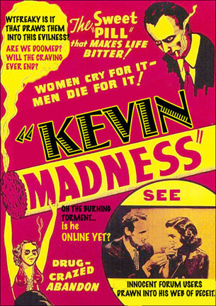
I figured it wouldn't be long until the principal found out what was going on in the playground and broke up all the fun...I guess he has a point...this thread wasn't exactly putting out best feet forward..but it made for some amusing content, creative photoshopping, and all around witty bantor...even if it was at Kevin's self inflicted expense...
Hello! It looks like you're interested in this conversation, but you don't have an account yet.
Getting fed up of having to scroll through the same posts each visit? When you register for an account, you'll always come back to exactly where you were before, and choose to be notified of new replies (either via email, or push notification). You'll also be able to save bookmarks and upvote posts to show your appreciation to other community members.
With your input, this post could be even better 💗
Register LoginAdvertisement


