The slammer
-

I was thinking of adding some more detail somewhere, but i couldnt really think what to add

-
A bed. A toilet. A prisoner.
-
prisoner= im crap at modelling/rendering people.
Toilet= too chromey for my liking

bed= good idea

-
a drip in the ceiling, a rodent on the floor and a way out (a gap in the bars), that cell is depressing...pretty convincing. The shadows cast by the bars show an interesting pattern.
-
a chamber pot in the corner!

beautyful render, remus. especially nice stains of rust/dirt at the window.
only thing that is a bit strange, is the direction of the ceiling texture

-
@plot-paris said:
...only thing that is a bit strange, is the direction of the ceiling texture

The same thought. And maybe the texture could/should be a bit different, too (maybe just scale it differently).
-
I just discovered that someone tried to bend these bars at the window - with very little effect!

this is the sort of fine detail, that brings such a scene to life. really great!

-
I think a bed in such a place would be out of place. How about some straw on the floor?
-
@plot-paris said:
...someone tried to bend these bars...
Nice catch Jakob! Wonderful detail indeed. Daniel, I was thinking straw too...would give the eye some color and texture relief. Great job, Remus!
-
Some toxic barrels maybe

Some help for you

-
Nice render ramus. Too boost the mood, add some chains on the wall with skeletons hanging from it? Chain and Skeletons will not be easy to make with SU thought.
-
i like the composition , very simple and efficient and ....
a spider and its web, skeleton with handcuffs on the wall, 4 lines with one crossing them on the wall,one of these excellent french cheese delicately put in the ray of light of that quiet morning , or just the shadow of someone sat on the floor , a key on the floor, feet walking at the window ...
anything that can tells us a story ...

-
Cheers for the ideas guys, i was kind of aiming for the decrepid look, so i guess ive achieved that.
Im surprised you noticed the bars, i can hardly tell theyre bent myself!
More stuff coming up...
-
Right on the edge Remus,
Ouch, my head is a prison this AM, not much good I'm all afraid about.
Tried to push the webs back with a all you can eat breakfast over at the Kip's big Jack down the hill -- road tripping again, looking for "what" again.
Yeah, yeah, yeah, on this... Cell.
It looks a lot like a school I attended -- back in the way back -- I had this teacher there, who was on his last year I'm trusting, he was a Jack bird right on mentor, Lee H something was his handle -- he had some kind of aqua-safalic kind of deal disorder all working dribble gland in his noggin, so he called himself a cyborg... Doctor dudes put this little plastic hose in his head that ran from the inner brain pan down into his bladder -- draining the excess water, and then he was more normal -- or didn't fall down so much.
Anyway that dude set me up with "Zen And The Art Of Motorcycle Maintenance" and that Jack really got my gray brain mud berries in a twitch.
I highly recommend that action -- perhaps render an old copy of that killer tome in that dank shadow land you've created.
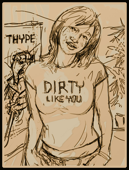
Or, there is "Be Easy" and Sam Atomic... I might be able to get her to take a few photos -- but in the mean time here's a sketch I did of her about what? Four years ago.
Perhaps just write Be Easy + Sam on the wall.
Durant "bring a cake" Hapke

-
Well here's mk 2.

I cant tell wether im just being over critical, but i dont like it as much as the original. theres something not quite right (the back wall texture, definetly) aobut the layout. The problem is its taking 24 hours to render each one, now. Damm'd slow computer! wheres my render farm...
-
reminds me a lot of the torture scene in "Casino Royal"

I think what is a bit iritating is the brightness of the light. it seems a bit too bright to me on the wall... not sure how to change this though, because if you reduce the amount of light, the room will grow darker

or is it perhaps the reflectivity of the wall/floor? (look at the light spot on the floor - looks almost like an emmiter) -
Thats a good point, and it could probably help quite a lot.
The room was actually pretty light to start with, i just darkened it in ps, so i dont think reducing the strength of it is going to be too much of a problem.
On a slight side note, i cant wait until the new indigo exporter comes out, all that layer blending goodness!
-
Hey, this is nice...although nice isn't the right word to describe a place like that.

The light in both images is very good.Somehow I would love to see some detail added so there is more of a story to the image.
The slightly bent bars are a good touch, but maybe this scene needs more clues.
Great concept to think about. -
oh yes, the new indigo will bring such a great enhancement. perhaps we should discuss what is the best way to implement this feature in SU, give whaat some ideas.

-
Kwist, the 'telling a story' thing was what i was what i was aiming at, its damm hard to do though

Hello! It looks like you're interested in this conversation, but you don't have an account yet.
Getting fed up of having to scroll through the same posts each visit? When you register for an account, you'll always come back to exactly where you were before, and choose to be notified of new replies (either via email, or push notification). You'll also be able to save bookmarks and upvote posts to show your appreciation to other community members.
With your input, this post could be even better 💗
Register LoginAdvertisement


